# A tibble: 53,940 × 10
   carat cut       color clarity depth table price     x     y     z
   <dbl> <ord>     <ord> <ord>   <dbl> <dbl> <int> <dbl> <dbl> <dbl>
 1  0.23 Ideal     E     SI2      61.5    55   326  3.95  3.98  2.43
 2  0.21 Premium   E     SI1      59.8    61   326  3.89  3.84  2.31
 3  0.23 Good      E     VS1      56.9    65   327  4.05  4.07  2.31
 4  0.29 Premium   I     VS2      62.4    58   334  4.2   4.23  2.63
 5  0.31 Good      J     SI2      63.3    58   335  4.34  4.35  2.75
 6  0.24 Very Good J     VVS2     62.8    57   336  3.94  3.96  2.48
 7  0.24 Very Good I     VVS1     62.3    57   336  3.95  3.98  2.47
 8  0.26 Very Good H     SI1      61.9    55   337  4.07  4.11  2.53
 9  0.22 Fair      E     VS2      65.1    61   337  3.87  3.78  2.49
10  0.23 Very Good H     VS1      59.4    61   338  4     4.05  2.39
# ℹ 53,930 more rowsData Analysis
Chapter 1: Introduction
Yu-You Liou
Shih Chien University
2026-09-20
Welcome to ggplot2
What this course is
This course teaches you to draw statistical graphics in R using ggplot2.
ggplot2 is not a menu of finished chart types. It is a small set of parts that you combine yourself. That sounds like extra work, and for the first week it is. The payoff comes the moment your data asks for a picture that nobody has written a function for.
The slides follow the course book chapter for chapter. Read the book chapter first, come to the slides for the worked version, then do the exercises.
What is expected of you
Three habits, every week.
Run the code. Reading a plotting call teaches you almost nothing. Typing it, changing one argument and watching what moves teaches you most of the chapter.
Do the exercises. They are the part that turns recognition into recall. The slides are only the setup.
Ask early. An error message you bring to class on Tuesday costs five minutes. The same error message the night before a deadline costs you the assignment.
You are not expected to have used R before. Chapter 1 is about getting the software onto your machine and knowing what the rest of the course is for.
A first look at some data
diamonds comes with ggplot2, so installing the package is all it takes to get it.
It records the price, the weight and three quality grades for close to 54,000 stones. We start with it because it is large enough to misbehave. A data set of twenty rows makes every plot look fine, which teaches you nothing about which plots are honest.
A first plot
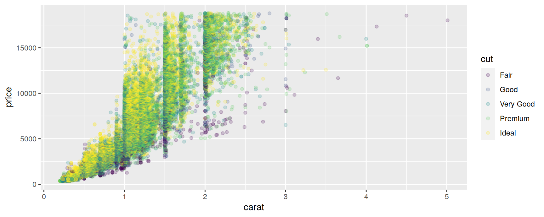
Read that call as three answers. Which data? diamonds. Which variable is shown by which visual property? Weight across, price up, cut quality as colour. How is each stone drawn? As one semi-transparent point.
Those three answers are all any ggplot2 plot ever needs. Everything else in the course is a longer answer to one of them.
Plots are built up, not chosen
A ggplot object is an ordinary R value. You can store it, add to it and reuse it.
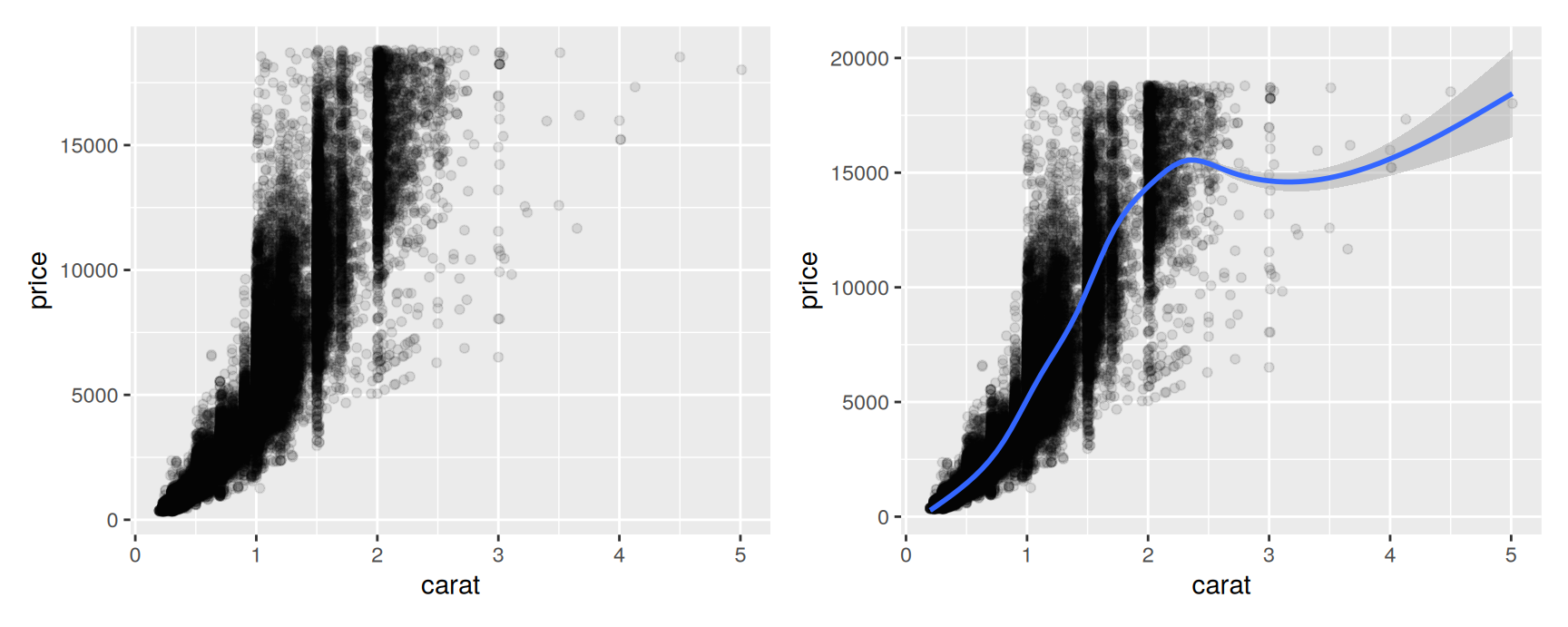
The right hand plot is the left hand plot plus one more line of code. Nothing was redrawn from scratch and nothing was retyped.
This is the working style the whole course uses. Start with a layer that shows the raw data, then add summaries, labels and annotations on top, checking the picture after each addition. It matches the way you would think through the analysis anyway.
What the grammar buys you
Speed. The defaults are good. Legends, axes, breaks and colours are chosen for you, so a publishable draft takes seconds rather than an afternoon of fiddling.
Control when you want it. Every default can be overridden. You spend your effort on the plots that need it instead of on all of them.
Room to grow. New plots are made from the same parts as old ones. In systems that ship a fixed list of chart types, anything off the list means drawing lines and points by hand.
The cost is a vocabulary of about eight words. Learn those and the rest is combination.
What is the grammar of graphics?
The question it answers
Wilkinson (2011) asked what a statistical graphic actually is, and answered with a grammar. Not a list of chart types, but a description of the pieces that every chart is assembled from. ggplot2 (Wickham 2010) is a version of that grammar for R, rearranged so that layers come first.
The short version. A graphic maps variables in your data onto visual properties of geometric objects. It may transform the data statistically before drawing. It places the result in a coordinate system, and it may repeat the whole picture for subsets of the data.
The components
You will meet all of these again, in their own chapters. Do not try to absorb them now. Just learn that these are the slots you will be filling.
Data is the data frame you are plotting.
Mappings say which variable is shown by which visual property. Position, colour, shape and size are the usual ones.
Layers are what you actually see. A layer pairs a geom, the shape drawn for each observation, with a stat, the summary computed before drawing. A histogram is a bar geom on top of a binning stat.
Scales do the translation between data values and visual values. A scale also builds the axis or the legend, which is what lets a reader run the translation backwards and recover a number from the picture.
The coordinate system places the result on the page. Cartesian almost always. Polar coordinates and map projections when the data demand them.
Facets split the data into subsets and draw the same plot for each, on shared axes.
The theme controls everything that carries no data. Fonts, background, grid lines, spacing. Good typography will not rescue a bad plot, but bad typography will sink a good one (Tufte 1983).
What the grammar will not do for you
It will not tell you which plot to draw. The grammar describes how to build any plot you can specify. Deciding which plot answers your question is a separate skill, and it is the harder one. Cleveland (1993) and Tukey (1977) are the places to start on that.
It does not cover interaction. Everything here is static. A ggplot2 figure on a screen and the same figure printed on paper are the same object. Interactive graphics are a different tradition with different tools.
How does ggplot2 fit in with other R graphics?
Base graphics
R ships with a plotting system that predates all of this. It follows a pen on paper model. You draw, and then you can only draw on top. There is no object holding the plot, so nothing can be modified or removed after the fact.
Base graphics are fast and the syntax is short for simple cases. If you have ever typed plot(x, y) or hist(x), that was base graphics. The limits appear as soon as you want a legend, a shared axis across panels, or anything the function’s author did not anticipate.
grid
A much richer set of drawing primitives, written by Paul Murrell (Murrell 1998). Objects drawn with grid persist and can be edited, and its viewports make complex layouts manageable. What grid does not provide is any statistical graphics. It is the engine, not the car.
lattice
Deepayan Sarkar’s implementation of Cleveland’s trellis system, built on grid. Panelled plots and automatic legends are its strengths, and it was a clear advance on base graphics. It has no formal model underneath, though, so extending it means special cases on top of special cases.
ggplot2
Started in 2005 as an attempt to keep what base and lattice got right and put a real model underneath. Like lattice it draws through grid, so low level control is still available when you need it. Unlike lattice, a new kind of plot is usually a new combination of existing parts rather than a new function.
Interactive graphics
htmlwidgets gives R a common interface to JavaScript visualisation libraries, with leaflet for maps and networkD3 for networks built on top of it. plotly is the best known of these, and its ggplotly() converts many ggplot2 plots into interactive versions with one call.
Specialist packages
Plenty of packages draw one particular kind of picture well, usually for one field. None of them offers a general framework, which is why they are worth reaching for when you need exactly that picture and not otherwise.
The CRAN Task Views at https://cran.r-project.org/web/views/ keep an organised list of what is available. It is a better first stop than a search engine when you suspect someone has already solved your problem.
About this course
The route through the chapters
Chapter 2 gets you drawing immediately. Geoms, aesthetic mappings and facets, with the theory postponed.
Chapters 3 to 9 are the working toolbox. Distributions, categories, overlapping points, time, maps, annotations, and the plots you will meet in practice.
Chapters 10 to 12 cover scales. This is where axes and legends stop being whatever
ggplot2decided and start saying what you want them to say.
Chapters 13 to 16 are the grammar itself. Building layers by hand, choosing stats and position adjustments, changing the coordinate system, and faceting properly.
Chapter 17 is polish. Themes, fonts, sizes, and saving a figure at a resolution that survives a projector.
Chapter 18 treats plots as objects that code can build, which matters as soon as you need the same figure for forty different groups.
The numbering here matches the book, so a reference to Chapter 11 means the same chapter in both.
Prerequisites
R
Install R first. Everything else in the course sits on top of it, and nothing works until it is there. Get it from https://cran.r-project.org.
No prior R experience is assumed. We start from the beginning, and the early chapters deliberately use small, tidy data sets so that the R gets out of the way of the graphics.
If you want extra reading alongside the course, R for Data Science is free online and covers the data handling that happens just before the plotting.
RStudio
RStudio is a free editor for R. The course book treats it as optional. This course requires it, because the assignment workflow depends on the Knit button and on the official template.
Download RStudio Desktop from https://posit.co/download/rstudio-desktop, and install it after R rather than before.
Packages
For the assignments you need only this:
The course R page has the current instructions and the template.
The longer list below covers every example used in the rest of the course. Install it when you have an hour to spare, and expect sf and stars to take a while, since they compile against system libraries.
install.packages(c(
  "colorBlindness", "directlabels", "dplyr", "ggforce", "gghighlight",
  "ggnewscale", "ggplot2", "ggraph", "ggrepel", "ggtext", "ggthemes",
  "hexbin", "Hmisc", "mapproj", "maps", "munsell", "ozmaps", "paletteer",
  "patchwork", "rmapshaper", "scico", "seriation", "sf", "showtext",
  "stars", "tidygraph", "tidyr", "wesanderson"
))
A failed install is normal and is not your fault. Read the last line of the error, bring it to class, and install the rest in the meantime.
Exercises
Install R and RStudio, open RStudio, and report what
R.version.stringprints. Say in one sentence whether your version is newer or older than the one used to build these slides.Run
install.packages("tidyverse"). When it finishes, runlibrary(ggplot2). What is the difference between what those two commands do, and which one do you have to repeat every time you restart R?Type
diamondsand thennrow(diamonds)andncol(diamonds). Name three columns that are numbers and two that are categories.
Run
ggplot(diamonds, aes(carat, price)) + geom_point(). Now delete+ geom_point()and run it again. Describe what you get and explain which of the three required parts is missing.Deliberately break something. Run
ggplot(diamonds, aes(carat, prices)) + geom_point()with the typo. Copy the error message and say, in your own words, what it is complaining about.Create a new Quarto or R Markdown document in RStudio, paste the plot from exercise 4 into a code chunk, and press Knit. Confirm that an HTML file appears. This is the workflow every assignment uses.
Other resources
The built-in help
These slides teach the grammar and the common cases. They do not document every argument of every function, and you will need that detail sooner than you expect.
The help pages are the authority, and they are already on your machine:
The same pages are online at https://ggplot2.tidyverse.org/reference/index.html, where the example plots are rendered and you can move between related topics by clicking.
When you are stuck
Most of your questions have been asked before. Search stackoverflow before you post, and search the ggplot2 issue tracker if you suspect a bug.
When you do ask, supply a reproducible example. That means the smallest piece of code that fails, using a data set the reader already has, such as mpg or diamonds. The reprex package formats one for you and checks that it really does run on its own.
A question with a reproducible example usually gets an answer. A question that says “my plot looks wrong” usually does not. This applies in class too.
Cheatsheets and the book
The number of functions is genuinely large. Nobody remembers them all. The ggplot2 cheatsheet fits the common ones onto two pages and is worth printing.
The course book is free to read at https://ggplot2-book.org, and its full source, including the code for every figure, is at https://github.com/hadley/ggplot2-book. If you ever wonder how a figure in the book was made, the answer is in that repository.
How these slides are built
Reproducibility
Every figure in these slides is produced by the code printed next to it. Nothing is pasted in from elsewhere. The deck is written in Quarto, and each render runs the code again from scratch.
This matters more than it sounds. A figure that cannot be regenerated cannot be checked, and a result that cannot be checked is not a result. Your assignments are marked the same way, which is why the Knit button is not optional.
Two commands report the versions your own plots were made with. Include them when you report a problem.
If your output differs from the slides, a version difference is the first thing to suspect and the easiest to check.
Recap
ggplot2gives you parts to combine, not a list of charts to pick from.Every plot answers three questions. Which data, which variable maps to which visual property, and how each observation is drawn.
The grammar’s vocabulary is data, mappings, layers, scales, coordinates, facets and themes. The rest of the course fills in one slot at a time.
A plot is an R object. Build it in layers, store it, add to it.
The grammar builds any plot you specify. Choosing which plot to specify is still your job.
Install R and RStudio this week, get the assignment packages working, and bring any error message to class.
Acknowledgement
Source. These slides follow the structure and the teaching sequence of ggplot2: Elegant Graphics for Data Analysis (3e) by Hadley Wickham, Danielle Navarro and Thomas Lin Pedersen. The explanations, examples and exercises here have been rewritten for this course; any errors in them are mine and not the book’s.
Copyright. All rights in the original work are reserved by its authors and publishers. Students are encouraged to read the book itself, which is freely available online.
Non-commercial use only. These materials are for teaching and must not be used for commercial gain.
Attribution. Any reuse or redistribution must credit both the original book and this course.
References
Cleveland, William S. 1993. Visualizing Data. Summit, NJ: Hobart Press.
Murrell, Paul R. 1998. “Investigations in Graphical Statistics.” PhD thesis, University of Auckland.
Tufte, Edward R. 1983. The Visual Display of Quantitative Information. Cheshire, CT: Graphics Press.
Tukey, John W. 1977. Exploratory Data Analysis. Reading, MA: Addison-Wesley.
Wickham, Hadley. 2010. “A Layered Grammar of Graphics.” Journal of Computational and Graphical Statistics 19 (1): 3–28.
Wilkinson, Leland. 2011. “The Grammar of Graphics.” In Handbook of Computational Statistics: Concepts and Methods, 375–414. Springer.

ggplot2: Elegant Graphics for Data Analysis