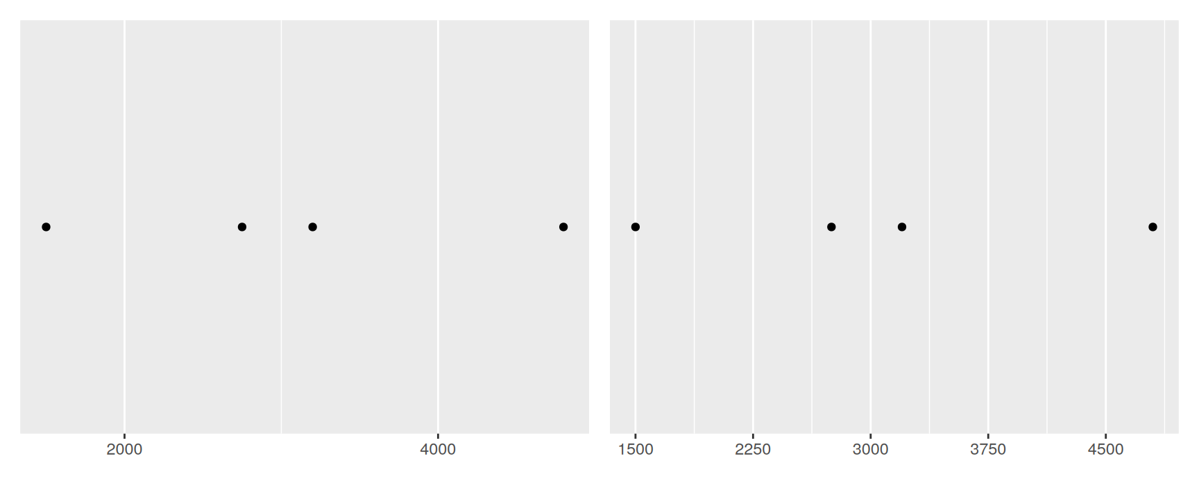
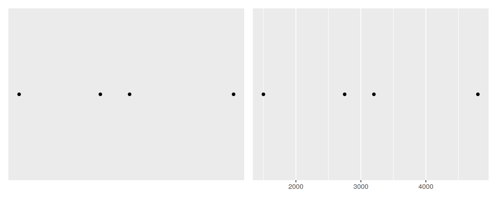
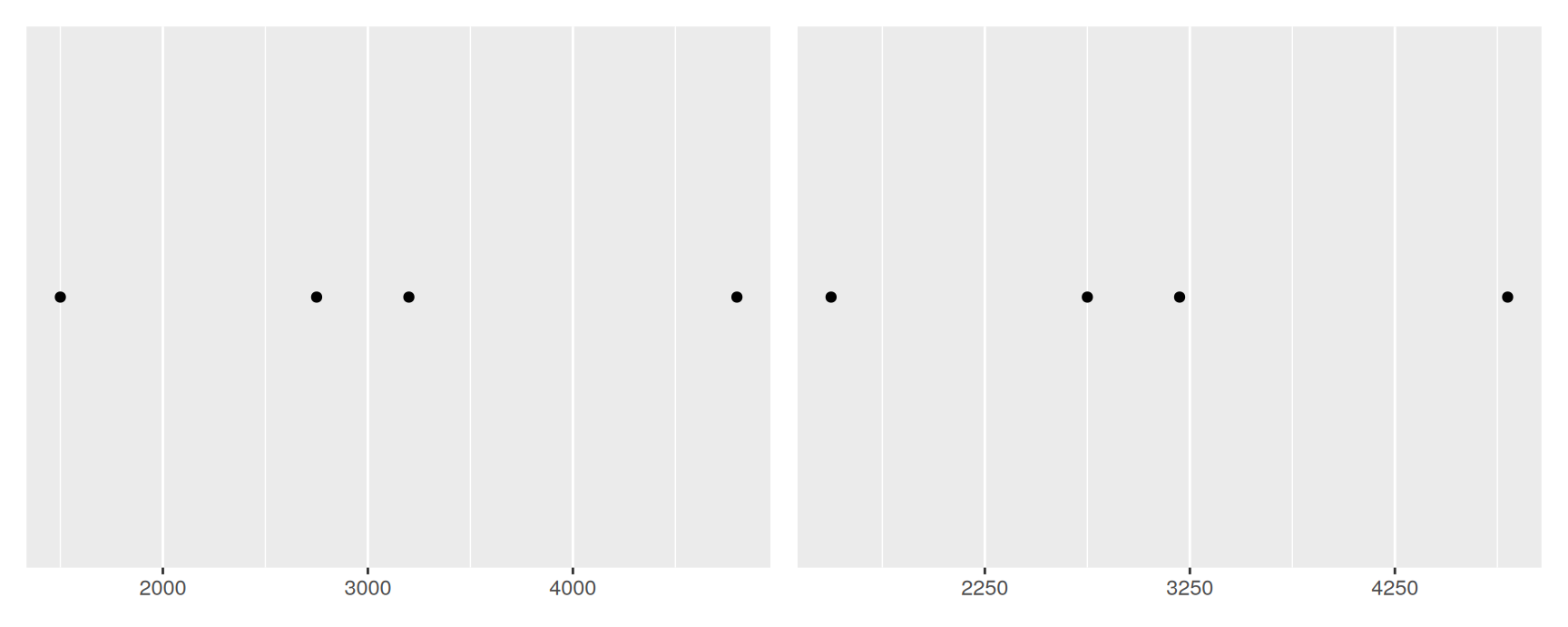
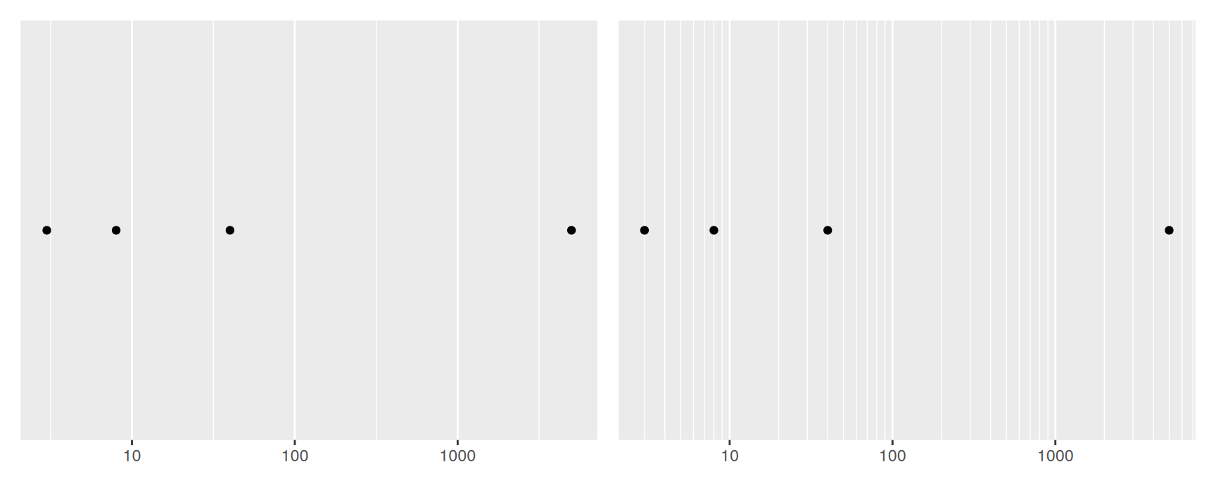
A scale is the rule that turns a data value into something you can see. For the x and y aesthetics, the thing you see is a location on the panel.
Position scales are in every plot you have drawn so far. You have simply not had to name them.
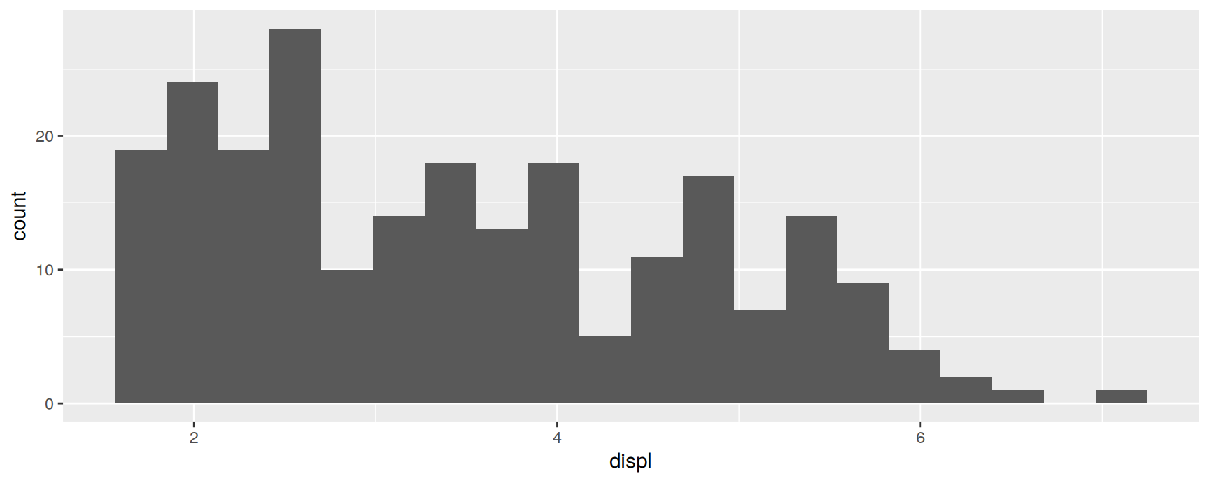
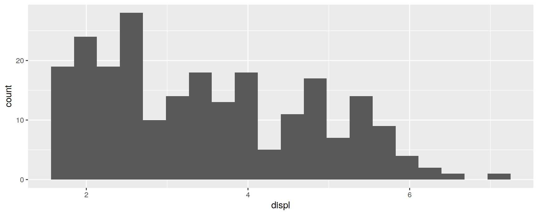
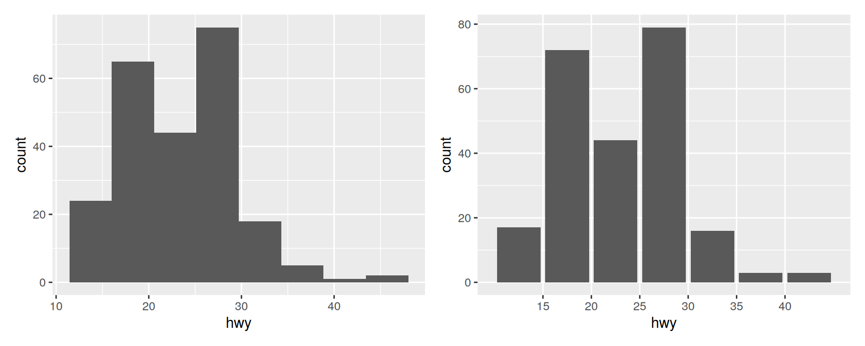
ggplot(mpg, aes(displ)) +geom_histogram(bins =20)
Only x was mapped, yet the plot has a y axis. geom_histogram() counted the observations in each bin and mapped that count to y on your behalf. Writing it out changes nothing:
Because position scales are unavoidable, learning to steer them pays off in every plot you will ever make.
What this chapter covers
Four kinds of variable end up on an axis, and each gets its own family of scales.
Numeric.scale_x_continuous() and friends. The bulk of the chapter.
Date and time.scale_x_date(), scale_x_datetime(), scale_x_time().
Discrete.scale_x_discrete(), for factors and character vectors.
Binned.scale_x_binned(), which cuts a numeric variable into slices.
Everything on the x side has a matching y function. The arguments are identical, so learn one axis and you have both.
Numeric Position Scales
Six arguments
scale_x_continuous() and scale_y_continuous() map the data onto the panel with a straight line. Six arguments control what that mapping looks like.
Argument
What it does
limits
The range the scale is defined over
expand
Padding added beyond that range
breaks
Where the labelled ticks and major grid lines go
minor_breaks
Where the faint unlabelled grid lines go
labels
What the ticks say
trans
A mathematical transformation applied before drawing
Helpers like scale_x_log10() and scale_x_reverse() are shortcuts for particular settings of trans.
Limits
By default the scale stretches to cover the data and no further. That is convenient until you want two plots compared, because each one then picks its own range.
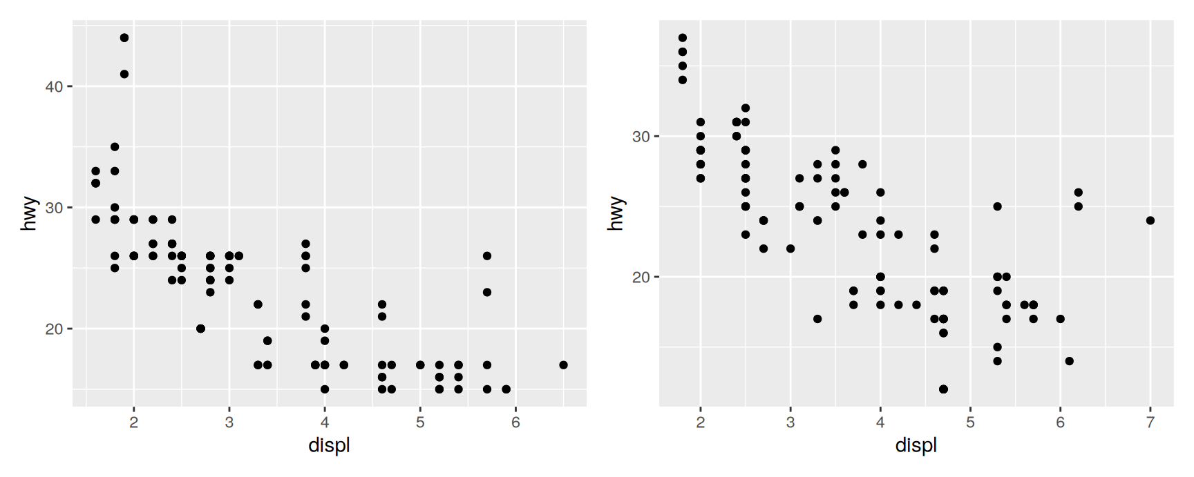
older <-ggplot(subset(mpg, year ==1999), aes(displ, hwy)) +geom_point()newer <-ggplot(subset(mpg, year ==2008), aes(displ, hwy)) +geom_point()older + newer
The right panel reaches further along both axes. Any difference you think you see between 1999 and 2008 is partly an artefact of the drawing.
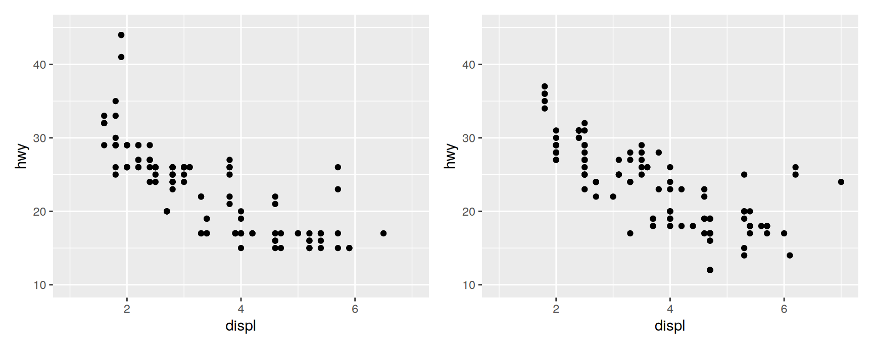
Give both plots the same limits and the comparison becomes honest:
lims() works like labs(). The argument name is the aesthetic, the value is what you want for it. For a single axis, xlim() and ylim() are shorter.
Two details worth remembering:
NA leaves one end alone. ylim(0, NA) forces the axis to start at zero and lets the top find itself.
Setting limits by hand is a promise that the range you chose is wide enough. Any observation outside it is thrown away, which is the subject of the next slide.
Zooming in
Restricting limits is not the same as zooming. Values outside the limits become NAbefore any statistic is computed, so the summary you end up looking at is a summary of the survivors.
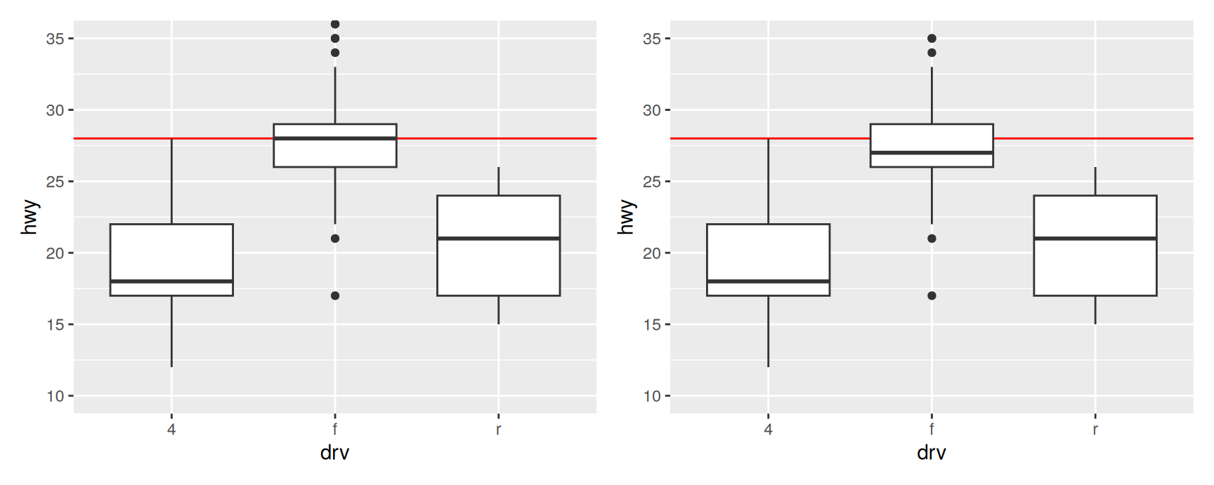
The red line is fixed at 28 mpg, so it makes a useful reference.
On the left, coord_cartesian() has changed the window and nothing else. The boxes sit where they always did. On the right, ylim() deleted every car above 35 mpg and then drew boxplots of what was left. Two of the three medians have moved.
ggplot2 does warn about the rows it removed. That warning is easy to scroll past and expensive to ignore.
The rule. If you want to see less, use coord_cartesian(). Use limits only when you genuinely mean to exclude the data.
Visual range expansion
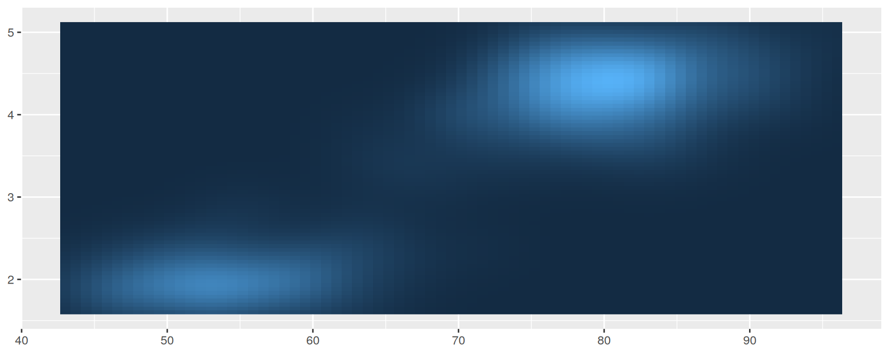
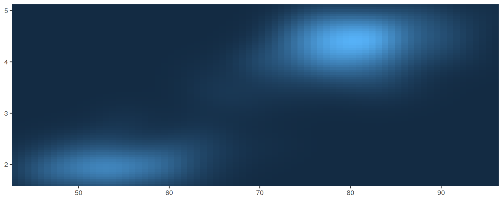
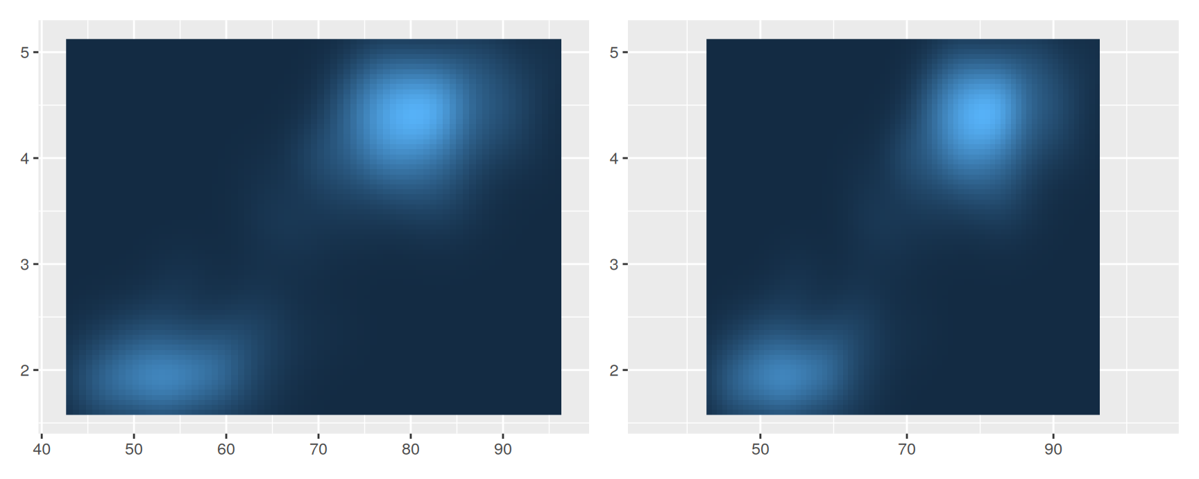
ggplot2 pads the panel a little beyond the limits so that points and bars do not sit on top of the axis line. The expand argument controls the padding.
Give either argument two numbers and the two ends are padded differently, low end first. expansion(mult = c(0.05, 0.2)) leaves a sliver at the bottom and room at the top, which is what you want when labels go above the tallest bar.
Use add when the padding should mean something in data units, and mult when it should stay proportional however the data change.
Breaks
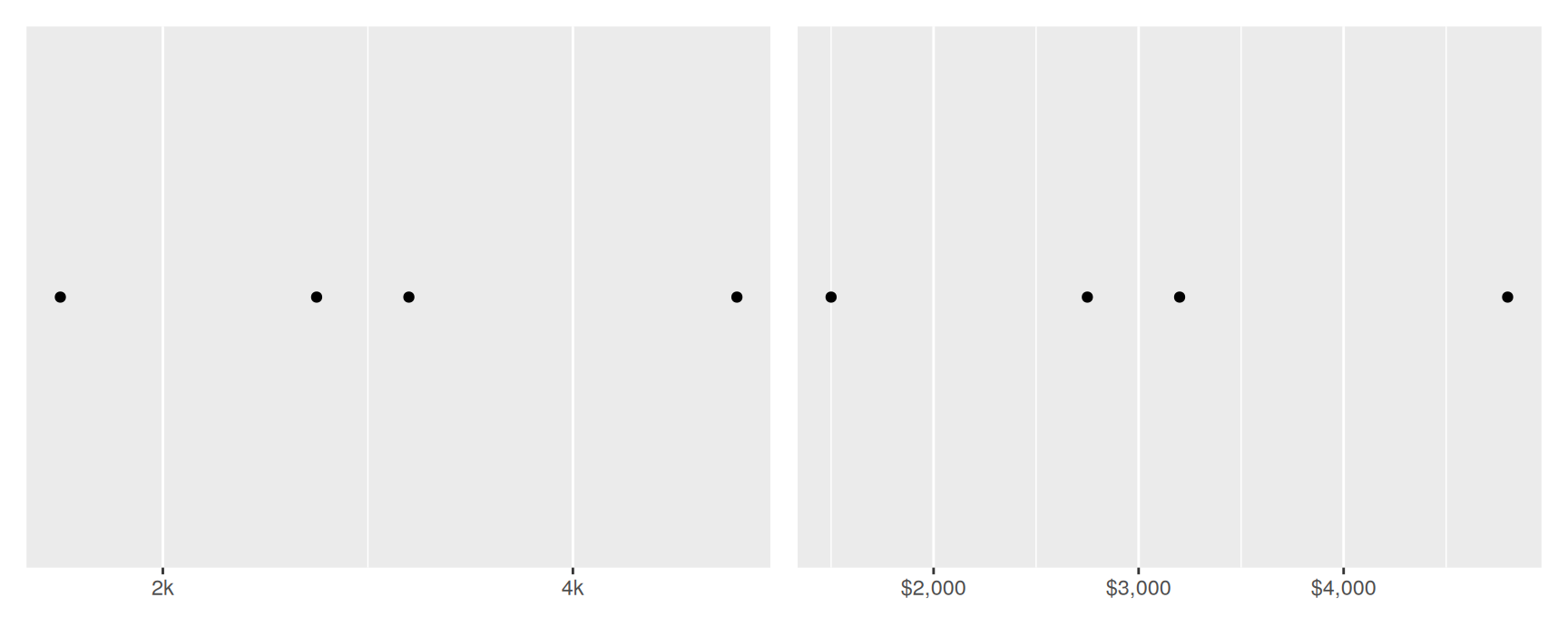
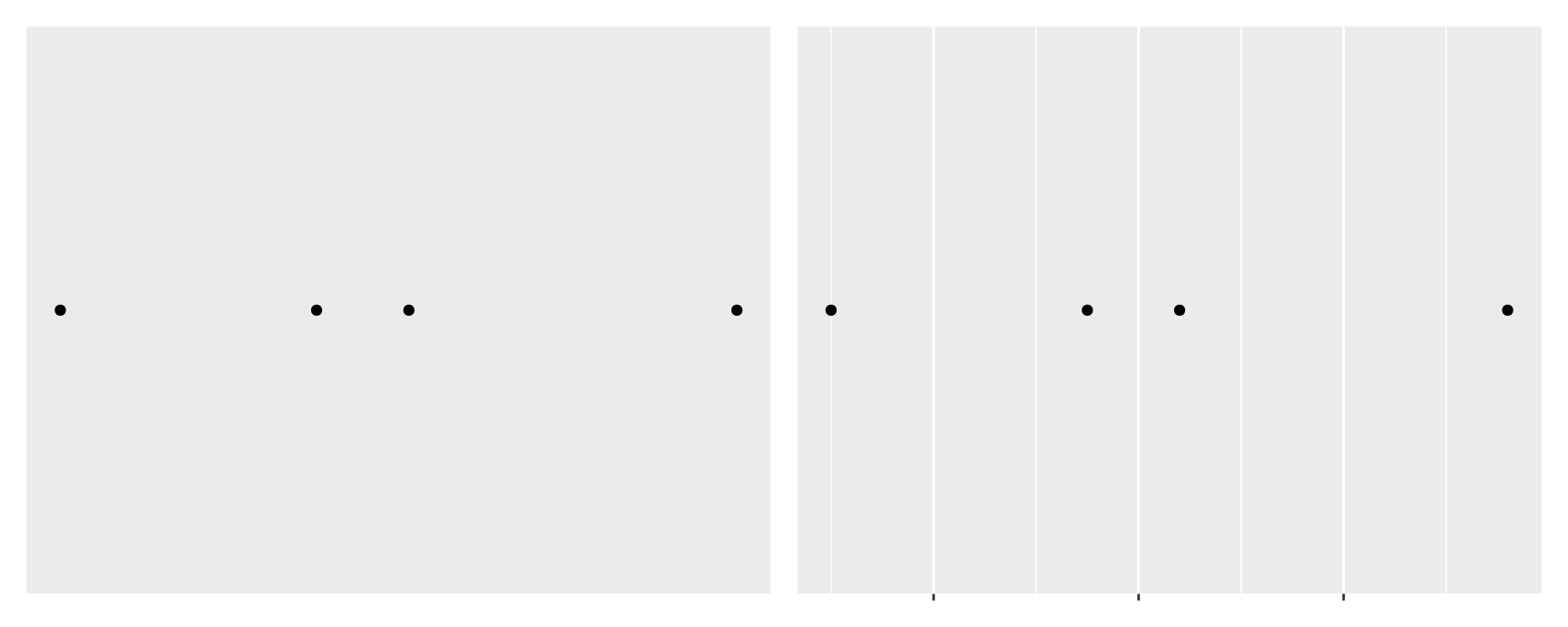
Ticks, their labels and the major grid lines are all the same thing to ggplot2. They are the scale’s breaks. The examples below use a small table of prices.
Minor breaks are the faint grid lines between the labelled ones. On a linear axis the default is one per gap and there is rarely a reason to change it.
On a log axis they earn their keep. They show the reader that the spacing is not linear, which a set of labels alone does not.
A character vector must be exactly as long as the break vector, so the two arguments have to be kept in step by hand. A formatter never falls out of step.
Function
Example output
scales::label_comma()
1,000
scales::label_dollar()
$1,000
scales::label_percent()
10%
scales::label_bytes()
1.5 kB
scales::label_ordinal()
1st, 2nd
scales::label_pvalue()
<.05
Each takes arguments of its own. label_dollar(prefix = "", suffix = "€") moves the symbol to the other side.
breaks = NULL and labels = NULL sound alike and are not.
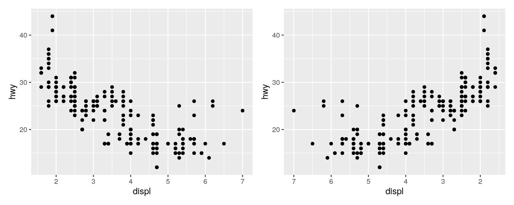
scale_x_reverse() is trans = "reverse" with a shorter name. scale_x_log10() and scale_x_sqrt() work the same way. Reach for trans when there is no shortcut.
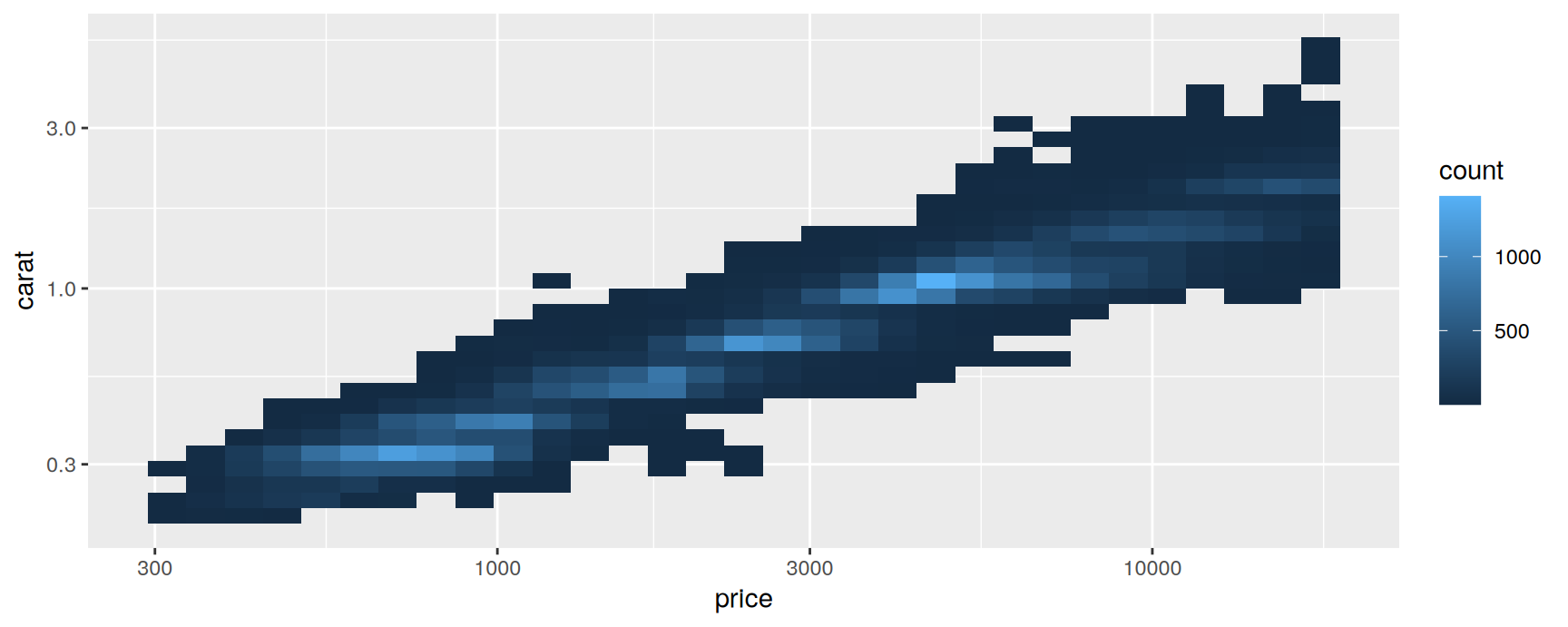
Prices and weights are both strongly right skewed, and on linear axes the plot is a blob in one corner. On log axes the relationship is close to a straight line.
The names scales recognises fall into three groups:
Powers and logs."sqrt", "exp", "log", "log2", "log10".
Proportions."logit", "probit", "asn". These stretch the ends of the 0 to 1 interval, where proportions are hard to tell apart.
The rest."identity", "reverse", "reciprocal".
You can also pass the transformer object itself. trans = "reciprocal" and trans = scales::reciprocal_trans() are the same instruction.
Transforming the scale is not transforming the variable
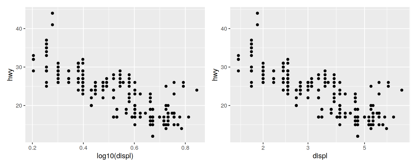
The two clouds of points are identical. Only the axis differs.
On the left the labels read 0.4, 0.6, 0.8. Those are logarithms, and your reader has to undo them in their head. On the right the labels are litres, which is what the variable actually measures. Prefer the scale.
Both versions transform before any statistic is computed, so a smoother added to either one is fitted to logged values. To transform afterwards, so that the fit happens on the raw data and only the drawing is bent, use coord_trans().
Exercises
Draw cty against displ. Apply ylim(15, 25) to one copy and coord_cartesian(ylim = c(15, 25)) to another, adding geom_smooth(method = "lm") to both. Report the two slopes and explain which one you would quote.
Put hwy on the y axis and force the axis to start at zero without fixing the top. Does the plot make the differences between cars look larger or smaller, and which version is the fairer one?
Using scales::breaks_width(), put a tick every 5 mpg on the hwy axis of a boxplot by class. Now do it with a plain numeric vector. Which version survives someone swapping hwy for cty?
Draw a histogram of diamonds$price with scale_x_continuous(labels = scales::label_dollar()) and then with label_comma(). Say in one sentence which suits a slide for a non-technical audience.
Take ggplot(diamonds, aes(carat, price)) + geom_point(alpha = 0.1) and log both axes. Then log neither and use coord_trans(x = "log10", y = "log10") instead. Where do the two pictures differ, and why?
Set expand = expansion(mult = 0) on the y scale of a bar chart of class. What happens at the bottom of the bars, and why is that acceptable for bars but not for points?
Date-Time Position Scales
Three classes, three scales
ggplot2 picks a date aware scale when the variable has a date class.
Date is a calendar date. The scale is scale_x_date().
POSIXct is a date and a time. The scale is scale_x_datetime().
hms is a time of day with no date attached, from the hms package. The scale is scale_x_time().
If your dates arrived as text, convert them first with as.Date(), as.POSIXct() or hms::as_hms(). A character vector will be treated as a set of categories, which is almost never what you want.
These scales accept everything from the previous section and add arguments that speak in calendar units.
Breaks
date_breaks takes a string such as "10 days" or "15 years". The unit can be seconds, minutes, hours, days, weeks, months or years.
Calendar units are not fixed lengths, so this is more than cosmetic. Asking for "1 month" gives you the first of every month. Asking for 30 days would slowly drift away from the calendar.
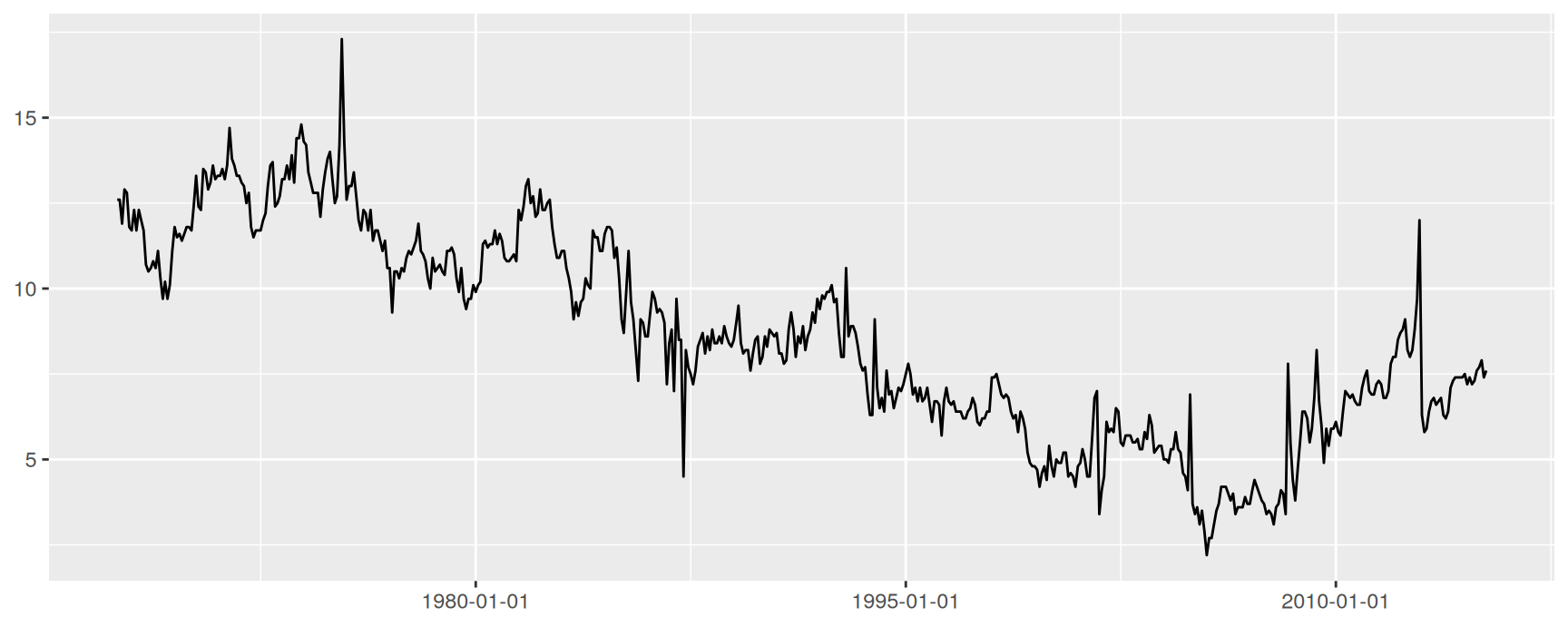
date_breaks = "15 years" is shorthand for breaks = scales::breaks_width("15 years"). Writing the long form buys you offset:
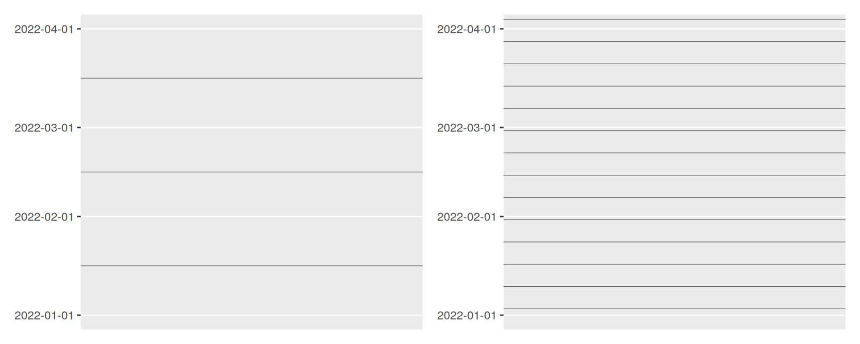
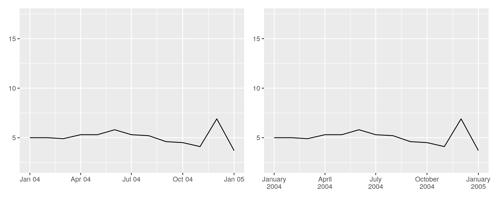
The dark lines are the minor breaks. On the left they are the default, one halfway through each month. On the right they are weeks.
Look at the right panel closely. The weekly lines sit exactly seven days apart, but the month boundaries do not, because January, February and March have different lengths. So the weeks never divide a month evenly and the last gap is always short. The grid is telling the truth about the calendar. It just looks untidy.
Labels
date_labels takes a format string in the strptime() style. Each code stands for one piece of the date.
Code
Meaning
Code
Meaning
%Y
Year, four digits
%y
Year, two digits
%B
Month name
%b
Month name, short
%m
Month number
%d
Day of month
%A
Weekday name
%a
Weekday, short
%H
Hour, 24 hour clock
%M
Minute
Anything else in the string is printed as it stands, so "%d/%m/%Y" and "%B %Y" both work.
Stacking lets you spell the month out in full without the labels colliding.
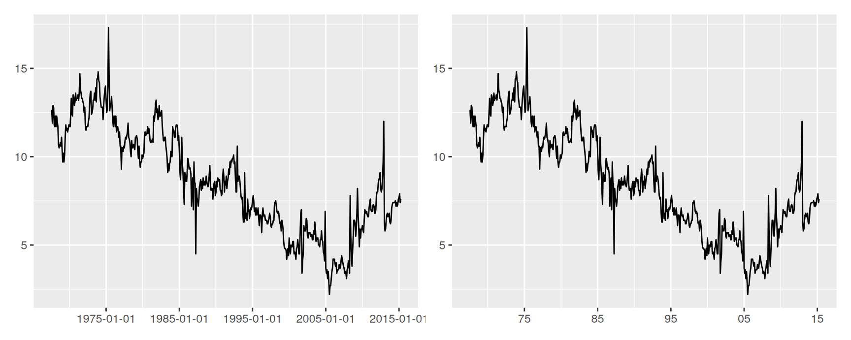
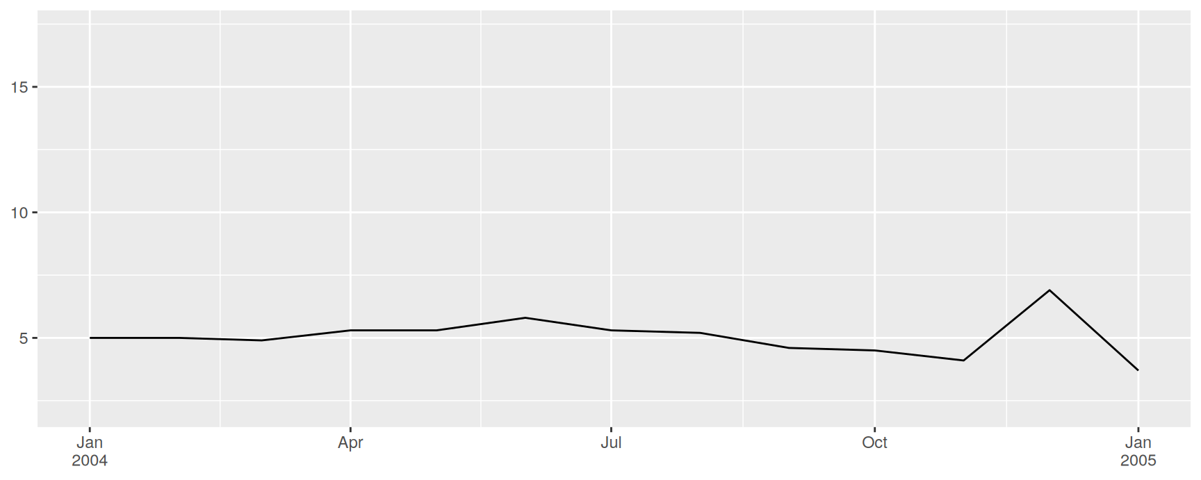
There is a third option that is often the best one. scales::label_date_short() prints each part of the date only when it changes, so the year appears once at the start of the year instead of twelve times.
Compare the three. date_labels = "%b %y" repeats the year on every tick. Stacking repeats it too, just on a second line. label_date_short() says it once.
The saving grows with the series. On a plot of daily data over three years the short labels are the difference between a readable axis and a black smear.
Exercises
Plot unemploy against date from economics. Set major breaks every 10 years and minor breaks every 2 years, then label the ticks with two digit years. Say whether the minor lines helped you read the plot.
Restrict the same plot to the 1980s with limits. Which observations were dropped, and how would you achieve the same view without dropping any?
Use scales::breaks_width("1 year", offset = 90) on a date axis. Print the breaks it returns for 2020 and 2021, and explain why the dates are not identical in the two years.
Build a plot of psavert over a single decade and label it three ways: with date_labels = "%Y", with "%b\n%Y", and with scales::label_date_short(). Rank them for a slide and justify your first choice.
economics_long holds the same series in long form. Facet it by variable with free y scales and give every panel the same date breaks. Why did faceting not change what you had to write for the x axis?
Discrete Position Scales
Categories are integers underneath
Map a factor or a character vector to a position and ggplot2 chooses scale_x_discrete() or scale_y_discrete(). Each level is given an integer position, in the order of the levels.
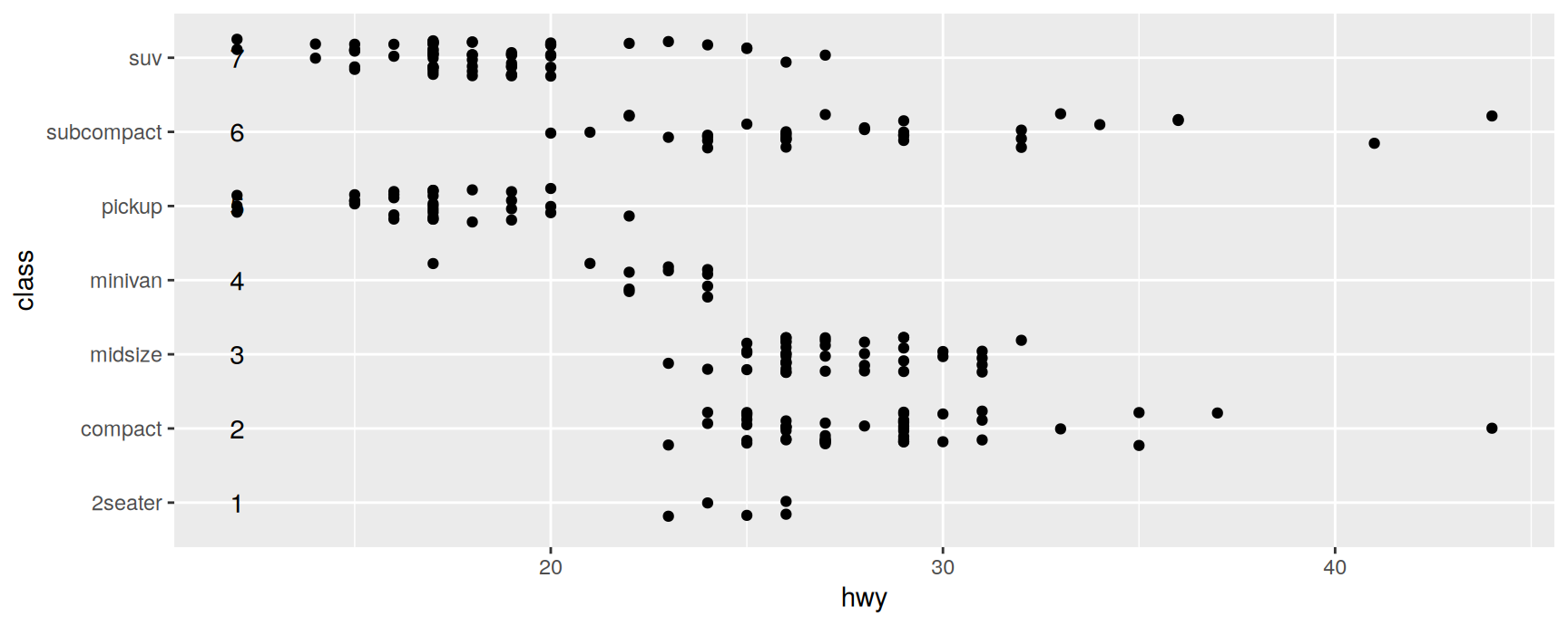
ggplot(mpg, aes(hwy, class)) +geom_jitter(width =0, height =0.25) +annotate("text", x =12, y =1:7, label =1:7)
The numbers written on the panel are the positions ggplot2 is using. 2seater sits at 1, compact at 2, and so on.
This is why widths are given as fractions. Each category owns one unit of space, so height = 0.25 above scatters points a quarter of a slot either side and they cannot stray into the neighbouring category. The same reasoning applies to width in geom_boxplot() and geom_col().
Once you know that, guessing a sensible width stops being guesswork.
Limits
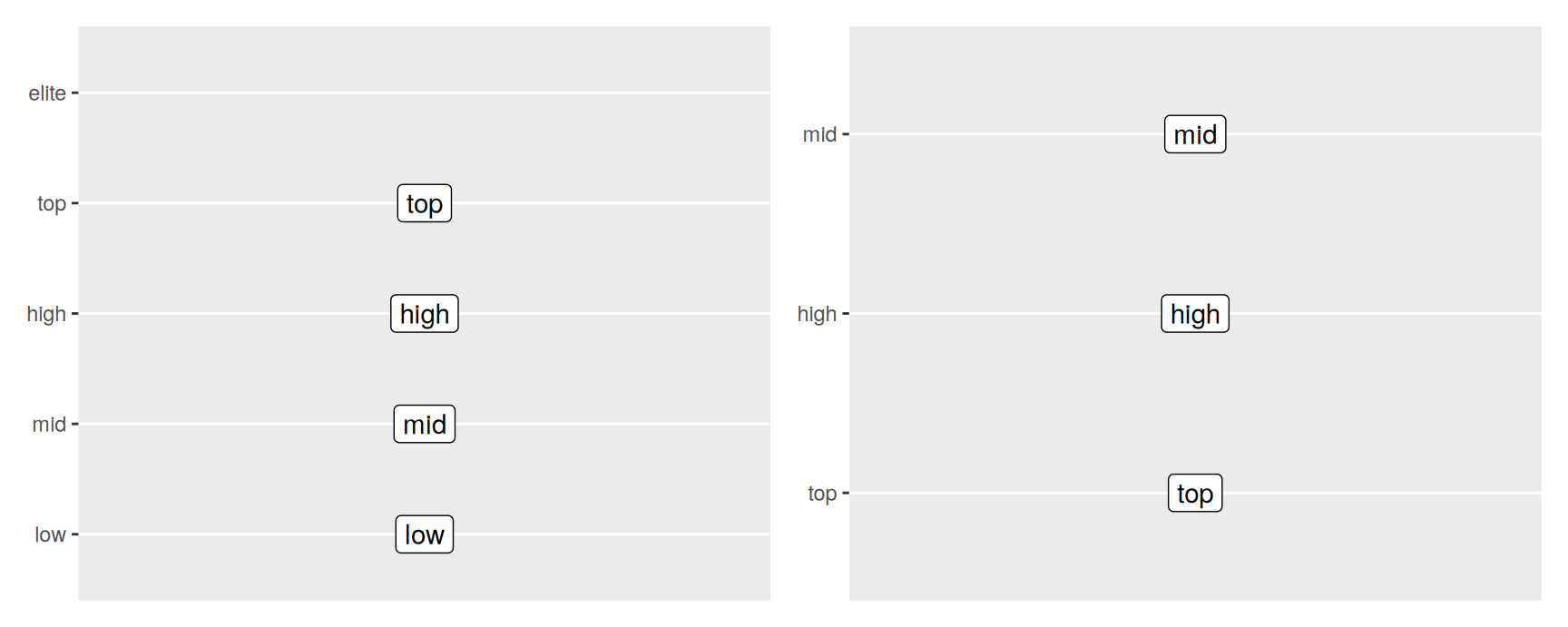
On a continuous scale limits is two endpoints. On a discrete scale it is the full list of categories, in the order you want them.
A category in limits but not in the data gets an empty slot. That is how you keep the axis the same across several plots when one group happens to be missing from one of them.
A category in the data but not in limits is removed, quietly, along with its observations. Same hazard as continuous limits, so treat it the same way. If you only want to reorder, list every level.
Reordering by hand is fine for four categories. For more, build the order with reorder() or set the factor levels before you plot.
Breaks and labels
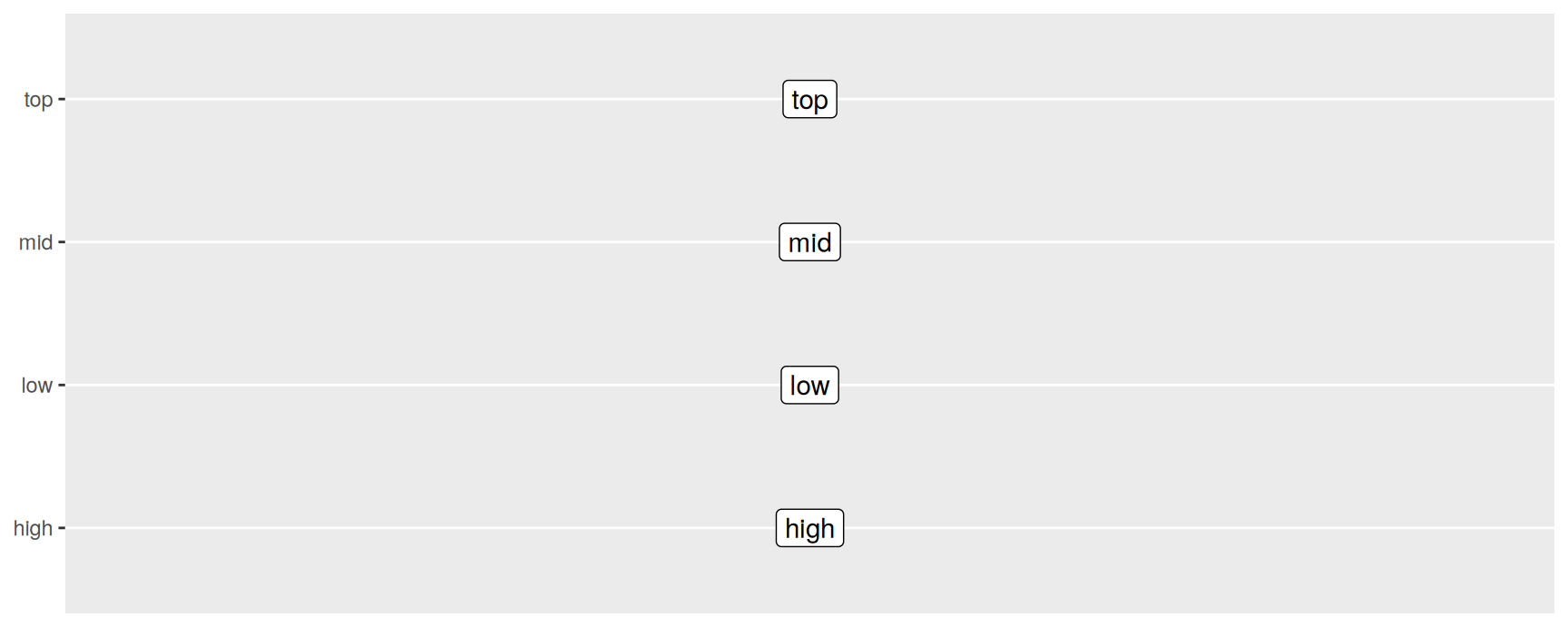
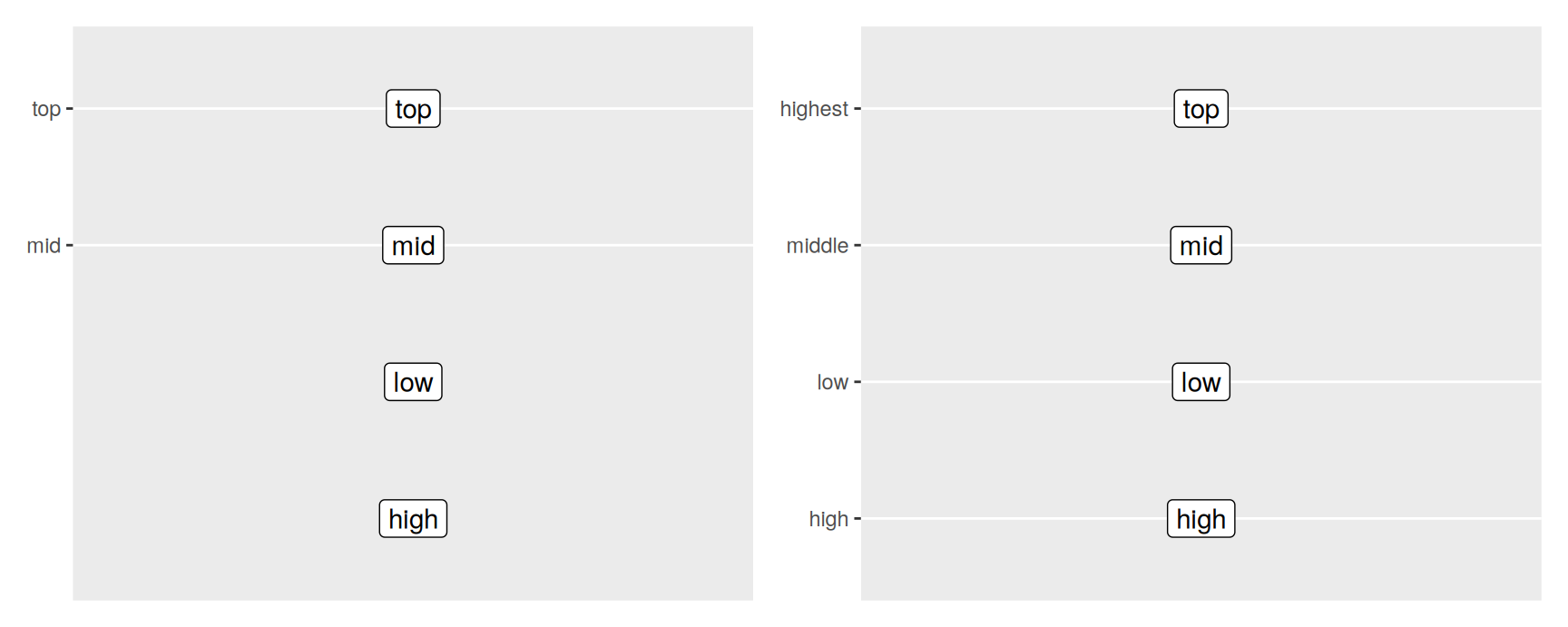
breaks chooses which categories get labelled. limits decides which ones exist, so the two do different jobs.
The unlabelled categories on the left still occupy their slots. Nothing was dropped.
On the right, labels was given a named vector. Only the names you mention are changed, and the order is untouched. This is the safe way to tidy up codes like "f" and "4" for an audience, because you are not rewriting the data.
For long category names, scales::label_wrap(20) breaks them across lines at about twenty characters, which is usually enough to avoid rotating anything.
Label positions
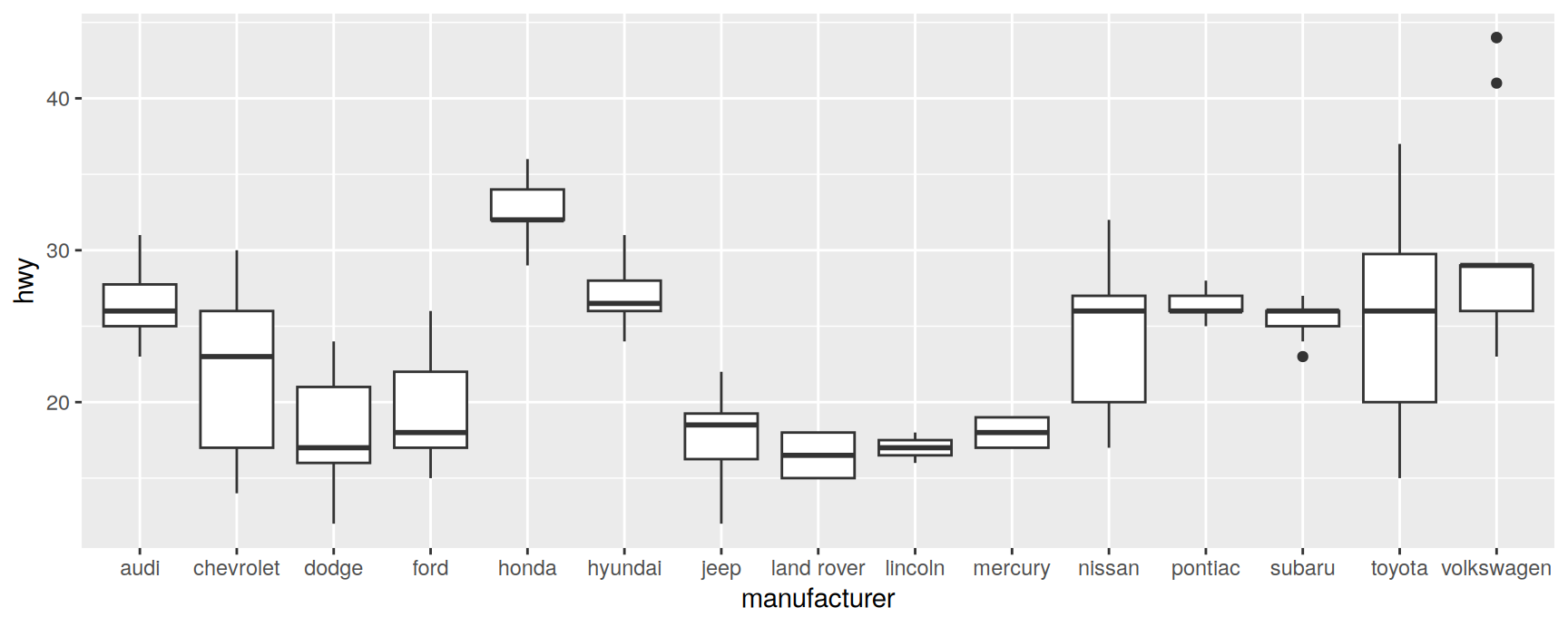
Long category names collide. There are 15 manufacturers in mpg, and the default axis cannot fit them.
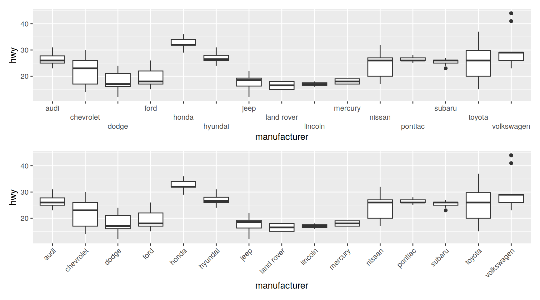
Dodging keeps the text horizontal, which is easier to read, and costs vertical space. Rotating keeps the plot short and makes the reader tilt their head. At 45 degrees the cost is small. At 90 degrees it is real.
A third option, check.overlap = TRUE, simply drops labels that would collide. Use it when the axis is a rough guide rather than something readers look values up in.
guides(x = ...) is shorthand. The long form puts the same object inside the scale:
Draw boxplots of cty by class. Reorder the categories by median cty, from worst to best, and say which of the two orderings you would use in a report.
Using scale_x_discrete(limits = ...), restrict the same plot to the three categories with the most cars. Check how many rows were removed and explain where they went.
Relabel drv as "front", "rear" and "four wheel" with a named vector passed to labels. Why is this better than editing the values in mpg?
Put manufacturer on the y axis instead of the x axis. Which of the fixes from this section do you still need, and what does that tell you about when to rotate a plot rather than its labels?
Compare guide_axis(n.dodge = 2), guide_axis(angle = 90) and guide_axis(check.overlap = TRUE) on the manufacturer boxplot. Name a situation where each is the right answer.
Set width = 0.2 and then width = 1 in geom_boxplot(). Explain both results using the fact that each category owns one unit of space.
Binned Position Scales
Between continuous and discrete
A binned scale cuts a numeric variable into equal slices and then treats each slice as a category. It keeps the numeric axis and gains the tidiness of discrete positions.
The two are close but not the same. The histogram bins in the statistic. The bar chart counts distinct values and then lets the scale put them in slices, which is why the bars are separated and sit between the ticks.
The real payoff is with geoms that need discrete positions but are handed continuous data. geom_count() is the obvious one.
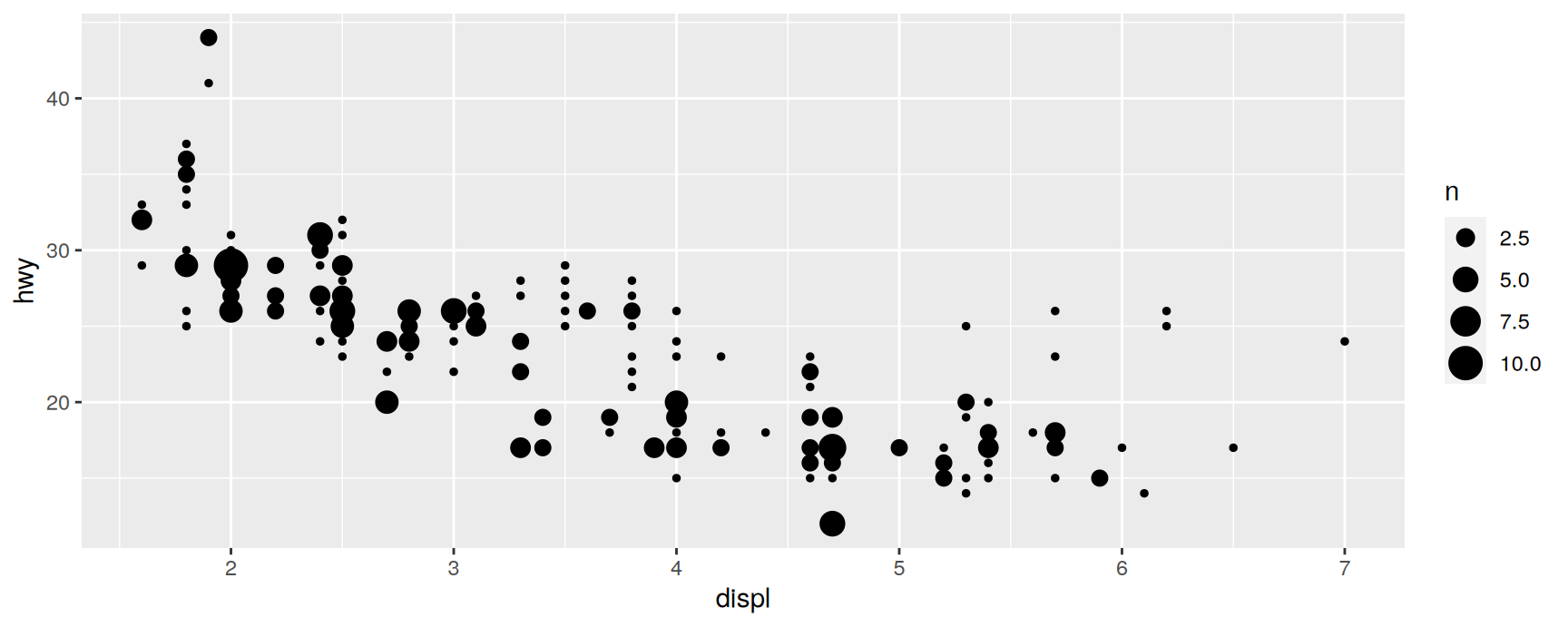
ggplot(mpg, aes(displ, hwy)) +geom_count()
Almost every dot is the same size, because almost every pair of values occurs once. The plot has the cost of a bubble chart and the information of a scatterplot.
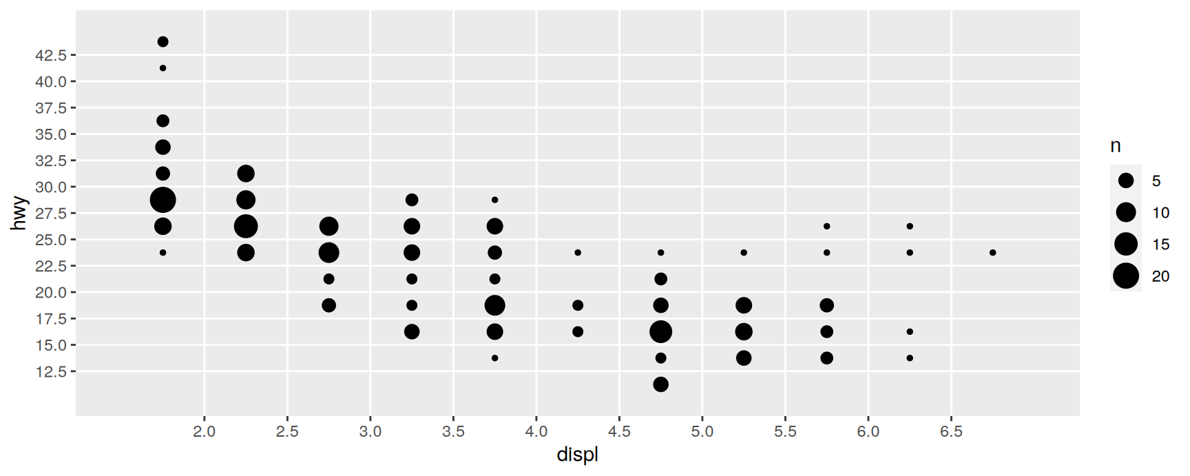
Bin both axes and the counts become worth showing:
n.breaks asks for a number of cut points. Fewer bins give bigger, blunter cells. More bins take you back towards the scatterplot.
Try a few values. The right one is the coarsest grid that still shows the shape you care about.
The same idea applies to colour and size. Chapters 11 and 12 cover binned scales for those aesthetics, where they turn a continuous legend into a small set of labelled steps.
Exercises
Draw cty against hwy with geom_count(), then bin both axes with n.breaks = 10. Which version tells you more about how the two measures agree?
Repeat the binned plot with n.breaks set to 5, 10 and 25. State the rule you would give a colleague for choosing.
Compare geom_bar() + scale_x_binned() against geom_histogram(bins = 8) on diamonds$carat. Name one thing each version shows that the other hides.
Add scale_x_binned() to a plot of hwy against displ drawn with geom_boxplot(). What did binning make possible that a continuous x axis would not allow?
Bin only the y axis of the geom_count() plot. Is a half binned plot ever useful, or is it the worst of both?
Recap
Every plot has an x and a y scale, even when the code never mentions them.
limits throws data away before statistics are computed. coord_cartesian() only changes the window. Know which one you meant.
breaks places the ticks and the grid lines. labels says what they read. Setting either to NULL does something different.
Transform the scale, not the variable. The picture is the same and the axis stays in units your reader understands.
Date scales think in calendar units. date_breaks, date_minor_breaks and date_labels are the arguments worth memorising.
On a discrete scale, limits is the list of categories and each one owns a unit of space. That is where widths and jitter heights get their meaning.
Acknowledgement
Source. These slides follow the structure and the teaching sequence of ggplot2: Elegant Graphics for Data Analysis (3e) by Hadley Wickham, Danielle Navarro and Thomas Lin Pedersen. The explanations, examples and exercises here have been rewritten for this course; any errors in them are mine and not the book’s.
Copyright. All rights in the original work are reserved by its authors and publishers. Students are encouraged to read the book itself, which is freely available online.
Non-commercial use only. These materials are for teaching and must not be used for commercial gain.
Attribution. Any reuse or redistribution must credit both the original book and this course.