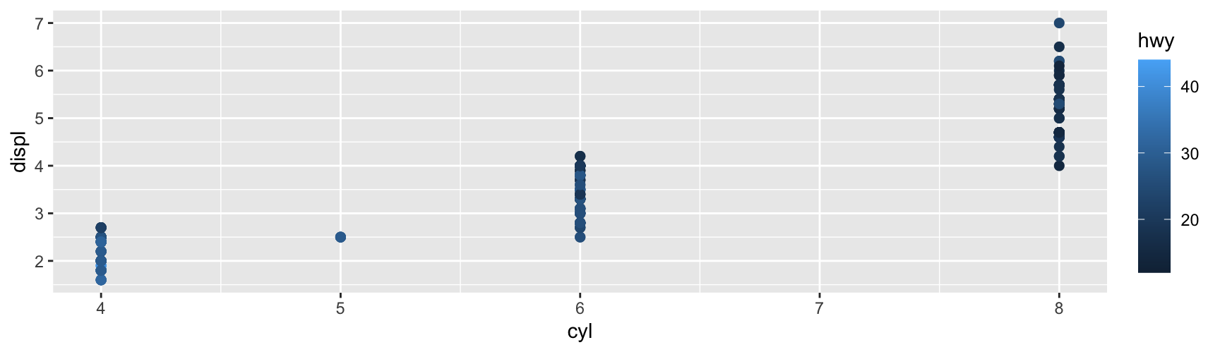
Position carries most of the information in a plot. Colour is the next most useful channel, and it is the one that goes wrong most often.
The reason is that colour is a perceptual quantity, not a numeric one. Two colours the same numeric distance apart can look almost identical in one part of the colour space and obviously different in another. A palette that ignores this will hide structure that is really in your data, or invent structure that is not.
So Chapter 11 starts with a little theory. Everything after it follows from that theory.
ggplot2 gives you three families of colour scale, one for each kind of variable.
Variable
Scale family
Default legend
Continuous
scale_*_continuous(), scale_*_gradient()
Colour bar
Discrete
scale_*_discrete(), scale_*_brewer()
Key table
Binned
scale_*_binned(), scale_*_steps()
Colour steps
Most examples on these slides map a variable to fill. Every one of them works the same way for colour. Replace scale_fill_ with scale_colour_ and change nothing else. The American spelling scale_color_ is accepted everywhere.
A little colour theory
Three numbers are enough
A colour is physically a whole spectrum of wavelengths. Your eye does not measure the spectrum. It has three kinds of cone cell, so it compresses whatever arrives into three numbers. That is why three numbers are enough to name any colour you can see.
The usual three are red, green and blue intensity. RGB is how screens are built, so it is convenient, but it describes hardware rather than perception. Step a fixed distance through RGB and the colour sometimes jumps and sometimes barely moves.
A better choice is the HCL space, whose three axes were chosen to match what people actually see.
The HCL axes
Axis
Range
What it controls
Hue
0–360°
Which colour it is: red, blue, green
Chroma
0 to a maximum
How pure it is: 0 is grey, high is vivid
Luminance
0–1
How light it is: 0 is black, 1 is white
The maximum chroma depends on hue and luminance, so the space is not a cube. Very light yellows can be extremely vivid. Very light blues cannot.
Hue is not perceived as ordered. Nobody looking at a chart reads green as larger than red. Chroma and luminance are perceived as ordered. Lighter reads as more, darker reads as less, and readers do this without being told.
Three palette families follow directly:
Sequential palettes hold hue fixed and move through chroma and luminance. Use them for data that runs from low to high.
Diverging palettes run from one hue through a neutral middle to a second hue. Use them when a particular value, usually zero, is the reference point.
Qualitative palettes vary hue and hold chroma and luminance roughly constant. Use them for unordered categories.
Colour blindness
Around one man in twelve has reduced colour discrimination, most commonly between red and green. If your only cue is a red-to-green contrast, that part of your audience gets nothing.
Two habits fix most of this. Do not build a palette whose whole message is red versus green. Give colour a backup whenever you can, so that shape, line type or a direct label says the same thing colour is saying.
You can also check a palette instead of guessing. dichromat::dichromat() takes a vector of colours and returns how they appear to a colour-blind reader. The colorBlindness package does the same job with ready-made display functions.
Checking a palette
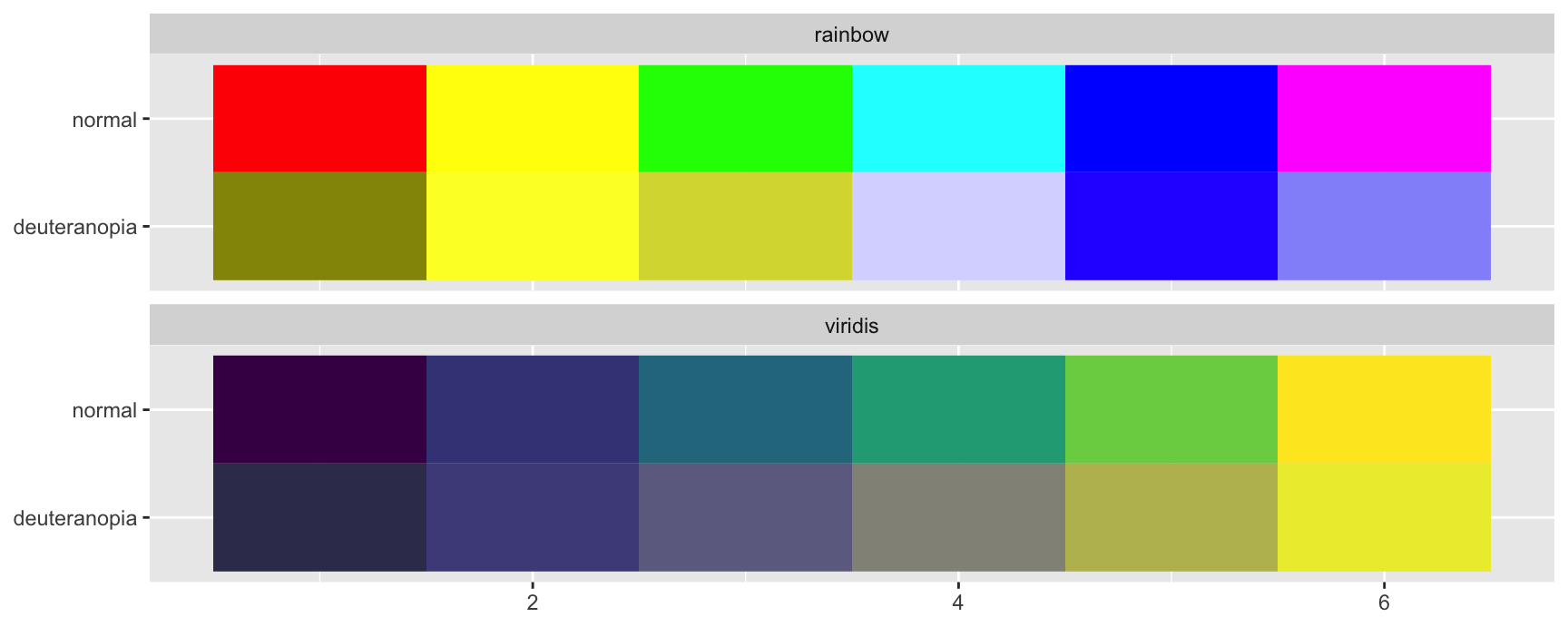
Build both palettes and their simulated versions as one data frame of colour strings.
shown <-c(rainbow(6), viridis::viridis(6))palettes <-data.frame(colour =c(shown, dichromat::dichromat(shown)),family =rep(rep(c("rainbow", "viridis"), each =6), times =2),vision =rep(c("normal", "deuteranopia"), each =12),key =1:6)
scale_fill_identity() tells ggplot2 that the column already holds colours and must not be mapped again.
ggplot(palettes, aes(key, vision, fill = colour)) +geom_tile() +facet_wrap(~family, ncol =1) +scale_fill_identity() +labs(x =NULL, y =NULL)
The rainbow palette loses its middle entirely. Two pairs of keys collapse onto almost the same colour, so a reader with deuteranopia cannot tell those categories apart.
The viridis palette keeps its order. It was built by varying luminance monotonically, which is exactly the property that survives both colour blindness and a black and white printer.
Exercises
Run the check above on RColorBrewer::brewer.pal(6, "Set1") and on RColorBrewer::brewer.pal(6, "Dark2"). Which of the two would you trust in a printed report, and which two keys are the risky pair?
Convert viridis::viridis(6) to greyscale with grDevices::col2rgb() and average the three rows. Do the same for rainbow(6). Report the two sets of numbers and say which palette survives a photocopier.
scale_fill_hue() holds chroma and luminance fixed. Using the previous exercise, explain in one sentence what that guarantees about its greyscale behaviour.
Pick a plot you have made in an earlier chapter that relies on colour alone. Describe one redundant cue you could add, and say what it would cost the reader.
Continuous colour scales
A surface to colour
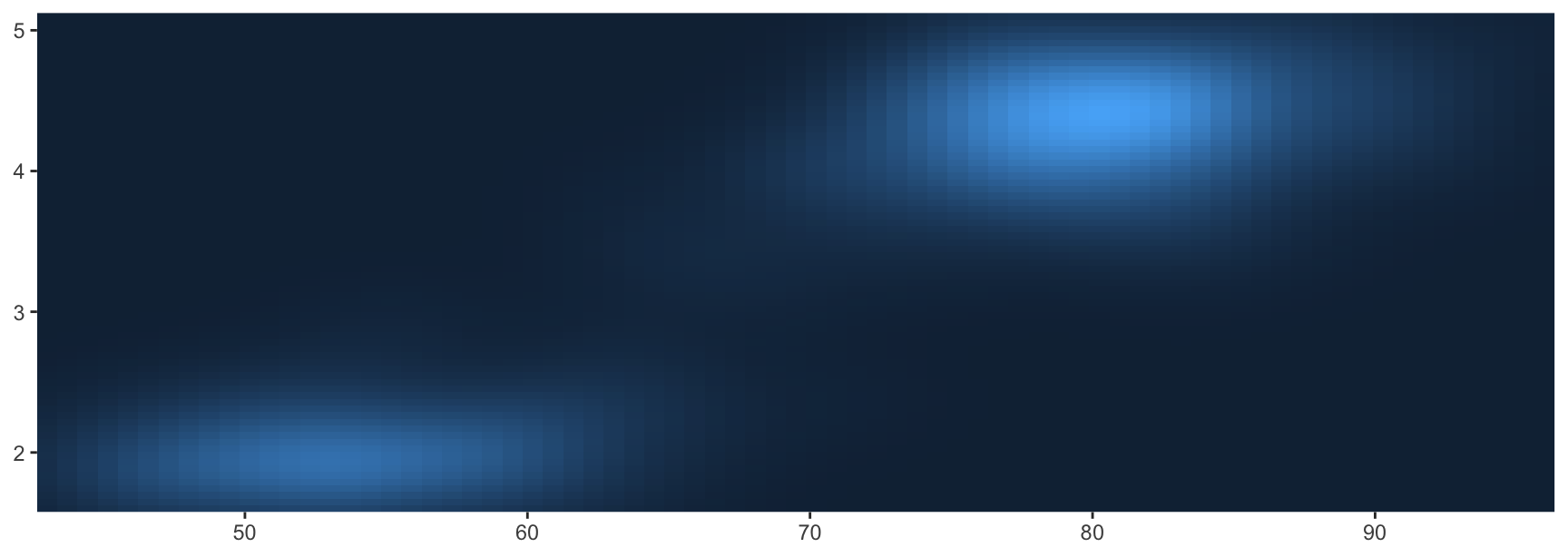
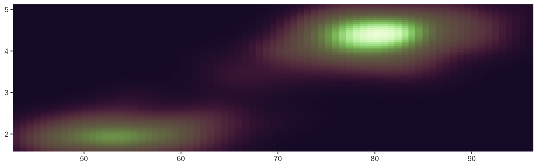
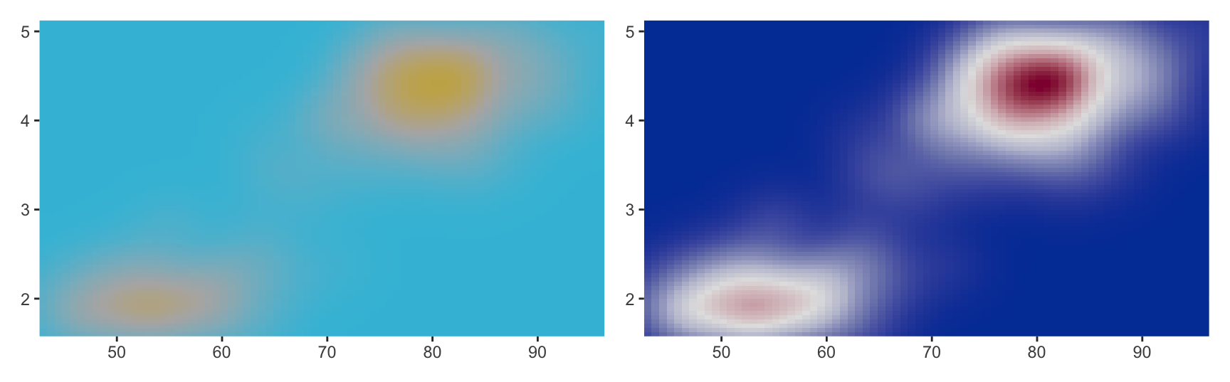
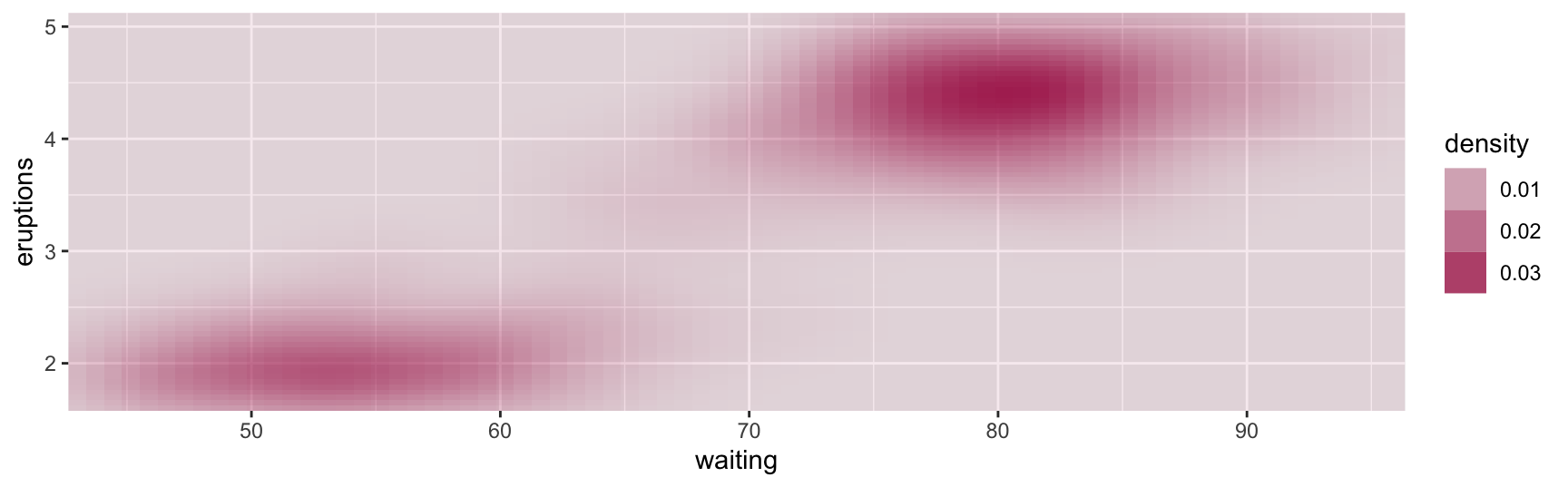
faithfuld holds a two-dimensional density estimate for the Old Faithful eruption data. It is a good test object because a density surface makes any flaw in a palette visible at once.
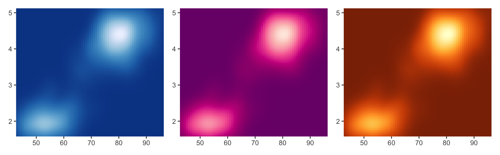
The ColorBrewer palettes were designed for maps, where large blocks of colour sit next to each other. scale_fill_distiller() interpolates one of them into a smooth gradient.
Use RColorBrewer::display.brewer.all() once, at the console, to see the whole catalogue. Do not put it in a report.
The catalogue is split into the three families from the theory section. Sequential palettes such as "YlOrBr" fit ordered data. Diverging palettes such as "RdBu" fit data with a meaningful centre. Qualitative palettes such as "Set1" are for categories and should never be used for a continuous variable.
Palettes from other packages
paletteer collects several hundred palettes from dozens of packages behind one naming convention, "package::palette". The _c suffix means continuous.
The scico package is worth knowing on its own. Its palettes were built for scientific publication and are perceptually uniform by construction.
Building a gradient by hand
When no ready-made palette fits, interpolate between colours you choose.
Function
What you supply
scale_fill_gradient()
low and high
scale_fill_gradient2()
low, mid, high and a midpoint
scale_fill_gradientn()
a vector of colours
The default continuous fill scale is scale_fill_continuous(), which is itself scale_fill_gradient(). So the plain erupt plot is already a two-colour gradient.
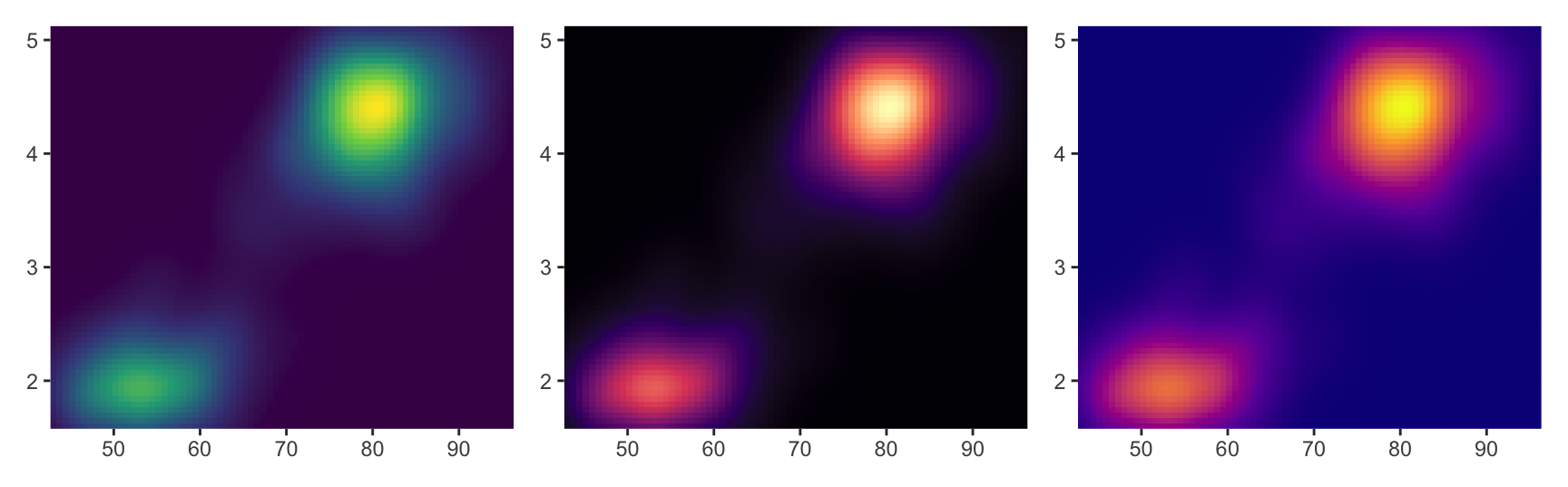
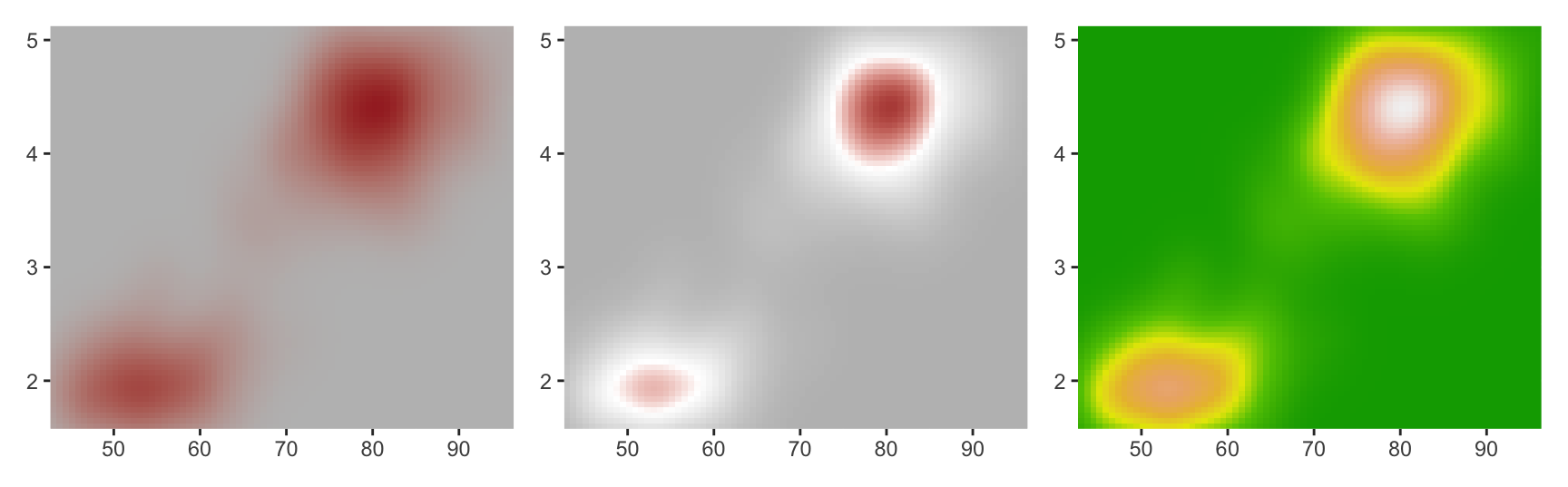
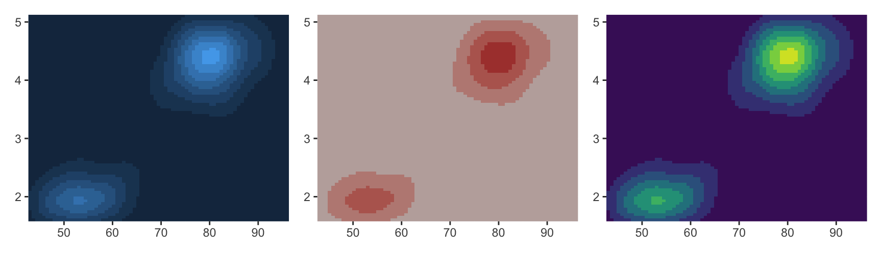
two <- erupt +scale_fill_gradient(low ="grey", high ="brown")three <- erupt +scale_fill_gradient2(low ="grey", mid ="white", high ="brown", midpoint =0.02)many <- erupt +scale_fill_gradientn(colours =terrain.colors(7))two | three | many
The three-colour version needs a midpoint in data units, and it is your job to pick one that means something. Here 0.02 is roughly the middle of the density range, so the scale reads as low, typical and high.
The terrain.colors() version shows the trap in gradientn(). The palette has bands of similar luminance, so the surface gains contour lines that are not in the data. Every colour you add is another chance to invent an edge.
Choosing endpoints that work
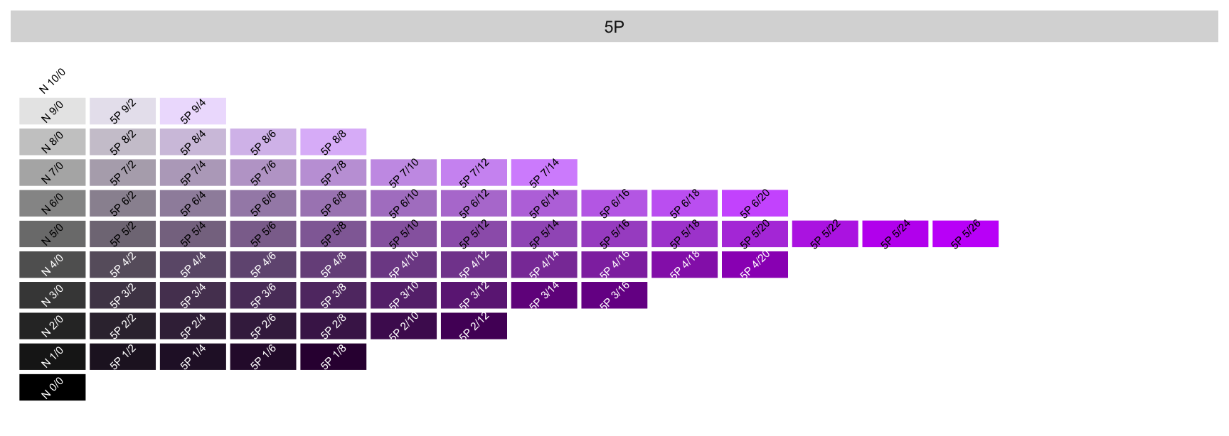
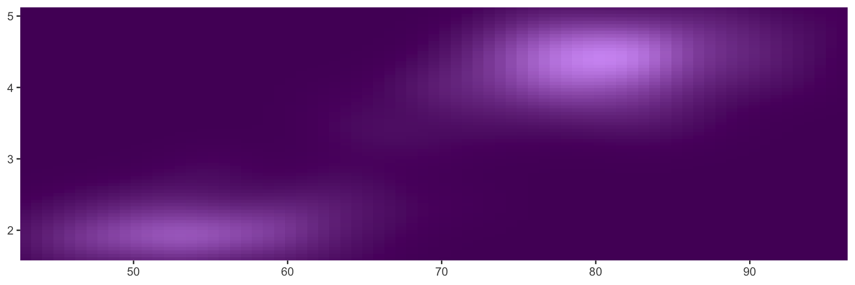
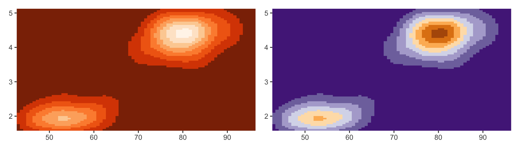
A clean sequential gradient keeps hue fixed and moves luminance. The Munsell system makes that easy because its notation separates the three axes. "5P 2/12" means hue 5P, value 2 and chroma 12.
munsell::hue_slice("5P")
Read the endpoints off the slice, then hand them to scale_fill_gradient().
For a diverging scale, pick two hues at the same value and chroma and a neutral grey for the middle. Matching value and chroma is what keeps either side from shouting louder than the other.
Every continuous colour scale has an na.value argument. It colours genuine NA values and also anything that falls outside the scale limits, which is a common source of surprise.
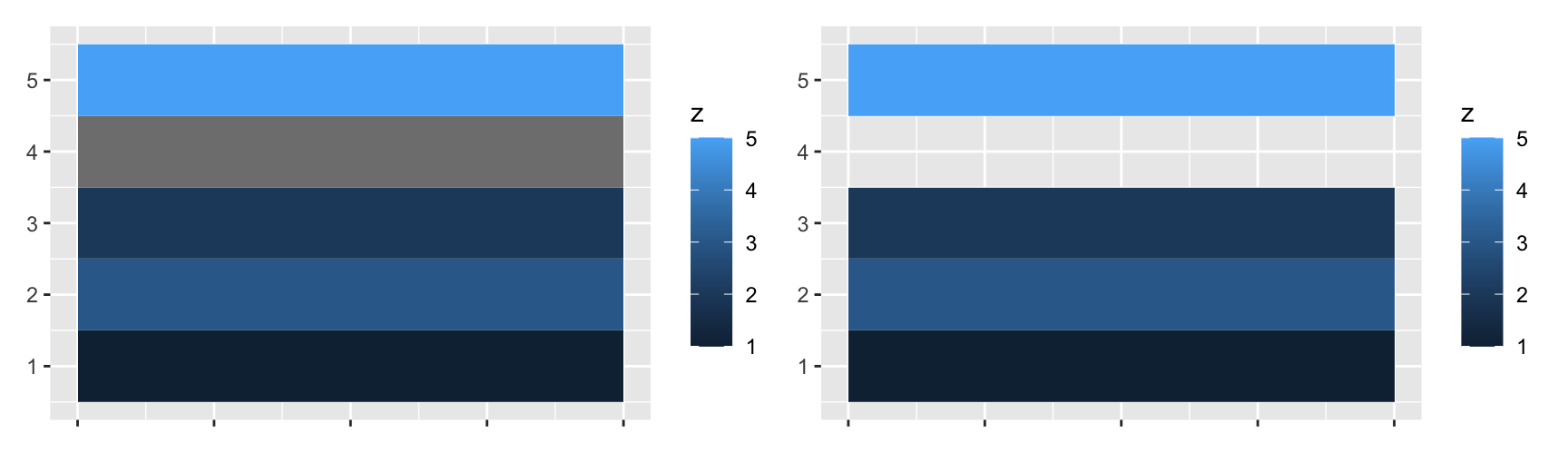
gaps <-data.frame(x =1, y =1:5, z =c(1, 3, 2, NA, 5))tiles <-ggplot(gaps, aes(x, y)) +geom_tile(aes(fill = z), linewidth =5) +labs(x =NULL, y =NULL) +scale_x_continuous(labels =NULL)tiles | tiles +scale_fill_gradient(na.value =NA)
The default grey is deliberate. It says “no value here” without competing with the palette, and it makes the gap countable.
Setting na.value = NA deletes the tile instead. That is the right choice when the background already means “no data”, such as sea around a coastline. It is the wrong choice when the reader needs to know that a measurement was attempted and failed.
Limits, breaks and labels
These behave exactly as they do for position scales in Chapter 10. limits sets the span of the scale, breaks picks the values that get a label, and labels controls how those values are printed.
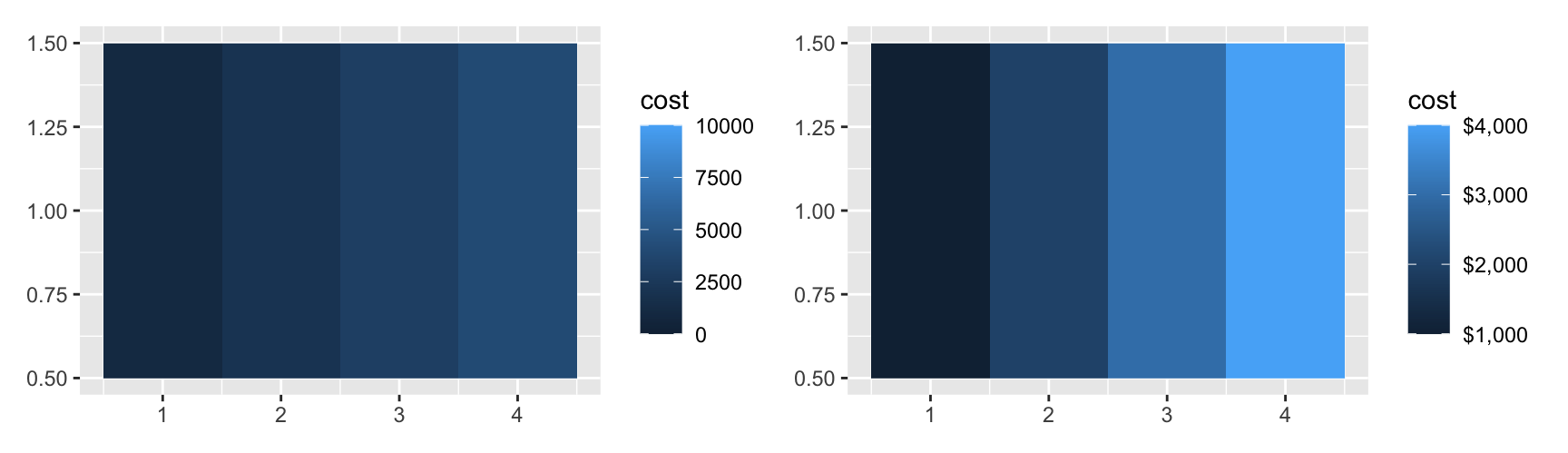
money <-data.frame(x =1:4, y =1, cost = (1:4) *1000)bill <-ggplot(money, aes(x, y, fill = cost)) +geom_tile() +labs(x =NULL, y =NULL)bill +scale_fill_continuous(limits =c(0, 10000)) | bill +scale_fill_continuous(labels = scales::label_dollar())
Widening the limits to c(0, 10000) compresses all four tiles into the bottom of the palette. The values did not change but the picture now says they are all small. Limits are a claim about what range matters, so set them on purpose.
breaks = NULL removes the keys and their labels but keeps the colour mapping. That is useful when the colours are decoration and the numbers are given elsewhere.
Colour bar legends
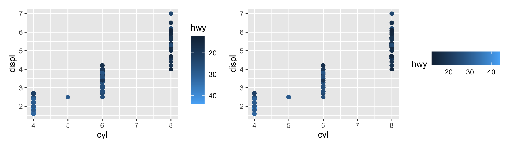
A continuous scale gets a colour bar, drawn by guide_colourbar(). Pass it through guides().
barwidth and barheight resize the bar, in grid units. A taller bar makes small differences readable, which matters when the reader has to estimate a value rather than just rank two points.
There are two routes to the same guide and they are equivalent. Use guides() when you are adjusting the legend and the scale is otherwise fine. Use the guide argument when you are already writing out the scale.
Draw erupt with scale_fill_viridis_c() and with scale_fill_gradientn(colours = rainbow(7)). Describe one feature of the density surface that the rainbow version appears to show and the viridis version does not.
Map cty to colour in a scatterplot of displ against hwy. Set limits = c(20, 30) and look at what happens to the cars outside that range. Change na.value to "red" and say what the plot now tells you.
Use munsell::hue_slice("5R") to choose a light and a dark red, then build a sequential gradient from them for faithfuld. Compare it with scale_fill_distiller(palette = "Reds") and say which you would ship.
Build a diverging fill scale for faithfuld with midpoint set to the median density, then to the mean. Which one splits the surface more evenly, and why does the choice of midpoint matter more here than the choice of colours?
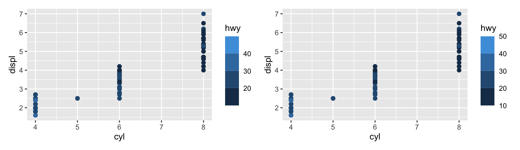
Take the engines plot and give the colour bar a horizontal direction and a barwidth of 6 cm. Where does the bar end up, and what does that tell you about how legends are allocated space?
scale_fill_continuous() and scale_fill_gradient() produce the same plot. Explain what the first one is actually doing, and name one situation where writing the second is clearer.
Discrete colour scales
Four bars
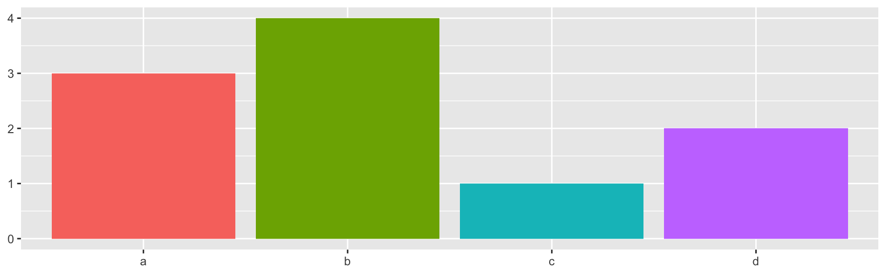
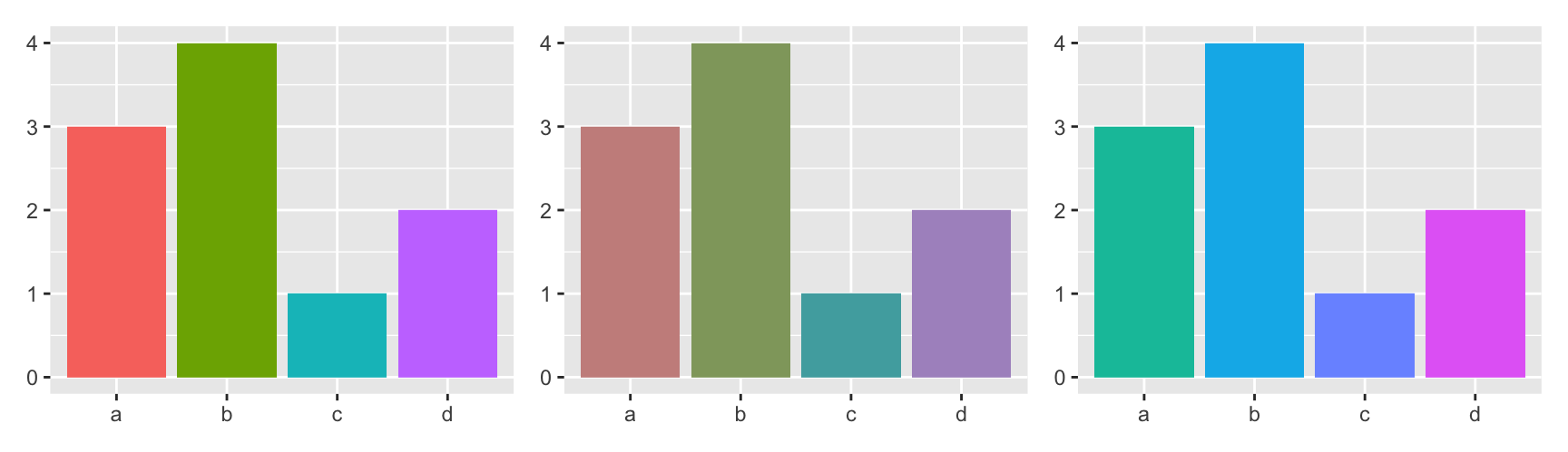
For categorical data, map the variable to fill and let a discrete scale pick the colours. A bar chart with four categories is enough to judge a palette.
counts <-data.frame(x =c("a", "b", "c", "d"), y =c(3, 4, 1, 2))bars <-ggplot(counts, aes(x, y, fill = x)) +geom_col() +labs(x =NULL, y =NULL) +theme(legend.position ="none")bars
The default is scale_fill_discrete(), which is scale_fill_hue().
Brewer palettes
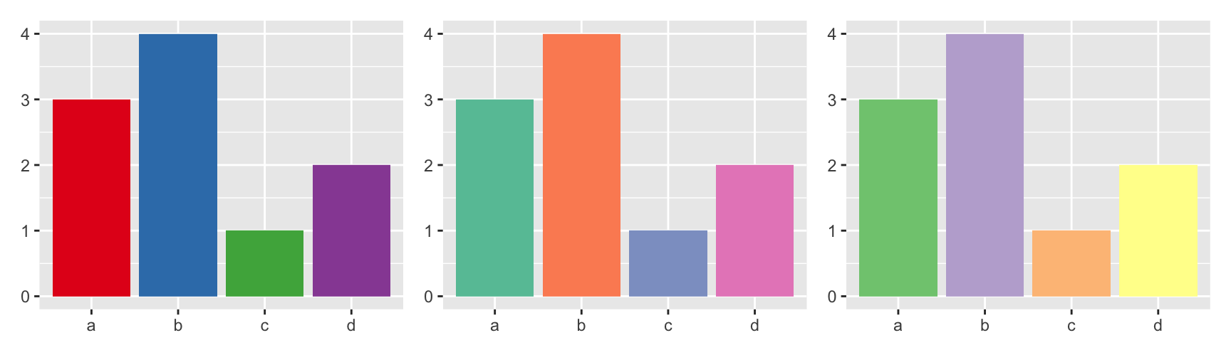
scale_fill_brewer() gives you the ColorBrewer catalogue for categories. These palettes were chosen by hand rather than generated, which is why they usually look better than anything you will mix yourself.
How much area the colour covers should decide how vivid it is. Points are small, so they need strong colours to be told apart. Bars and polygons are large, so strong colours become noise.
"Set1" and "Dark2" are the usual choices for points and lines. "Set2", "Pastel1" and "Accent" suit filled areas.
The same rule applied to the bars is the reverse of the scatterplot. Look back at the previous comparison and the vivid "Set1" bars are the ones that are hard to read for any length of time.
Hue scales
The default scale spaces hues evenly around the colour wheel and holds chroma and luminance fixed. h restricts the range of hues, c sets the chroma and l the luminance.
Even hue spacing keeps working up to about eight categories. Past that the colours are too close together to name, and you should be using facets or a different encoding instead.
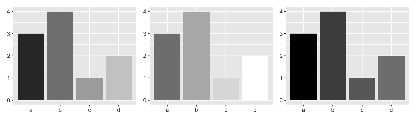
The hue scale has two known failures, and both come from holding luminance fixed. Print it in black and white and every bar becomes the same grey. Show it to a red-green colour-blind reader and some pairs merge. Neither problem is a bug. It is the price of a palette whose only ordered axis is switched off.
Grey scales
When the output really will be printed in black and white, say so with scale_fill_grey(). start and end set the two ends of the range, from 0 for black to 1 for white.
full <- bars +scale_fill_grey()light <- bars +scale_fill_grey(start =0.5, end =1)dark <- bars +scale_fill_grey(start =0, end =0.5)full | light | dark
Paletteer palettes
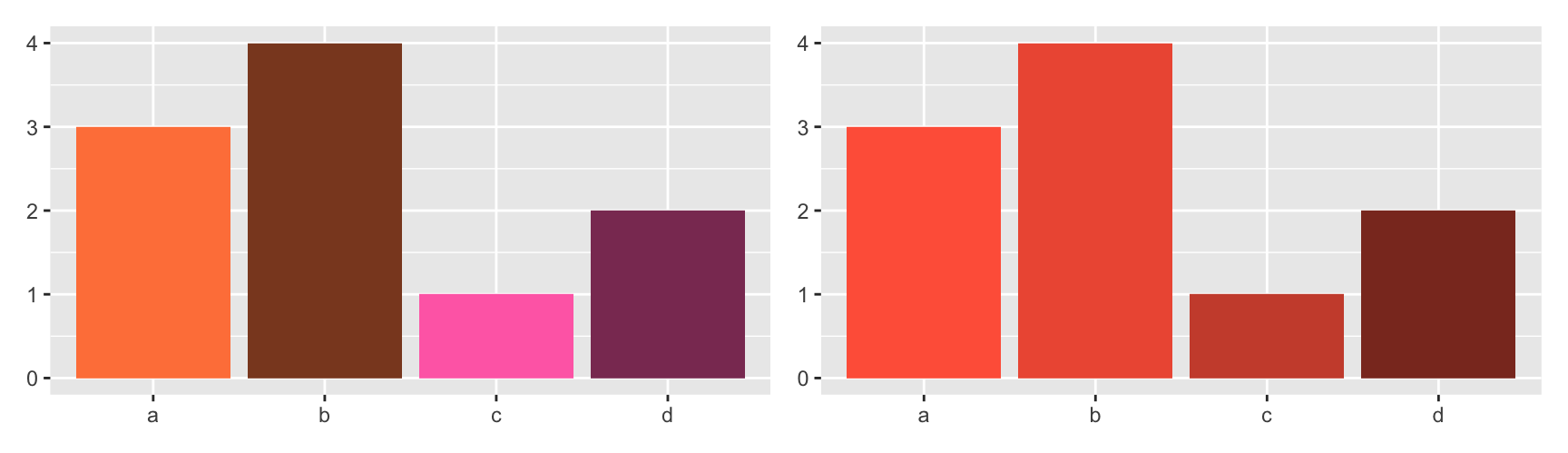
The discrete half of paletteer works the same way as the continuous half, with a _d suffix. It is the fastest way to try a palette you saw somewhere and liked.
The first palette says the four categories are two pairs. The second says they are one ordered run. Neither claim is in the data, and both are what a reader will take away. That is the power and the danger of a manual scale.
Highlighting one category
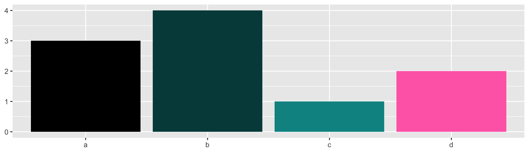
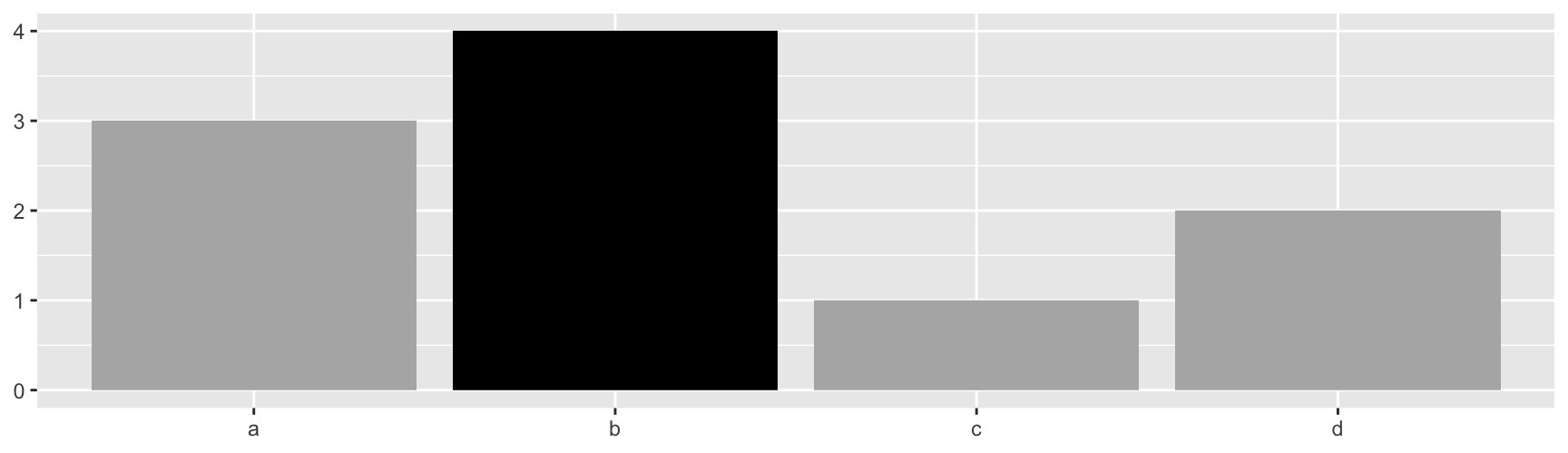
Name the entries of values and the order stops mattering. This is the standard way to push one group forward and let the rest recede.
bars +scale_fill_manual(values =c(a ="grey70", b ="black", c ="grey70", d ="grey70"))
A named vector also keeps colours stable when a plot is redrawn on a subset that happens to be missing a level.
Keeping colours stable across plots
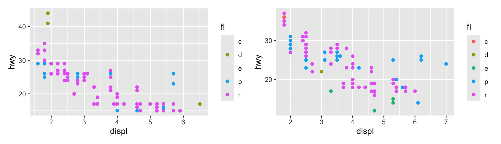
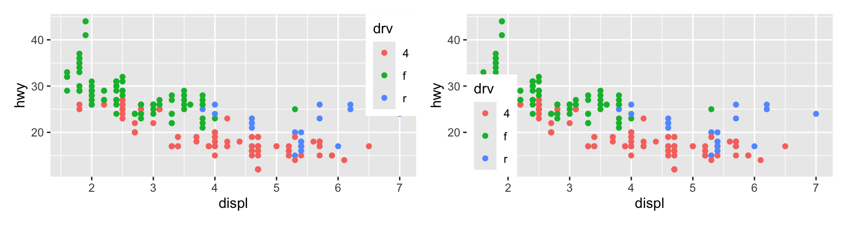
Two plots of different subsets will assign different colours to the same category, because each scale only sees the levels present in its own data. Fix it by declaring the full set of levels with lims().
lims() sets limits for several aesthetics at once, so lims(x = c(1, 7), y = c(10, 45), colour = ...) locks all three and makes the two panels genuinely comparable.
Limits, breaks and labels
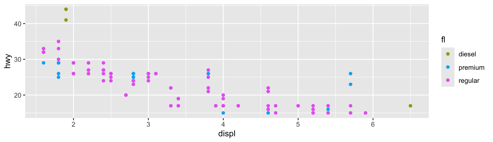
limits decides which levels get a colour. breaks decides which of them appear in the legend. labels decides what those entries are called.
Splitting the three arguments is what makes a shared palette readable. limits is shared across every plot in the report so the colours never move. breaks is set per plot so each legend lists only the fuel types that plot actually contains. labels turns codes into words for the reader.
Note that labels lines up with breaks, not with limits. Get that wrong and you will silently mislabel a category.
Legend layout
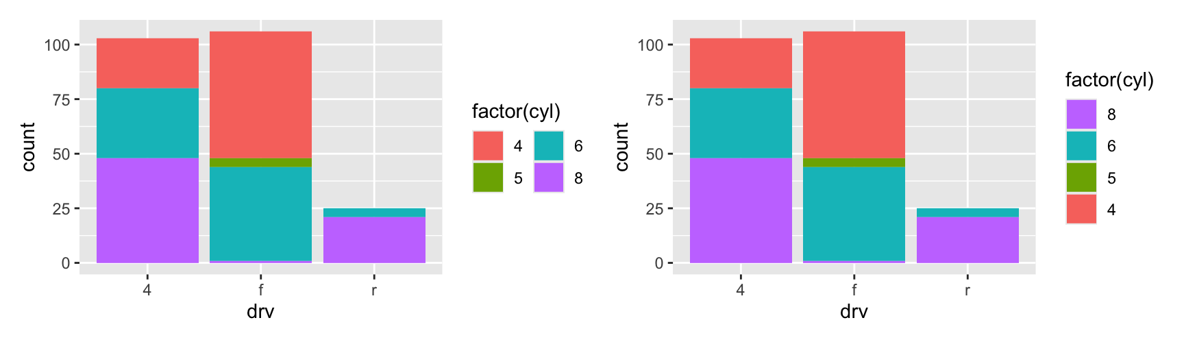
A discrete legend is a table of keys, laid out by guide_legend(). nrow and ncol set its shape, byrow fills across instead of down, and reverse flips the order.
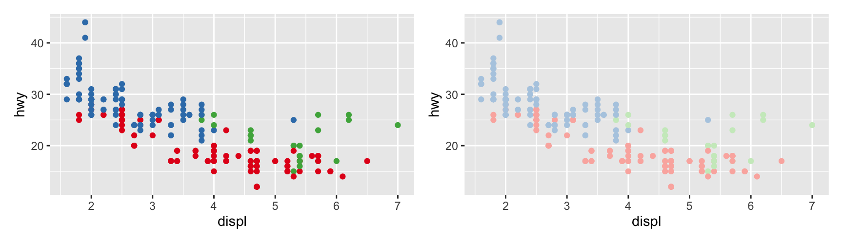
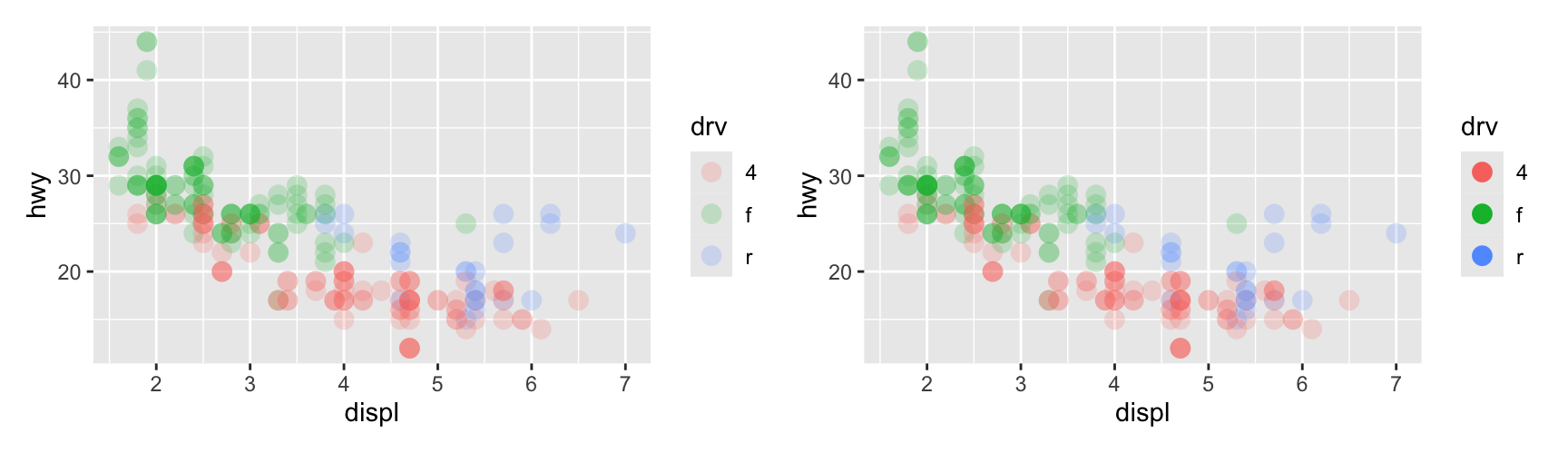
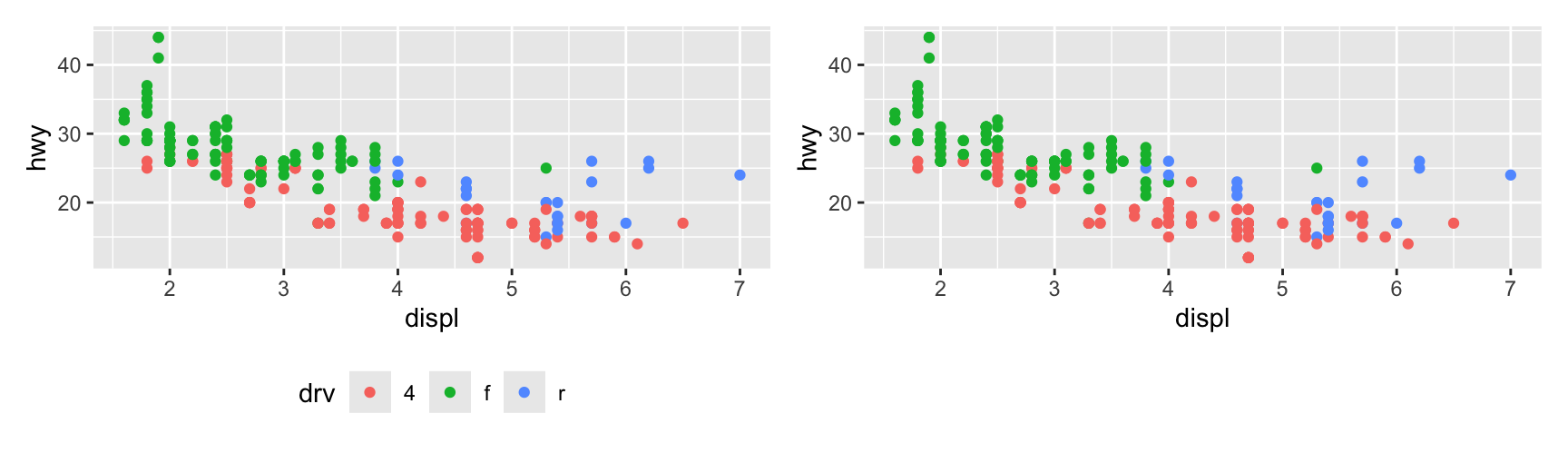
Settings that make the plot readable often make the legend unreadable. Transparency is the usual culprit. override.aes changes the keys without touching the layer.
In the left panel the keys inherit alpha = 0.2 from the layer, so the reader is asked to identify three washed-out dots. In the right panel the keys are opaque and the plot is unchanged.
keywidth and keyheight do the same kind of job for size. Use them when a line type or a small point needs more room than the default key allows.
Exercises
Draw mpg as a scatterplot of displ against hwy coloured by class, once with scale_colour_brewer(palette = "Set1") and once with the default. class has seven levels. Which categories become hard to separate, and in which version?
Build the same plot as a filled bar chart of class by drv and try "Set1" and "Pastel1" on it. State the rule you would give a colleague about picking between them.
Using scale_fill_manual() with a named vector, colour only the "suv" class and grey out the rest. Then do the same for "2seater". What does the second plot show that the first one hides?
Filter mpg to drv == "f" and to drv == "4", then draw both coloured by class. Without lims(), name a class that gets a different colour in the two plots, and explain why.
Take the legend from exercise 1 and arrange it in two columns with the keys filled by row. Then reverse the key order. Which of the three versions would you use for a slide, and which for a printed page?
scale_fill_grey() and scale_fill_hue(c = 0) both produce grey bars. Draw both and say what the difference is.
Binned colour scales
Cutting a gradient into steps
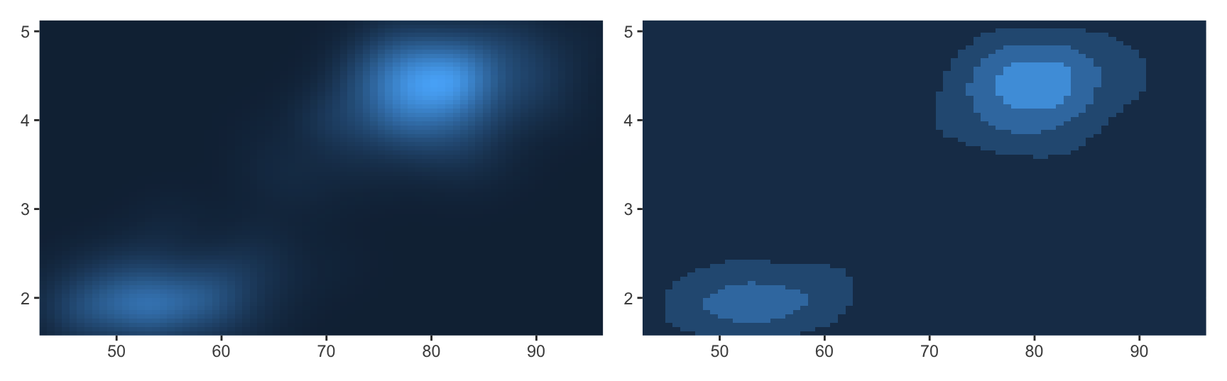
A binned scale takes a continuous variable, cuts it into intervals, and gives each interval one colour. It sounds like a loss of information, and it often reads better than the gradient it replaces.
The reason is that eyes are good at edges and poor at slow gradients. In the stepped version you can trace a single band and see where the density level goes. In the smooth version you cannot, because there is no boundary to follow.
The cost is that the boundaries are arbitrary. A reader will treat them as real thresholds, so either choose the breaks to mean something or accept that you are making the picture easier at the cost of a small fiction.
The stepped family
Each gradient function has a stepped twin with the same arguments. n.breaks asks for a number of steps, and the scale picks nearby round numbers.
eight <- erupt +scale_fill_steps(n.breaks =8)two <- erupt +scale_fill_steps(low ="grey", high ="brown")many <- erupt +scale_fill_stepsn(n.breaks =9, colours = viridis::viridis(9))eight | two | many
Brewer steps
scale_fill_fermenter() is the binned member of the Brewer family, alongside scale_fill_brewer() for categories and scale_fill_distiller() for gradients.
fermenter() does not interpolate. Ask for more breaks than the palette has colours and you get a warning and missing steps.
Limits, breaks and labels
limits works as it does for a continuous scale, a pair of numbers marking the ends.
breaks is different and this is the thing to remember. For a binned scale the breaks are the boundaries between bins, not tick positions. Give it three breaks and you get four bins.
All three arguments also accept a function, which is how you make a scale that adapts to whatever data it is handed. Chapter 10 covers that pattern.
Colour step legends
A binned scale is drawn with guide_coloursteps(). By default the endpoints of the scale are not labelled, which hides the range. show.limits = TRUE puts them back.
Two more arguments are worth knowing. ticks draws tick marks beside the labels, which helps when the bins are narrow.
even.steps decides whether the blocks in the legend are drawn at equal size or in proportion to the data range each one covers. The default is equal size, which is easier to read. Set it to FALSE when the widths themselves are part of the message.
Date-time and alpha scales
Dates mapped to colour
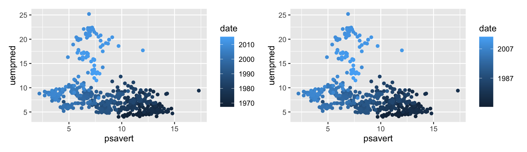
Map a date to colour and ggplot2 reaches for scale_colour_date(). The date-time version is scale_colour_datetime(). Both take date_breaks and date_labels, just like the position scales in Chapter 10.
The default legend labels a date scale with full dates, which are long and force the legend wider. date_labels takes the same format codes as strptime(), so "%Y" gives you bare years and "%b %Y" gives month and year.
Colour is a weak channel for time. It is worth using when time is a secondary variable and the two axes are already spoken for, as here. When time is the point of the plot, put it on an axis.
Alpha scales
scale_alpha() maps a variable to transparency. It is a weak encoding and a poor first choice, but it is good at pushing observations into the background.
Alpha only reads against a known background. On white, a transparent maroon looks pink, and the reader has no way to separate “pale colour” from “see-through colour”. Overlap two transparent layers and the problem doubles.
Use it for one job. Map alpha to a measure of confidence or weight so that uncertain observations recede, and carry the real variable on colour or position.
Legend position
Moving the legend
Legend placement is a theme setting, not a scale setting. legend.position takes "right" (the default), "left", "top", "bottom" or "none".
"bottom" and "top" are worth reaching for more often than people do. A legend on the right steals width from the panel, and width is usually the scarce direction in a slide or a journal column.
"none" is not a way to hide a mistake. Use it when the colour is already explained by a facet strip or by a label in the plot, so the legend would only repeat it.
Several legends at once
Three more theme settings control layout when a plot has more than one legend.
Setting
Values
Effect
legend.direction
"horizontal", "vertical"
How keys run inside one legend
legend.box
"horizontal", "vertical"
How the legends stack against each other
legend.box.just
"top", "left", …
How the legends line up with each other
legend.margin = unit(0, "mm") removes the padding around the legend box, which is sometimes the only way to fit everything into a fixed-size figure.
Putting the legend inside the panel
Give legend.position two numbers between 0 and 1 and the legend moves inside the panel. c(0, 0) is the bottom left corner and c(1, 1) the top right.
legend.justification says which corner of the legend box is pinned to that point. Setting the two to the same value is what keeps the legend from hanging off the edge.
An inside legend only works when the data leaves a corner empty. Check that it does before you move it, and check again after you change the data, because the empty corner is a property of this particular data set and not of the plot.
Exercises
Draw mpg coloured by class and put the legend at the bottom. Compare the width of the panel with the default version and say which you would use on a slide.
Move the same legend inside the panel at the top right, with matching legend.justification. Then try it at the top left. One of the two covers data. Which, and why could you not have predicted it without drawing the plot?
Add size = cty to that plot so it has two legends. Set legend.box = "horizontal" and then "vertical", and say which reads faster.
Combine guide_legend(ncol = 2) with an inside legend position for the class plot. Does the two-column shape make the legend fit better, or just differently?
Take any plot from this chapter, set legend.position = "none", and add the information back with a facet or a direct text label. Describe what you gained and what you lost.
Recap
Hue is unordered, luminance and chroma are ordered. Almost every palette rule in this chapter follows from that one fact.
Viridis is the safe default for continuous data. It survives colour blindness and a black and white printer, and nothing you mix by hand is likely to beat it.
Continuous, discrete and binned data each get their own scale family and their own legend guide. Pick the family from the variable, not from the look you want.
limits, breaks and labels do three different jobs. Use limits to fix the colours across plots, breaks to choose what the legend lists, labels to write it in words.
Binning a gradient is a real improvement in readability, paid for with boundaries the reader will believe. Choose the breaks deliberately.
Legends are a theme matter. Move them, shrink them, override their keys, or drop them when a facet already says the same thing.
Acknowledgement
Source. These slides follow the structure and the teaching sequence of ggplot2: Elegant Graphics for Data Analysis (3e) by Hadley Wickham, Danielle Navarro and Thomas Lin Pedersen. The explanations, examples and exercises here have been rewritten for this course; any errors in them are mine and not the book’s.
Copyright. All rights in the original work are reserved by its authors and publishers. Students are encouraged to read the book itself, which is freely available online.
Non-commercial use only. These materials are for teaching and must not be used for commercial gain.
Attribution. Any reuse or redistribution must credit both the original book and this course.