Chapters 10 and 11 gave position and colour a lot of room. They deserve it, because most plots spend most of their information budget on those two.
But they are not the whole list. Size, shape, line width and line type are aesthetics too, with scales of their own that behave in the same way. They matter when a third or fourth variable has to go somewhere, and when colour is already spoken for or cannot be relied on.
This chapter works through the remaining aesthetics and two families of scale that apply to all of them.
Size maps a continuous variable to how big a marker is drawn.
Shape maps a small number of categories to different point symbols.
Line width controls the thickness of a line, separately from point size.
Line type maps categories to dash patterns.
Manual scales let you write the lookup table by hand.
Identity scales hand your data straight to the renderer with no translation.
A word of warning before we start
These aesthetics are weaker than position and colour, and they run out of room fast.
Six shapes is already a lot to ask a reader to hold in mind. Five dash patterns on one plot is usually four too many. Size is read as “bigger” and “smaller”, not as a number you can recover.
So treat what follows as a way of adding a secondary variable, one the reader glances at rather than measures. The variable you actually want your audience to read goes on an axis.
Size
What scale_size() does
size is the aesthetic for how large a point or a piece of text is drawn. The default continuous scale is scale_size().
The important detail is what it makes proportional. scale_size() maps the data value linearly to the area of the marker, not to its radius. That is deliberate. People judge relative area far better than they judge relative diameter, so area scaling is the one that makes a dot twice as big look like twice as much.
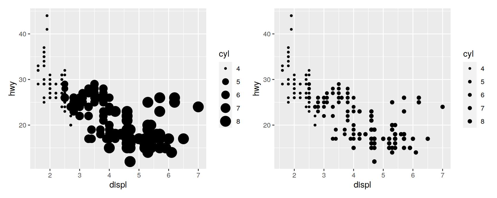
By default the smallest observation is drawn at size 1 and the largest at size 6. The range argument replaces those two numbers.
On the left the four cylinder cars are visibly small dots and the eight cylinder cars are visibly large ones. On the right the range has been squeezed to c(1, 2), and the variable has almost stopped being readable.
That is the trade-off range controls. A wide range makes the variable legible and the plot messy, because large markers overlap their neighbours. A narrow range keeps the scatter clean and throws the third variable away. There is no default that is right for every data set, which is why the argument exists.
The rest of the size family
Scale
What it is for
scale_size_area()
Forces a data value of 0 to an area of 0
scale_size_binned_area()
The same guarantee, in discrete steps
scale_radius()
Makes the radius proportional instead of the area
scale_size_binned()
Cuts a continuous variable into a few size classes
scale_size_date(), scale_size_datetime()
Size from a date or date-time column
scale_size_area() is worth remembering. The default scale only promises that the smallest value gets the smallest marker, so a dot of area zero could stand for any number. If your variable is a count, zero should look like nothing, and scale_size_area() is how you say so.
Radius scales
Area is the right default, but it is not always right.
Sometimes the number in the column is itself a radius. Then the honest picture is the one where the drawn radius is proportional to the recorded radius, and area scaling understates every difference. scale_radius() is for exactly that case.
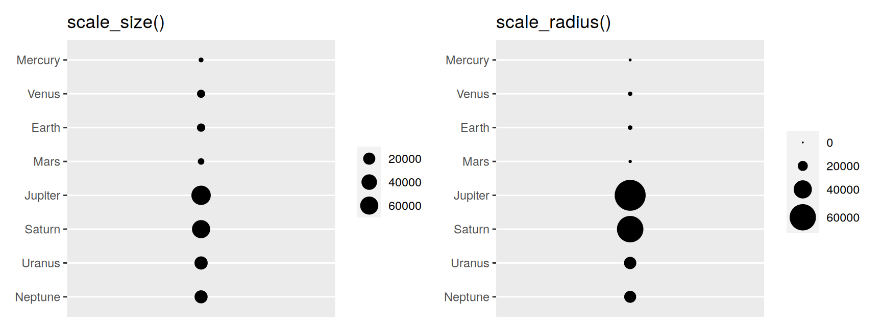
Here is a small table of planetary radii to try it on.
The left panel is a lie about the solar system. Jupiter and Saturn look almost the same size, and Mercury looks like a small version of Earth rather than a third of it.
The right panel is drawn to scale. Two arguments do the work. limits = c(0, NA) fixes the bottom of the scale at a radius of zero instead of at the smallest planet, and range = c(0, 10) says that zero on the data scale is zero on the screen. Without both of them the discs would still be proportional to each other only up to an offset.
The difference between Jupiter and Saturn is now clearly larger than the whole of Earth, which is the fact the plot was drawn to show.
Binned size scales
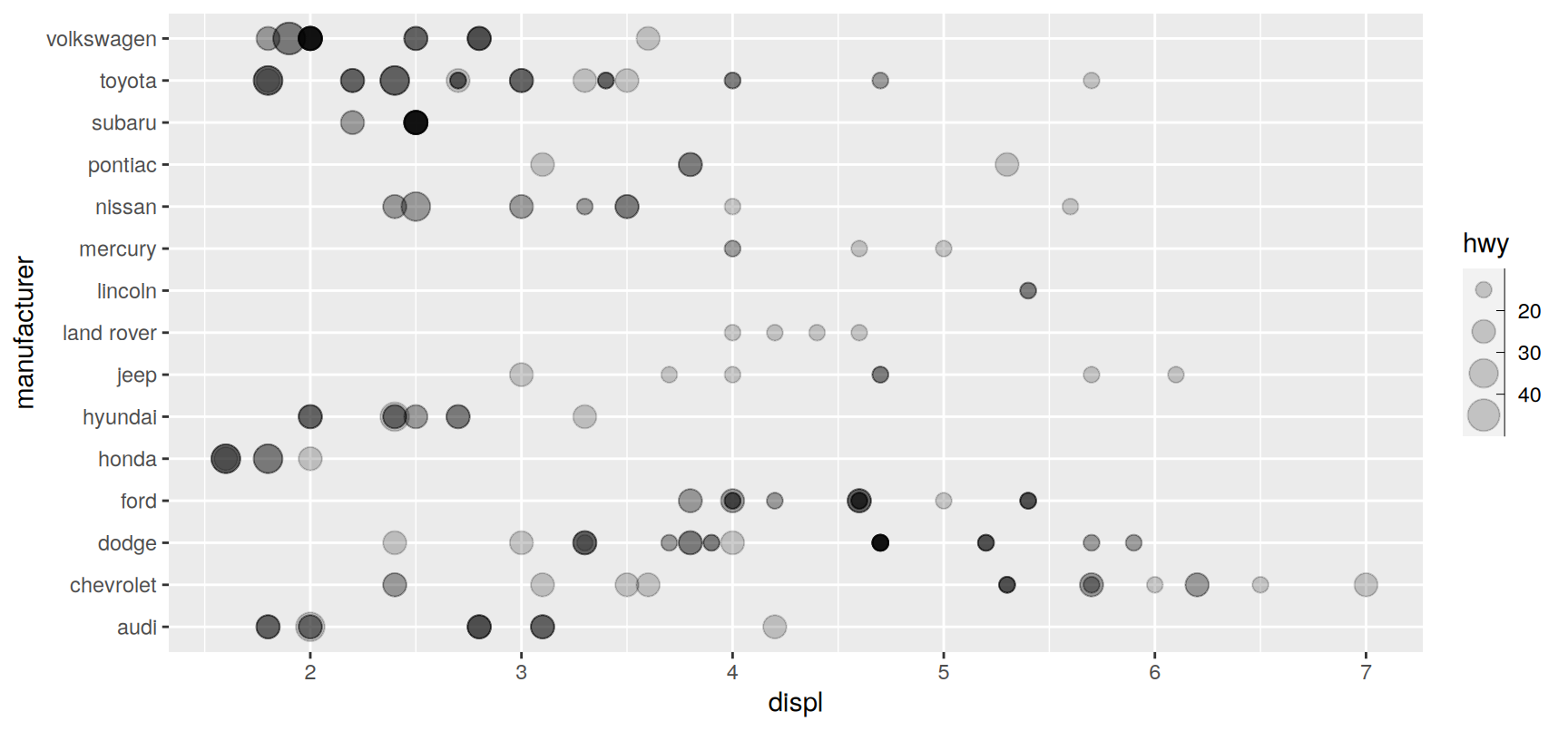
scale_size_binned() does to size what scale_fill_binned() did to colour in Chapter 11. The continuous variable is cut into a handful of classes, and each class gets one marker size.
Binning is a good idea when you want the reader to sort observations into groups rather than to compare them one by one. It also tidies the legend, because a binned scale has a small fixed number of keys.
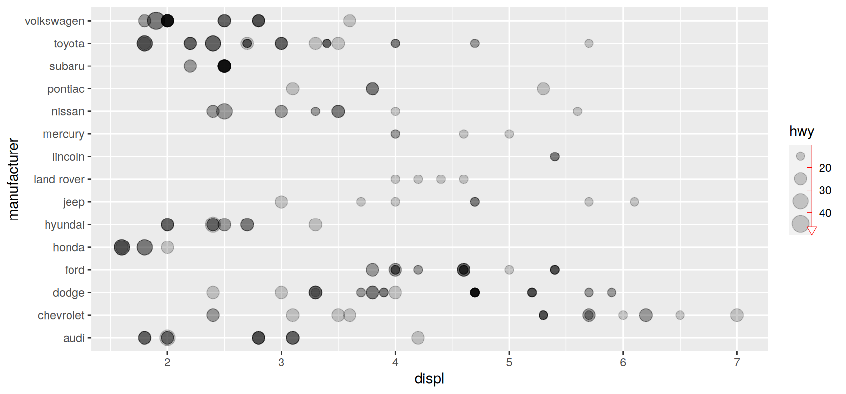
Notice the legend. It is not the usual table of keys. Binned scales are drawn by guide_bins(), which lines the keys up along an axis so that you can read them as a ruler rather than as a list.
That axis is the point. It tells the reader that the classes are ordered and adjacent, which a legend made of separate boxes does not.
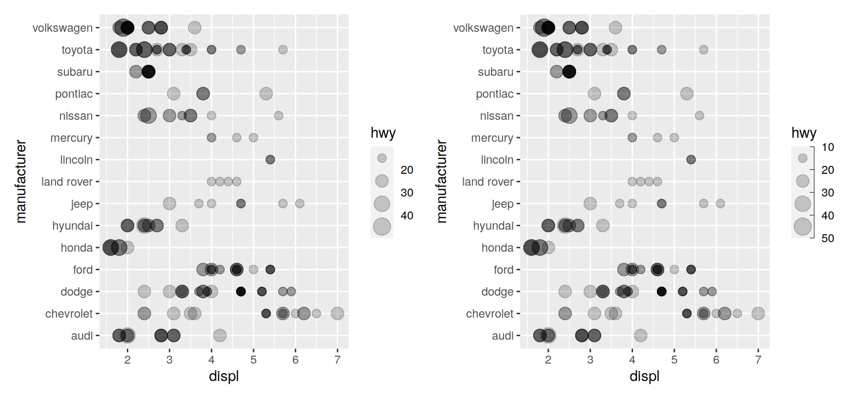
Controlling guide_bins()
Argument
Effect
axis
Draw the axis line beside the keys. TRUE by default
direction
"vertical" (the default) or "horizontal"
show.limits
Label the two ends of the scale. FALSE by default
axis.colour
Colour of that axis line
axis.linewidth
Thickness of that axis line
axis.arrow
An arrowhead for the axis, built with arrow()
keywidth, keyheight, reverse and override.aes behave exactly as they do in guide_legend(), so nothing new has to be learnt for them.
Draw cty against displ from mpg with size = cyl, once with scale_size() and once with scale_size_area(). Read the two legends. Which marker size does each scale assign to a car with four cylinders, and why do they disagree?
Repeat the same plot with range = c(0.5, 12). Count how many points you can still separate, and write one sentence saying what you have gained and what you have lost.
Using the planets data, put orbit on the x axis on a log scale and radius on size. State one thing the plot shows about the inner planets that the earlier one-column version could not.
Apply scale_size_binned(n.breaks = 3) to the mpg plot, then to the same plot with n.breaks = 8. Which version would you hand to someone who has thirty seconds, and which to someone writing a report?
Take the binned plot and set guide_bins(direction = "horizontal"), then move the legend to the bottom with theme(legend.position = "bottom"). Say when that layout is better than the default.
scale_size() warns if you map it to a factor. Try it, read the message, and explain in your own words what the scale is objecting to.
Shape
Mapping a category to a symbol
shape turns a discrete variable into a set of point symbols. It is the aesthetic of last resort for a small categorical variable, and it earns its place in two situations. Colour may already be carrying something else. Or the figure may have to survive being printed in black and white.
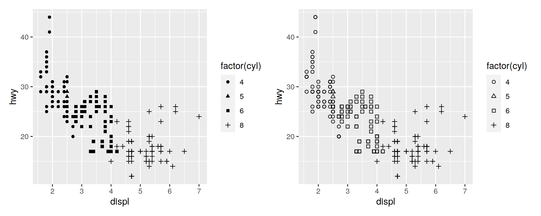
The default scale is scale_shape(). With solid = TRUE it hands out three filled symbols and three outlined ones. With solid = FALSE all six are outlined.
Six is the hard limit. Ask for a seventh category and ggplot2 warns you and leaves those points undrawn, because it has run out of symbols it trusts a reader to tell apart.
The outlined version is usually the better one for a crowded scatterplot. Hollow symbols let you see through the pile-up, so two overlapping points still read as two points.
The filled version wins when the markers are small or the figure will be reduced, because an outline thins out and disappears before a solid blob does.
The full set of symbols
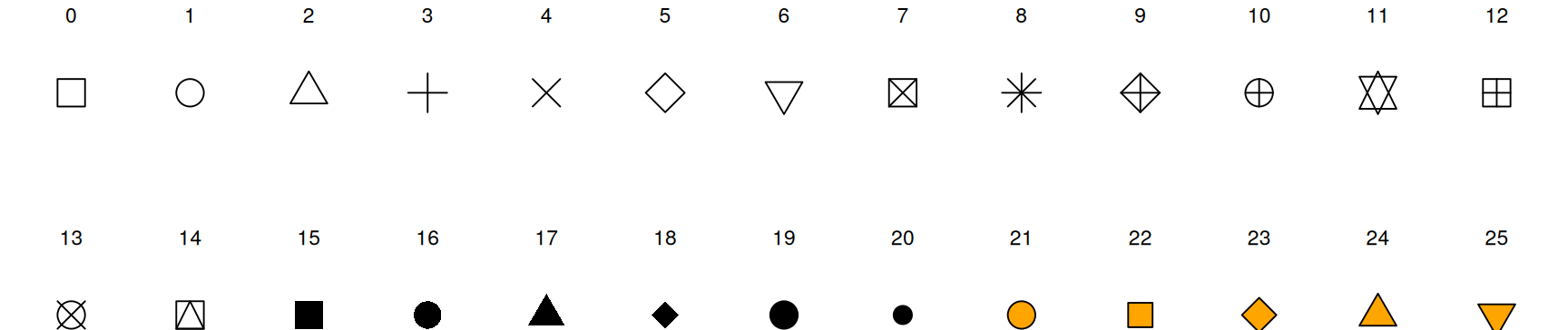
There are 26 symbols, numbered 0 to 25. Three bands behave differently.
symbols <-data.frame(code =0:25, x =0:25%%13, y =-(0:25%/%13))ggplot(symbols, aes(x, y, shape = code)) +geom_point(size =5, colour ="black", fill ="orange") +geom_text(aes(label = code), nudge_y =0.35, size =3) +scale_shape_identity() +theme_void()
0 to 14 are drawn with an outline only. colour sets the outline and fill is ignored.
15 to 20 are solid. colour fills them and fill is again ignored.
21 to 25 have an outline and an interior that are controlled separately, by colour and fill.
That last band is the useful one. It is what lets you map one variable to the border and another to the inside of the same point, and it is why the orange in the figure above only shows up on the last five symbols.
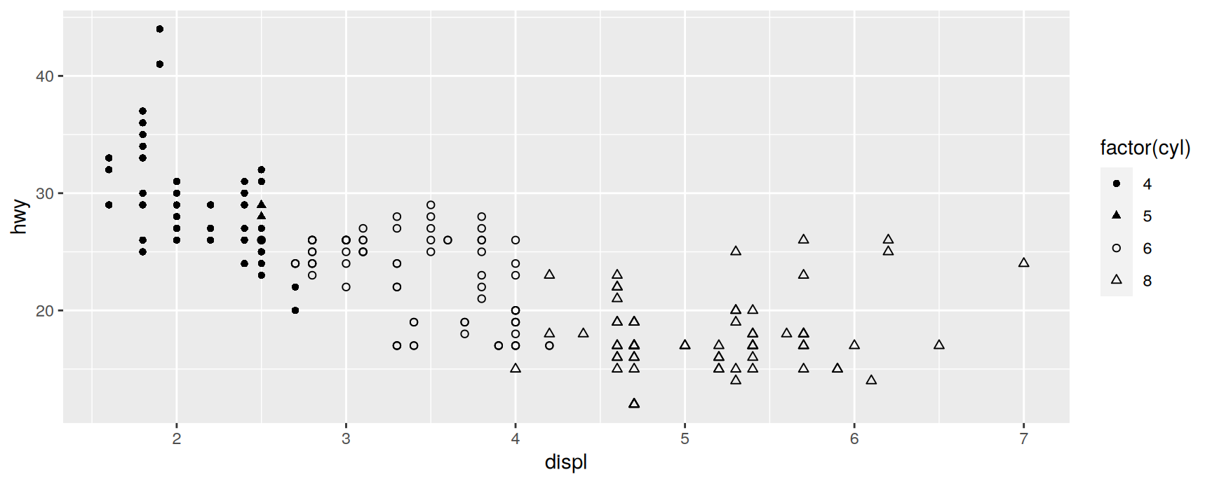
To choose the symbols yourself, give scale_shape_manual() a named vector of codes. The names are the levels of the variable and the values are the numbers above.
Hand-picking is not just decoration. The default palette gives you an arbitrary six, and an arbitrary six is a bad idea whenever the categories have an order or a natural pairing.
In the plot above the filled circle and filled triangle go to four and five cylinders and their hollow twins go to six and eight. The reader can now see that the symbols come in two families before reading a single legend entry.
Line width
linewidth is not size
Until version 3.4.0 the size aesthetic did two unrelated jobs. It set how big a point was and how thick a line was. For a geom that draws only one of those it was fine. For a geom that draws both it was a mess.
linewidth fixed that. Lines are now controlled by linewidth and points by size, and the two can be set independently on the same layer. Passing size to a line geom still works in the version we are using, but it is deprecated and will warn, so write linewidth in new code.
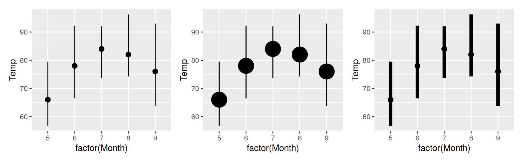
geom_pointrange() is the clearest illustration, because a single layer draws a dot and a bar through it.
The middle panel changed size and only the dots grew. The right panel changed linewidth and only the bars grew.
Before 3.4.0 there was no way to say either of those things on its own. That is the whole reason the aesthetic was split, and it is worth knowing if you ever read older code and wonder why a size argument made a plot look wrong.
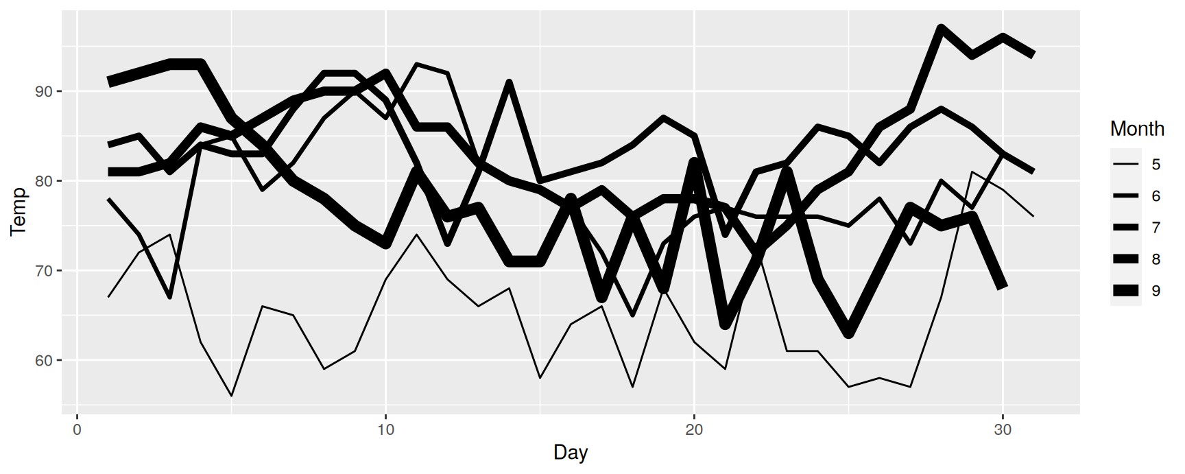
linewidth is a real aesthetic, so it can be mapped rather than set. scale_linewidth() is the continuous scale.
One difference from scale_size() is worth keeping in mind. Size is linear in area, because that is how people read blobs. Line width is linear in width, because that is how people read lines.
Read that plot sceptically. Thickness is a poor way to encode a variable, and here it is encoding a month, which is really a category rather than a number.
The plot does show something. Later months sit higher and are drawn thicker, so the warming through the summer is visible. But colour or a facet would show it better, and the honest use of scale_linewidth() is usually to emphasise one series against a background of others rather than to encode a variable at all.
scale_linewidth_binned() exists as well, and takes the same arguments as the other binned scales.
Line type
Dash patterns as a variable
linetype maps a discrete variable to a dash pattern. scale_linetype() is a shorter name for scale_linetype_discrete().
There is no continuous version. A scale_linetype_continuous() function exists, but all it does is raise an error, because there is no sensible way to read a gradient of dash patterns. If the variable is continuous you must bin it first with scale_linetype_binned().
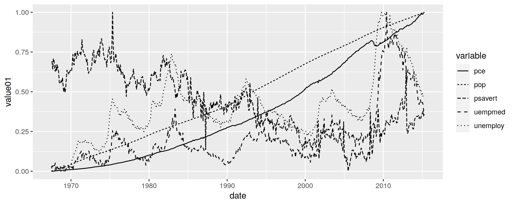
Five series is already too many. The dotted and the dot-dash series are hard to separate where they cross, and any series drawn with a long dash disappears wherever it is steep, because a steep line has fewer dashes per inch of screen.
Two or three categories is the comfortable limit. Beyond that, use colour if you can and facets if you cannot.
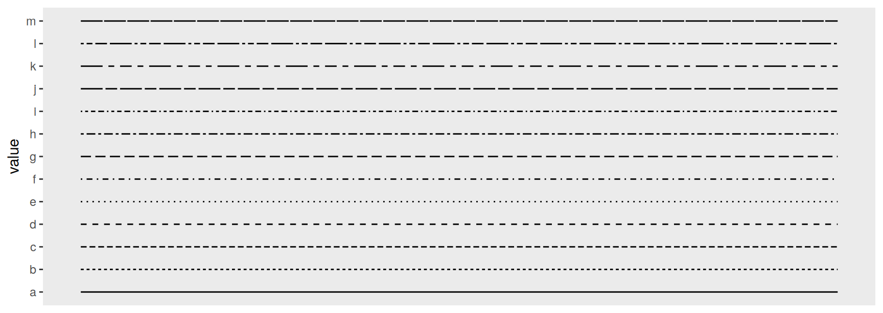
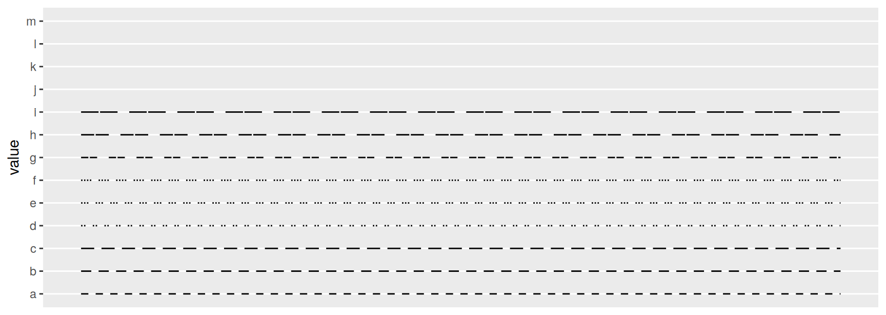
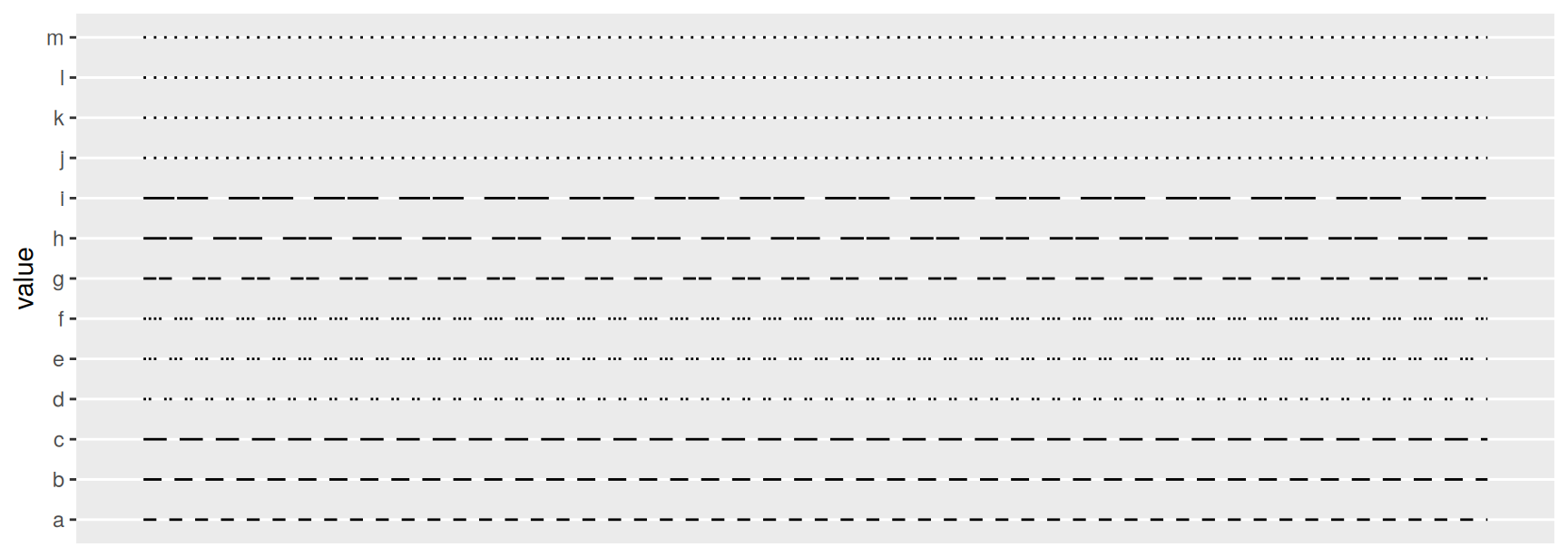
The default palette comes from scales::linetype_pal() and holds 13 patterns. This is what they look like.
A line type can be given as a string of up to eight hexadecimal digits. The digits are read in pairs from the left. The first is the length of a drawn segment, the second is the length of the gap after it, the third is the next drawn segment, and so on.
So "55" is a dash of 5 followed by a gap of 5, a plain dashed line. "1115" is a short dash, a short gap, a short dash, then a long gap. Digits run from 1 to F, so a single pattern can mix very short and very long pieces.
The short names you already know are shorthand for these strings. "blank", "solid", "dashed", "dotted", "dotdash", "longdash" and "twodash" are all accepted anywhere a hex string is.
To use your own patterns, write a palette function and hand it to discrete_scale().
The data has 13 levels and the palette only supplies 9, so the last four lines are missing. A palette that runs out returns NA, and the default rendering of an NA line type is nothing at all.
That silence is dangerous. A reader cannot tell a category that was drawn invisibly from a category that had no data. Set na.value so that the failure is visible.
Plot displ against hwy from mpg with shape = drv, then add colour = drv as well. Print both. Does the redundant encoding help, and would you keep it in a figure for a colour-blind reader?
Map class to shape in the same plot. Read the warning, then use scale_shape_manual() to give all seven classes a symbol. Say why ggplot2 refused to do this for you.
Draw a scatterplot of mpg using shape 21 with fill = factor(cyl) and colour = "grey20". Explain what each of the two aesthetics is painting.
Build a geom_pointrange() summary of Ozone by month from airquality. Set size and linewidth to three different combinations and say which combination reads best on a projector.
Take the economics_long plot and keep only psavert and uempmed with subset(). Draw them with linetype and again with colour. Which version would survive a black and white photocopy, and which is easier to read on screen?
Invent three hex dash patterns of your own and apply them with scale_linetype_manual() to the two-series plot from the previous question. Report which of your patterns is still legible where the line is steepest.
Manual scales
Writing the lookup table yourself
A manual scale is a scale whose palette you supply by hand. Every discrete aesthetic has one. scale_colour_manual(), scale_fill_manual(), scale_shape_manual(), scale_linetype_manual() and scale_size_manual() all work the same way.
The one argument that matters is values. Give it a named vector and the names are matched against the values of the variable. Give it an unnamed vector and the entries are handed out in the order of the factor levels.
Prefer the named form. Unnamed vectors silently change meaning the moment someone reorders a factor or drops a level.
vignette("ggplot2-specs") lists what counts as a legal value for each aesthetic.
Manufacturing a legend
Manual colour scales have a second use that has nothing to do with choosing colours. They are how you get a legend for something that is not a column in your data.
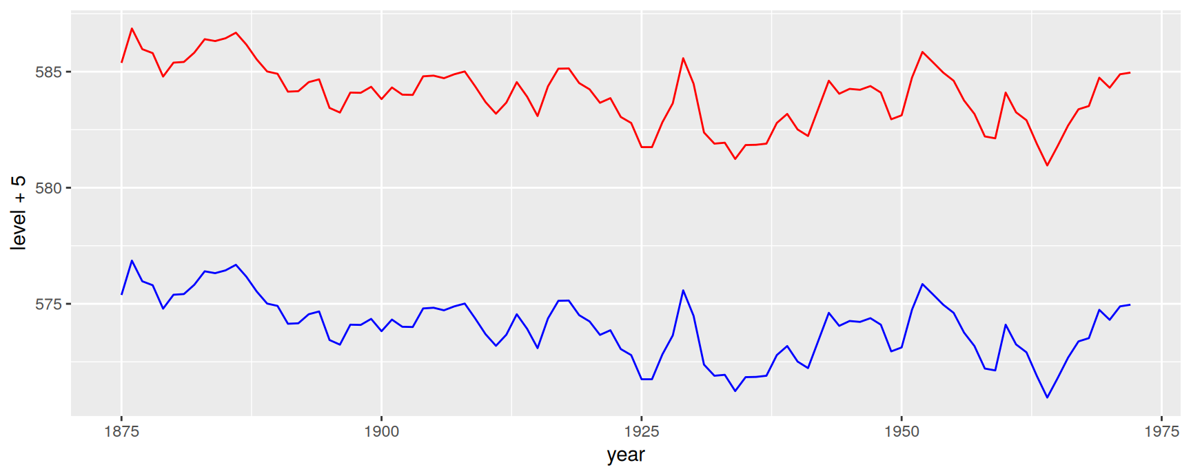
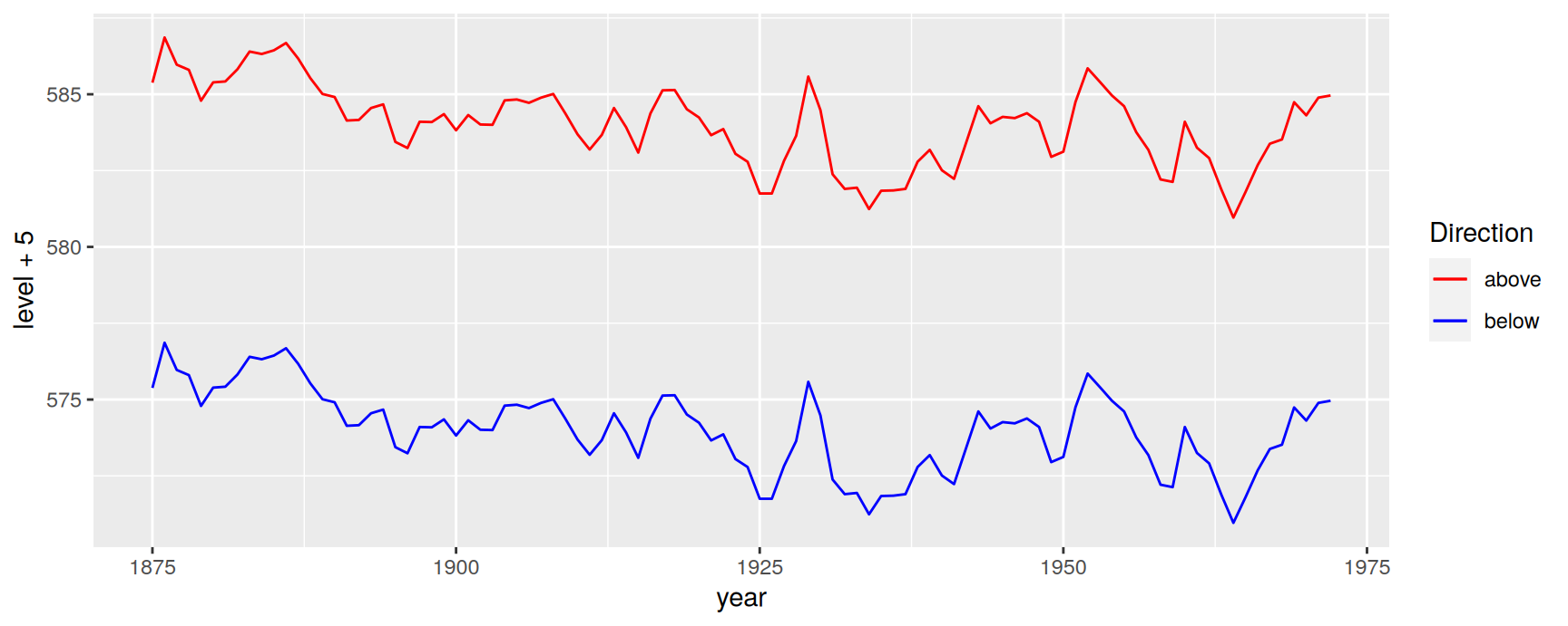
The situation comes up whenever two layers draw two different things from the same untidy data frame. Here are the Lake Huron water levels, offset up and down by five feet.
That is not a bug. colour = "red" sits outside aes(), so it is an instruction to the renderer, not a mapping. ggplot2 builds legends from scales, scales come from mappings, and there is no mapping here to build one from.
The fix is to turn the instruction back into a mapping.
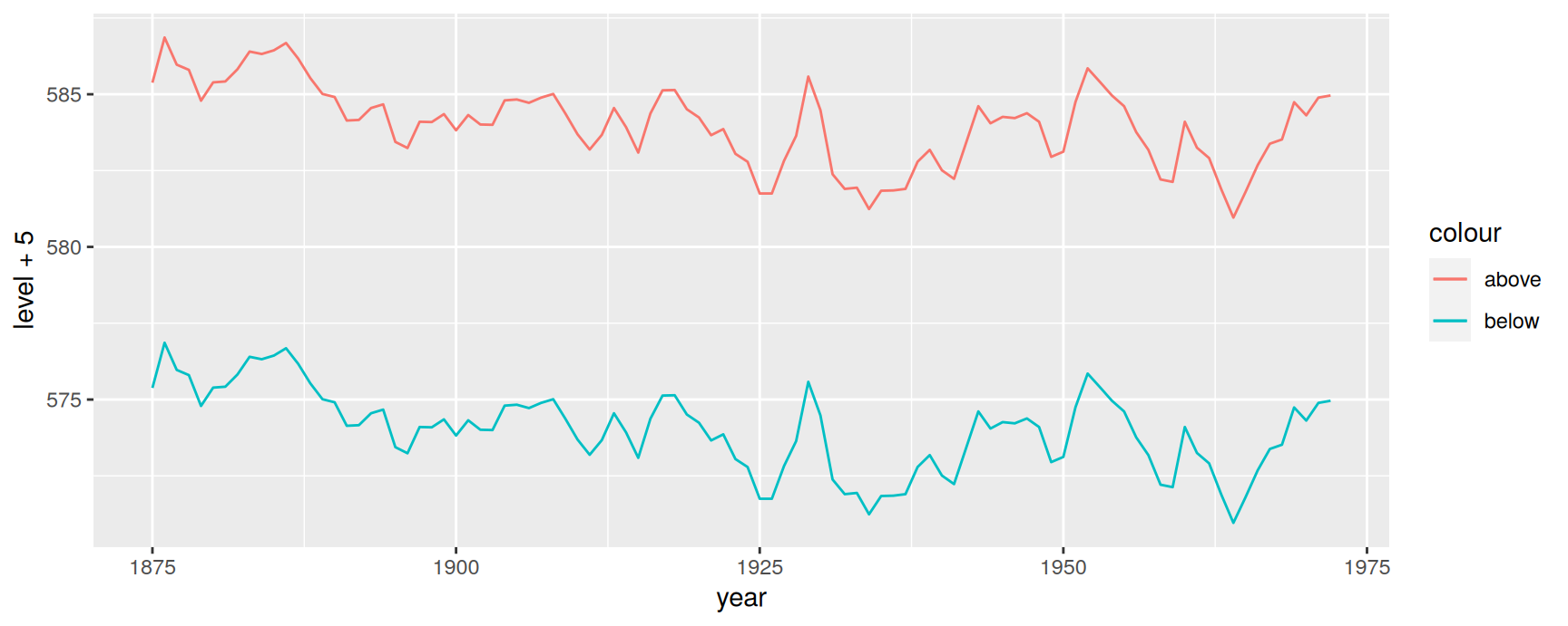
Move colour inside aes() and give it a string. ggplot2 treats that string as a one-level variable, creates a discrete colour scale for it, and the legend appears.
We now have a legend and the wrong colours. The scale picked the default discrete palette, because nobody told it what "above" and "below" should look like.
The pattern generalises. Map a label to the aesthetic inside aes(), then decode the labels with the matching manual scale. It works for linetype and shape in exactly the same way.
Two caveats. The labels are strings you invented, so a typo in one of them produces a silent extra legend entry rather than an error. And reshaping the data into long form and mapping a real column is still the better answer when the layers really are the same kind of thing. Use this trick when they are not, for example a fitted curve drawn over raw observations.
Identity scales
When no translation is needed
Every scale so far has been a translator. Data values go in, aesthetic values come out, and the legend documents the dictionary.
An identity scale is the case where the dictionary is empty because the data already speaks the target language. If a column literally contains "red" and "#1B9E77", or integers that are already shape codes, then the right thing to do is pass them through untouched.
scale_colour_identity(), scale_fill_identity(), scale_shape_identity(), scale_linetype_identity() and scale_size_identity() all do this. We used scale_shape_identity() earlier to draw the table of 26 symbols.
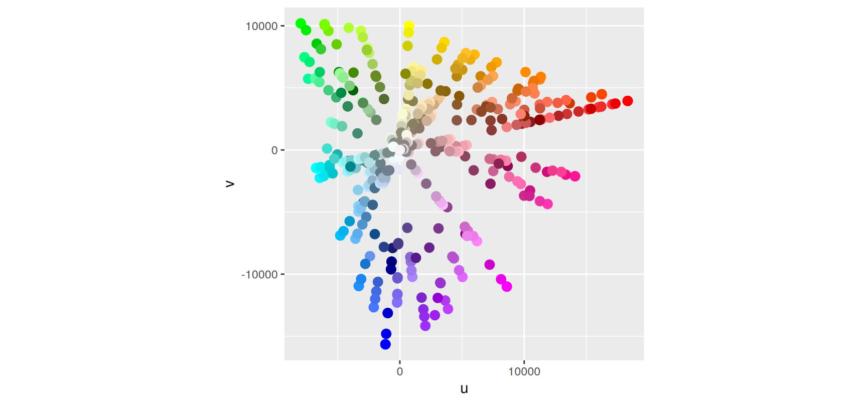
luv_colours ships with ggplot2. It gives the position of every named R colour in the Luv perceptual colour space, the space behind the HCL palettes of Chapter 11.
head(luv_colours)
         L             u         v           col
1 9341.570 -3.370649e-12    0.0000         white
2 9100.962 -4.749170e+02 -635.3502     aliceblue
3 8809.518  1.008865e+03 1668.0042  antiquewhite
4 8935.225  1.065698e+03 1674.5948 antiquewhite1
5 8452.499  1.014911e+03 1609.5923 antiquewhite2
6 7498.378  9.029892e+02 1401.7026 antiquewhite3
The col column holds the colour name itself, which is exactly the kind of column an identity scale is for.
No legend appears, and none is wanted. Each dot is drawn in the colour it stands for, so the plot is its own key.
coord_equal() is doing quiet work here. u and v are two directions in the same perceptual space, and distances in that space are only comparable if one unit of u takes the same amount of screen as one unit of v.
When to reach for one
Two cases justify an identity scale.
The first is data that arrived pre-scaled. Output from another tool, or a palette agreed on elsewhere, may already carry its own colour column. Re-mapping it would throw that work away.
The second is a colour you computed yourself, from a clustering or a rule that ggplot2 has no way to express. The identity scale is how you tell it to stop being helpful.
Outside those cases, map the variable properly. A real mapping gives you a legend, a documented palette and a plot that still makes sense when the data changes underneath it.
Exercises
Draw the Lake Huron plot with linetype mapped to "above" and "below" instead of colour, decoded through scale_linetype_manual(). Which of the two versions makes the gap between the series easier to judge, and why?
Add labels = c("above" = "five feet up", "below" = "five feet down") to the manual colour scale. What did the plot gain, and which argument would you use if you also wanted the two keys in the other order?
Give scale_colour_manual() a values vector containing only "above". Read the error and say what a named vector protects you from.
Build a column on mpg holding "firebrick" for four wheel drive cars and "grey60" for everything else, then plot displ against hwy using it with scale_colour_identity(). What have you given up compared with mapping drv to colour?
Repeat the previous question but add guide = "legend" to the identity scale. Describe what the legend now says, and explain why it needs labels to be useful.
Take luv_colours, keep only the rows whose col contains "blue" with grepl(), and draw them over the full plot as shape 21 points with fill = col and a black border. Which identity scale did you need, and which colour did the border need to be set rather than mapped?
Recap
Size, shape, line width and line type are secondary aesthetics. Put the variable the reader must actually measure on an axis.
scale_size() is linear in area, scale_radius() is linear in radius, and scale_linewidth() is linear in width. Pick the one that matches what the number means.
Shape and line type carry about six and about three categories respectively. Past that, ggplot2 either warns or produces something no one can read.
linewidth replaced size for lines in version 3.4.0. Write linewidth in new code.
Manual scales take a named values vector. Mapping a label string inside aes() and decoding it with a manual scale is the standard way to get a legend for a fixed aesthetic.
Identity scales pass values straight through. They are right when the column already holds valid aesthetic values, and wrong whenever a legend would have helped.
Acknowledgement
Source. These slides follow the structure and the teaching sequence of ggplot2: Elegant Graphics for Data Analysis (3e) by Hadley Wickham, Danielle Navarro and Thomas Lin Pedersen. The explanations, examples and exercises here have been rewritten for this course; any errors in them are mine and not the book’s.
Copyright. All rights in the original work are reserved by its authors and publishers. Students are encouraged to read the book itself, which is freely available online.
Non-commercial use only. These materials are for teaching and must not be used for commercial gain.
Attribution. Any reuse or redistribution must credit both the original book and this course.