Earlier chapters kept promising that the rules behind ggplot2 would be explained later. This is later.
Up to now you have added layers by calling geom_point() or geom_histogram() and trusting them. That works, and it stops working the moment you want something the shortcut does not offer. This chapter opens a layer up so that you can build one yourself.
The other payoff is iteration. A plot is not one drawing. It is a stack of layers, each with its own data and its own mapping, and you can keep adding to the stack until the picture says what you mean.
Every layer is made of five parts:
Data — the data frame this layer reads.
Aesthetic mappings — which variable in that data frame drives which visual property.
Geom — the shape that gets drawn for each row.
Stat — the transformation applied to the data before anything is drawn.
Position adjustment — how overlapping shapes are moved apart.
Every geom_ function you have used so far fills in all five. Most of the time it fills in four of them with sensible defaults and lets you supply the fifth. The rest of this chapter takes them one at a time.
Building a plot
Two steps, not one
ggplot() and geom_point() look like one idiom, but they do separate jobs.
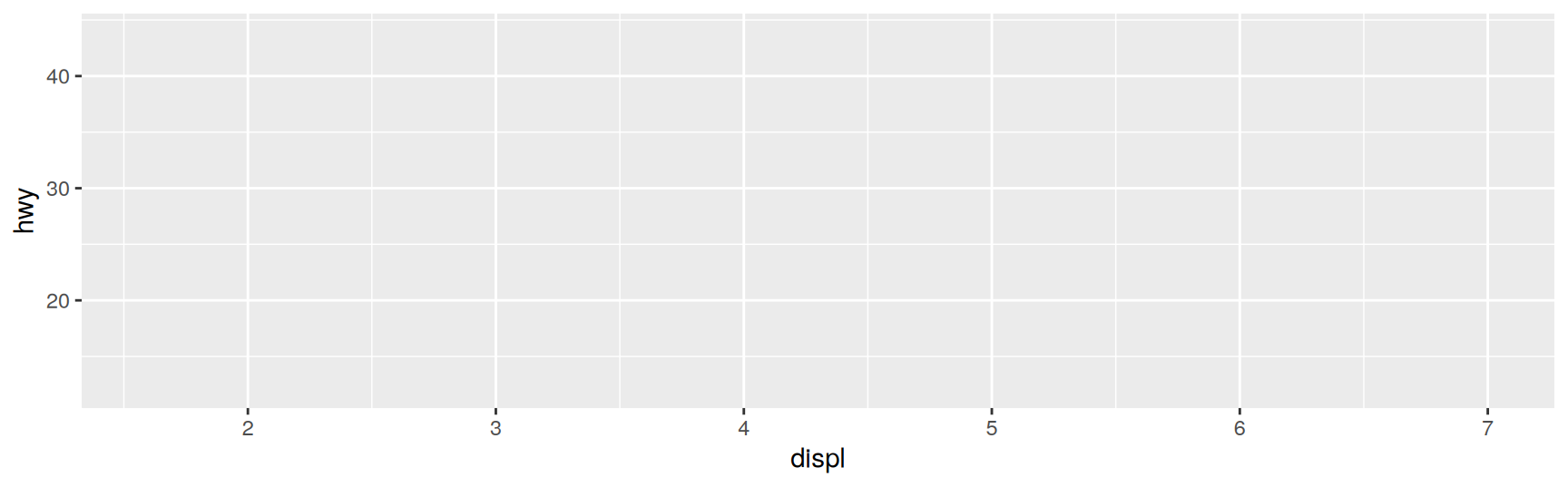
ggplot() creates a plot object holding a default data set and a default mapping. It draws nothing, because nothing has said what shape to use.
base_plot <-ggplot(mpg, aes(displ, hwy))base_plot
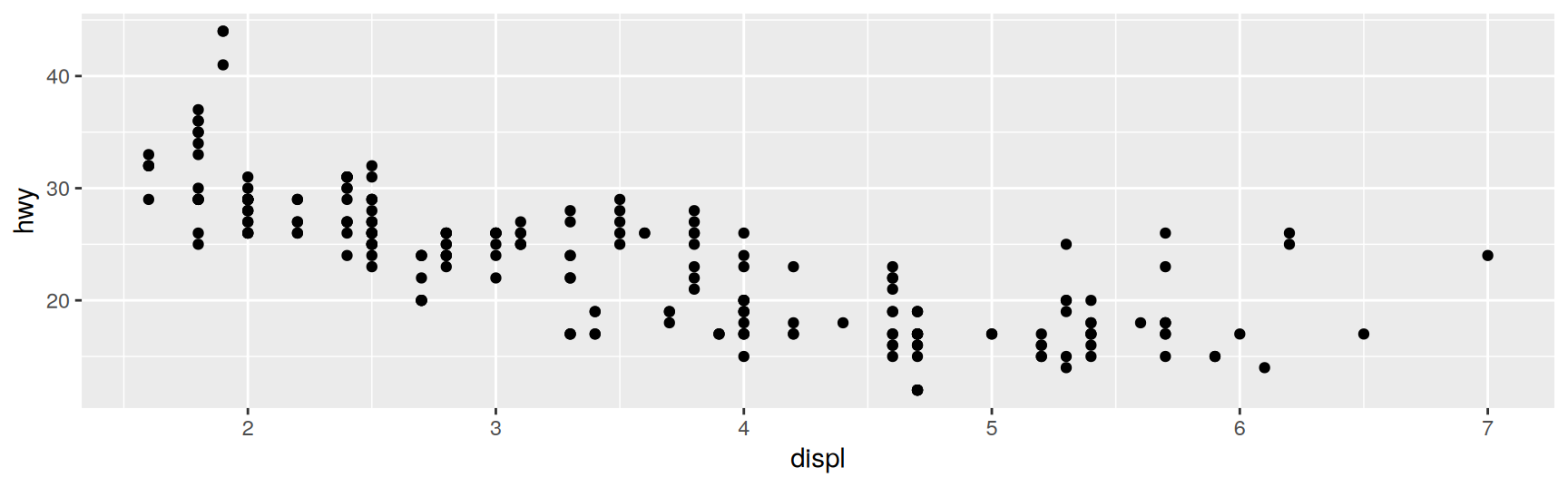
Adding a layer is what makes something appear.
base_plot +geom_point()
The axes were already decided by ggplot(). All geom_point() contributed was the decision to draw one dot per row.
geom_point() is a shortcut
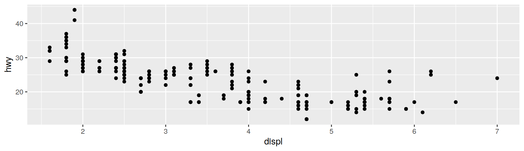
Underneath, it calls layer() and fills in all five components. Writing the call out in full produces exactly the same picture.
base_plot +layer(mapping =NULL, data =NULL,geom ="point", stat ="identity", position ="identity")
mapping = NULL and data = NULL mean inherit from the plot. stat = "identity" means leave the data alone. position = "identity" means draw each row where it lands.
You will almost never type layer(). It is too verbose, and the geom_ functions exist precisely so that you do not have to. But the shortcut hides five decisions, and knowing which five is what lets you reason about a plot instead of guessing at it.
From here on, read geom_point(mapping, data, ...) as layer(mapping, data, geom = "point", ...).
Data
Each layer carries its own data
A layer needs data, and that data must be a tidy data frame. Variables in columns, observations in rows, nothing else.
That restriction is not laziness. It forces the data to be an object you can inspect, save and hand to someone else, and it keeps the work of preparing data separate from the work of drawing it. A plotting function that accepted loose vectors would let you draw a picture that nothing on disk can reproduce.
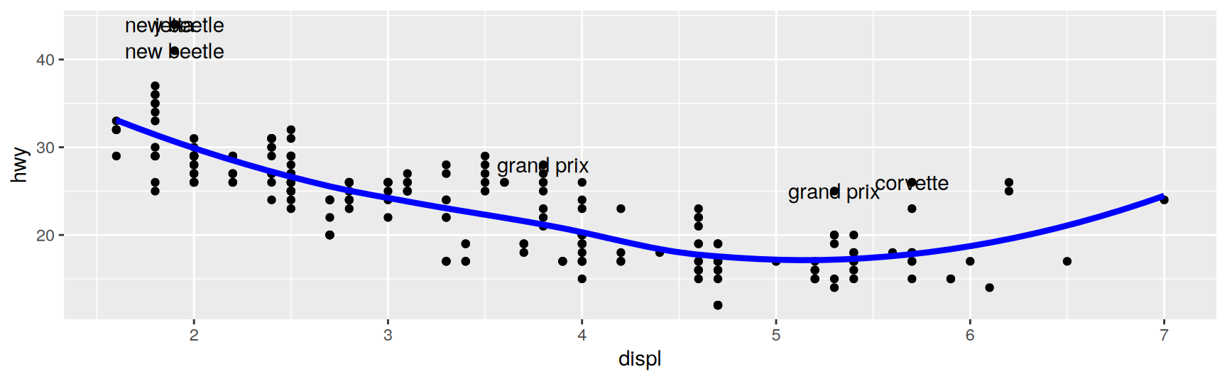
The useful consequence is that layers do not have to share. Each one can read a different data frame, which is how you put a model, a summary and the raw observations into one picture.
To show that, we build two small data sets out of mpg. First a smooth fit evaluated on a regular grid.
mod <-loess(hwy ~ displ, data = mpg)grid <-tibble(displ =seq(min(mpg$displ), max(mpg$displ), length =50))grid$hwy <-predict(mod, newdata = grid)head(grid, 3)
Then the cars the fit gets badly wrong. Dividing each residual by the residual scale puts them on a common ruler, so “more than two” means the same thing everywhere.
# A tibble: 6 × 3
  model      displ   hwy
  <chr>      <dbl> <int>
1 corvette     5.7    26
2 grand prix   3.8    28
3 grand prix   5.3    25
4 jetta        1.9    44
5 new beetle   1.9    44
6 new beetle   1.9    41
Read the layers in order. The points come from mpg, the blue curve from grid, the labels from outlier. All three inherit aes(displ, hwy) from the plot, which is why they line up. Only geom_text() adds a mapping of its own.
Notice the data =. It is required in a layer and optional in ggplot(), because the argument orders differ.
ggplot(data, mapping)
geom_point(mapping, data)
The asymmetry is deliberate. The thing you name most often comes first in each case, and a positional second argument to a layer would silently be read as data.
No default data at all
If no single data set is the main one, leave ggplot() empty and give every layer its own.
This is honest when the three sources are equals. It is worse when one of them is clearly the subject of the plot, because a reader then has to check all three layers to find out what the plot is about.
Exercises
Fit loess(cty ~ displ, data = mpg), build a grid of 30 displacement values, and overlay the prediction as a line on a scatterplot of the raw data. Where along the x axis do you trust the curve least, and what in the data tells you that?
Using the standardised residuals from that fit, pull out the four worst fitted cars and label them with geom_text(). Which class do they belong to, and does that suggest the model is missing a variable?
Summarise mpg with group_by(class) and summarise(n = n(), hwy = mean(hwy)). Draw the per class means as points, and write one sentence about which class the mean is least trustworthy for.
Take the three layer plot above and rewrite it with no data in ggplot(). Both versions render the same picture. Say which one you would put in a shared script, and why.
Give geom_line() a data frame that has displ but not hwy. Predict the error message before you run it, then say which of the five layer components the message is really complaining about.
Drop the data = from geom_line(data = grid) and pass grid positionally instead. Explain what ggplot2 does with it.
Aesthetic mappings
What aes() is for
aes() pairs a visual property with a variable.
aes(x = displ, y = hwy, colour = class)
The first two arguments default to x and y, so aes(displ, hwy, colour = class) says the same thing. Two habits are worth forming early.
Keep the arithmetic inside aes() trivial. aes(log(carat), log(price)) is fine. Anything longer belongs in a mutate() call, where you can look at the result.
Never write diamonds$carat inside aes(). The mapping is supposed to name a column, and $ pulls out a detached vector instead. When a facet or a stat reorders the rows, that vector no longer lines up with them.
Plot mappings and layer mappings
A mapping can go in ggplot(), in a layer, or partly in each. These four calls build the same specification.
A layer’s aes() does not replace the plot’s. It is merged into it, and it can do three things.
Operation
Layer aesthetics
Result
Add
aes(colour = cyl)
aes(displ, hwy, colour = cyl)
Override
aes(y = cty)
aes(displ, cty)
Remove
aes(y = NULL)
aes(displ)
With one layer the choice is cosmetic. With two layers it changes the plot, because a plot level mapping reaches every layer and a layer level one does not.
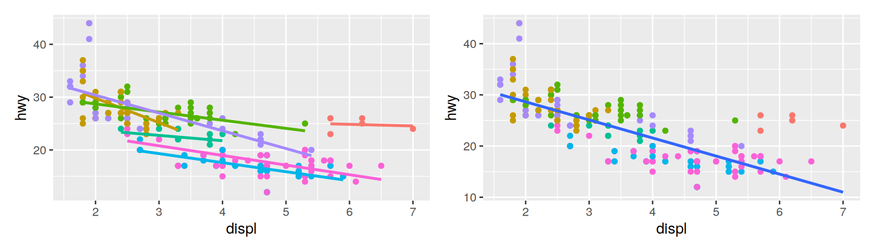
On the left, colour = class reaches the smoother too, so the data are split into seven groups and seven lines are fitted. On the right the smoother never sees class, so it fits one line to all 234 cars.
Both are correct. They answer different questions. The left asks whether the displacement penalty differs by class. The right asks how far each class sits from the overall trend.
Neither is a default you should accept without noticing. Whenever a plot has a statistical layer, check which mappings that layer can see.
Setting versus mapping
You can hand an aesthetic a variable or a constant, and the two go in different places.
Put it insideaes() when appearance should follow the data. Put it outside, as an ordinary layer argument, when you just want everything to look a certain way.
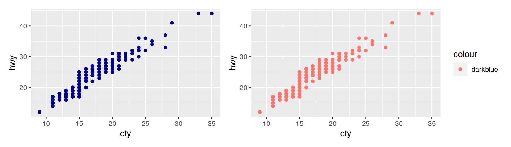
The left panel is what you asked for. The right one is not.
Inside aes(), "darkblue" is not a colour. It is data, a column whose every value is the string "darkblue". The discrete colour scale does its job, assigns that single level the first colour in its palette, and produces a legend for a variable that carries no information. The salmon pink is the scale’s answer, not yours.
Remember it as a rule about types. Inside aes() goes a column name. Outside aes() goes a value.
Mapping a value on purpose
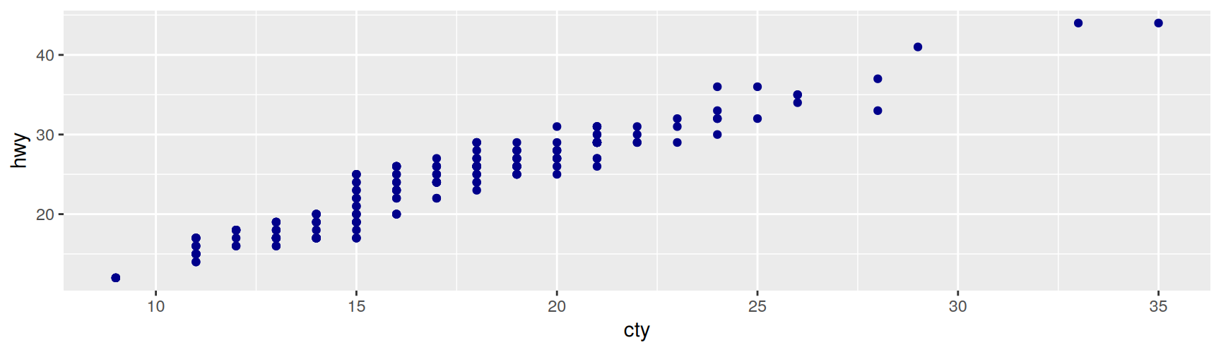
There is a third option. Map the string and then tell the scale to take it literally.
scale_colour_identity() skips the palette and uses the data values as colours. It is the right tool when a column already holds colour names, and an odd way to write colour = "darkblue".
Naming layers
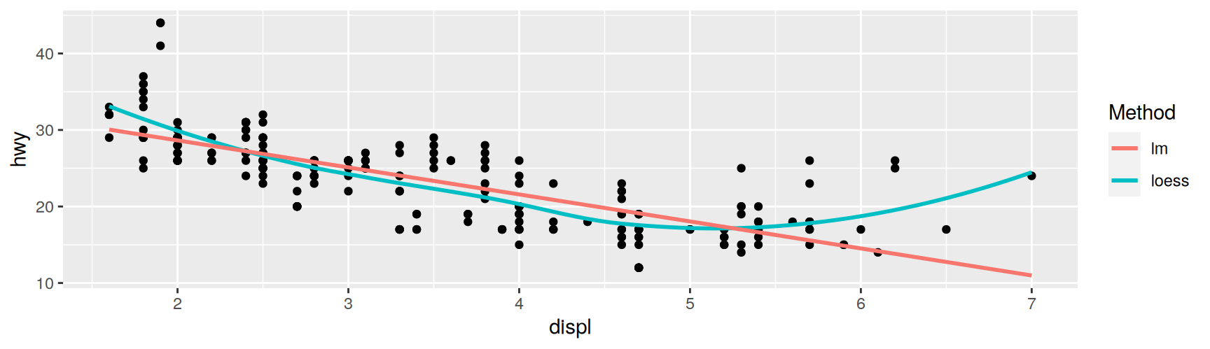
Mapping to a constant becomes genuinely useful with several layers. Give each one a name and the legend turns into a key for the layers themselves.
ggplot(mpg, aes(displ, hwy)) +geom_point() +geom_smooth(aes(colour ="loess"), method ="loess", se =FALSE) +geom_smooth(aes(colour ="lm"), method ="lm", se =FALSE) +labs(colour ="Method")
Two one level variables become one two level scale, and the reader gets told which curve is which without a caption.
Exercises
Simplify each of these without changing the result. Say what was redundant.
Draw hwy against displ with geom_point() and geom_smooth(method = "lm"), putting colour = drv first in ggplot() and then in geom_point(). Count the fitted lines in each and explain the difference in one sentence.
Start from ggplot(mpg, aes(displ, hwy)) and add geom_bar(aes(y = NULL)). What does the removal buy you, and why would the bar layer fail without it?
geom_point(size = cty) and geom_point(aes(size = cty)) behave very differently. Run both, read the error from the first, and state the rule it is enforcing.
Add a column shade to mpg holding "firebrick" for four wheel drive cars and "grey40" for the rest. Draw the scatterplot with and without scale_colour_identity() and describe both legends.
Map class to x in one layer and displ to x in another, then swap which layer comes first. What does ggplot2 do, and does the order matter?
Geoms
Geoms do the drawing
The geom is the part of the layer that decides what a plot is. Points make a scatterplot, lines make a line plot, and nothing else in the layer has to change.
ggplot2 ships with a large vocabulary of them. The useful way to organise it is by how many variables the geom shows at once.
Three variables.geom_contour(), geom_tile(), geom_raster().
Each geom understands a set of aesthetics, and some of them are required. A point needs x and y, and accepts colour, size, shape and alpha. An error bar needs ymin and ymax as well. The help page for a geom lists both sets, and that list is the fastest way to find out why a layer refuses to draw.
Some geoms are the same picture with a different steering wheel. A rectangle can be specified three ways.
Geom
You supply
geom_tile()
a centre (x, y) plus a width and height
geom_rect()
the four edges (xmin, xmax, ymin, ymax)
geom_polygon()
four rows of corner coordinates
Pick whichever matches the columns you already have. Reshaping data to suit a geom when another geom fits it as it stands is wasted work.
Exercises
Open the help for geom_segment(), geom_ribbon() and geom_rect(). Write down the required aesthetics of each, then say what the three have in common that geom_point() does not.
Draw the rectangle from x = 2 to x = 5 and y = 10 to y = 30 twice, once with geom_tile() and once with geom_rect(). Which call was shorter, and would that still be true if you had one row per rectangle with centre coordinates?
Suggest a geom for each job and give a reason, not just a name. Track one variable through time. Show the full shape of one distribution. Show the trend in 50,000 points. Mark a handful of named observations.
mpg has 234 rows and drv crossed with trans has few cells. Draw that pair with geom_point(), then with geom_count(). What does the second one show that the first destroys?
Take geom_boxplot() off a plot of hwy by class and put geom_violin() in its place, changing nothing else. Explain why that substitution needs no other edit, in terms of the five components of a layer.
Find a geom in the catalogue above that you have never used. Read its help page and draw one plot with it on mpg or diamonds. Say in one sentence when you would reach for it again.
Stats
Stats transform before drawing
A stat takes the layer’s data frame and returns a different data frame, usually a smaller one. It runs before the geom, so what the geom draws is often not what you passed in.
You have been using stats all along. A histogram has no bars in its data, and a boxplot has no median.
Stat
Geoms built on it
stat_bin()
geom_bar(), geom_freqpoly(), geom_histogram()
stat_bin2d(), stat_binhex()
geom_bin2d(), geom_hex()
stat_boxplot()
geom_boxplot()
stat_contour()
geom_contour()
stat_smooth()
geom_smooth()
stat_sum()
geom_count()
Some stats have no geom_ wrapper, because there is no obvious default shape for them. stat_ecdf(), stat_function(), stat_summary(), stat_qq() and stat_unique() are the ones you are most likely to want.
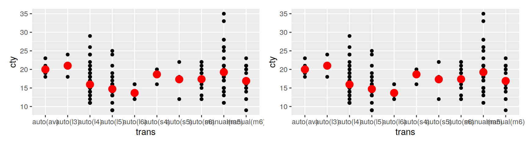
You can build such a layer from either end. Add a stat_ and override its geom, or add a geom_ and override its stat.
The two are identical. The second spelling is better, because it puts the shape first and the transformation second, which is the order a reader thinks in.
It also keeps an important fact visible. The red dots are not observations. Any layer whose stat is not "identity" is showing you a calculation, and that deserves to be stated in the code rather than discovered from the picture.
Generated variables
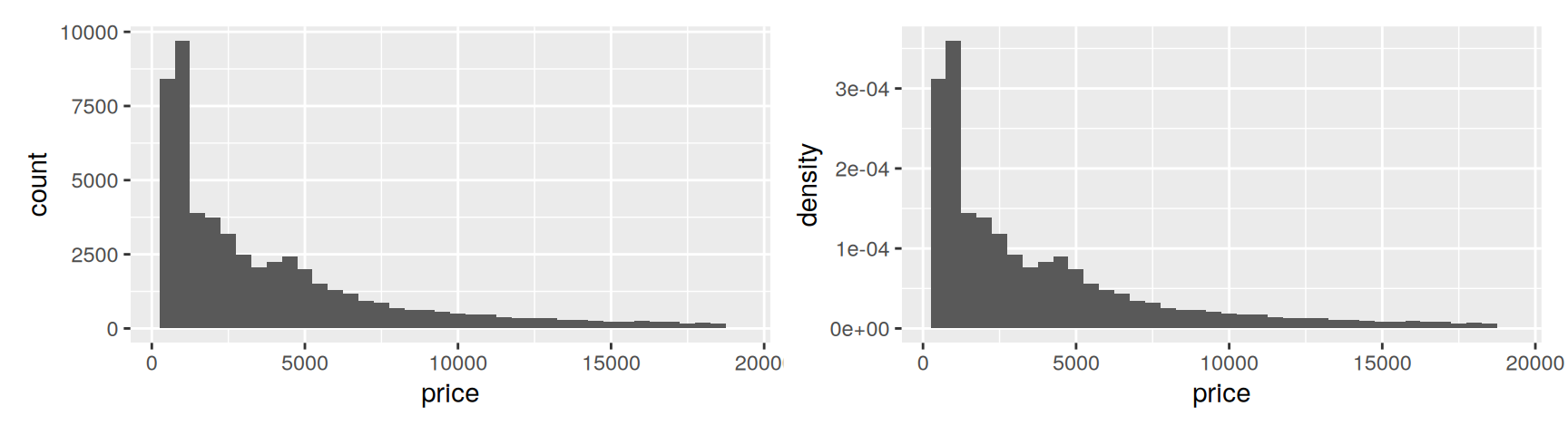
A stat usually adds columns that were not in your data. stat_bin() returns count, density and x, one row per bin, and you can map any of them.
after_stat() is not decoration. It tells ggplot2 to look the name up after the stat has run rather than before, which matters when your own data happens to have a column called count. It also tells the next reader that the variable was computed, not measured.
The two histograms above have the same shape, because rescaling by a constant cannot change one distribution. The point of density is comparing distributions of very different sizes.
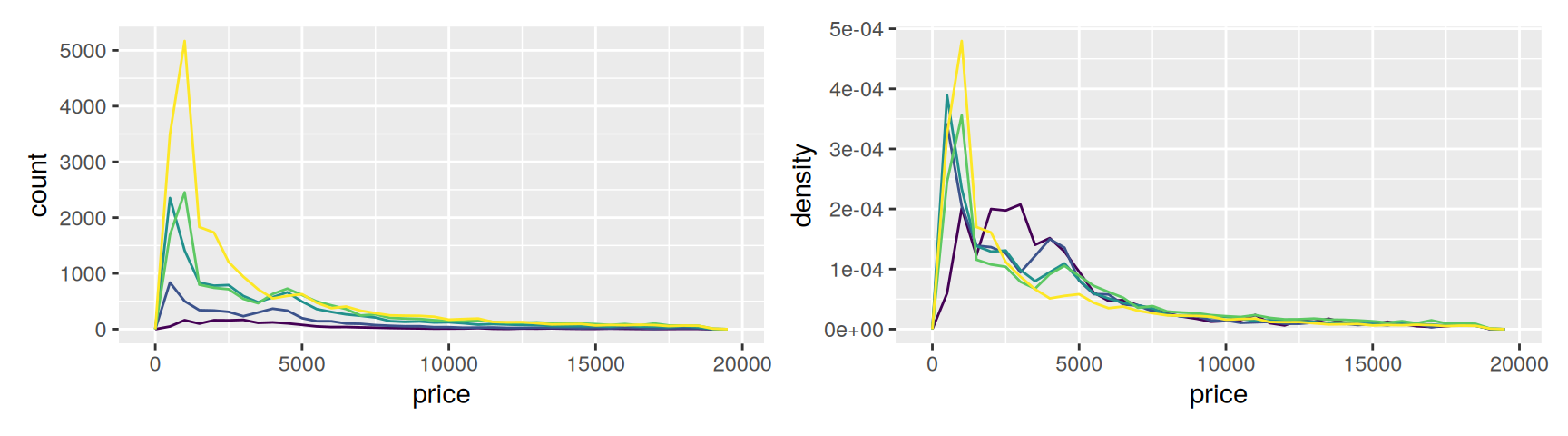
diamonds has 21,551 ideal cut stones and 1,610 fair ones. A count based frequency polygon is therefore about group size, not about price.
The left panel says almost nothing except that some cuts are common. The right panel puts every group on the same footing, and an unpleasant result appears. Fair diamonds, the worst cut grade, sit at higher prices than ideal ones.
That is not a pricing error. Cut is confounded with size, and large stones are usually cut to preserve weight rather than to maximise brilliance. Chapter 14 shows how to condition on carat and recover the effect you expected.
Note what did the work here. Neither the data nor the geom changed. One generated variable was swapped for another.
Exercises
Replace the mean in the trans plot with a median, and add the first and third quartiles using fun.min and fun.max with geom = "pointrange". Which transmission has the widest spread?
Draw geom_bar() of class with aes(y = after_stat(prop), group = 1). Read the y axis and explain what group = 1 had to be there for.
Compare carat across levels of cut with geom_freqpoly(), once on counts and once on after_stat(density). Does the second panel support the explanation of the price result given above?
Use stat_ecdf() on hwy with colour = drv. State one thing the empirical cumulative distribution shows more clearly than a frequency polygon does.
Build a loess fit of hwy on displ that returns standard errors, then reproduce the default geom_smooth() display from it with geom_ribbon() and geom_line(). What did geom_smooth() do for you that you had to do by hand?
Read ?stat_sum, then use geom_count() to show what proportion of cars falls into each combination of drv and trans. Which generated variable did you map, and why not count?
Position adjustments
Moving things out of each other’s way
The last component fixes collisions. Once a stat has decided where things go, several of them may want the same spot, and the position adjustment decides who moves.
Three of them are mostly for bars.
position_stack() piles overlapping bars up. This is already the default for geom_bar() with a fill mapping.
position_fill() stacks and then stretches every bar to height 1.
position_dodge() puts them side by side instead.
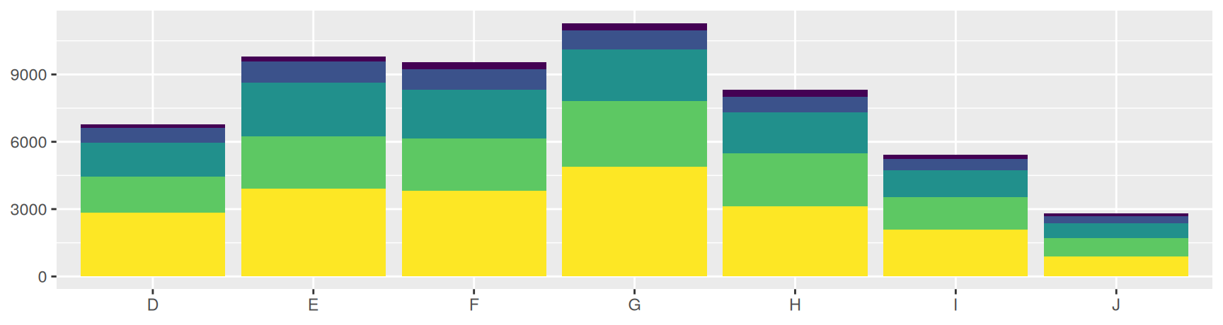
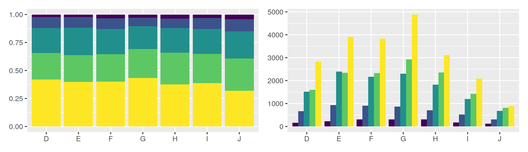
dplot <-ggplot(diamonds, aes(color, fill = cut)) +labs(x =NULL, y =NULL) +theme(legend.position ="none")dplot +geom_bar()
Each answers a different question. Stacking shows how many diamonds there are of each colour, and buries the cut proportions inside bars of unequal height. Filling shows the cut composition within each colour, and throws away how many diamonds that colour has. Dodging keeps both readable but spends a lot of width.
Choose by what you want compared. Totals, shares, or individual groups against each other.
Doing nothing
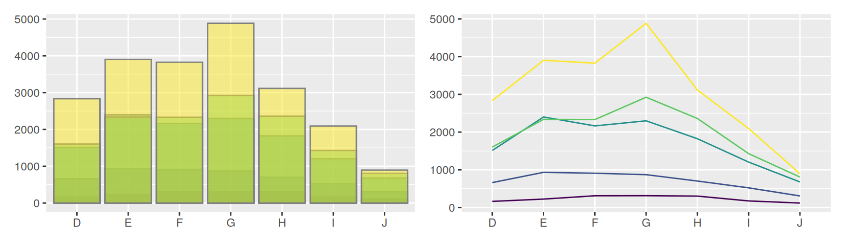
position_identity() leaves everything where it fell. For bars that is close to useless, since each one hides the ones behind it, and even a transparent fill only half rescues it.
The right panel is the honest version of the same comparison. Lines do not occlude each other, so identity costs nothing, and the counts can be read group by group.
That is the general rule. A position adjustment is only needed for geoms that take up area. Swap in a geom that does not, and the problem disappears instead of being managed.
Adjustments for points
position_nudge() shifts everything by a fixed amount. Useful for pushing text labels off the points they describe.
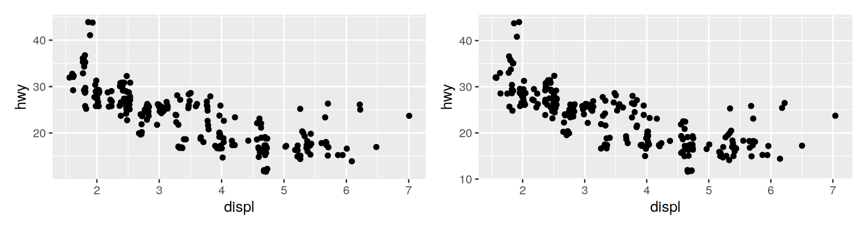
position_jitter() adds a little random noise to every position.
position_jitterdodge() dodges by group first, then jitters inside each group.
Positions take their arguments differently from geoms and stats. You cannot pass them through the ..., so you construct the position object yourself.
geom_jitter(width = 0.05, height = 0.5) is the short way to write the second one.
Pick the amounts deliberately. displ is recorded to one decimal place and hwy to whole numbers, so a width of 0.05 and a height of 0.5 move each point by less than the resolution of its own measurement. Noise that large would invent structure. Noise that small only separates ties.
Jittering earns its keep on discrete or heavily rounded data, where exact overlaps are common. On genuinely continuous data there is usually nothing to separate.
Exercises
Label the five most efficient cars in mpg with geom_text(), then add position_nudge(y = 1). Read ?position_nudge and say why nudging beats changing the y mapping.
Draw clarity filled by cut three times, with stack, fill and dodge. For each one, write the single question it answers best.
Try position = "stack" on a boxplot of hwy by class. Explain what a geom must provide before stacking is even meaningful, and what it must provide to be dodgeable.
Plot hwy against class with colour = drv, first with geom_jitter() and then with position_jitterdodge(). Which one lets you compare drivetrains within a class, and what did it cost?
Show the drv by class combinations with geom_jitter() and again with geom_count(). Name one thing each technique tells you that the other cannot.
Build a stacked area plot of unemploy in economics and compare it with a plain line. When is stacking areas a good idea, and what does it do to your ability to read any series except the bottom one?
Recap
A layer is data, a mapping, a geom, a stat and a position. geom_ functions fill in all five, and knowing which five is how you take control.
Layers do not share data. Raw observations, a fitted curve and a set of labels can come from three different data frames.
A mapping in ggplot() reaches every layer. A mapping in a layer stays there. With a smoother in the plot, that choice changes the model being fitted.
Inside aes() goes a column name. Outside aes() goes a value. Mapping a constant on purpose is how you name layers in a legend.
Anything a stat computes is available through after_stat(). Swapping count for density can change the whole conclusion of a plot.
Position adjustments decide who moves when shapes collide. Stack for totals, fill for shares, dodge for group comparisons, jitter for ties.
Acknowledgement
Source. These slides follow the structure and the teaching sequence of ggplot2: Elegant Graphics for Data Analysis (3e) by Hadley Wickham, Danielle Navarro and Thomas Lin Pedersen. The explanations, examples and exercises here have been rewritten for this course; any errors in them are mine and not the book’s.
Copyright. All rights in the original work are reserved by its authors and publishers. Students are encouraged to read the book itself, which is freely available online.
Non-commercial use only. These materials are for teaching and must not be used for commercial gain.
Attribution. Any reuse or redistribution must credit both the original book and this course.