Chapters 10 to 12 were a toolbox. You learned which function to reach for when an axis needed a log transform, when a legend needed better labels, when a colour palette was wrong for the data.
This chapter is the theory underneath that toolbox. It answers a different question. Not “which function do I call”, but “why do all of those functions look alike”.
The payoff is transferable knowledge. Once you see that breaks means the same thing on an axis and in a legend, you stop learning arguments one aesthetic at a time.
By the end of the chapter you should be able to:
state what a scale is and what a guide is, in terms of a function and its inverse;
predict which scales ggplot2 adds to a plot when you add none yourself;
read a scale function’s name and say what it does before looking it up;
set name, breaks and limits on any scale, and say what each one controls;
choose how out-of-bounds values are handled;
explain why two aesthetics sometimes share one legend and sometimes do not;
change the guide a scale uses, and change the symbol drawn in a legend key.
A note on the source
The book chapter these slides follow is marked by its authors as a work in progress. Two of its sections are little more than headings.
These slides fill those gaps rather than skip them. Where the book points forward to a section it has not written, we show a worked example instead.
Theory of Scales and Guides
What a scale is
A scale is a function. Its domain is a region of data space, which is where your variables live. Its range is a region of aesthetic space, which is where pixels, colours and sizes live.
Mapping displ to x means a scale converts 1.6 litres into a horizontal position. Mapping class to colour means a scale converts "suv" into an RGB triple.
A guide runs that function backwards. It is the part of the plot that lets a reader take a visual property and recover the data value behind it.
There are only two kinds of guide, and you already use both. An axis is a guide. A legend is a guide.
That is the claim worth pausing on. Axes and legends look nothing alike, but they are the same object doing the same job for different aesthetics.
The arguments line up one for one.
Scale argument
On an axis
In a legend
name
The axis label
The legend title
breaks
Tick marks and grid lines
The keys
labels
Tick labels
The text beside each key
Why legends are harder
If the two are the same thing, why does ggplot2 give legends so many more options? Three reasons.
A legend can carry several aesthetics at once, drawn from several layers. The symbol in each key has to be chosen to match whatever geom produced it.
An axis has one place to go. A legend can sit on any side of the plot, or inside it, so the layout has to be decided rather than assumed.
Legends have their own internal layout. Direction, number of columns, key size and text placement all need controls that an axis simply does not need.
None of that changes the theory. It only means the legend code has more to do.
Scale specification
Every aesthetic in a plot gets exactly one scale. If you do not supply one, ggplot2 supplies it for you before drawing.
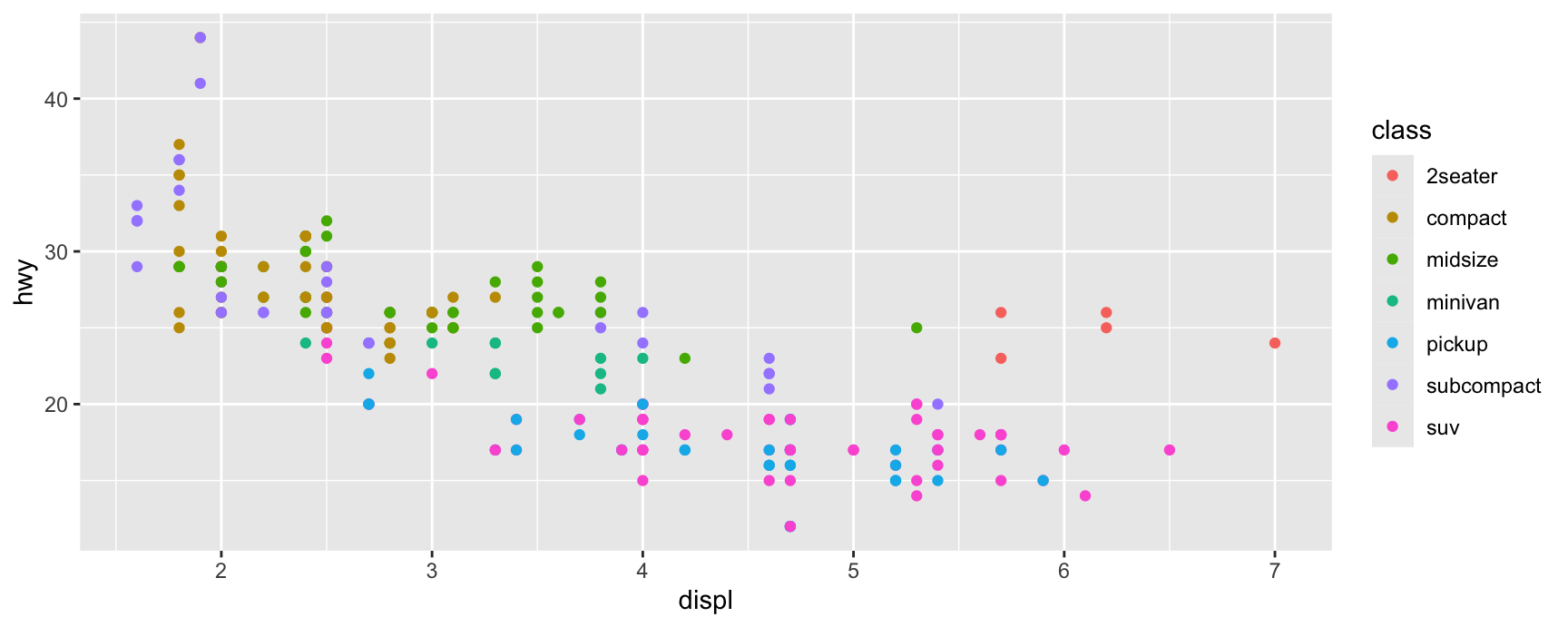
The plot below names its scales explicitly. Writing only the first two lines produces the identical picture.
The choice of default is made from two facts. Which aesthetic is being mapped, and what type the variable is.
hwy is numeric and mapped to y, so the default is scale_y_continuous(). class is a character vector mapped to colour, so the default is scale_colour_discrete().
This is why you can draw useful plots for a whole chapter without ever writing the word scale. The defaults were there the entire time.
Adding a scale replaces, it does not accumulate
Layers stack. Scales do not. A second scale for the same aesthetic throws the first one away, and the last one written is the one you get.
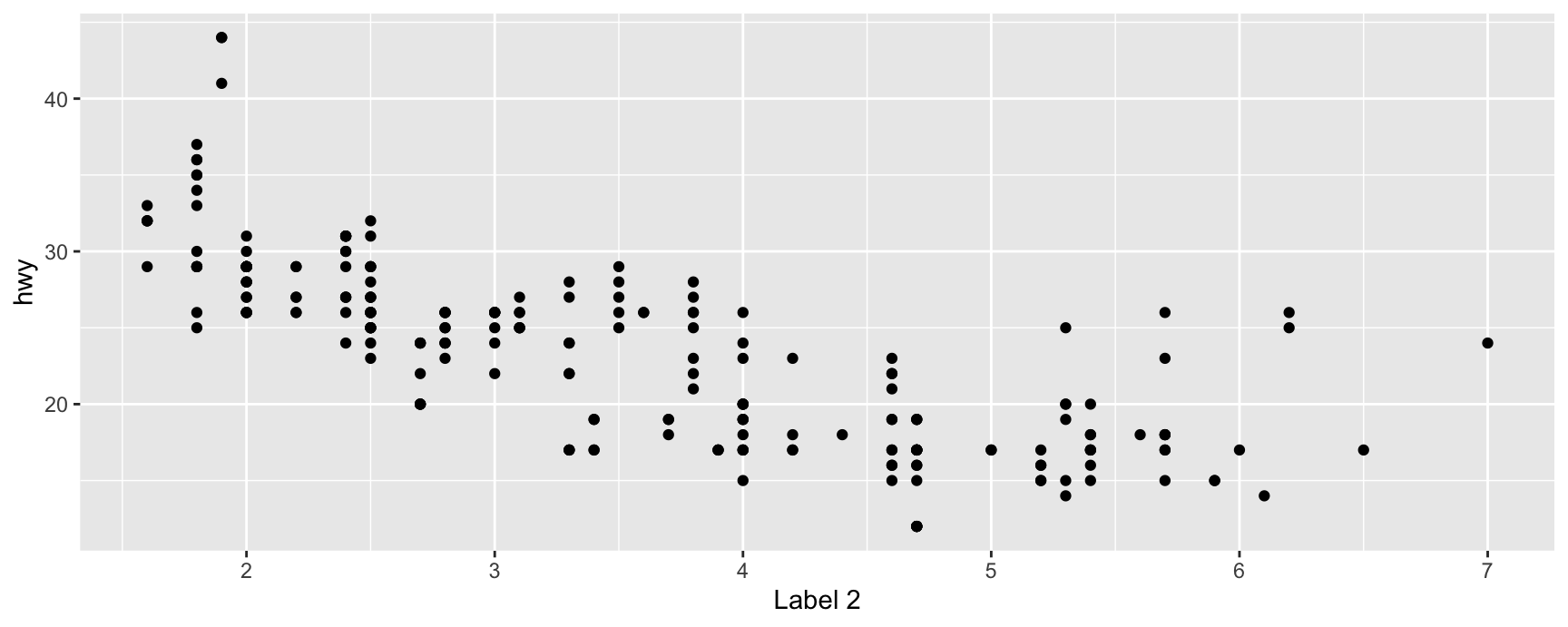
Scale for x is already present.
Adding another scale for x, which will replace the existing scale.
Notice the message. ggplot2 tells you when you add two scales for one aesthetic, because that is almost always a mistake in your code.
It stays silent when you replace a default, because that is the normal way to work. Nobody wants a message every time they set an axis label.
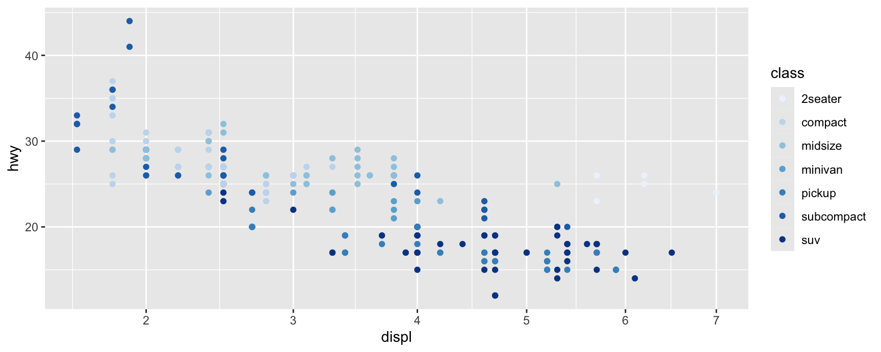
Replacing the default is how you change a scale’s type, not just its settings. Here the x scale becomes a square root scale and the colour scale becomes a ColorBrewer palette.
Scale function names are built from three parts joined by underscores. Learn the pattern and you can guess names you have never seen.
The word scale.
The aesthetic it governs, such as x, colour, shape or size.
The name of the scale itself, such as continuous, discrete, brewer or viridis_c.
So scale_colour_brewer() is the ColorBrewer scale for the colour aesthetic, and scale_size_binned() is the binned scale for the size aesthetic.
Where the pattern bends
The middle part is the aesthetic, but a few of them cover more ground than their name suggests.
scale_x_continuous() does not only govern x. It governs every horizontal position aesthetic in the plot, including xmin, xmax and xend. A single scale has to serve them all, otherwise the ends of an error bar would be positioned by different rules than its middle.
colour and fill are separate aesthetics with separate scales, even though they often carry the same variable. Setting one leaves the other alone.
Fundamental scale types
There are dozens of scale functions and only three kinds of scale. Everything you call is built by one of three constructors.
Fundamental type
Constructor
Domain is
Continuous
continuous_scale()
An interval, given by two end points
Discrete
discrete_scale()
A set of categories, listed one by one
Binned
binned_scale()
An interval, cut into intervals
You should never have to call these directly. They matter because they explain the behaviour you are about to see.
The fundamental type decides everything that follows. It decides what limits can mean, how breaks are chosen, and which guide the scale asks for by default.
A binned scale is the interesting middle case. It takes continuous data, so its limits are two numbers, but it shows that data in groups, so its guide has discrete steps.
Keep the three types in mind for the rest of the chapter. Nearly every rule that follows is really a rule about one of them.
Exercises
Draw ggplot(mpg, aes(cty, hwy, size = cyl)) + geom_point(), then write out the three default scales ggplot2 added for you and add them explicitly. Confirm the picture is unchanged, and say which fundamental type each of the three belongs to.
scale_x_log10() and scale_x_continuous(trans = "log10") produce the same plot of displ against hwy. Given the naming scheme, why does the first one exist at all?
Add scale_colour_viridis_d() and then scale_colour_brewer() to the same plot, in that order. Which palette appears, and what does ggplot2 print? Now swap the order and explain the result in one sentence.
Map drv to both colour and fill in a geom_point(shape = 21) plot. How many scales are at work, and how many legends appear? What does that tell you about the claim that colour and fill are separate aesthetics?
Draw geom_errorbar() with aes(x = drv, ymin = ..., ymax = ...) on summarised mpg data, then add scale_y_sqrt(). Do both ends of each bar move? Use the answer to explain why one scale has to serve y, ymin and ymax.
Find three scale functions in ?scale_colour_continuous that you have never used. For each, say from the name alone what aesthetic it governs and what kind of scale it is, then check whether you were right.
Scale Names
Naming a scale
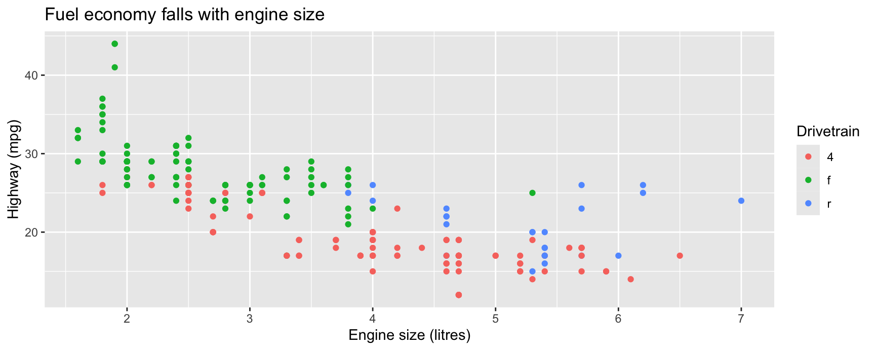
The name argument is the first argument of every scale function. It sets the axis label or the legend title, depending on which guide the scale ends up drawing.
Because it is first, it is usually given without a name of its own. scale_x_continuous("Engine size") and scale_x_continuous(name = "Engine size") are the same call.
There is a second route to the same setting. labs() takes an aesthetic name and a string, and writes it into whichever scale governs that aesthetic.
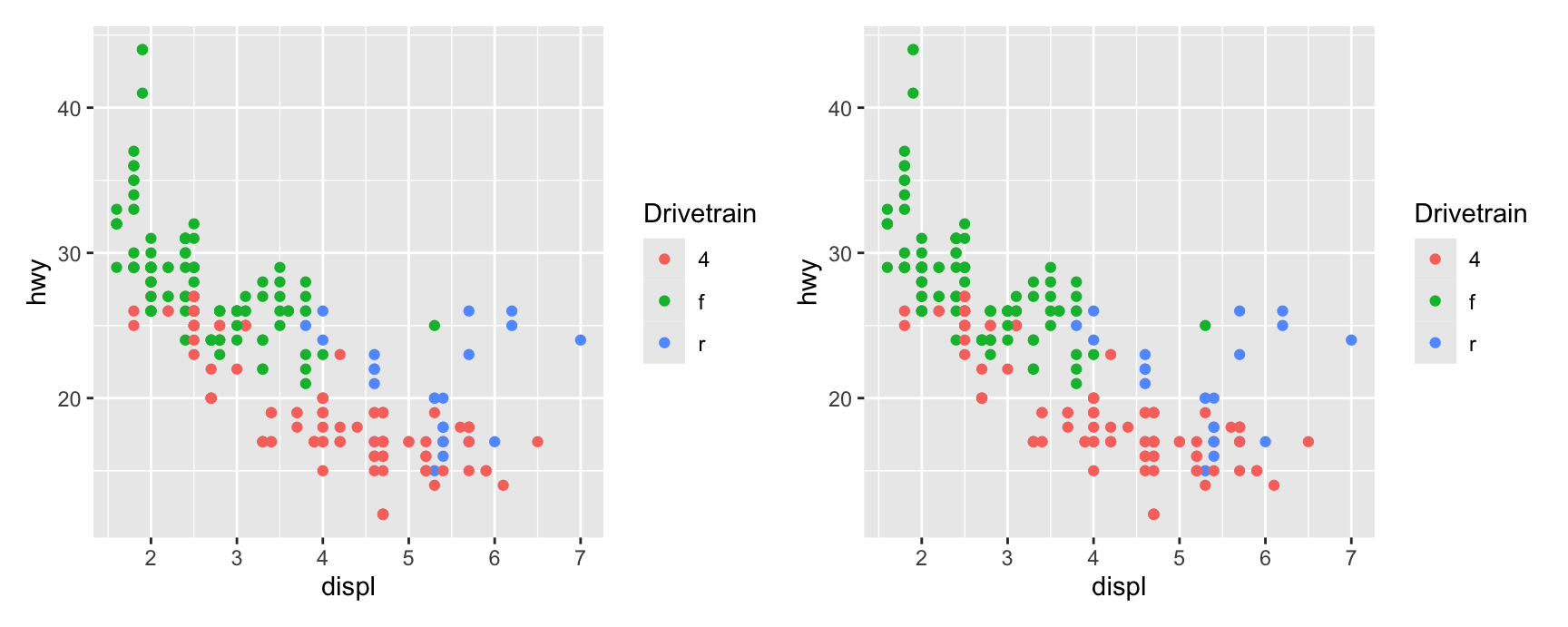
base <-ggplot(mpg, aes(displ, hwy, colour = drv)) +geom_point()via_scale <- base +scale_colour_discrete("Drivetrain")via_labs <- base +labs(colour ="Drivetrain")via_scale + via_labs
The two plots are identical, so the choice is about how you want to organise your code.
Use the scale function when you are already there. If you are writing scale_colour_brewer(palette = "Set2") anyway, the title belongs in the same call.
Use labs() when you only want to rename things. It lets you set every label in the plot in one place, and it does not force you to remember whether the scale is continuous or discrete.
labs() also reaches parts of the plot that no scale owns, which is why it is the more common choice in practice.
Set a name to NULL to remove the label entirely and reclaim the space.
Scale Breaks
What breaks are
breaks names the data values at which the guide has to show something. That definition is deliberately vague about what “something” means, because the answer depends on the guide.
On an axis, a break becomes a tick mark, a grid line and a tick label. In a legend, the same break becomes a key and the text beside it.
The values you pass are always in data units. You say “put a break at 20 miles per gallon”, never “put a break 340 pixels from the left”.
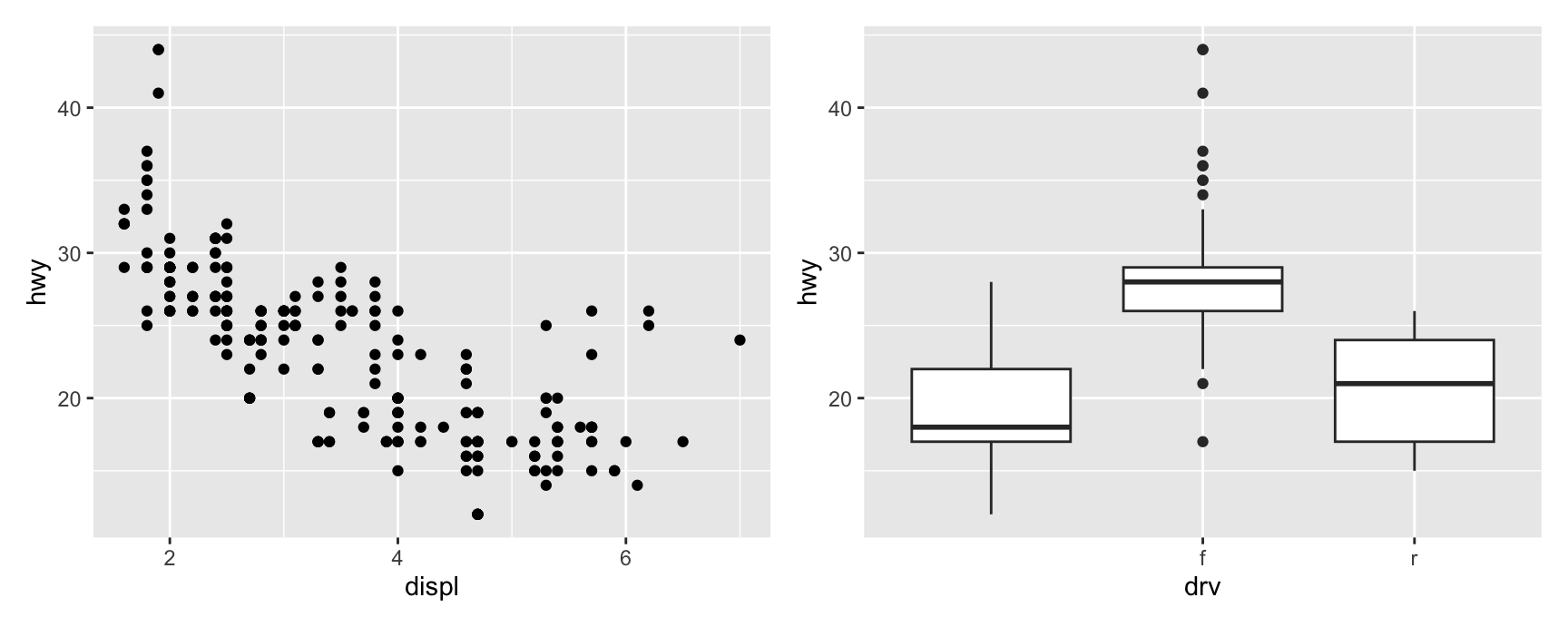
Compare what the two calls had to say. The continuous scale was given three numbers chosen from an unbroken range. The discrete scale was given a subset of the categories it already knows about.
That difference is the fundamental type showing through. Continuous breaks are picked out of an interval, discrete breaks are picked out of a list.
Note what did not happen on the right. Dropping a break dropped the label, not the data. The four wheel drive boxplot is still drawn, and still occupies its position.
Binned scales are the third case, and here breaks do more work. They are not only labels. They are the cut points that decide which bin each observation lands in.
Changing breaks on a continuous or discrete scale changes only the guide. Changing breaks on a binned scale changes the picture, because the colours themselves are recomputed.
Two more values are worth knowing. breaks = NULL removes the guide entirely, ticks, labels and all. breaks = waiver() is the default and means “let the scale decide”.
labels is the companion argument. It takes the same number of entries as breaks and replaces the text without moving the tick.
Scale Limits
What limits are
The limits of a scale define the region of data space the mapping is defined on. Outside that region, the scale has no answer.
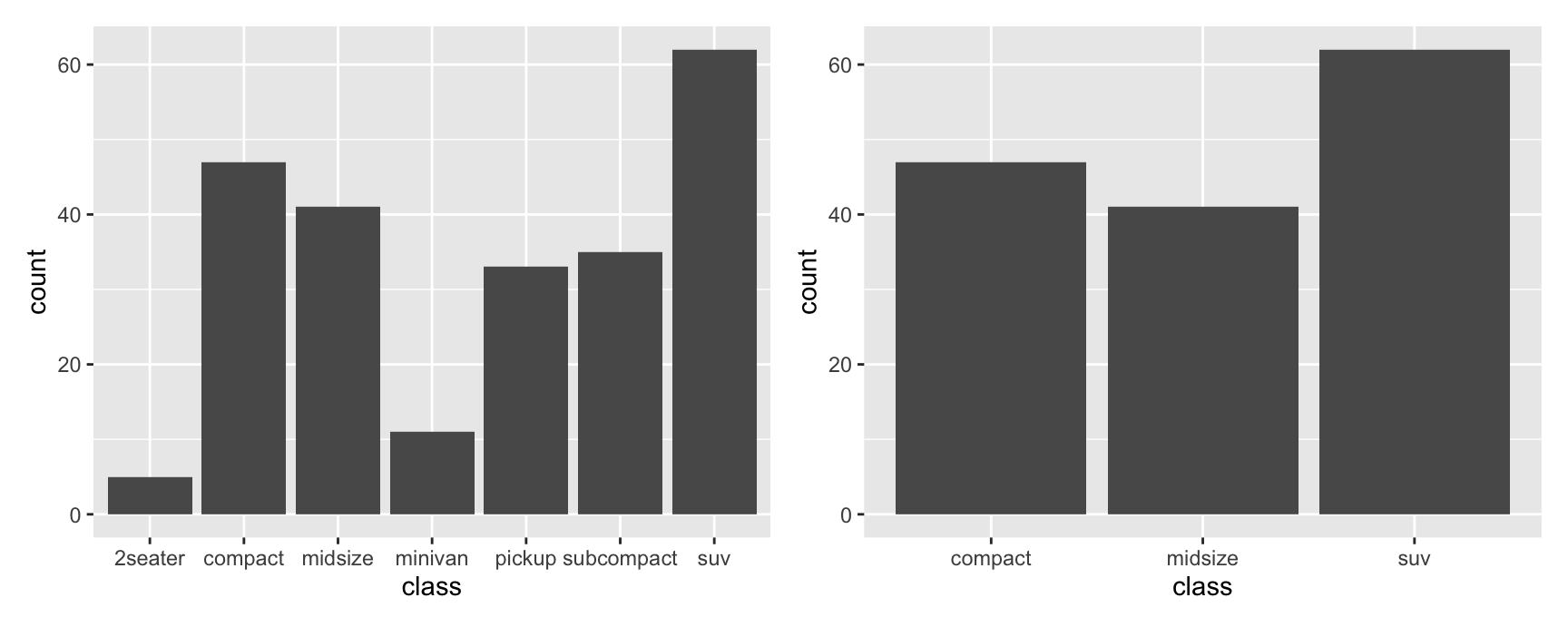
The shape of the region follows the fundamental type, exactly as it did for breaks. Continuous and binned scales take two end points. Discrete scales have to enumerate every category they accept.
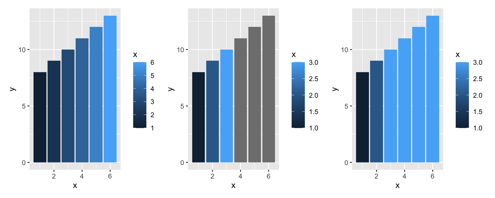
On the left the gradient runs over the full range of x, so every bar gets its own shade. In the middle, limits = c(1, 3) puts bars four to six outside the domain, and censoring turns them grey.
On the right the same three bars are squished up to the limit. They are all drawn in the colour of x = 3, which is honest about them being at or above the top and dishonest about them differing from each other.
Which one to use
Censor when out-of-bounds means “not comparable”. A grey patch says clearly that the scale does not speak for this value.
Squish when out-of-bounds means “off the top of my chosen range, and I do not care how far”. This is the standard fix for a heatmap where a handful of extreme cells flatten the palette for everything else.
The danger is the same in both cases. The limits are your choice, and a reader cannot see what you excluded. Say so in the caption.
Exercises
Take the bars plot from these slides and set limits = c(3, 6) instead. Which bars go grey now? Explain the result by reference to what the scale’s domain is.
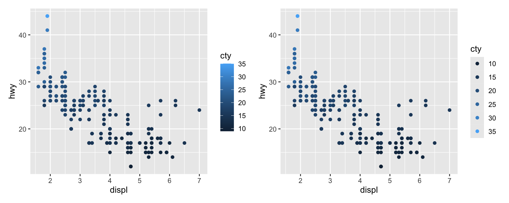
Draw hwy against displ coloured by cty, with scale_colour_continuous(limits = c(15, 25)). Do the censored points disappear or change colour? Now add oob = scales::squish and describe what moved.
Compare scale_y_continuous(limits = c(20, 35)) against coord_cartesian(ylim = c(20, 35)) on a plot of hwy by class drawn with geom_boxplot(). The medians differ. Say exactly why.
Use scale_x_discrete(limits = c("r", "f", "4")) on a bar chart of drv. Two things changed at once. Name both, and say which one surprised you.
Build a geom_raster() heatmap of faithfuld and squish the fill scale at limits = c(0, 0.02). Write one sentence you would have to put in the caption so that a reader is not misled.
scales::oob_keep() is the third option. Apply it with a fill limit that excludes some data and describe what you get. Why is this rarely what you want on a colour scale?
Scale Guides
Choosing a guide
name, breaks and labels take text and numbers. The guide argument is different. It takes a guide object, built by a guide function.
Each scale asks for a default guide, and the choice is made from the fundamental type together with whether the aesthetic is positional.
Scale type
Default guide
Continuous colour or fill
guide_colourbar()
Binned colour or fill
guide_coloursteps()
Position scales, any type
guide_axis()
Discrete, not position
guide_legend()
Binned, not colour or fill
guide_bins()
The fourth row is the one to notice. Every position scale gets guide_axis(), whether the data are continuous, discrete or binned.
That is the theory earning its keep. An axis is not a special feature of numeric data. It is just the guide that positional aesthetics happen to use.
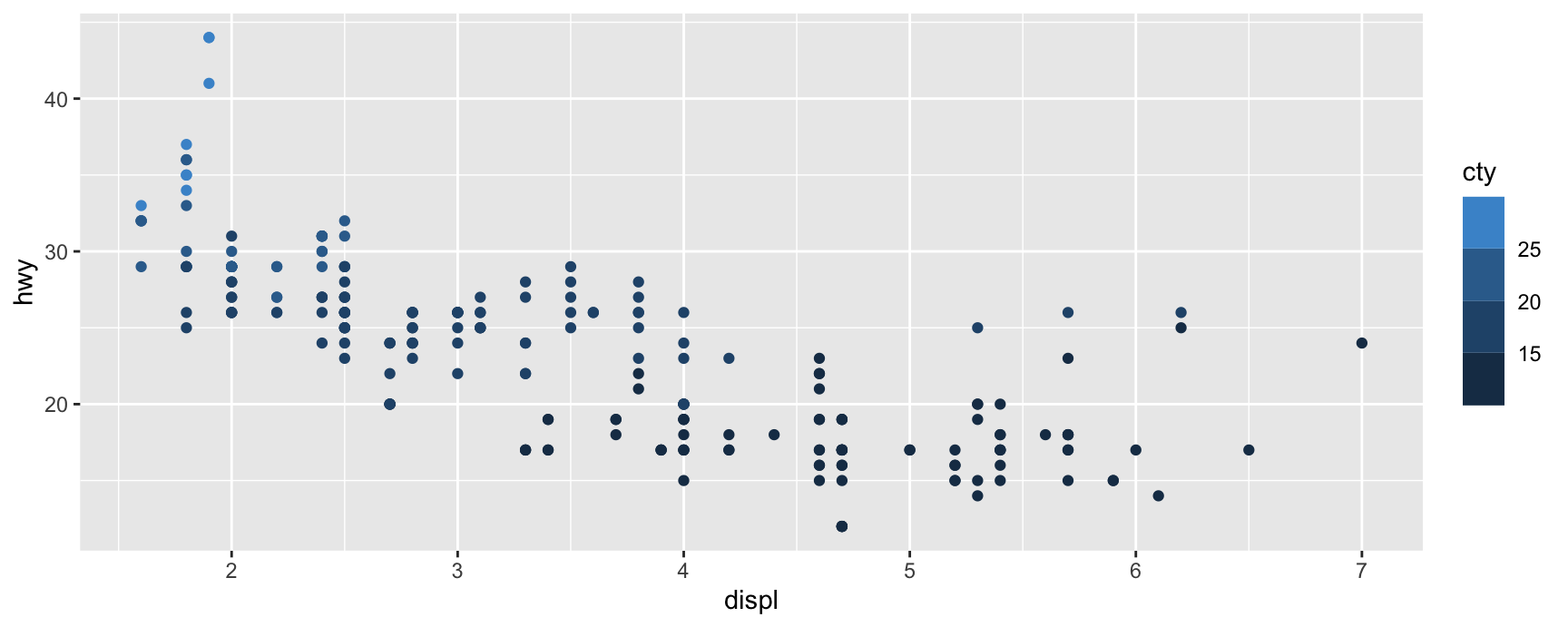
Because the guide is an argument, you can override it. A continuous colour scale defaults to a colour bar, but nothing stops you asking for a legend.
The bar shows that cty is continuous and lets a reader interpolate between the labelled values. The legend implies a small number of discrete groups, which is not what the data are.
Prefer the default here. The point of the example is that guides are replaceable, not that this replacement is a good idea.
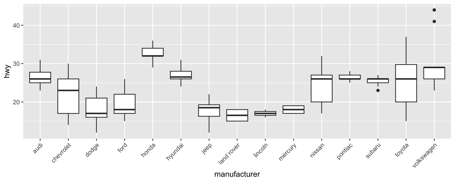
Guide functions are also where you fix a crowded axis, because an axis is a guide like any other.
Without the guide the fifteen maker names overlap and none of them can be read.
Every guide function carries a long list of further arguments. They control text colour, text size, font, key size and spacing.
Those are theme settings in everything but name. The difference is scope. A theme setting applies to every guide in the plot, while a guide argument applies to one.
Chapter 17 covers the settings themselves. What matters here is knowing where to look when you want to change one legend and leave the others alone.
Scale Transformation
Transforming a non-position aesthetic
Transformations are most familiar on position scales, where scale_x_log10() and friends compress a long tail. The same machinery works on every other aesthetic.
The purpose is usually visual emphasis rather than statistics. A transformed fill scale spends more of the palette on the part of the range you care about.
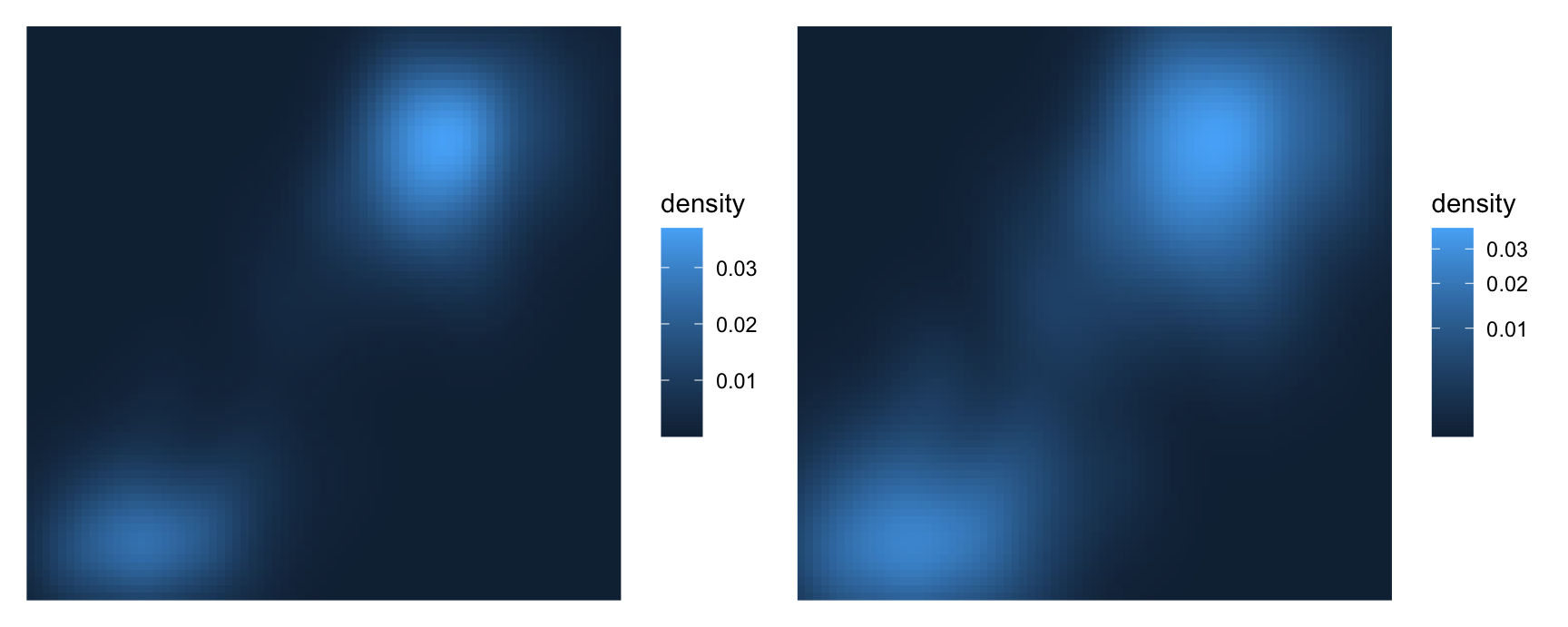
On the left almost the whole plot is dark blue. The two density peaks are so much higher than everything else that they use up the bright end of the palette by themselves.
The square root transform pulls the low values apart. The ridge connecting the two peaks becomes visible, and so does the shape of the low density region around them.
Nothing was filtered and nothing was rescaled in the data. Only the assignment of colours to values changed.
A transformation can also change what an aesthetic means to the reader.
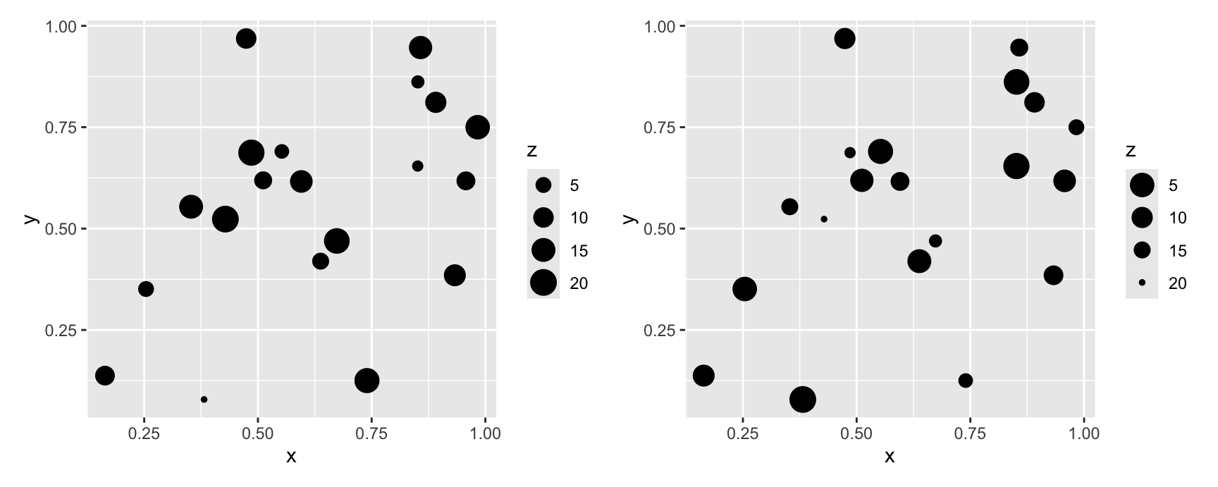
set.seed(14)towns <-data.frame(x =runif(20), y =runif(20), z =sample(20))weight <-ggplot(towns, aes(x, y, size = z)) +geom_point()distance <- weight +scale_size(trans ="reverse")weight + distance
On the left, a big point means a big z. The reader takes size as importance, or mass, or count.
On the right the mapping is reversed, so a big point means a small z. Now size reads as nearness. The picture looks like objects at different distances, and z reads as how far away each one is.
Same data, same aesthetic, opposite interpretation. This is a case where a one word argument changes the story, so choose it deliberately.
A version note
In ggplot2 3.4, the argument is spelled trans, and that is the spelling used on these slides.
From ggplot2 3.5 onwards it is spelled transform, and trans still works but is deprecated. If you are on a newer version and see a deprecation warning, change the word and nothing else.
Exercises
Replace the default colour bar on a cty colour scale with guide_coloursteps(). What has to be true about the scale for that guide to make sense, and does the plot still read correctly?
Use guide_axis(n.dodge = 2) instead of angle = 45 on the manufacturer boxplot. Which version would you put on a slide, and which in a printed report? Give a reason.
Set guide = "none" on the colour scale of a plot that has a legend. The legend goes, but something else stays. What, and why is that a feature rather than a bug?
Apply trans = "log10" to the fill scale of the faithfuld raster instead of "sqrt". Compare all three versions. Which regions of the plot does each one spend its palette on?
Apply trans = "reverse" to a colour scale rather than a size scale. Does the reversal change the meaning as strongly as it did for size? Say why or why not.
Map cyl to size and add scale_size(trans = "sqrt"). Areas, not radii, are what scale_size() maps by default. Given that, what does the extra square root do to the radius of each point?
Legend Merging and Splitting
Why legends are not one-to-one
Position scales and axes match up neatly. One x scale, one x axis, every time.
Non-position scales and legends are looser. A single legend can be assembled from several layers, and a single aesthetic can occasionally need more than one legend.
ggplot2 aims for the fewest legends it can get away with. When the same variable is mapped to two different aesthetics, it combines them into one.
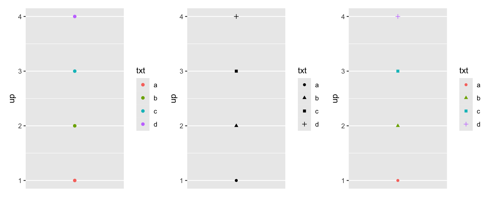
toy <-data.frame(const =1, up =1:4, txt = letters[1:4])
base <-ggplot(toy, aes(const, up)) +scale_x_continuous(NULL, breaks =NULL)by_colour <- base +geom_point(aes(colour = txt))by_shape <- base +geom_point(aes(shape = txt))by_both <- base +geom_point(aes(shape = txt, colour = txt))by_colour | by_shape | by_both
The third plot has two scales and one legend. Look at its keys. Each one is a coloured point of a particular shape, so it reports both aesthetics at once.
This is the right answer. Two legends listing the same four letters would waste space and invite the reader to look for a difference that is not there.
When merging fails
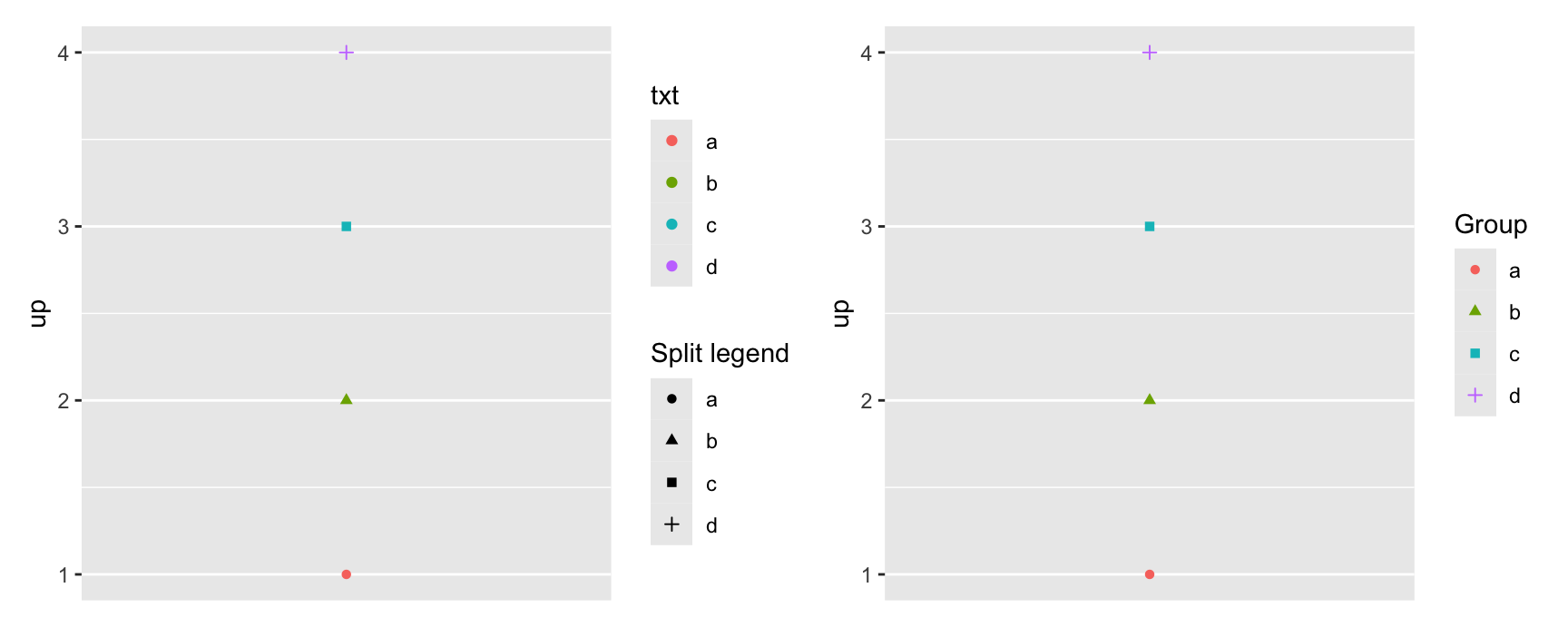
Merging happens when the scales agree on their name. If the names differ, ggplot2 concludes the two aesthetics are telling different stories and draws them separately.
both <-ggplot(toy, aes(const, up)) +geom_point(aes(shape = txt, colour = txt)) +scale_x_continuous(NULL, breaks =NULL)split <- both +labs(shape ="Split legend")merged <- both +labs(shape ="Group", colour ="Group")split + merged
Only the shape scale was renamed on the left, and the legend came apart immediately.
So the practical rule is short. If you rename one scale in a merged legend, rename all of them, to exactly the same string. labs() makes that easy because both names sit on one line.
This catches people out when they set the title on a colour scale inside scale_colour_brewer() and forget the shape scale entirely.
Forcing a legend on or off
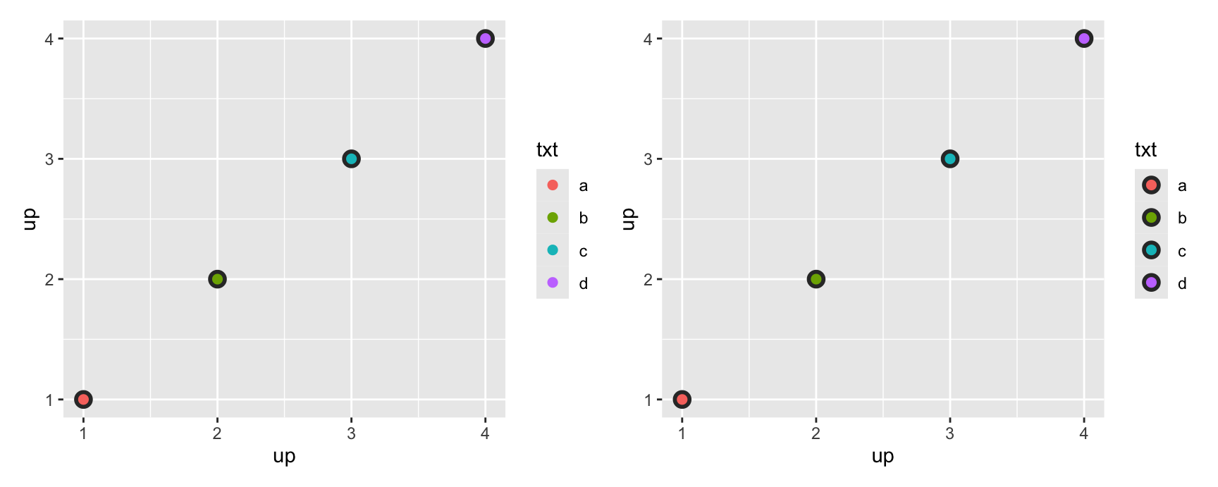
A layer with no mapped aesthetics normally produces no legend entry. The show.legend argument overrides that in either direction.
The grey layer has a fixed colour, so on the left it stays out of the legend. On the right show.legend = TRUE puts it in, and the keys now show the grey halo underneath each coloured point.
The right hand version is more honest about what is drawn. The left hand version is tidier. Either can be the correct choice.
show.legend = FALSE is the more common direction. Use it on annotation layers, label layers and background layers that would otherwise clutter the key.
Splitting legends
Splitting is the opposite problem. You have one aesthetic and you want two independent scales for it.
ggplot2 does not allow this. The one scale per aesthetic rule is built into how a plot is assembled, and it exists because two colour scales in one plot are usually a mistake.
The ggnewscale package works around it. new_scale_colour() closes the current colour scale and starts a fresh one. Everything added before it belongs to the first scale, everything added after it to the second.
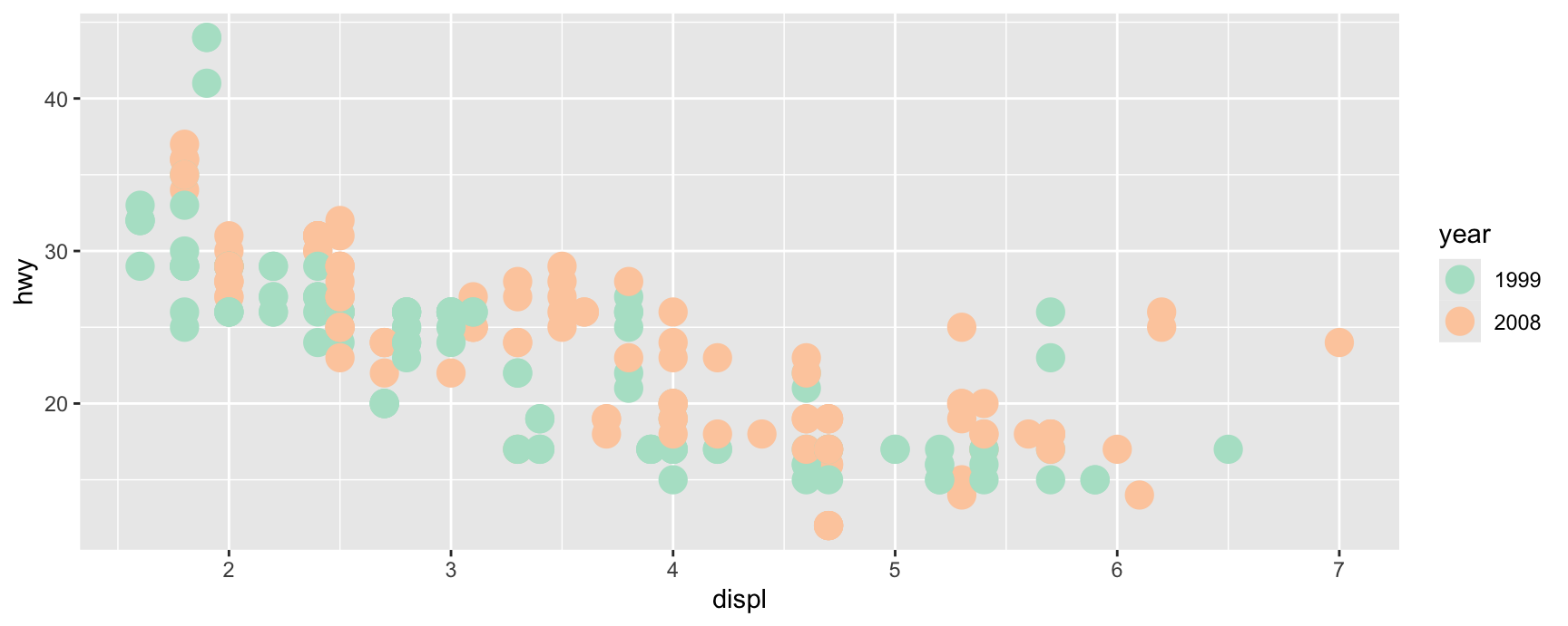
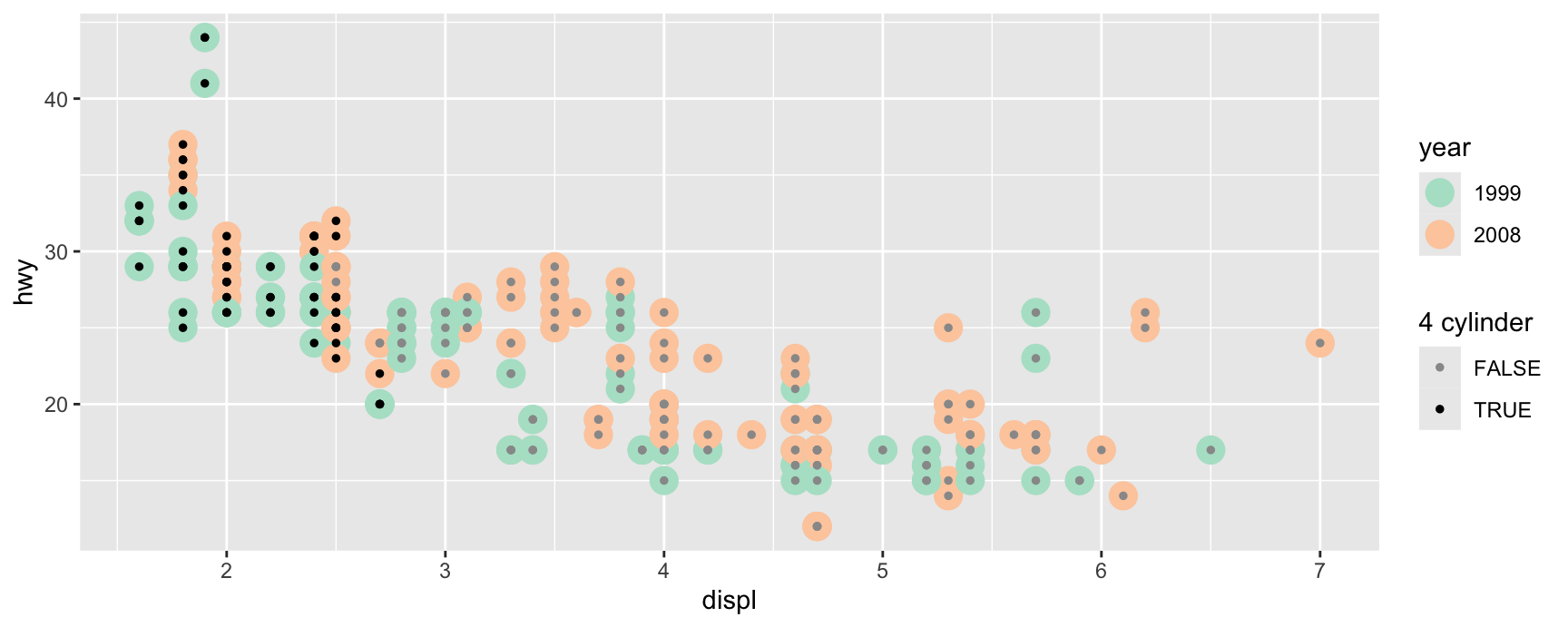
years <-ggplot(mpg, aes(displ, hwy)) +geom_point(aes(colour =factor(year)), size =5) +scale_colour_brewer("year", type ="qual", palette =5)years
Two colour scales, two legends, and a reader who now has to hold two colour codes in mind at once.
It works here only because the two scales are visually separated by size. The big points carry year, the small points carry cylinder count, and no key is ambiguous.
Before reaching for this, ask whether a facet or a second plot would do. Most of the time the answer is yes.
Legend Key Glyphs
The symbol in the key
The glyph drawn in a legend key is chosen by the geom. A point layer puts points in the key, a line layer puts line segments, a boxplot layer puts small boxplots.
That default is usually right, because the key should look like the thing it explains. When it is not right, key_glyph overrides it.
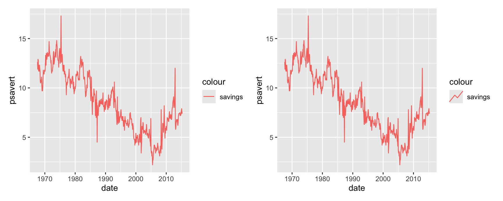
The default key is a flat horizontal segment, which tells the reader the layer is a line and nothing more.
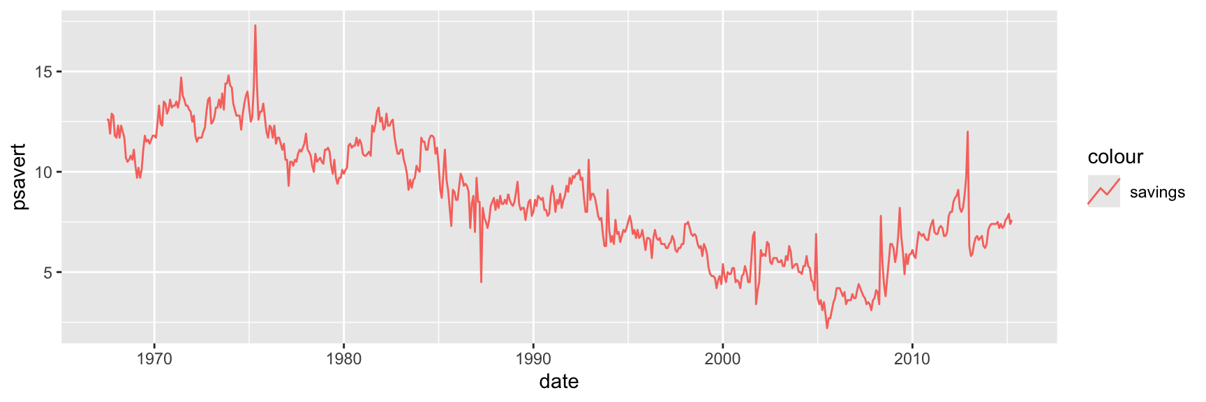
The "timeseries" glyph draws a small wiggle. It hints that the layer is a series that moves over time, which is a little more information for the same space.
Note how the legend appeared at all. colour = "savings" maps a constant string, so ggplot2 builds a one entry scale. That is a common trick for labelling a layer when there is no grouping variable to map.
Behind each glyph is a drawing function whose name starts with draw_key_. The string you pass is the part of the name after that prefix.
So key_glyph = "timeseries" calls draw_key_timeseries(). You can also pass the function itself, without quotes, which is useful when you have written your own.
Run apropos("^draw_key") to list the ones ggplot2 ships with. draw_key_path(), draw_key_point(), draw_key_rect() and draw_key_boxplot() cover most needs.
Writing your own is possible and rarely necessary. A key drawing function takes the layer’s data, the plot parameters and a size, and returns a grid grob.
The honest advice is to change a glyph only when the default misleads. A legend that looks unlike the plot is worse than a plain one.
Exercises
Map class to colour and drv to shape in one mpg scatterplot. How many legends do you get? Now map drv to both. Explain the change in terms of the merging rule.
Take a merged colour and shape legend and rename only the colour scale with scale_colour_discrete("Type"). Predict what happens before you run it, then fix the plot so the legend merges again.
Add geom_smooth(aes(colour = drv), show.legend = FALSE) on top of a coloured scatterplot. The smoother still uses the colour scale. What exactly did show.legend = FALSE suppress, and what did it leave alone?
Build the ggnewscale example from these slides, then try to achieve something similar with facet_wrap(~year) instead. Which version answers “did four cylinder cars improve between 1999 and 2008” more directly?
Draw boxplots of hwy by drv with fill = drv, and set key_glyph = "rect", then key_glyph = "point". Which one misleads a reader about what the layer draws?
Use economics_long to plot several series with geom_line(aes(colour = variable)) and compare the default key against "timeseries". Write one sentence on whether the extra detail in the glyph earned its space here.
Recap
A scale maps data space to aesthetic space. A guide runs the map backwards so a reader can recover data values. Axes and legends are both guides.
name, breaks and labels mean the same thing on every scale. Only their appearance changes between an axis and a legend.
Every aesthetic has exactly one scale. Adding a second replaces the first, and ggplot2 only warns you when the replacement was not a default.
All scales are continuous, discrete or binned. The type decides what limits mean, how breaks behave and which guide the scale asks for.
Setting limits removes data. oob decides what happens to the values you removed, and coord_cartesian() is the tool when you meant to zoom.
Legends merge when two aesthetics carry the same variable under the same name. Rename one scale and the legend splits.
Acknowledgement
Source. These slides follow the structure and the teaching sequence of ggplot2: Elegant Graphics for Data Analysis (3e) by Hadley Wickham, Danielle Navarro and Thomas Lin Pedersen. The explanations, examples and exercises here have been rewritten for this course; any errors in them are mine and not the book’s.
Copyright. All rights in the original work are reserved by its authors and publishers. Students are encouraged to read the book itself, which is freely available online.
Non-commercial use only. These materials are for teaching and must not be used for commercial gain.
Attribution. Any reuse or redistribution must credit both the original book and this course.