Up to now x and y have meant horizontal and vertical. That is a convention, not a law. The coordinate system is the component that decides what the two position aesthetics actually mean.
It has two jobs.
It combines the two position aesthetics into a position on the page. In polar coordinates one of them becomes an angle and the other a radius. On a map they become longitude and latitude.
It draws the axes and the panel background, working with the faceter, because only the coordinate system knows what a grid line is in the space it has created.
A fair name for the aesthetics would be “position 1” and “position 2”.
Two families
The split that matters is whether the system preserves shape.
Linear systems stretch and swap, but a straight line stays straight and a rectangle stays a rectangle. coord_cartesian(), coord_flip() and coord_fixed() live here.
Non-linear systems may bend anything. A rectangle can become a wedge of a circle, and the shortest route between two points need not be a straight line. coord_trans(), coord_polar() and the map coordinates live here.
Linear systems are cheap and safe. Non-linear ones are the interesting half of the chapter, and also the half where you can mislead a reader without noticing.
Linear coordinate systems
Zooming with coord_cartesian()
coord_cartesian() is the default system. You only name it when you want to change something, and the usual reason is its xlim and ylim arguments.
Scales already have a limits argument, so why a second way to set a range? Because the two do genuinely different things, and the difference decides whether your numbers are right.
A scale limit is a filter. Anything outside the range is turned into NA and dropped before any statistic is computed.
A coordinate limit is a window. Every row is still there and still used. The plot simply shows you a smaller part of the panel.
Why the distinction matters
Chapter 2 introduced xlim() and ylim() and warned that they discard data. Chapter 10 made the same point about scale limits. This is the slide those warnings pointed at.
If your plot has no stat, the two approaches agree and the argument is academic. As soon as a layer computes something from the data, they part company. A smoother, a boxplot, a density, a bin count and a stacked bar are all computed from whatever rows survived the scale.
Clip the scale and you refit on the survivors. Set a coordinate limit and the fit is the one you already had, seen close up.
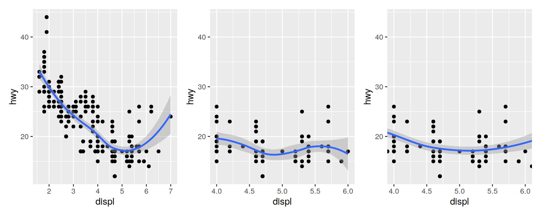
base <-ggplot(mpg, aes(displ, hwy)) +geom_point() +geom_smooth()everything <- baseclipped <- base +scale_x_continuous(limits =c(4, 6))zoomed <- base +coord_cartesian(xlim =c(4, 6))everything | clipped | zoomed
Look at the middle and right panels together. They cover the same range of engine sizes and disagree about the trend.
The middle panel threw away every car under four litres and over six, then fitted a loess curve to the 60 or so that remained. With no data beyond the edges to anchor it, the curve swings at both ends and the confidence band opens up.
The right panel fitted the smoother to all 234 cars and then cropped the view. Its curve is a slice of the full-data fit, which is almost always what you meant.
The rule is short. To change what is analysed, set the scale. To change what is shown, set the coordinates.
Flipping the axes with coord_flip()
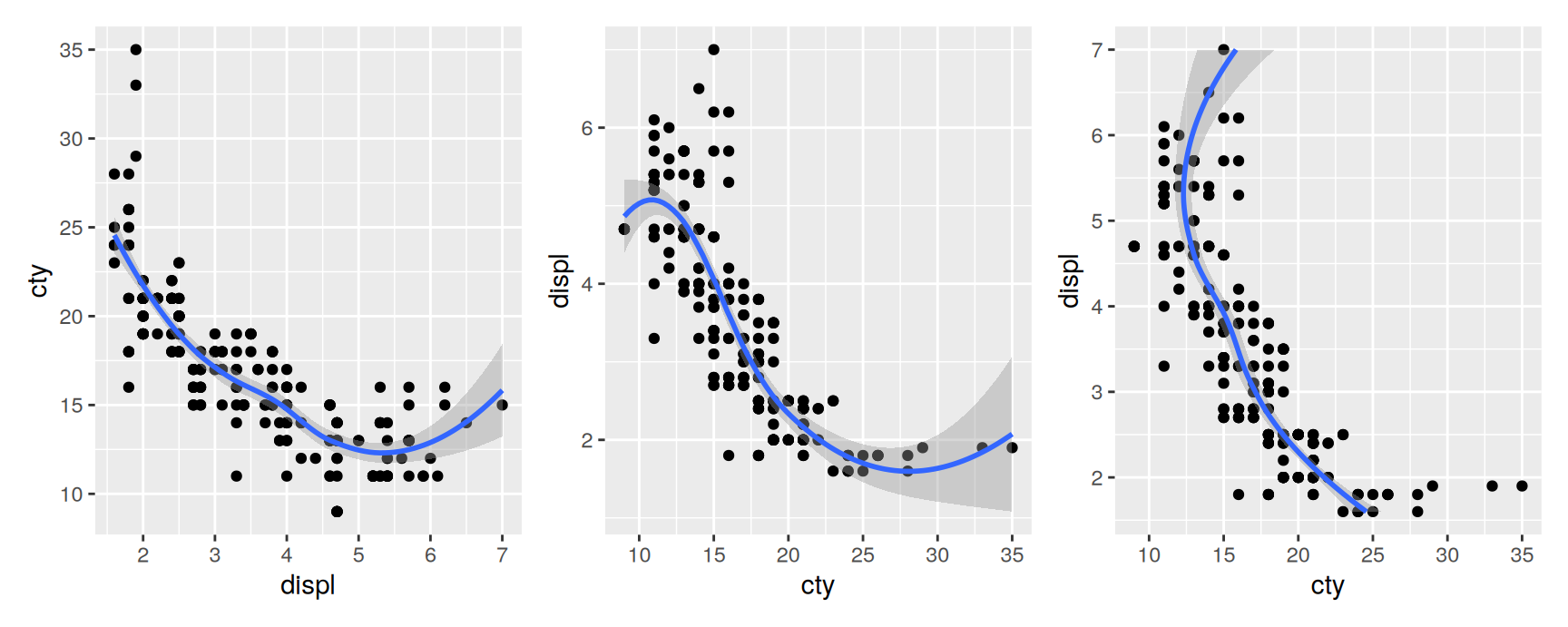
Stats in ggplot2 are not symmetric. Most of them summarise y given x, so geom_smooth() fits a curve through the vertical spread at each horizontal position.
That means there are two different things you might mean by “turn the plot on its side”. You can exchange the variables, which changes what is being modelled. Or you can leave the model alone and rotate the finished picture, which is what coord_flip() does.
The first and third panels are the same fit, drawn at ninety degrees to each other. The second panel is a different fit, because swapping the mapping asks the smoother a different question. It now predicts engine size from fuel economy.
Neither question is wrong. They are just not the same question, and the plots only look interchangeable.
Use coord_flip() when the rotation is cosmetic, usually to give long category labels horizontal room. Recent versions of ggplot2 often let you do that by mapping the categorical variable to y directly, which is clearer still.
Equal scales with coord_fixed()
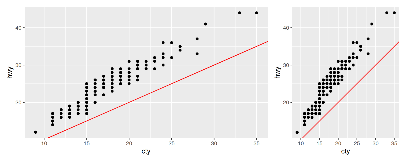
coord_fixed() locks the ratio between physical length on the two axes. With the default ratio = 1, one centimetre of x covers exactly as many data units as one centimetre of y, whatever shape the output device happens to be.
You want this whenever the two axes are in the same units and the reader will compare distances by eye. City and highway fuel economy are both miles per gallon, so a fixed plot lets you read the gap from the diagonal.
On the left the aspect ratio is whatever the panel happened to be, so the reference line is not at forty five degrees and the distance from it is not readable. On the right the line is a true diagonal and the vertical gap means what it appears to mean.
The cost is wasted space. A fixed coordinate system cannot fill a panel of the wrong shape, so you get white margins. Accept them when distance carries meaning, and skip coord_fixed() when it does not.
Exercises
Draw hwy against displ with geom_smooth(), once with ylim(20, 40) and once with coord_cartesian(ylim = c(20, 40)). Report how many rows the first version removes, and describe in one sentence where the two curves disagree.
Build a boxplot of cty by class. Add scale_y_continuous(limits = c(15, 25)), then replace it with coord_cartesian(ylim = c(15, 25)). Read the median of the suv group off each plot. Which one is the median of all SUVs?
ggplot(mpg, aes(class)) + geom_bar() has labels that collide. Fix it with coord_flip() and again by putting class on y. Which code would you rather hand to somebody else, and why?
Map class to x and hwy to y with geom_violin(), then add coord_flip(). Is the violin computed before or after the rotation? Say how the plot lets you tell.
Plot cty against hwy with and without coord_fixed(). Now try coord_fixed(ratio = 3). State what a ratio of 3 promises the reader, and name one pair of variables in mpg for which fixing the ratio would be meaningless.
Non-linear coordinate systems
Shapes are no longer safe
A linear system moves geoms around. A non-linear system can change what they are.
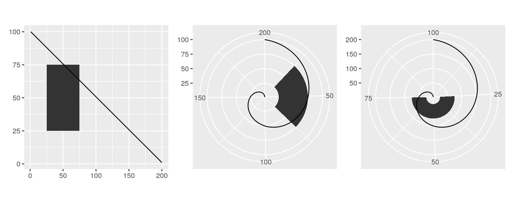
The test case is one tile and one straight line. Under Cartesian coordinates the tile is a square and the line is straight. Send the same two layers through polar coordinates and neither claim survives.
rect <-data.frame(x =50, y =50)line <-data.frame(x =c(1, 200), y =c(100, 1))base <-ggplot(mapping =aes(x, y)) +geom_tile(data = rect, aes(width =50, height =50)) +geom_line(data = line) +xlab(NULL) +ylab(NULL)base | base +coord_polar("x") | base +coord_polar("y")
The square has become a wedge, and the straight line has become a spiral. Which of the two position aesthetics you send to the angle decides which way the bending goes.
This is worth taking seriously before you reach for polar coordinates. A reader who compares two wedges is comparing areas of different shapes at different radii, which the eye does badly. The plot has not lied, but it has made an easy comparison into a hard one.
Munching
How does ggplot2 bend a shape? In two steps.
First it re-parameterises every geom into pure locations. A bar stops being a height and a width and becomes four corners. A ribbon becomes a polygon. After this step nothing in the plot is anything but points.
Second it transforms each location into the new system.
Points survive this untouched. A point is a point in any coordinate system. Lines and polygons are the problem, because the straight segment between two transformed endpoints is not the transform of the straight segment between the originals.
The fix assumes the transformation is smooth. Over a short enough distance any smooth transformation is close to linear, so a very short straight line stays very nearly straight.
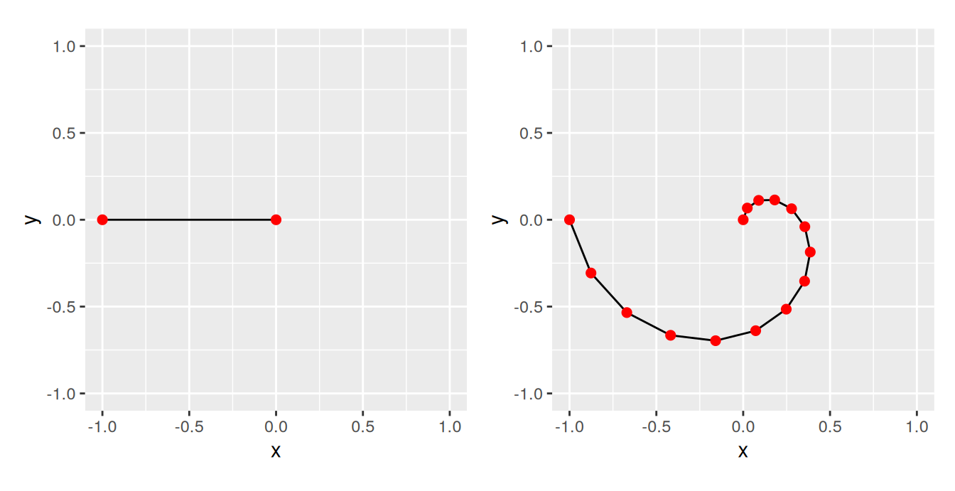
So ggplot2 chops long lines into many short ones and transforms each piece separately. That is munching, and you can do it by hand to see the effect.
spiral <-function(n) { r <-seq(0, 1, length.out = n) theta <-seq(0, 3/2* pi, length.out = n)data.frame(x = r *sin(theta), y = r *cos(theta))}
Both plots draw the same curve in polar terms. It runs from the origin out to radius one while the angle sweeps through three quarters of a turn.
With two points there is nothing to interpolate, so the path is the chord between the two ends and the spiral is gone. With fifteen the pieces are short enough that the shape shows through. More points would be smoother still, at a cost in drawing time.
You never call this yourself. It explains why non-linear coordinates are slow on large data sets, and why a coarse polygon can look faceted after projection.
Transformations with coord_trans()
Chapter 10 transformed a scale. This chapter transforms a coordinate system. The functions look similar and they act at opposite ends of the pipeline.
A scale transformation happens before the stats. The layer sees log values and fits to them. Geom shapes are unaffected, because as far as the geom is concerned the data were always like that.
A coordinate transformation happens after the stats. The fit is already computed, and the transformation only moves the drawing. Shapes change.
Combining the two is the useful trick. Model on the scale where the model works, then report on the scale the reader understands.
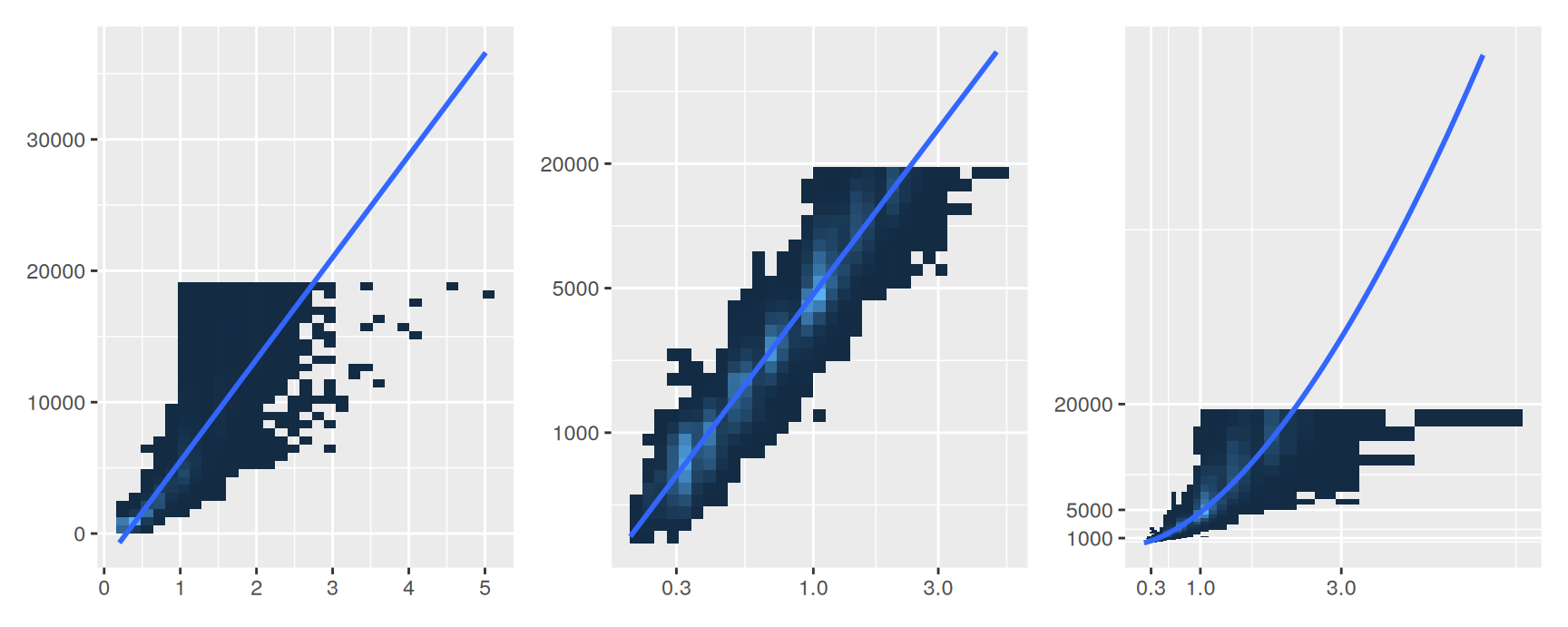
base <-ggplot(diamonds, aes(carat, price)) +stat_bin2d() +geom_smooth(method ="lm") +xlab(NULL) +ylab(NULL) +theme(legend.position ="none")logged <- base +scale_x_log10() +scale_y_log10(breaks =c(1000, 5000, 20000))back <- logged +coord_trans(x = scales::exp_trans(10), y = scales::exp_trans(10))base | logged | back
The left panel fits a straight line to raw carat and price. The relationship is curved, so the line runs above the data in the middle and below it at both ends.
The middle panel logs both scales first. Now the relationship really is a straight line and the fit is honest, but the axes are in powers of ten and most readers cannot price a diamond from them.
The right panel keeps that fit and undoes the log on the way to the page. scales::exp_trans(10) is the inverse of log10, so the axis labels are carats and dollars again. The line is curved because a straight line on a log scale is a power curve on the original scale.
Two practical notes.
coord_trans() accepts either a transformation object, as above, or the name of one as a string, so coord_trans(y = "log10") also works.
In ggplot2 4.0.0 this function was renamed to coord_transform(). coord_trans() still runs and warns. Write the new name in new code, and expect to meet the old one in anything written before the change.
Polar coordinates with coord_polar()
coord_polar() maps one position aesthetic to angle and the other to radius. The theta argument chooses which. That single choice turns a stacked bar chart into two quite different figures.
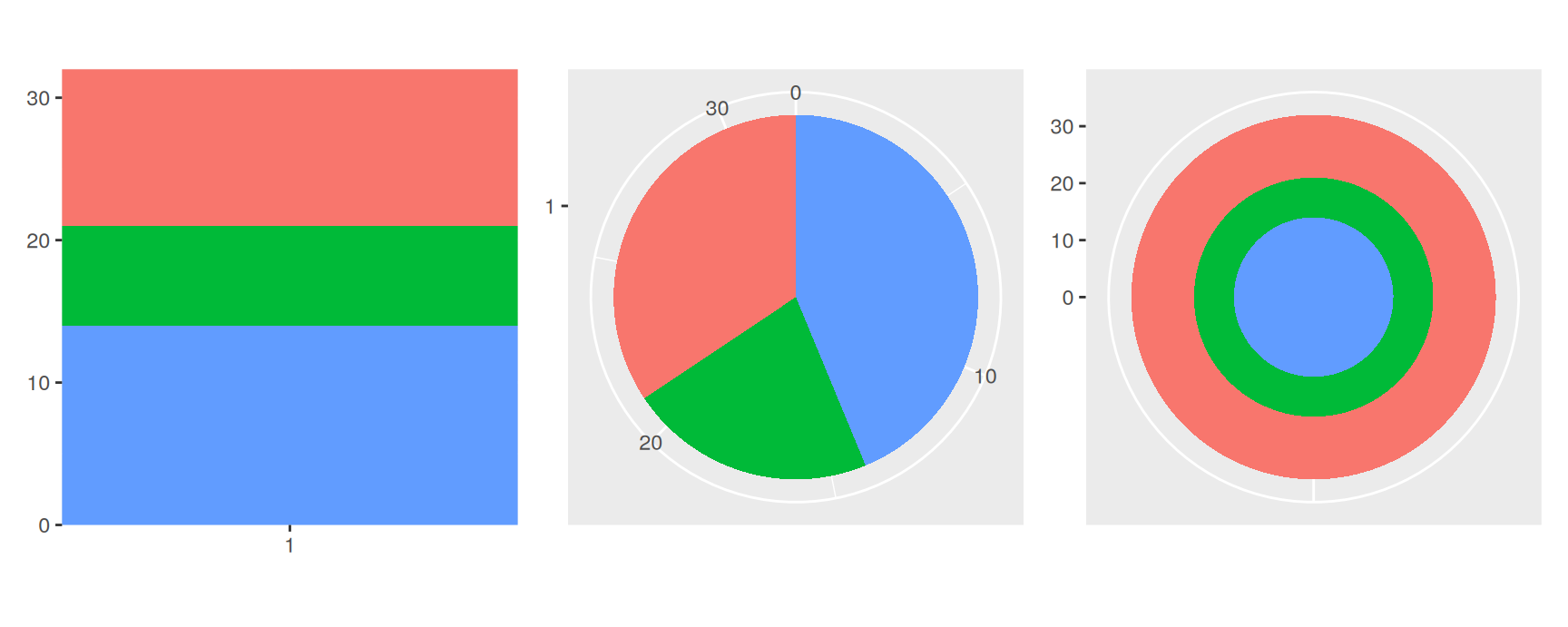
base <-ggplot(mtcars, aes(factor(1), fill =factor(cyl))) +geom_bar(width =1) +theme(legend.position ="none") +scale_x_discrete(NULL, expand =c(0, 0)) +scale_y_continuous(NULL, expand =c(0, 0))base | base +coord_polar(theta ="y") | base +coord_polar()
Sending the count to the angle gives a pie chart. Sending the category to the angle gives a bullseye. The same bar chart underlies all three.
A pie chart is a stacked bar bent into a circle, and that is its whole problem. The reader now has to judge angles rather than lengths, and people judge angles worse. Slices near the centre are the worst case, because a large angular difference is a small difference in drawn area.
Polar coordinates earn their place when the variable really is circular, such as wind direction, time of day or month of year. Reach for them there. For “what share of the total”, the stacked bar on the left was already better.
Map projections
A map shows data from the surface of a sphere. Plotting raw longitude and latitude on a flat panel treats a degree of longitude as a fixed distance, which it is not. A degree of longitude is about 111 km at the equator and nearly nothing near the poles, so an unprojected map stretches high latitudes sideways.
ggplot2 offers two answers for data held as ordinary data frames of long and lat.
coord_quickmap() is the cheap one. It sets the aspect ratio so that, at the centre of the plot, one metre north to south takes up the same room as one metre east to west. It is an approximation, and a good one for a region small enough that the correction barely changes across it.
coord_map() is the real thing. It projects every point through the mapproj package and takes the same arguments as mapproj::mapproject().
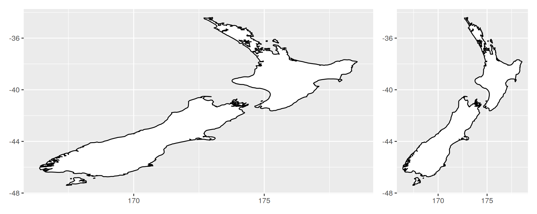
nzmap <-ggplot(map_data("nz"), aes(long, lat, group = group)) +geom_polygon(fill ="white", colour ="black") +xlab(NULL) +ylab(NULL)nzmap | nzmap +coord_quickmap()
New Zealand is at about 41 degrees south, where a degree of longitude is roughly three quarters of a degree of latitude. The left panel ignores that and comes out visibly too wide. The right panel corrects the aspect ratio and the country regains its shape.
For a country-sized region this is all you need, and it costs nothing. Over larger areas the single correction at the centre stops being right at the edges, and you need a projection that varies across the map.
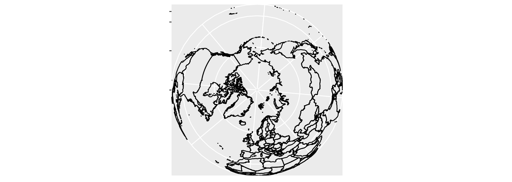
world <-map_data("world")worldmap <-ggplot(world, aes(long, lat, group = group)) +geom_path() +scale_y_continuous(NULL, breaks = (-2:3) *30, labels =NULL) +scale_x_continuous(NULL, breaks = (-4:4) *45, labels =NULL)worldmap +coord_map("ortho")
coord_map() has to munch and transform every polygon in the data, so it is slow on a detailed map. The world outline above has around a hundred thousand rows, which is enough to notice.
Every projection trades one kind of accuracy for another. No flat map keeps area, angle and distance all at once. Mercator preserves angles and inflates the poles, "ortho" draws the globe as seen from space and hides half of it, and equal-area projections keep area at the cost of shape. Choose by what your map is for.
Spatial data and coord_sf()
Modern spatial work does not store maps as columns of long and lat. It uses the sf package, where each row carries a geometry and the object records its own coordinate reference system.
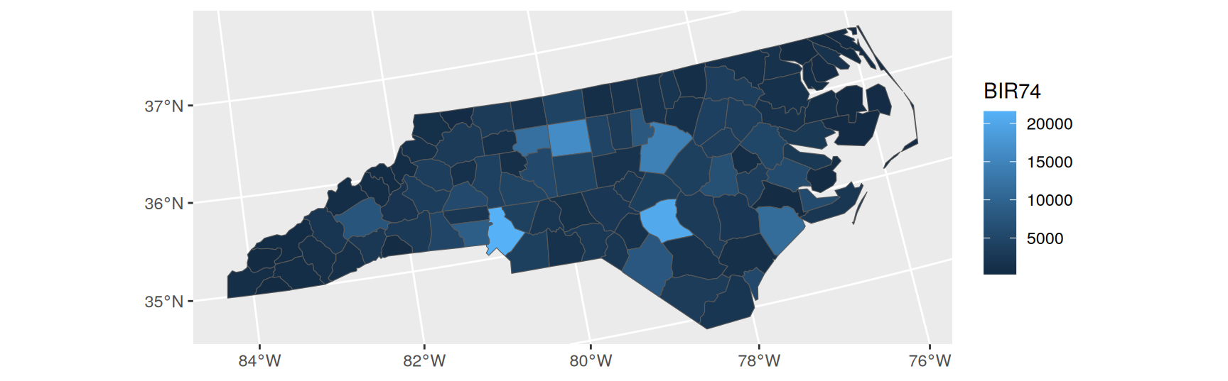
For those objects the coordinate system is coord_sf(), and geom_sf() adds it for you. It reads the reference system off the data, so the projection is right without your asking. Chapter 6 covers maps properly.
Take the tile and line example and send it through coord_polar("x") and coord_polar("y"). Change the line so that it runs from (1, 1) to (200, 200). Describe what that line becomes under each of the two settings, and explain why.
Rewrite spiral() so it takes the number of turns as well as n. Draw three turns with 5, 20 and 200 points. At what point does adding points stop changing what you see, and what does that tell you about how ggplot2 chooses its own munching resolution?
Fit geom_smooth(method = "lm") to depth against carat in diamonds on a sqrt scale, then bring the axes back with coord_trans(). Does the back-transformed fit describe the data better or worse than a straight line on the raw axes? Say how you decided.
Draw a bar chart of mpg$class and add coord_polar(theta = "x"). Now do it with theta = "y". Which of the two would you use to answer “which class is most common”, and which for “what fraction of cars are SUVs”?
economics records the US economy by month. Extract the month with format(date, "%m"), plot mean psavert per month as a bar chart, and bend it into a circle with coord_polar(). Argue for or against the circle here.
Draw map_data("italy") in Cartesian coordinates, with coord_quickmap(), and with coord_map("mercator"). Time all three with system.time(). Report the times and say which version you would publish.
Read ?mapproj::mapproject and pick a projection the slides did not use. Apply it to the world map, and state in one sentence what it preserves and what it sacrifices.
Recap
The coordinate system decides what the two position aesthetics mean, and draws the axes and grid that let a reader read them back.
Scale limits filter the data before the stats run. Coordinate limits only change the view. Use coord_cartesian() to zoom, xlim() and ylim() to subset.
coord_flip() rotates a finished plot. Swapping the mappings fits a different model. coord_fixed() makes distance on the two axes comparable.
Non-linear systems change the shape of geoms. ggplot2 handles that by munching long lines into short ones, which is why these coordinates are slow on big data.
Scale transformations act before the stats, coordinate transformations after. Use both together to model on one scale and report on another.
Polar coordinates suit circular variables. Maps need a projection, and every projection gives something up.
Acknowledgement
Source. These slides follow the structure and the teaching sequence of ggplot2: Elegant Graphics for Data Analysis (3e) by Hadley Wickham, Danielle Navarro and Thomas Lin Pedersen. The explanations, examples and exercises here have been rewritten for this course; any errors in them are mine and not the book’s.
Copyright. All rights in the original work are reserved by its authors and publishers. Students are encouraged to read the book itself, which is freely available online.
Non-commercial use only. These materials are for teaching and must not be used for commercial gain.
Attribution. Any reuse or redistribution must credit both the original book and this course.