Faceting splits the data into subsets and draws the same plot once for each subset. Every panel is built on the same axes, so a difference in position on the screen is a difference in the data.
That is why faceting is the workhorse of exploratory analysis. You can scan a dozen panels in a second and decide whether the groups behave the same way or not.
There are three faceting functions.
facet_null() draws a single panel. Every plot uses it unless you say otherwise.
facet_wrap() takes one variable, makes a ribbon of panels, and wraps the ribbon into a rectangle.
facet_grid() takes two variables and crosses them into a table of panels.
Chapter 2 used facet_wrap() once, just to show that it exists. This chapter is about the decisions that one call hides.
How many rows the panels should occupy. Whether the panels share their axes. What happens to a layer whose data does not contain the faceting variable. When a facet is the wrong answer and a colour is the right one.
Faceting also has a limit worth knowing in advance. The eye compares things that are close together, and panels are never close together. Everything in this chapter is a way of paying that cost or avoiding it.
The data for these slides
mpg contains a few categories that are too rare to deserve a panel of their own. Trimming them once keeps every later example readable.
mpg2 <-subset(mpg, cyl !=5& drv %in%c("4", "f") & class !="2seater")
Five cylinder engines, rear wheel drive and two seaters are each represented by a handful of cars. A panel drawn from four observations says almost nothing, and it takes up exactly as much room as a panel drawn from forty.
Facet wrap
Wrapping a ribbon of panels
facet_wrap() fills panels in reading order and starts a new row when it runs out of width. Three arguments control the shape of the result.
nrow and ncol fix one dimension. Set one of them and let ggplot2 work out the other. Setting both usually means you have miscounted the levels.
as.table decides where the last level lands. TRUE puts it bottom right, the way a table is read. FALSE puts it top right, the way an axis grows.
dir decides the filling order. "h" fills row by row, "v" fills column by column.
The examples below draw nothing inside the panels. With geom_blank() the layout is the only thing left to look at.
base <-ggplot(mpg2, aes(displ, hwy)) +geom_blank() +labs(x =NULL, y =NULL)
Storing the shared part of a plot in an object and adding to it is worth doing in real work too. It keeps the difference between two plots visible in the code.
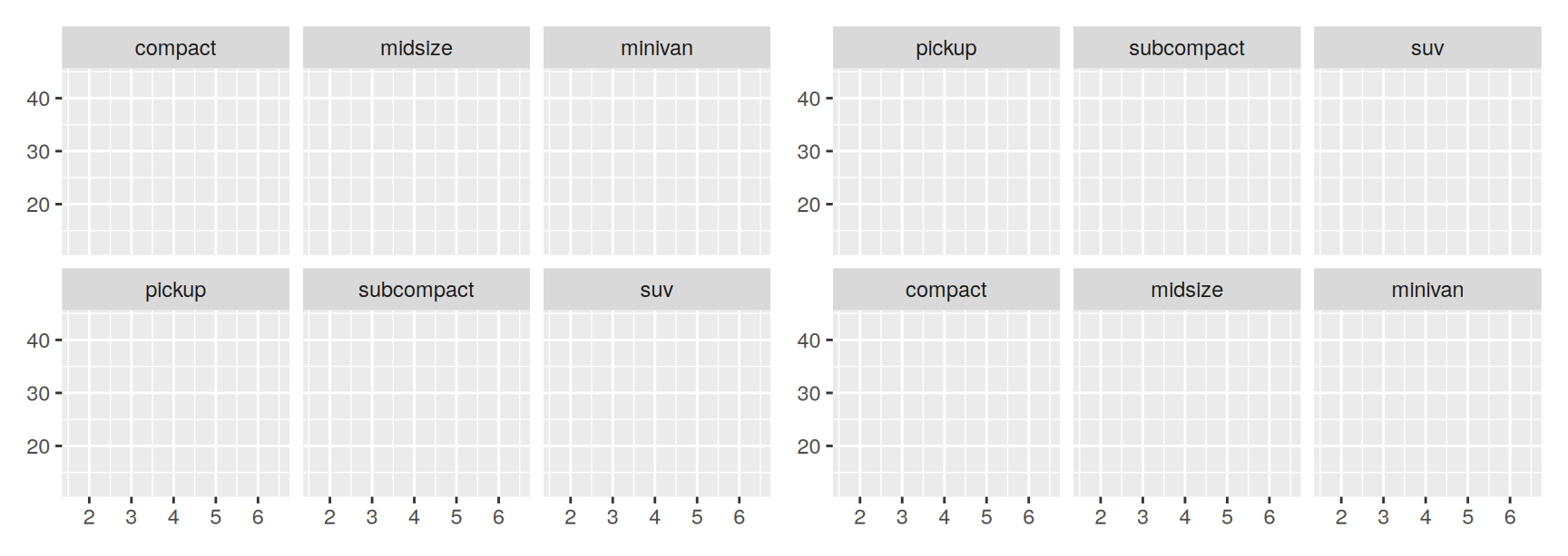
table_order <- base +facet_wrap(~class, ncol =3)plot_order <- base +facet_wrap(~class, ncol =3, as.table =FALSE)table_order + plot_order
Both versions hold the same six classes in the same alphabetical order. Only the starting corner has moved.
as.table = TRUE is the default and is almost always the right choice. Readers start at the top left and expect the sequence to finish at the bottom right, which is exactly what a table does.
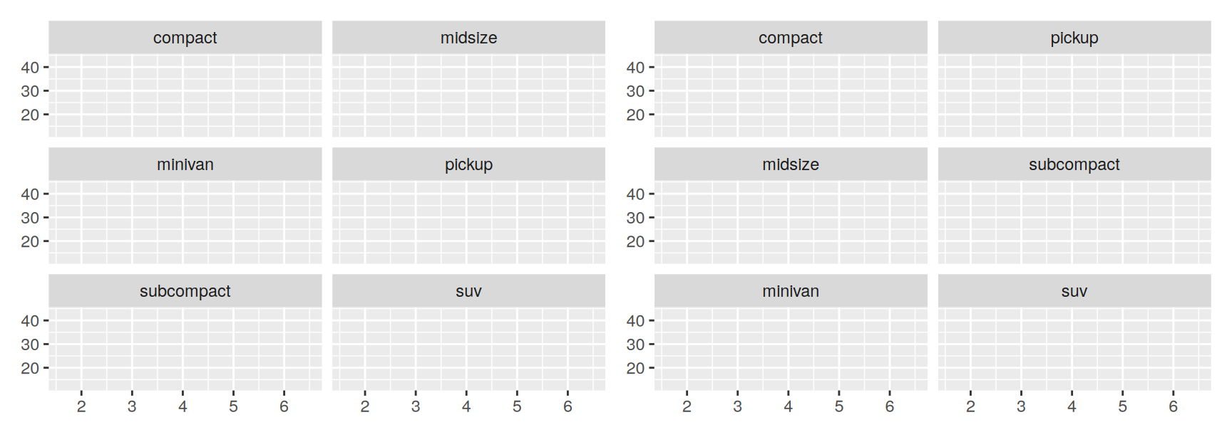
horizontal <- base +facet_wrap(~class, nrow =3)vertical <- base +facet_wrap(~class, nrow =3, dir ="v")horizontal + vertical
dir earns its keep when the faceting variable is ordered. Filling by column puts consecutive levels one above the other, so the reader compares them down a column instead of jumping to the start of the next row.
Pick the direction that matches the comparison you want to be easy.
Facet grid
Crossing two variables
facet_grid() reads a formula written as rows ~ cols. A dot means “nothing on this side”.
. ~ a spreads a across the columns. Panels standing side by side share a y axis, so vertical position is comparable.
b ~ . spreads b down the rows. Panels stacked on top of each other share an x axis, so horizontal position and the shape of a distribution are comparable.
b ~ a does both at once.
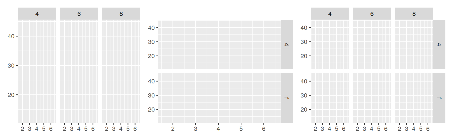
across <- base +facet_grid(. ~ cyl)down <- base +facet_grid(drv ~ .)crossed <- base +facet_grid(drv ~ cyl)across + down + crossed
Choose the side from the comparison you care about. Distributions are easiest to compare when they are stacked and share an x axis. Levels of a category are easiest to compare when they sit side by side and share a y axis.
One practical rule. Put the variable with more levels in the columns. Screens are wider than they are tall, so a wide grid wastes less space than a tall one.
Nested and crossed
A side of the formula can hold more than one variable, written a + b ~ c + d.
Variables on the same side are nested. Only the combinations that actually occur get a panel. Variables on opposite sides are crossed. Every combination gets a panel, whether or not any observation falls in it.
facet_wrap() always nests, so putting the two side by side shows the difference directly.
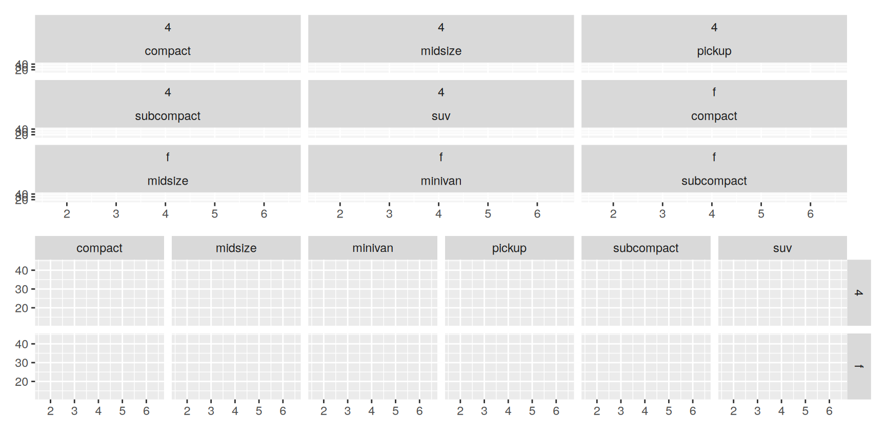
nested <- base +facet_wrap(~drv + class)crossed <- base +facet_grid(drv ~ class)nested / crossed
The wrapped version has nine panels, the grid has twelve. Three combinations never occur in these data. No minivan is four wheel drive, and no pickup or SUV is front wheel drive.
The empty panels are not a failure. They report a fact about the data that the wrapped version quietly hides. Use the grid when the absence is part of the story, and the wrap when it is only clutter.
Controlling scales
Fixed scales and free scales
By default every panel uses the same position scales. The scales argument relaxes that.
Value
Effect
"fixed"
x and y shared by all panels, the default
"free_x"
x varies by panel, y shared
"free_y"
y varies by panel, x shared
"free"
both vary by panel
Fixed scales make comparison between panels possible. Free scales make the pattern inside a panel visible. You cannot have both, and picking the wrong one is the most common way a faceted plot misleads.
facet_grid() is stricter than facet_wrap(). A column of the grid has to share one x scale and a row has to share one y scale, because the panels are aligned.
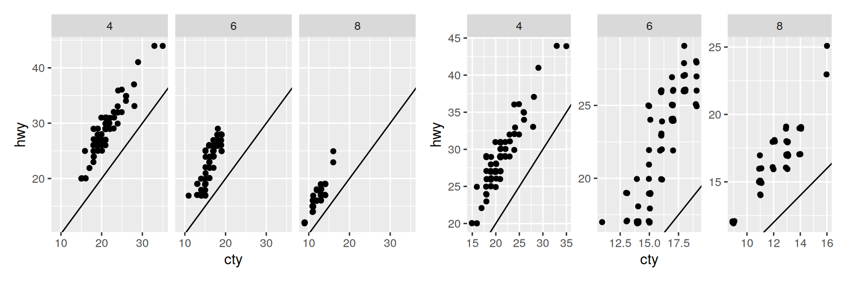
On the left the four cylinder panel sits high and to the right, and the eight cylinder panel sits low and to the left. That difference is the finding.
On the right each panel has been zoomed to its own data, so all three clouds look alike and the finding has disappeared. What free scales do show is that the relationship within each group is tight and roughly parallel to the diagonal.
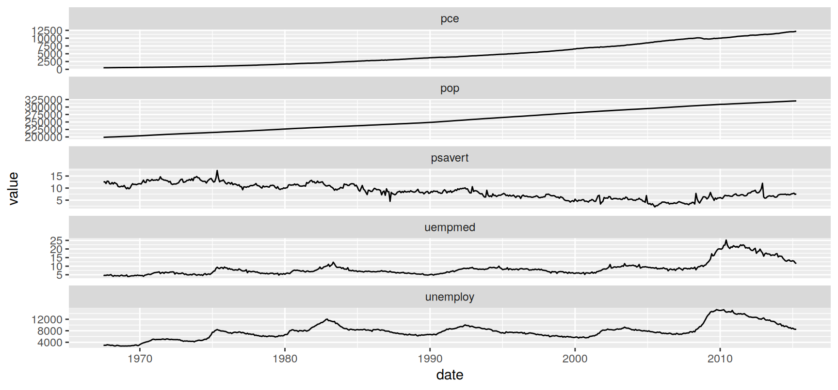
Free scales are not optional when the panels measure different things. economics_long stacks five US economic series whose units have nothing in common.
With a fixed y scale, pop runs to hundreds of thousands and flattens the other four series into straight lines at the bottom of the plot.
ncol = 1 matters as much as scales = "free_y". A single column keeps the dates aligned, so a downturn that appears in three series at the same moment lines up vertically and is easy to spot.
Sizing panels with space
facet_grid() has a second argument, space, taking the same four values as scales. By default every panel is given the same amount of room.
When space = "free", a row or column is sized in proportion to the range of its own scale. One centimetre of screen then stands for the same amount of data everywhere.
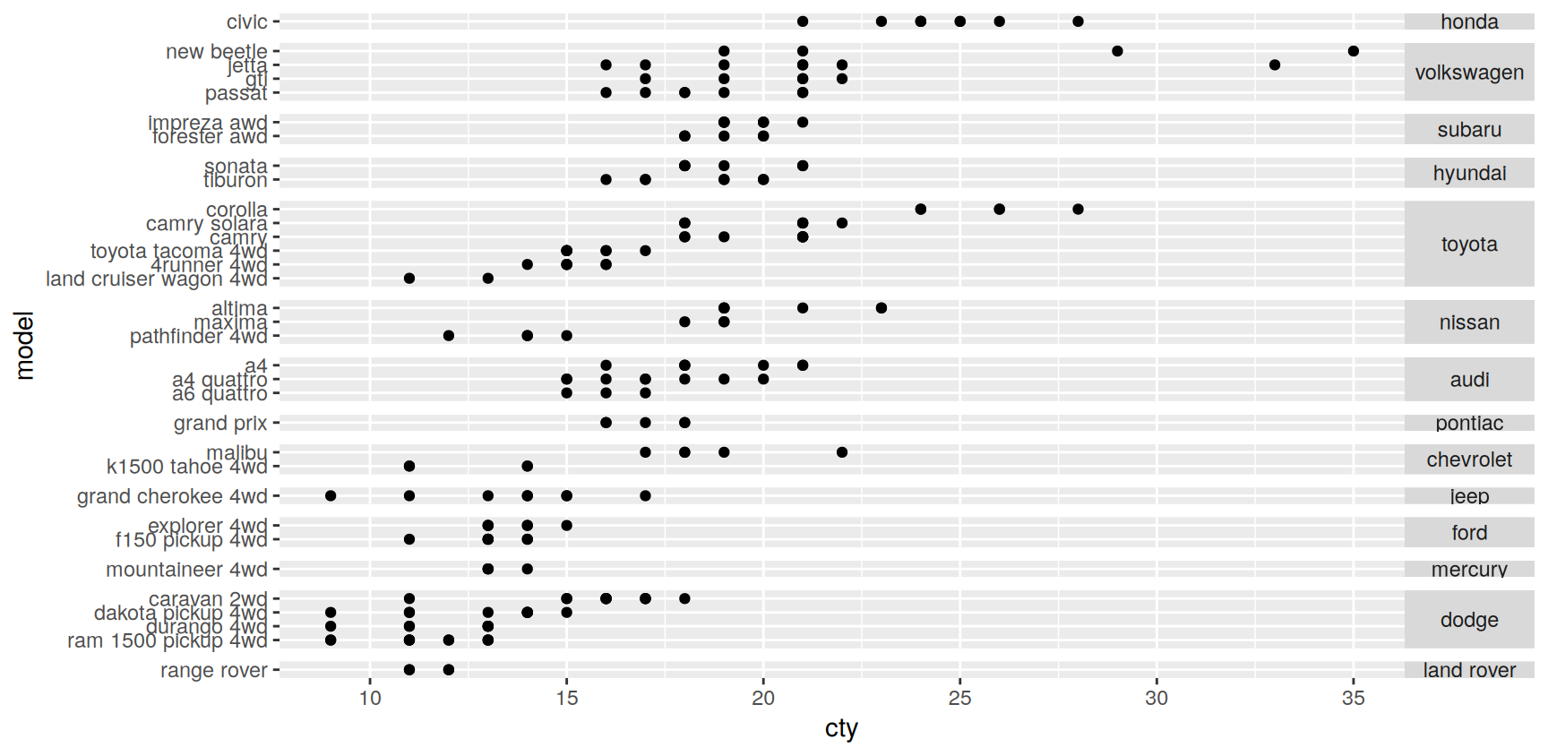
This is mostly a fix for categorical axes. A manufacturer with one model should not get the same vertical space as a manufacturer with eight.
Both variables are reordered by city fuel economy first. Alphabetical order carries no information, and a plot that is sorted by the value it shows is much faster to read.
Each strip now holds exactly as many rows as that manufacturer has models, and every row is the same height. Without space = "free" the single model manufacturers would each be stretched across a whole panel.
Rotating the strip text to horizontal is a small thing that makes the labels readable. Vertical text is the default only because it fits.
Missing faceting variables
A layer that has no facet
Faceting works by splitting each layer’s data by the faceting variable. If a layer’s data does not contain that variable, there is nothing to split.
ggplot2 treats the missing variable as taking every value, so the layer is drawn in full in every panel. This is a deliberate design choice, not an accident, and it is the standard way of putting the same context into all panels.
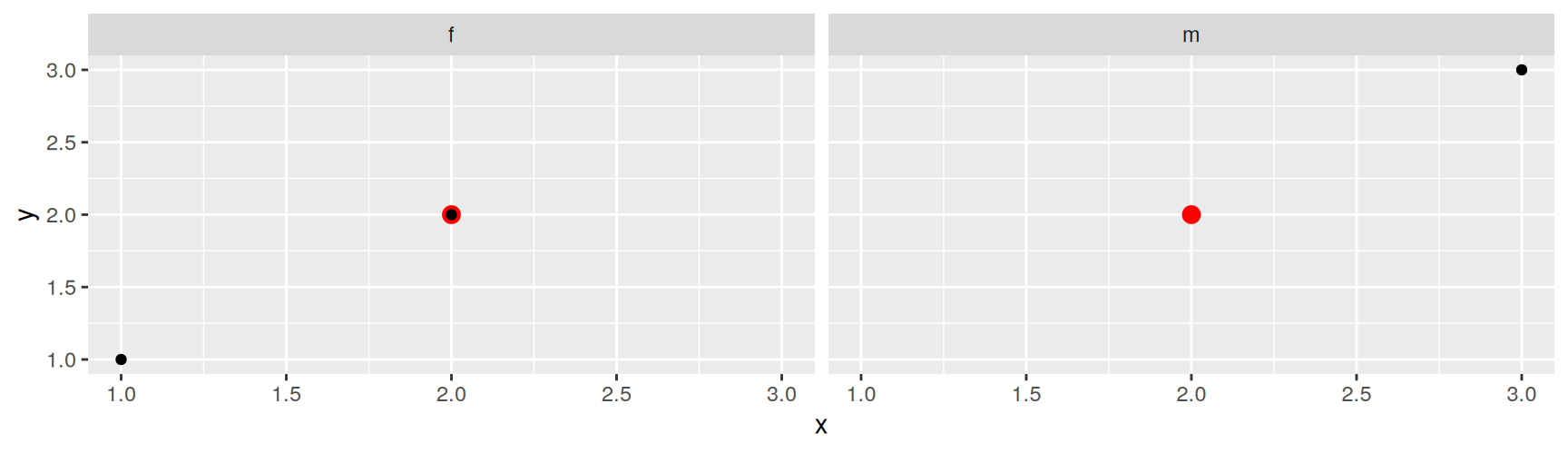
reference has no gender column, so its single point is drawn in both panels. The black points, which come from observations, are split as usual.
Remember this rule. Most of the annotation tricks later in the chapter are just this behaviour used on purpose, by handing a layer a data frame with the faceting variable removed.
Grouping vs. faceting
Two ways to show the same variable
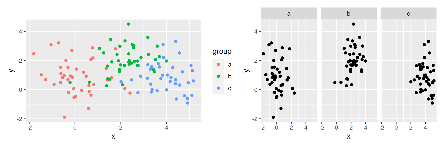
A categorical variable can go into a plot as an aesthetic or as a facet. The choice is about position.
Grouping keeps everything in one panel. The groups are close together, so small differences are easy to see. The cost is overlap. Once the groups sit on top of each other you cannot tell what is underneath.
Faceting gives each group its own panel. There is no overlap and the shape of each group is clear. The cost is distance. The eye has to travel, and it is bad at carrying a position with it.
These three groups overlap only a little, so grouping wins. The relative position of the clusters is obvious on the left and has to be reconstructed from the axes on the right.
Reverse the situation, with heavy overlap or a dozen groups, and faceting wins. There is no rule that settles it in advance. Draw both, which costs one extra line.
Annotating a faceted plot
Faceting is easier to read when each panel carries something that ties it back to the whole. The trick from the previous section does the work.
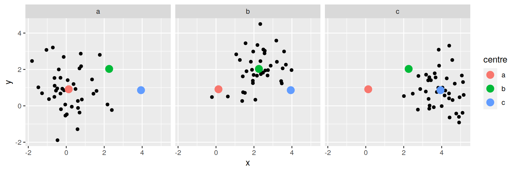
Group means, for example. Compute them, then rename the grouping column so that the summary layer no longer has the faceting variable.
All three means appear in every panel. Each panel now says where its own group sits relative to the other two, which is the comparison faceting normally throws away.
Had the column kept the name group, each panel would have shown one mean, and the plot would have been useless.
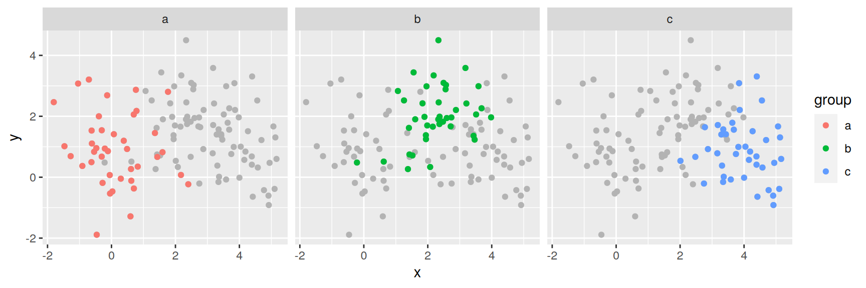
The other standard annotation is a grey backdrop of the complete data behind each panel.
Dropping the group column is what makes the backdrop appear everywhere. The grey points are the same 120 observations in all three panels.
Now each subset is seen against the whole. The panel is still a panel, but the reader no longer has to remember the other two while looking at this one. This costs one line and is worth adding to almost any faceted plot.
Continuous variables
Discretise first
A continuous variable has as many values as it has observations, so it cannot be faceted directly. You have to cut it into bins first. ggplot2 supplies three helpers.
Helper
Bins
cut_width(x, width)
bins of the width you give
cut_interval(x, n)
n bins of equal length
cut_number(x, n)
n bins holding equal numbers of observations
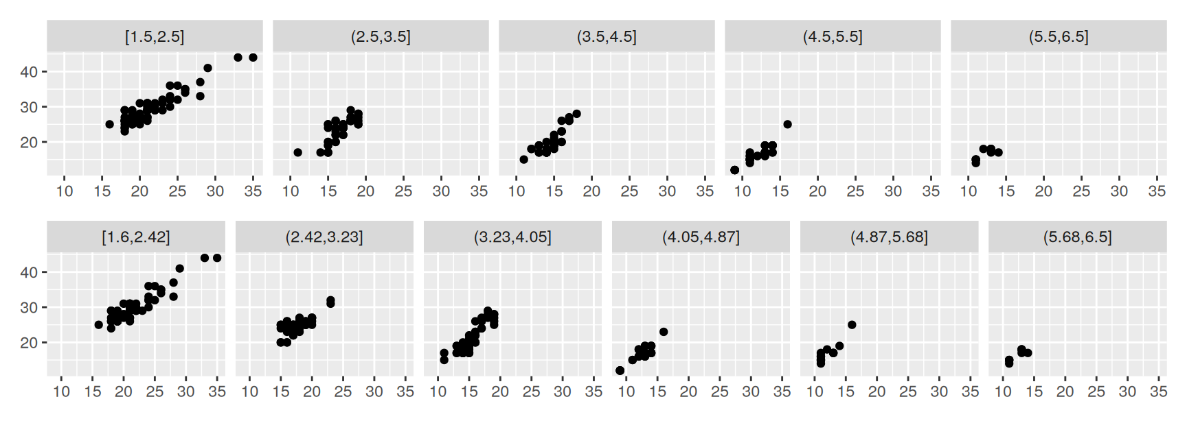
The three answer different questions. Equal width and equal length bins keep the x axis honest and let the counts fall where they may. Equal count bins keep every panel equally reliable and distort the axis instead.
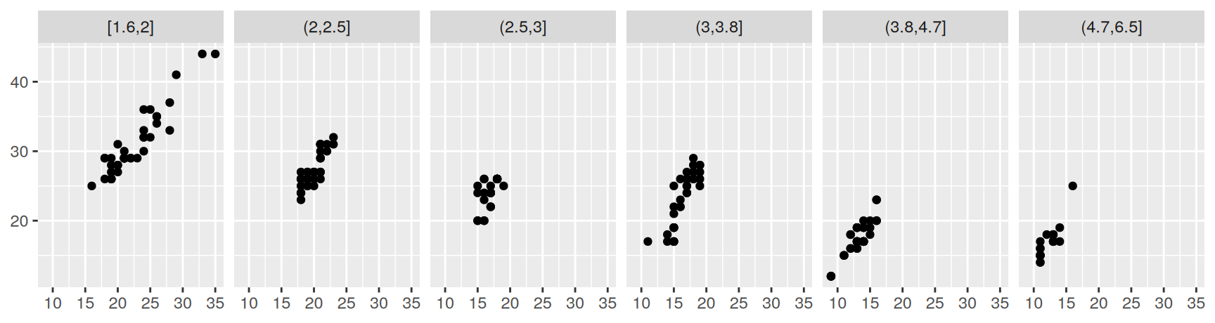
Building the variable first is the habit worth keeping. Current versions of ggplot2 will also evaluate a call inside the formula, as in facet_wrap(~cut_width(displ, 1)), but then the whole call becomes the strip label.
cut_width(displ, 1) gives five panels, one per litre. cut_interval(displ, 6) gives six panels of equal length, which here works out at about 0.9 litres each.
In both cases the end panels are nearly empty, because very small and very large engines are rare. That is an honest picture of the distribution and a poor use of the screen.
panel +facet_wrap(~disp_number, nrow =1)
Equal counts fill every panel. The price is an axis that is no longer even, so the apparent spread of a panel now depends on how wide its bin happens to be.
Exercises
Draw depth against table from diamonds, faceted by cut, once with the default scales and once with scales = "free". Which version would persuade a reader that one cut behaves differently from the rest, and what does the other version hide?
Facet a sample of diamonds by cut and color with facet_grid(). Are any panels empty or nearly empty? Say whether an empty panel here is a statement about diamonds or an accident of your sample.
Facet mpg2 with drv in the rows and cyl in the columns, then swap the two sides. Which version is easier to read on a wide screen, and which comparison does each version make easy?
Cut displ with cut_number(displ, 4) and then with cut_width(displ, 1.5), and facet the cty against hwy scatterplot by each. Count how many cars land in the emptiest panel of each version. Which cut would you use to compare the slope across panels, and why?
Facet mpg2 by class and add a single geom_smooth() fitted to the whole data set to every panel. (Give the smooth layer a copy of the data with class removed.) Name one class that departs from the overall trend and say in which direction.
Redraw the economics_long plot with scales = "fixed". Describe what happens, then state the condition under which free scales stop being a convenience and become necessary.
Add the grey backdrop trick to a plot of mpg2 faceted by class. Write one sentence about what the backdrop lets you see that the plain facets do not.
Recap
Faceting buys you room and charges you distance. Everything else in this chapter is about managing that trade.
facet_wrap() wraps one variable and draws only the combinations that occur. facet_grid() crosses two and draws all of them, empty panels included.
Fixed scales let you compare panels. Free scales let you read inside one. Choose deliberately, because the default is a choice too.
space = "free" sizes each row and column by its own range, which is what categorical axes with uneven numbers of levels need.
A layer whose data lacks the faceting variable is drawn in every panel. Group means and grey backdrops are that one rule, used on purpose.
Continuous variables have to be cut before they can be faceted. Equal width, equal length and equal count bins each distort something different.
Acknowledgement
Source. These slides follow the structure and the teaching sequence of ggplot2: Elegant Graphics for Data Analysis (3e) by Hadley Wickham, Danielle Navarro and Thomas Lin Pedersen. The explanations, examples and exercises here have been rewritten for this course; any errors in them are mine and not the book’s.
Copyright. All rights in the original work are reserved by its authors and publishers. Students are encouraged to read the book itself, which is freely available online.
Non-commercial use only. These materials are for teaching and must not be used for commercial gain.
Attribution. Any reuse or redistribution must credit both the original book and this course.