Everything on a plot is either data or it is not. Geoms and scales take care of the data. The theme system takes care of the rest. Fonts, tick marks, panel backgrounds, strip labels, the box around the legend.
That split is the whole point. You can settle what the plot shows before spending a minute on how it looks. A theme never moves a point and never changes a number.
This is also the chapter that Chapters 2 and 11 pointed at, for rotating crowded axis labels and for writing a finished plot to a file.
The system has four parts.
Elements are the pieces you can control. There are around forty, with names like plot.title and axis.ticks.x.
Element functions say how a piece should look. There are only four of them.
theme() takes element names and element functions and overrides the current settings, one element at a time.
Complete themes, such as theme_grey(), set every element at once to values that were chosen to work together.
A motivating example
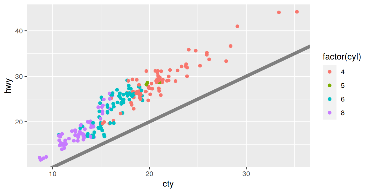
The plot you drew for yourself
An exploratory plot answers your question and embarrasses you in print.
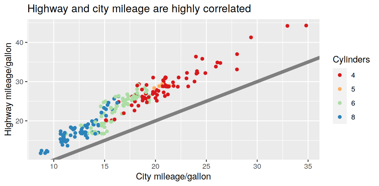
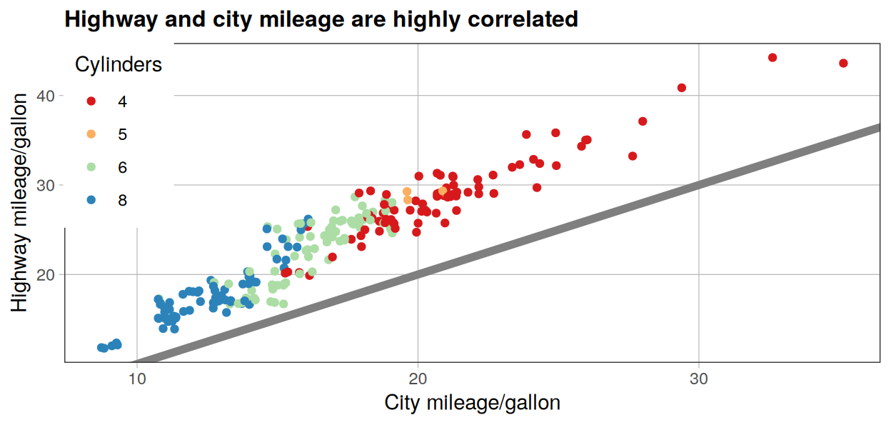
Read that theme() call as a list of seven corrections. Each one names an element and hands it a description of how to look.
Order matters. theme_bw() ran first and set everything, then theme() overrode the seven pieces the style guide cares about. Put the complete theme second and it wipes out every correction you just made.
Complete themes
The eight that ship with ggplot2
Theme
What it looks like
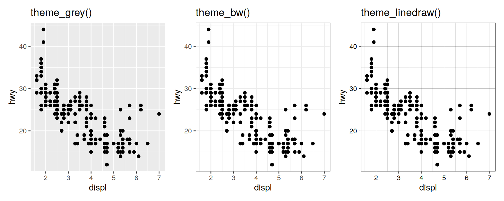
theme_grey()
grey panel, white gridlines, the default
theme_bw()
white panel, thin grey gridlines
theme_linedraw()
black lines only, like a line drawing
theme_light()
pale grey lines, a very light touch
theme_dark()
the same idea on a dark panel
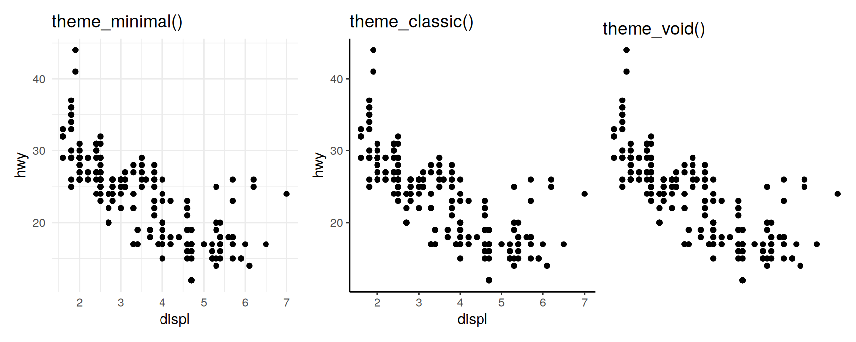
theme_minimal()
gridlines but no panel background
theme_classic()
axis lines and no gridlines
theme_void()
nothing but the data
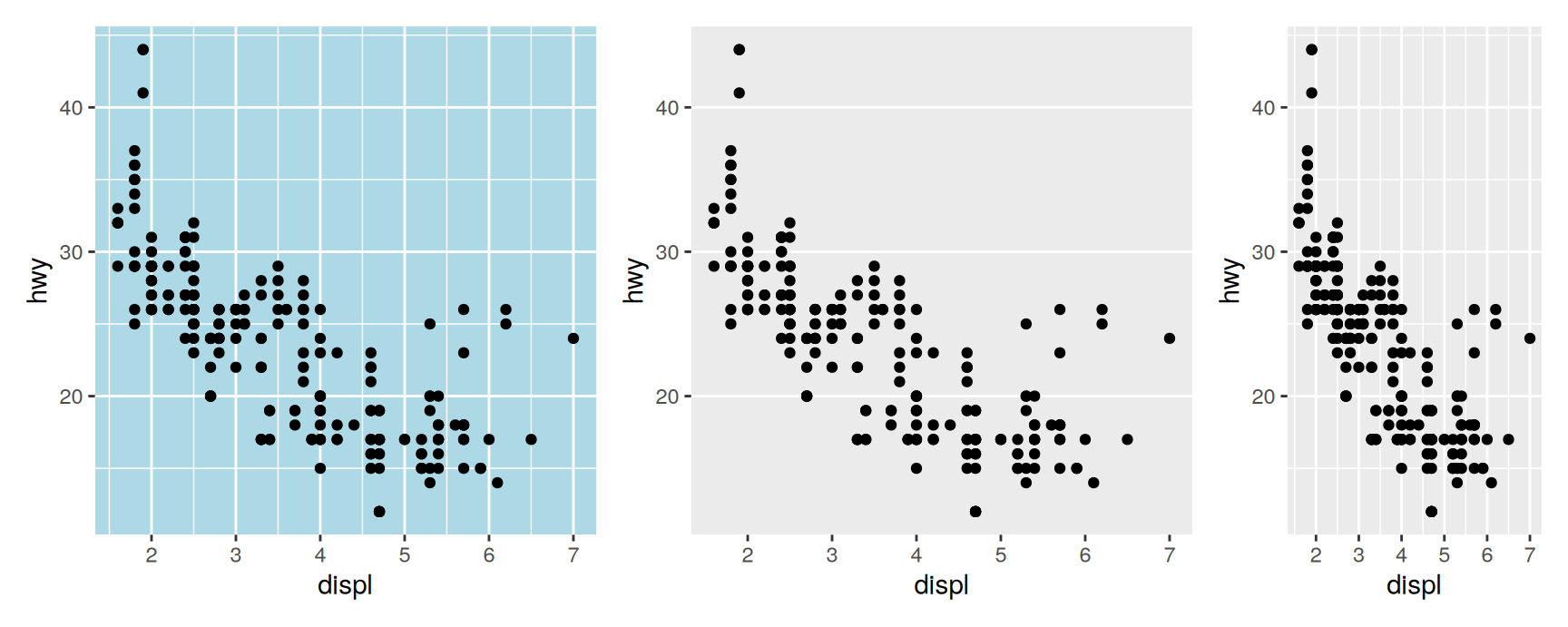
The default is not an accident. A grey panel stops the white gridlines from competing with the points while still letting you read a position off them.
theme_void() is more useful than it looks. Maps and network diagrams use position meaningfully and have no axes worth printing.
Base size
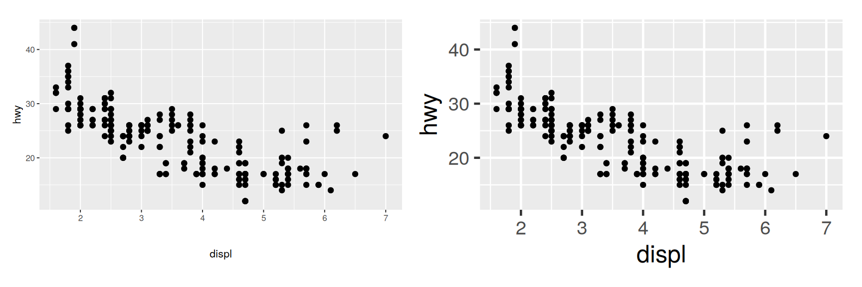
Every complete theme takes a base_size. It sets the font size of the axis titles, and the rest of the text is defined relative to that. Titles come out 1.2 times larger, tick labels and strip labels 0.8 times smaller.
One argument beats setting six text elements by hand, and it keeps the sizes in proportion. Choose it against the size the figure will be printed at, not against the size of your screen.
theme_set() replaces the default theme for every plot drawn afterwards. It returns the theme it replaced, so keep the return value if you ever want to get back.
old_theme <-theme_set(theme_bw())
You are not limited to the eight. The ggthemes package adds a long list, including theme_tufte(), theme_solarized() and theme_excel().
A ready made theme gets you a long way for one line of typing. What it will not do is let you change one detail without accepting the other forty. That is what the rest of the chapter is for.
Exercises
Draw hwy against displ coloured by drv under theme_light() and then under theme_dark(). Which one separates the three drivetrains better, and what is it about the panel that causes the difference?
Find a figure in a paper or a newspaper you have read this month. Which of the eight themes is it closest to? Name two things it does that none of the eight do.
Draw a bar chart of class twice, at base_size = 8 and at base_size = 20, and save both with ggsave(width = 4, height = 3). Open the files. Which one can you read, and what does that tell you about choosing type size?
Apply theme_void() to a scatterplot of cty against hwy. Say what a reader can still learn from the plot and what they have lost.
Run old <- theme_set(theme_minimal()), draw two plots, then restore the original with theme_set(old). Why is that safer than typing theme_set(theme_grey()) when you are finished?
Modifying theme components
Four element functions
The pattern is always plot + theme(element.name = element_function()).
element_text() for anything made of letters. family, face, colour, size, hjust, vjust, angle, lineheight, and margin for the space around it.
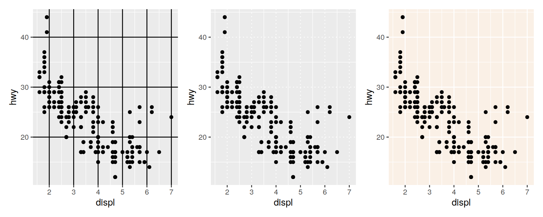
element_line() for lines. colour, linewidth, linetype.
element_rect() for filled boxes. fill for the inside, then colour, linewidth and linetype for the border.
element_blank() for deleting something.
The element’s name tells you which function it wants. Anything ending in .text takes element_text(), anything ending in .background takes element_rect().
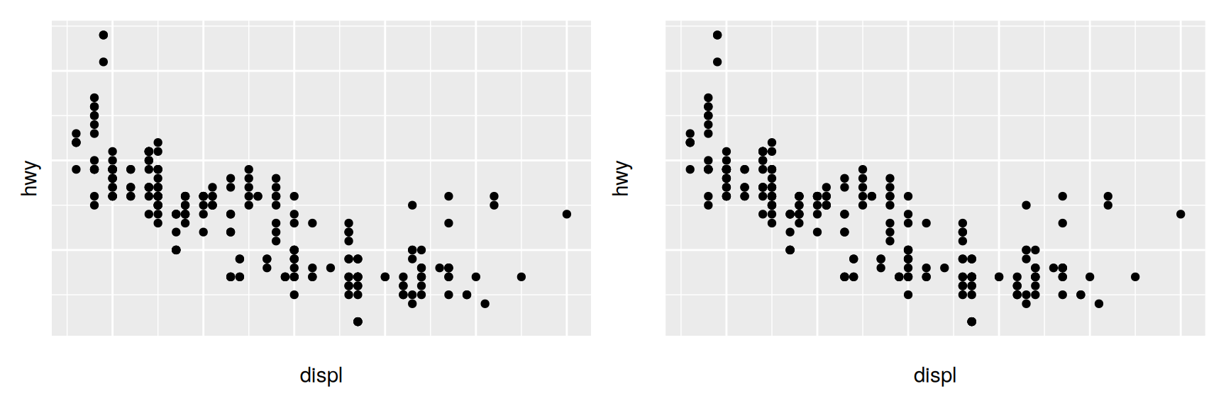
The left panel is wider than the right one, because it reclaimed the room the labels had. On the right the labels are still there, drawn in no colour at all, so the layout is untouched.
Reach for the second form whenever several plots have to line up and only some of them carry labels. Otherwise the panels come out different sizes and the comparison is harder than it should be.
Changing the defaults
theme_update() applies a theme() call to the current default, so every later plot inherits it. Like theme_set(), it returns what it replaced.
Catch that return value. Without it the only reliable way back is restarting R.
Theme elements
Five families
The forty odd elements fall into five groups. One for the plot as a whole, then one each for axes, legends, panels and facet strips.
The names are hierarchical, and so is the inheritance. axis.text covers both axes. axis.text.x covers one of them and inherits everything it does not set itself.
That is why a theme is usually short. Set axis.text once and both axes follow, then override a single axis only where it genuinely differs.
Plot elements
Element
Function
What it is
plot.background
element_rect()
the rectangle behind everything
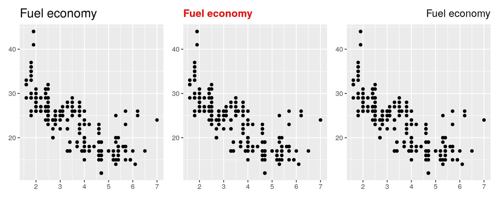
plot.title
element_text()
the title
plot.margin
margin()
the space outside the whole plot
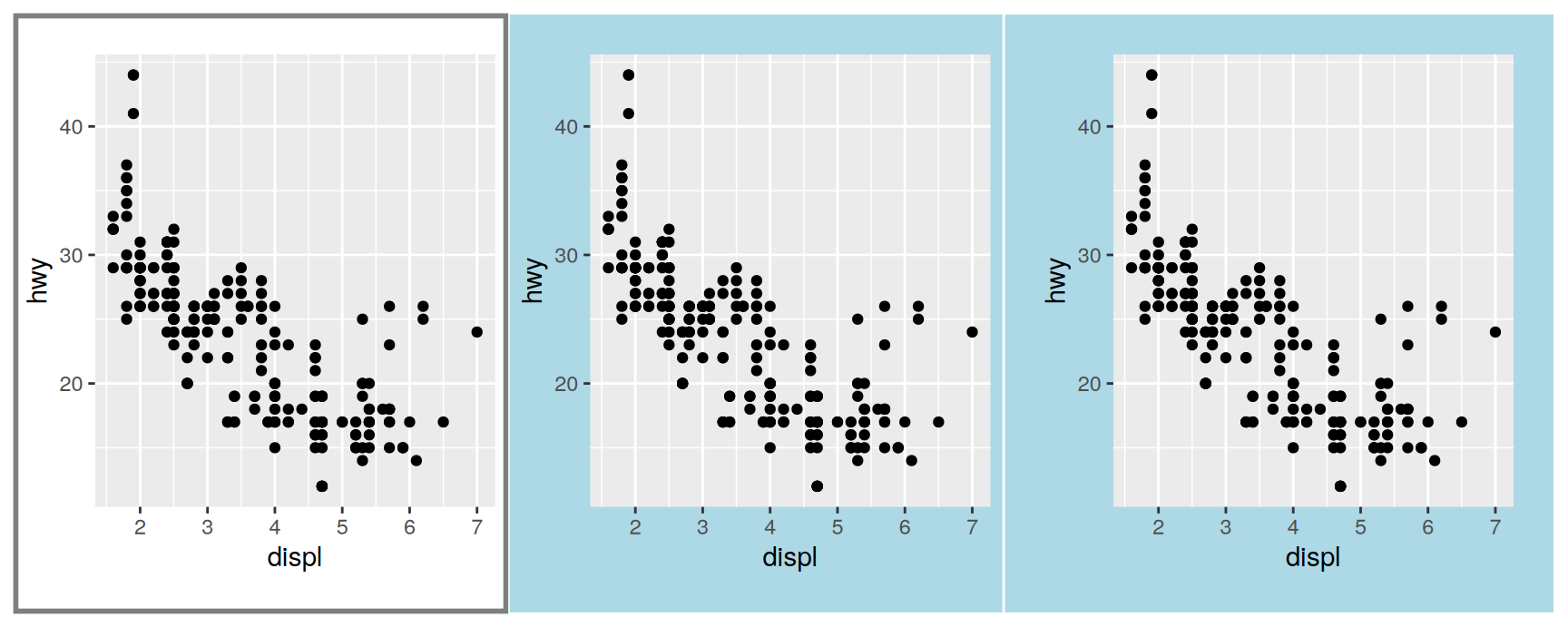
plot.background sits under the panel and under the labels, so it is the one to set when a slide has a coloured backdrop. margin() takes four sizes in the order top, right, bottom, left.
axis.line is drawn only if you ask for it. It looks right with theme_classic() and wrong under any theme that already draws a panel border.
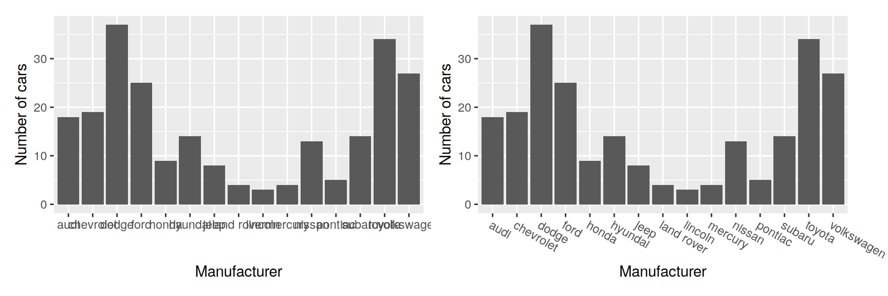
Chapter 2 left a bar chart of manufacturer with the names piled on top of each other. Rotation is the fix. Negative angles read faster, and they need hjust = 0 and vjust = 1 so that the start of each label meets its tick.
Rotated labels lean out past the edge of the panel, which is why the right hand plot.margin was widened to make room for them.
Chapter 2 offered a different fix for the same problem, which was to put manufacturer on the y axis and let the bars run sideways. Both work.
Rotation keeps the bars vertical, and vertical bars are easier to compare by height. Flipping the plot gives the labels unlimited room. Pick by which of the two you care about more, and stop rotating once the angle passes about 45 degrees, because at that point the labels are being read letter by letter.
Legend elements
Element
Function
What it is
legend.background
element_rect()
the box around the whole legend
legend.key
element_rect()
the patch drawn behind each key
legend.key.size, .height, .width
unit()
how big the keys are
legend.margin
margin()
space around the legend
legend.text, legend.title
element_text()
key labels and the legend name
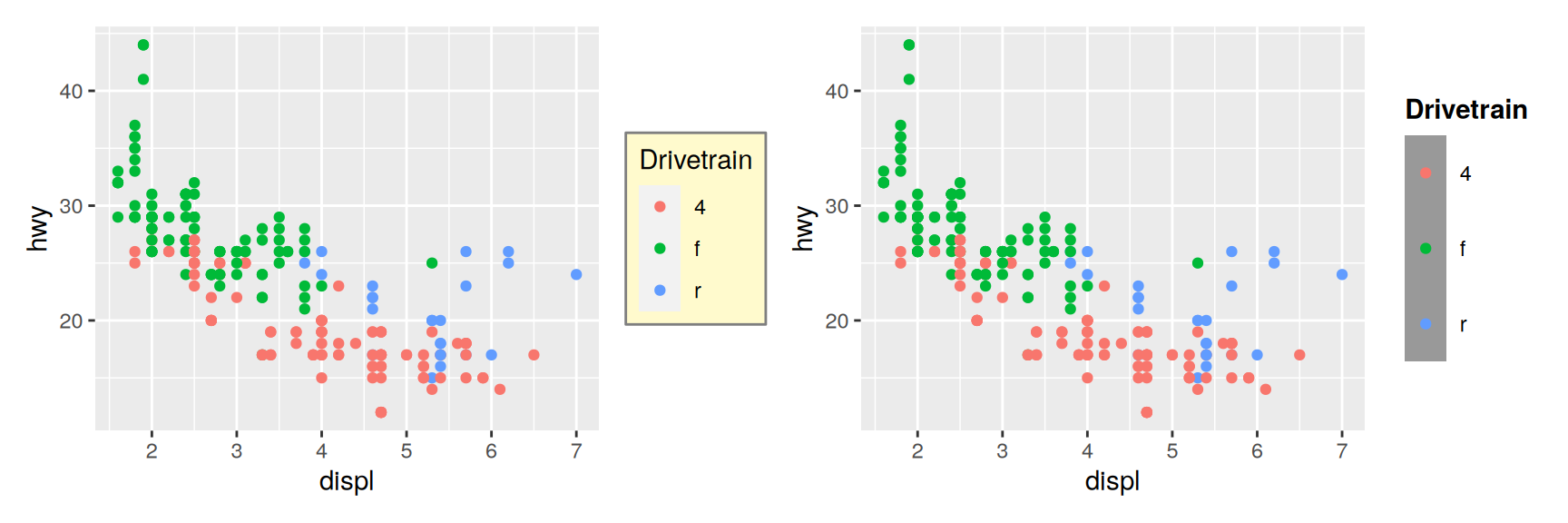
Where the legend sits is not an element. legend.position, legend.direction, legend.justification and legend.box are ordinary arguments to theme(), and Chapter 11 covers them. What goes in the keys is controlled by guide_legend() and guide_colourbar().
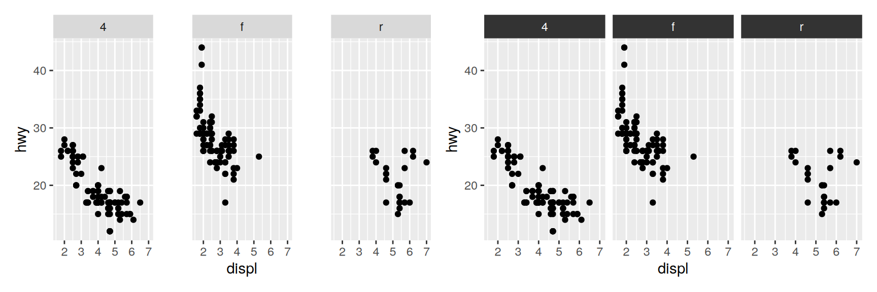
strip.text.x controls the strips along the top, so it applies to both facet_wrap() and facet_grid(). strip.text.y controls the strips down the right hand side, which only facet_grid() produces.
Build the ugliest mpg scatterplot you can in one theme() call. Then delete settings one at a time until it is merely bad. Which single setting was doing most of the damage?
theme_dark() darkens the panel and leaves everything around it white. Add a theme() call that darkens the rest and keeps every label readable. List the elements you had to touch beyond plot.background.
Write a theme for a printed handout. Linen background, serif type throughout, no minor gridlines. Apply it to hwy by drv faceted on year, then say what you would change if the handout were going to be photocopied in black and white.
Give a plot a two line title using \n, and vary hjust from 0 to 1. Then vary vjust. One of the two appears to do nothing. Explain why.
Draw one plot with panel.border = element_rect(colour = "black") and another with fill = NA added to it. Describe what happened to the points, and say which element was drawn over which.
Take the manufacturer bar chart. Rotate the labels to angle = 45, hjust = 1, then to angle = -30, hjust = 0. Which reads faster? Which would you choose if the names were twice as long, and why?
Set axis.text = element_text(colour = "grey40") and then axis.text.x = element_text(colour = "red") in the same theme() call. Predict the colour of each axis before you run it, and explain the result in terms of inheritance.
Saving your output
Raster or vector
Two families of file format, and you choose once per figure.
Vector formats such as .pdf, .svg and .eps store the drawing instructions. They redraw at any size without going soft, and the text inside them stays text. Prefer them unless you have a reason not to.
Raster formats such as .png, .jpg and .tiff store a grid of pixels at one intended size. Use them when the plot holds tens of thousands of objects, because the vector file would be enormous and slow to open. Use them too when the figure is heading into software with poor vector support.
ggsave()
ggsave() writes a plot to a file. Given no plot it writes the last one drawn, which is what makes it comfortable at the console.
The file extension picks the device, so you rarely have to name one.
The arguments worth knowing:
filename, whose extension selects the format. .pdf, .svg, .eps, .png, .jpg, .tiff and several more.
plot, the object to write. Defaults to the last plot drawn.
path, the directory to write into, so the file name stays short.
width and height, in inches. Left out, they copy the current graphics device, which is why a saved plot often looks nothing like the one on screen.
dpi, for raster formats only. 300 for print, 600 when the printing is good, 96 for a screen.
Set width and height when you save, not afterwards in a word processor. Scaling a saved figure scales its text along with it, and that is how figures end up with axis labels nobody can read.
This is where base_size earns its keep. Decide how large the figure will be on the page, then pick a type size that works at that size. If the plot still looks cramped, take something out of it rather than shrinking the type further.
Exercises
Save one mpg scatterplot as .pdf and as .png at dpi = 96, both at width = 6, height = 4. Compare the file sizes, then zoom both to 400 percent and describe the difference in one sentence.
Save a scatterplot of price against carat from diamonds, all 54,000 points, in both formats. Which file is larger this time? Explain the reversal.
Save the same plot at width = 8, height = 6 and at width = 3, height = 2.25. The proportions are identical. Why is only one of them usable?
Save a .png at 300 dpi and at 600 dpi. At what printed size does the difference start to show, and what did it cost you in file size?
Save a faceted plot without giving width and height. Now set them so that each panel is roughly square. What did you have to know about the number of panels?
Recap
Themes control everything that is not the data. They never change what the plot says, only how it reads.
A complete theme sets every element at once. A theme() call overrides the few you care about. The complete theme goes first.
Four element functions cover everything. Text, line, rectangle, blank. The name of the element tells you which one it wants.
element_blank() removes an element and its space. colour = NA hides it and keeps the space, which is what you want when plots have to align.
Element names inherit, so axis.text sets whatever axis.text.x does not override.
Save with ggsave(), in a vector format, at the size the figure will really be printed, and choose base_size to match.
Acknowledgement
Source. These slides follow the structure and the teaching sequence of ggplot2: Elegant Graphics for Data Analysis (3e) by Hadley Wickham, Danielle Navarro and Thomas Lin Pedersen. The explanations, examples and exercises here have been rewritten for this course; any errors in them are mine and not the book’s.
Copyright. All rights in the original work are reserved by its authors and publishers. Students are encouraged to read the book itself, which is freely available online.
Non-commercial use only. These materials are for teaching and must not be used for commercial gain.
Attribution. Any reuse or redistribution must credit both the original book and this course.