This chapter gets you drawing useful graphics as fast as possible.
ggplot2 is built on the grammar of graphics, a theory that describes a plot as a combination of a few independent parts. The payoff of that theory is that a handful of rules generate a very large number of plots. The cost is that the rules take a while to absorb.
So we postpone the theory. Here you learn the working parts of ggplot() and a small set of recipes that cover most of what you will actually draw. Later chapters go back and explain why the recipes work.
By the end of the chapter you should be able to:
describe the mpg data set and inspect a data set you have never seen before;
name the three parts every plot needs, and write them as a ggplot() call;
add a third or fourth variable with colour, shape or size;
split a plot into small multiples with facet_wrap();
choose among the common geoms for scatterplots, distributions, categories and time;
relabel and restrict the axes;
store a plot in an object, print it, describe it and save it to a file.
How to work through the slides
The code on these slides is meant to be run, not read.
Keep an R session open beside them. Type each example yourself, then change one argument and look at what moves. Most of what you need to learn here is which knob controls which part of the picture, and that is faster to discover than to memorise.
Every section ends with exercises. They are the point of the chapter; the slides are only the setup.
Fuel economy data
The mpg data set
Nearly every example in this chapter uses mpg, a data set that ships with ggplot2. It records fuel economy for popular car models sold in the United States in 1999 and 2008, as measured by the US Environmental Protection Agency (https://fueleconomy.gov).
Loading the package makes the data available:
library(ggplot2)mpg
# A tibble: 234 × 11
   manufacturer model      displ  year   cyl trans drv     cty   hwy fl    class
   <chr>        <chr>      <dbl> <int> <int> <chr> <chr> <int> <int> <chr> <chr>
 1 audi         a4           1.8  1999     4 auto… f        18    29 p     comp…
 2 audi         a4           1.8  1999     4 manu… f        21    29 p     comp…
 3 audi         a4           2    2008     4 manu… f        20    31 p     comp…
 4 audi         a4           2    2008     4 auto… f        21    30 p     comp…
 5 audi         a4           2.8  1999     6 auto… f        16    26 p     comp…
 6 audi         a4           2.8  1999     6 manu… f        18    26 p     comp…
 7 audi         a4           3.1  2008     6 auto… f        18    27 p     comp…
 8 audi         a4 quattro   1.8  1999     4 manu… 4        18    26 p     comp…
 9 audi         a4 quattro   1.8  1999     4 auto… 4        16    25 p     comp…
10 audi         a4 quattro   2    2008     4 manu… 4        20    28 p     comp…
# ℹ 224 more rows
The variables
Variable
Meaning
manufacturer, model
Maker and model name; 38 models, each sold in both 1999 and 2008
displ
Engine displacement, in litres
year
1999 or 2008
cyl
Number of cylinders
trans, drv
Transmission; drivetrain: front (f), rear (r), four wheel (4)
cty, hwy
Miles per gallon in city and highway driving
fl, class
Fuel type; type of car (compact, SUV, and so on)
Two conventions are worth noting. Fuel economy is reported as distance per unit of fuel, so bigger is better. And the 38 models were chosen precisely because they survived the full decade, which is a selected sample rather than a random one.
Questions the data can answer
A data set is only interesting if it settles an argument. mpg can speak to several:
Does a larger engine always cost you fuel economy?
Are some manufacturers systematically more efficient than the rest?
Did anything improve between 1999 and 2008?
Does the drivetrain matter once you account for engine size?
We will not answer all of them. We will, however, draw the plots you would need in order to start.
Exercises
Report the number of rows and columns in mpg in one line of code, and the type of every column in another. Name three more functions that tell you something about a data set you have just been handed.
class and drv are both categorical. Cross-tabulate them with table(). Which combinations never occur, and does that surprise you?
One US gallon is 3.785 litres and one mile is 1.609 kilometres. Add a column hwy_l100km holding highway fuel consumption in litres per 100 km. Is the car with the largest hwy also the car with the smallest hwy_l100km? Explain why that has to be so.
How many distinct values does trans take? Collapse it into just "auto" and "manual" and count how many cars fall into each. (substr() or grepl() will do the job.)
Find out which other data sets ggplot2 ships with, and pick one you might use later in the course.
Key components
Three parts, one plot
Every ggplot2 plot is assembled from three things:
Data — a data frame.
Aesthetic mappings — which variable is shown by which visual property (position, colour, size, shape).
At least one layer — how each observation is drawn. Layers come from geom_ functions.
Miss any one of them and you do not have a plot. Supply all three and you do, no matter how unusual the combination.
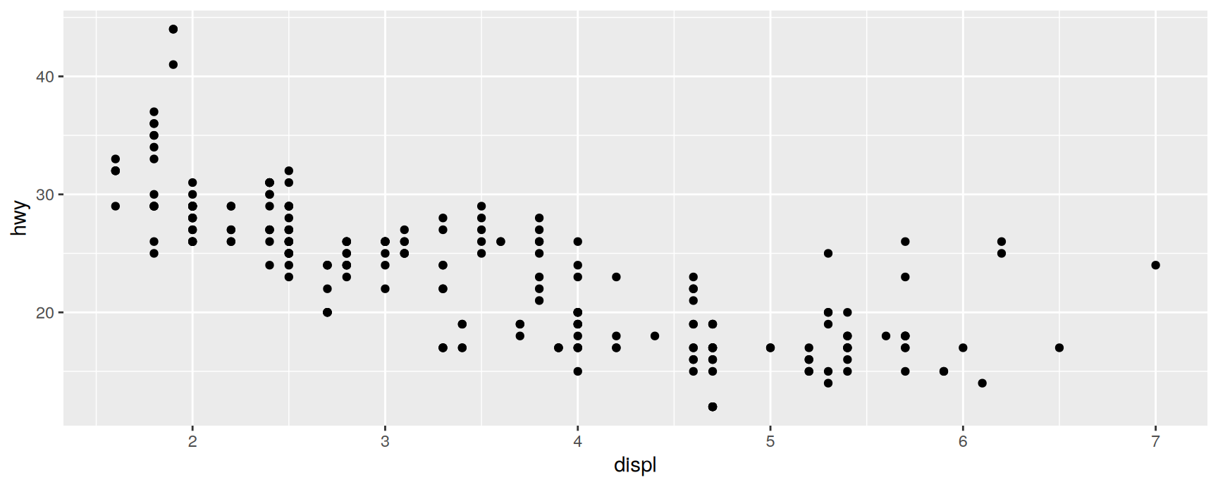
Here is the smallest useful example:
ggplot(mpg, aes(x = displ, y = hwy)) +geom_point()
Read the call back against the three parts:
Data: mpg.
Mapping: engine size to horizontal position, highway economy to vertical position.
Layer: one point per car.
The shape of the call matters as much as its content. Data and mappings go inside ggplot(), layers are attached afterwards with +. Every plot in the rest of the course is that same skeleton with more pieces bolted on.
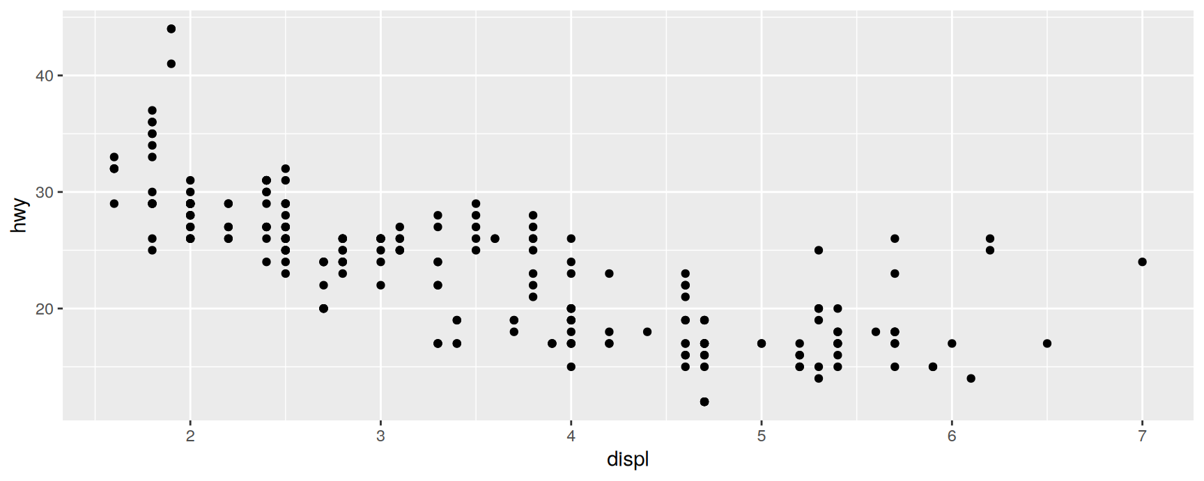
The first two unnamed arguments of aes() are x and y, so the names can be dropped:
ggplot(mpg, aes(displ, hwy)) +geom_point()
We use the short form from here on. Note also that each command sits on its own line. Write your own code that way: a plot specification is much easier to scan when the layers are stacked vertically.
What the plot says
The relationship is strong and negative. Bigger engines burn more fuel, and a two litre difference in displacement costs roughly ten miles per gallon.
The interesting part is the disagreement. A handful of cars sit well above the cloud at four litres and beyond, managing highway figures that their engine size does not predict. Hold that observation; the next section identifies them.
Exercises
Draw cty against cyl. Why is this plot harder to read than cty against displ, even though the two predictors measure much the same thing?
Two of the following three calls draw the same plot and one fails. Predict which before running them, then explain the failure.
ggplot(mpg, aes(displ, hwy)) +
  geom_point()
ggplot(mpg) + aes(displ, hwy) + geom_point()
ggplot(mpg, aes(displ, hwy)) + geom_point
For each call below, name the data, the mapping and the layer, and sketch the result on paper before you run it.
ggplot(mpg, aes(model, manufacturer)) + geom_point() technically works. Why is it useless, and what would you have to change about the data to make a plot of those two variables informative?
Colour, size, shape and other aesthetics
Beyond x and y
Position is only the most obvious aesthetic. Colour, shape, size, transparency and fill work exactly the same way: name a variable inside aes() and ggplot2 finds a visual value for every observation.
aes(displ, hwy, colour = class)
aes(displ, hwy, shape = drv)
aes(displ, hwy, size = cyl)
The translation from data values to visual values is done by a scale, one per aesthetic. The scale also produces the guide — the axis or the legend — that lets a reader run the translation backwards. Defaults are fine for now; Chapter 11 shows how to take them over.
Identifying the outliers
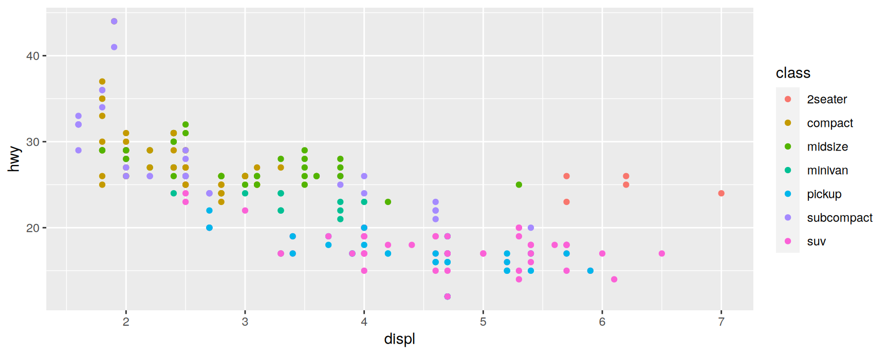
The cars that beat the trend at large engine sizes are worth a colour:
The legend answers the question. They are two seaters: sports cars carrying a large engine in a very light body. The efficiency they gain is a weight effect, not an engine effect, which is exactly the kind of confounding that a single scatterplot hides and a colour reveals.
Notice how little work that took. One argument turned a two variable plot into a three variable plot, and the legend appeared without being asked for.
Mapping versus setting
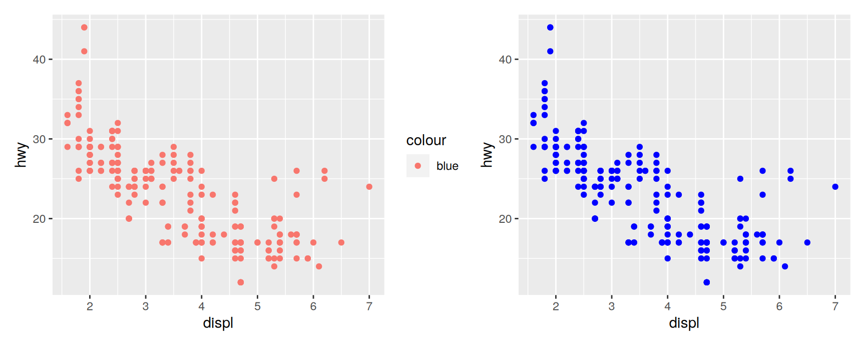
There are two ways to give points a colour, and they do different things. Inside aes() you map a variable; outside it, in the layer, you set a constant.
On the left, "blue" is treated as data: a variable with one value, which the scale maps to the first colour in the palette, along with a legend nobody wanted. On the right, "blue" is treated as an instruction, and the points come out blue.
The rule is short. Inside aes() goes a variable name. Outside aes() goes a value. Chapter 13 returns to this, and vignette("ggplot2-specs") lists the legal values for colours, shapes and line types.
Choosing an aesthetic
Different aesthetics suit different variables:
Colour and shape handle categorical variables, and only a few categories at a time. Past about seven colours a reader stops matching them to the legend.
Size handles continuous variables, but area is judged poorly, so read it as “roughly bigger” rather than “twice as much”.
Transparency (alpha) handles crowding rather than a variable.
Restraint pays. Colour, shape and size all at once produces a plot that is impressive and unreadable. A sequence of simple plots that each make one point will teach your reader more than one exhaustive plot that makes none.
Exercises
Map cyl to colour, then map factor(cyl) to colour. Describe how the legend and the palette change, and say which version you would put in a report.
Compare aes(displ, hwy, size = cty) with geom_point(size = 3). Both change the size of the points. Why does only one of them produce a legend?
Map drv to shape and year to colour in the same plot. Is the result readable? If you had to drop one of the two, which would you keep, and what does that cost?
What happens if you map cty — a continuous variable — to shape? Read the error message and say, in your own words, what it is objecting to.
Use colour and alpha together to show how drivetrain relates to engine size and fuel economy. Write one sentence stating what the plot shows about four wheel drive cars.
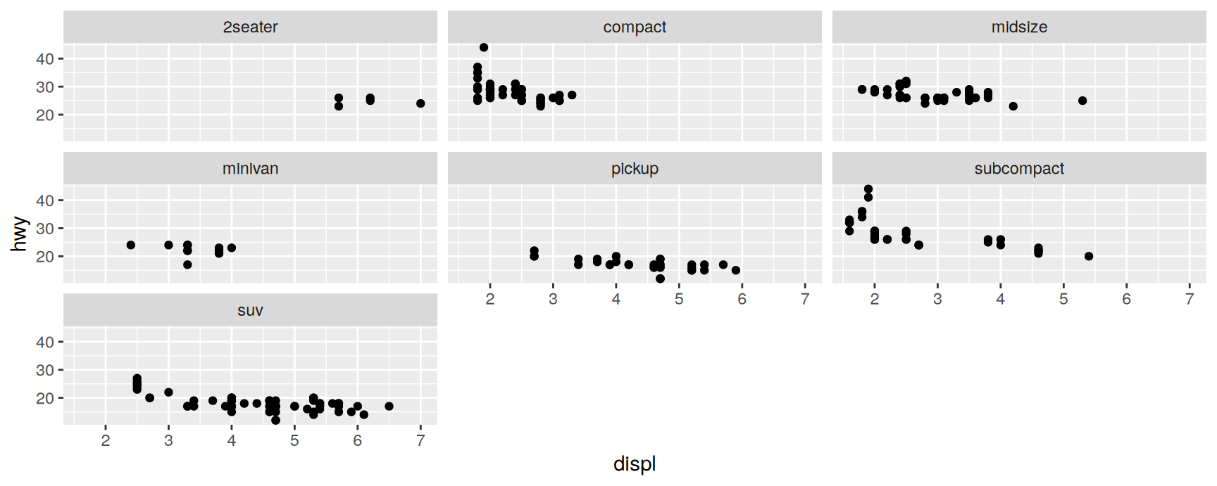
Faceting
Small multiples
Faceting is the other way to add a categorical variable. Instead of crowding every group into one panel, it splits the data into subsets and draws the same plot for each of them, on shared axes.
facet_wrap() takes a variable preceded by ~ and lays the panels out in a strip that wraps onto the next row when it runs out of width. There is also facet_grid() for crossing two variables, which Chapter 16 covers.
Both display a categorical variable, and the choice is about the comparison you want to make easy.
Colour keeps everything in one panel, so overlapping groups can be compared point by point. It fails when there are many groups or heavy overplotting.
Faceting gives each group room, so the shape within a group is clear. It costs you the direct comparison, because the eye has to travel between panels.
A useful default: colour when you are comparing groups, facets when you are describing them.
Exercises
Facet the displ–hwy scatterplot by drv, then by cyl, then by cty. What does facet_wrap() do with a variable that takes many distinct numeric values, and why is that rarely what you want?
Facet by class with nrow = 2 and then with ncol = 2. Which layout reads better for seven categories? State the rule you used to decide.
Add scales = "free_y" to a plot faceted by drv. What becomes easier to see, and what comparison have you just given up?
Draw the same three way relationship twice: once with cyl as colour, once with cyl as a facet. Which version would you use to argue that engine size matters within a cylinder count?
Read ?facet_wrap and find the argument that controls whether the panel labels appear at the top or on the right.
Plot geoms
Swapping the layer
The three part skeleton stays fixed; changing the geom changes the plot. These are the ones worth knowing now:
geom_smooth() adds a fitted curve with a confidence band.
geom_jitter(), geom_boxplot(), geom_violin() show a continuous variable across the levels of a categorical one.
geom_histogram(), geom_freqpoly(), geom_density() show the distribution of a continuous variable.
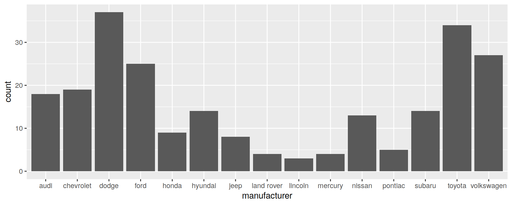
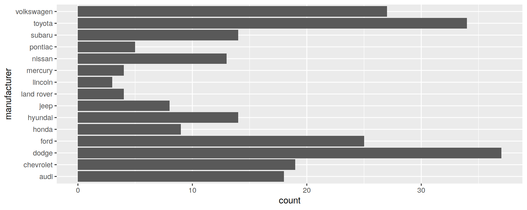
geom_bar() and geom_col() show counts and summaries across categories.
geom_line() and geom_path() connect observations; lines run left to right, paths follow the order of the rows.
Chapters 3 and 4 work through the full catalogue.
Adding a smoother
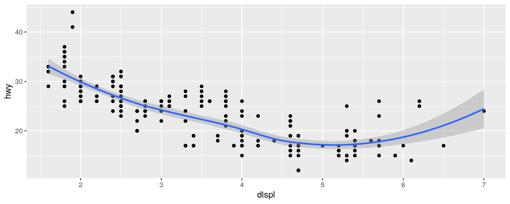
A scatterplot with a lot of scatter hides its own trend. geom_smooth() draws the trend and an assessment of how well it is pinned down:
The grey band is a pointwise confidence interval. Turn it off with geom_smooth(se = FALSE) when it distracts more than it informs.
Local regression (loess)
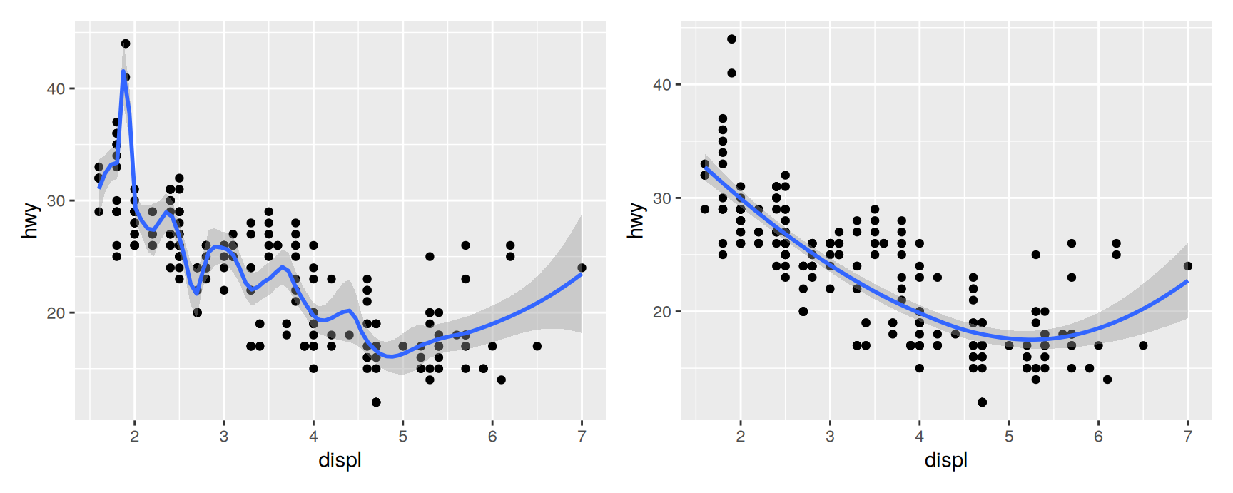
The default for small samples. It fits many tiny regressions in overlapping windows, and span sets how wide each window is: near 0 the curve chases every point, near 1 it is almost a straight line.
Neither extreme is honest. A span of 0.2 turns sampling noise into features; a span of 1 flattens the genuine curvature at small engine sizes. Try several before you believe any of them.
loess is \(O(n^2)\) in memory, so geom_smooth() switches method automatically once \(n\) exceeds \(1{,}000\).
Generalised additive model (gam)
The automatic replacement for large samples, supplied by the mgcv package. The formula y ~ s(x) asks for a smooth term in x; use y ~ s(x, bs = "cs") when the data are large.
library(mgcv)ggplot(mpg, aes(displ, hwy)) +geom_point() +geom_smooth(method ="gam", formula = y ~s(x))
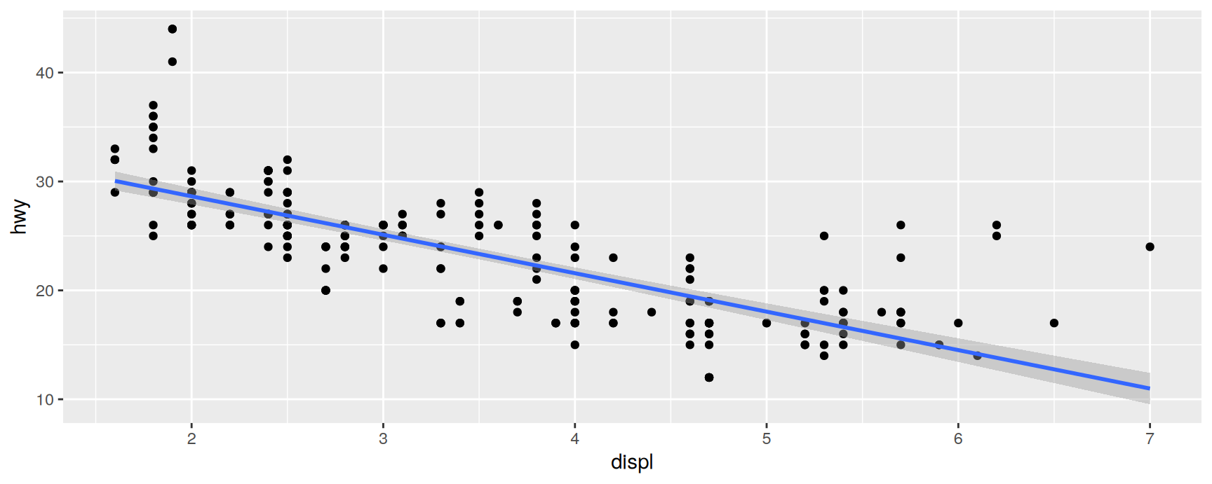
Linear model (lm)
A straight line, fitted by least squares. Use it when you want to report a slope, and look at the scatterplot first to check that a slope is a fair summary.
Compare it against the loess curve above. The line understates fuel economy at both ends of the range, which is a hint that displacement enters non-linearly.
Boxplots and jittered points
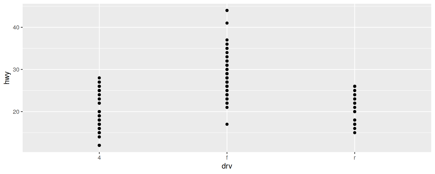
Suppose we want fuel economy broken down by drivetrain. The obvious plot disappoints:
ggplot(mpg, aes(drv, hwy)) +geom_point()
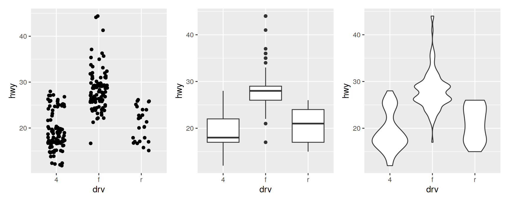
Both variables take few distinct values, so the 234 cars land on a few dozen positions and everything else is hidden underneath. Three geoms deal with this in different ways:
geom_jitter() nudges each point by a small random amount, so that overlapping observations become visible. Every observation is still drawn.
geom_boxplot() replaces the points with five summary numbers and the outliers.
geom_violin() draws a density estimate, mirrored, so the width of the shape tracks how many observations sit at that value.
Each has a failure mode. Jittering is honest but collapses once the sample is large. Boxplots are compact but will happily report a tidy five number summary for a bimodal distribution. Violins show the most, at the cost of a density estimate whose smoothness you chose rather than measured.
Here all three agree on the headline: front wheel drive cars are clearly the most economical, and four wheel drive the least.
geom_jitter() takes the same aesthetics as geom_point(). For boxplots and violins, colour controls the outline and fill the interior.
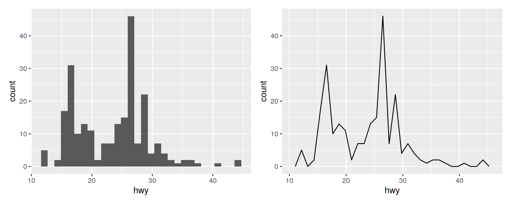
Histograms and frequency polygons
Both bin a continuous variable and count the observations per bin. The only difference is the drawing: bars for the histogram, a connected line for the frequency polygon.
ggplot2 picks 30 bins when you do not say otherwise, and warns you about it, because 30 is a placeholder and not a recommendation.
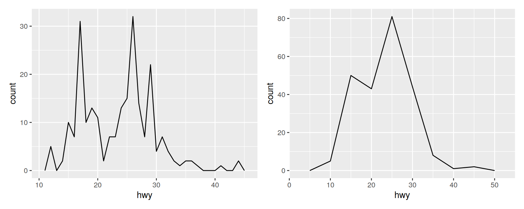
Set it with binwidth (or give explicit breaks). Different widths tell different stories, and it is worth looking at several before deciding which one is the story.
At a width of 1 the data look spiky, because highway figures are recorded as whole numbers and some values are simply more common. At a width of 5 the second mode around 40 mpg has been absorbed into its neighbour. The truth is somewhere in between, and you only find it by trying.
geom_density() offers a smooth alternative, but it assumes the underlying variable is continuous, unbounded and smooth. Fuel economy is bounded below by zero, so a density plot will put mass where no car can exist.
Comparing subgroups
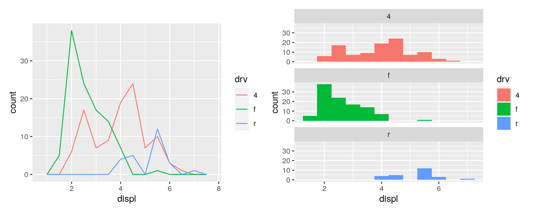
Map the grouping variable to colour for a frequency polygon, or to fill plus a facet for a histogram.
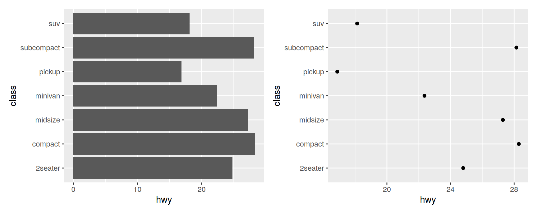
For pre-summarised data use geom_col(), which draws the value as it stands. geom_bar(stat = "identity") does the same thing and is what you will see in older code.
Often geom_point() is the better choice: a point needs less ink than a bar, and it does not oblige you to start the axis at zero.
geom_line() joins observations from left to right. geom_path() joins them in the order they appear in the data. A line plot is therefore a path plot of data sorted by x.
Use a line to follow one variable through time. Use a path to follow two variables at once, with time encoded in the route rather than in an axis.
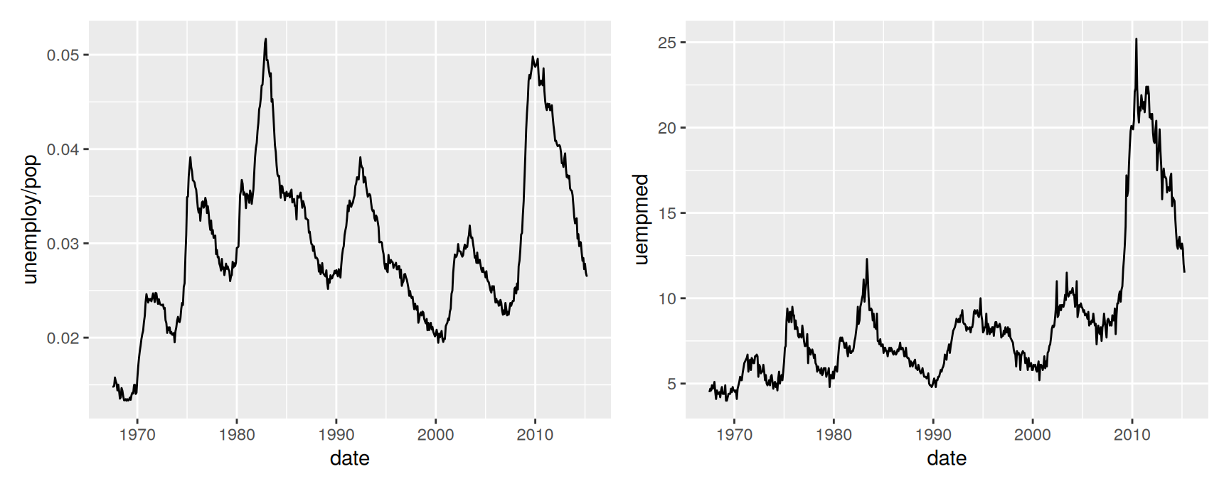
mpg has only two years, so these examples switch to economics, a monthly record of the US economy.
The two series move together for most of the record and then part company at the last peak: a smaller share of the population is unemployed than in earlier recessions, but those who are stay unemployed for much longer.
Putting both on one plot
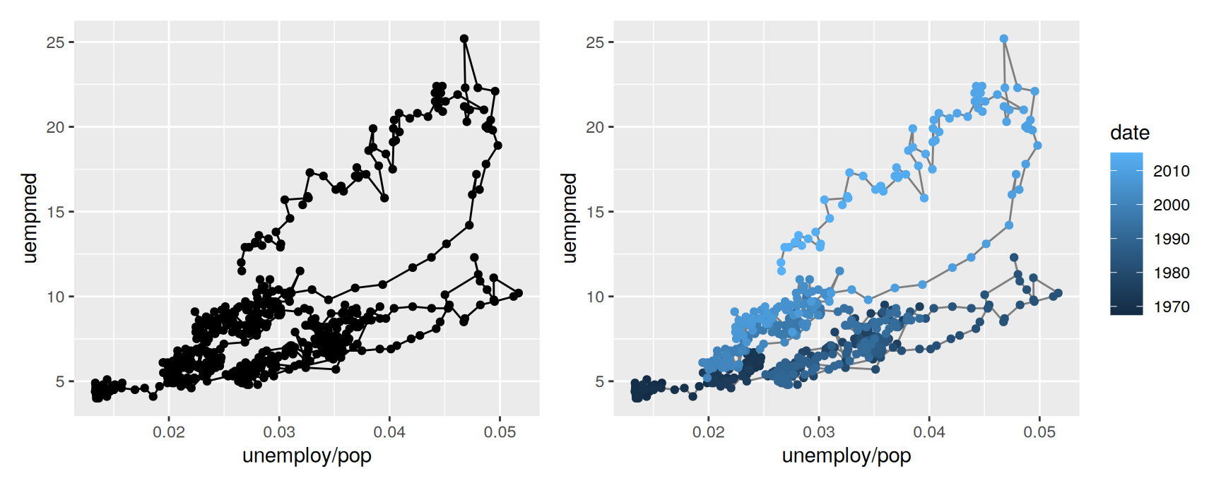
A scatterplot of the two would show the relationship and lose the chronology. Joining consecutive months with a path keeps both.
The first plot is a tangle: the path crosses itself often enough that you cannot tell which way time runs. Colouring the points by date fixes that at no cost, and the colour bar doubles as a key.
Read the second plot from dark to light. The loops are business cycles, and they have been drifting upwards: the same unemployment rate now comes with longer spells out of work than it did in the 1970s.
When each row belongs to one of several units followed over time, map the group aesthetic to the unit identifier so that the lines do not run into each other. Chapter 4 covers grouped data properly.
Exercises
ggplot(mpg, aes(cty, hwy)) + geom_point() hides how many cars sit at each pair of values. Fix it twice, once with alpha and once with geom_jitter(). Which fix would you use for these data, and why?
Boxplots of hwy by class come out in alphabetical order, which carries no information. Redraw them with reorder(class, hwy) and explain what reorder() returns.
Draw hwy as a histogram with binwidths of 1, 2 and 5. Which one would you put on a slide? Name one feature the narrowest shows that the widest hides.
Compare the hwy distribution of four wheel drive cars against the other two drivetrains, first with geom_freqpoly() and colour, then with geom_histogram() and facets. State one thing each version makes easier.
Read ?geom_bar and find the weight aesthetic. Use it to draw bars whose height is total cty per class rather than a count. What question does the weighted chart answer that the count chart does not?
Using economics, plot psavert against date with geom_line(), then psavert against uempmed with geom_path(). What does the path show that the two separate series do not?
drv and class are both categorical. Produce three different plots of their joint distribution using only geoms from this chapter, and say which one you would show first.
Modifying the axes
Labels
Later chapters cover scales in full. Two families of helpers handle the common cases.
xlab() and ylab() replace the axis labels, and NULL removes them. Variable names are rarely what a reader needs to see.
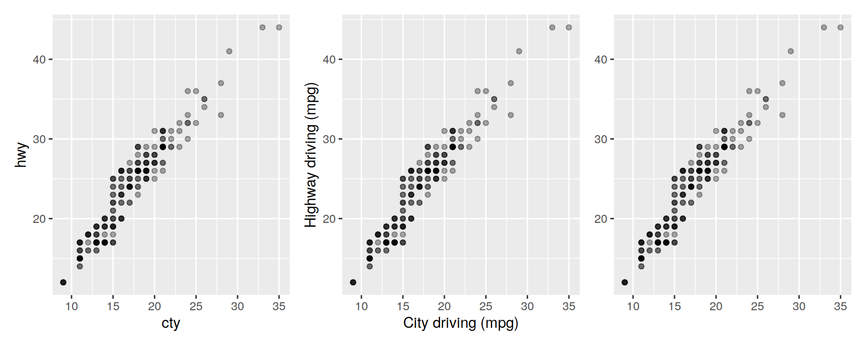
raw <-ggplot(mpg, aes(cty, hwy)) +geom_point(alpha =1/3)labelled <- raw +xlab("City driving (mpg)") +ylab("Highway driving (mpg)")bare <- raw +xlab(NULL) +ylab(NULL)raw + labelled + bare
Two things to notice in that code. alpha = 1 / 3 makes each point one third opaque, so that repeated observations show up as darker spots — the fix for the overplotting this pair of variables suffers from.
And the plot object raw was reused three times instead of being retyped. A ggplot object is an ordinary R value: build it once, then add to it.
Limits
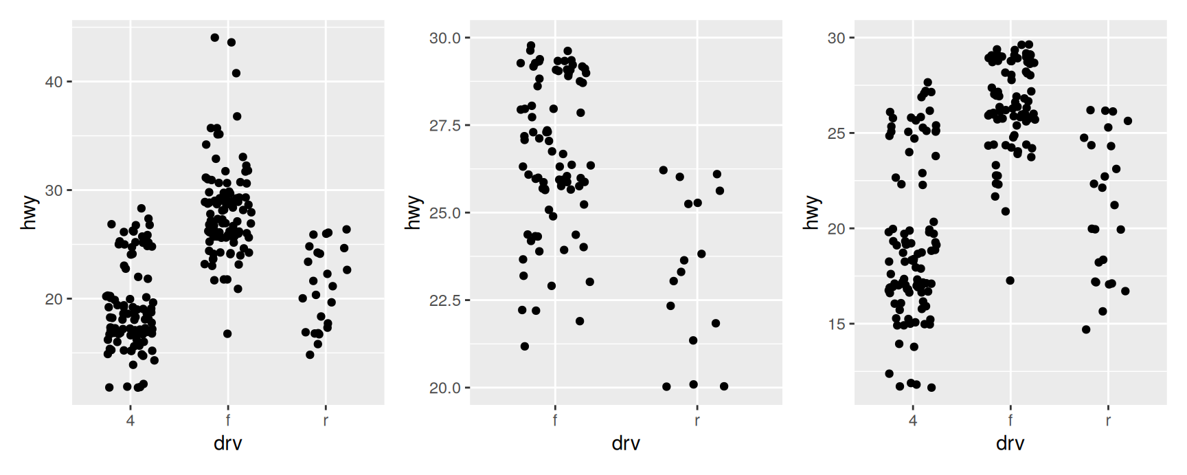
xlim() and ylim() restrict the range. For a discrete axis, list the levels to keep; for a continuous one, give two numbers, using NA where you want the default.
Setting limits does not zoom. It converts every observation outside the range to NA and then drops it, which is why ggplot2 prints a message telling you how many rows went missing. na.rm = TRUE silences the message; it does not keep the data.
That distinction matters as soon as a layer computes something. A boxplot or a smoother fitted after ylim() is fitted to the surviving subset, so the median you read off is the median of the cars that happened to fall inside the window. When you want to zoom without discarding data, use coord_cartesian() instead — Chapter 15 explains why it behaves differently.
Exercises
Draw cty against hwy with ylim(20, 40) and again with coord_cartesian(ylim = c(20, 40)). Add geom_smooth() to both. Where do the two fitted curves disagree, and why?
Rewrite one of the plots in this section using labs() instead of xlab() and ylab(). What else can labs() set that the older helpers cannot?
Build a base plot and store it, then produce three variants from it by adding different layers. Confirm that the stored object is unchanged afterwards.
Output
A plot is an object
Usually you type a plot and look at it. But ggplot() returns a value like any other function, and you can keep it:
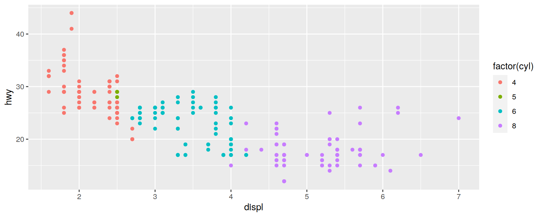
p <-ggplot(mpg, aes(displ, hwy, colour =factor(cyl))) +geom_point()
Nothing is drawn. The object holds the recipe; drawing happens when it is printed.
Print it
At the console, printing is automatic. Inside a loop, a function or an if block it is not, which is the usual explanation for a script that produces no plots.
print(p)
Save it
ggsave() writes the last plot, or a named one, to a file. It picks the format from the extension and the resolution from the size you ask for.
Set width and height in inches rather than resizing afterwards: scaling an image after the fact shrinks the text along with the plot, which is how figures end up with unreadable axis labels. Chapter 17 covers this in more detail.
Inspect it
summary() reports the data, the mappings and the layers, which is a quick way to check what a plot you inherited actually does.
summary(p)
data: manufacturer, model, displ, year, cyl, trans, drv, cty, hwy, fl,
  class [234x11]
mapping:  x = ~displ, y = ~hwy, colour = ~factor(cyl)
faceting: <ggproto object: Class FacetNull, Facet, gg>
    compute_layout: function
    draw_back: function
    draw_front: function
    draw_labels: function
    draw_panels: function
    finish_data: function
    init_scales: function
    map_data: function
    params: list
    setup_data: function
    setup_params: function
    shrink: TRUE
    train_scales: function
    vars: function
    super:  <ggproto object: Class FacetNull, Facet, gg>
-----------------------------------
geom_point: na.rm = FALSE
stat_identity: na.rm = FALSE
position_identity
Chapter 18 goes further, treating plot objects as things a programme can build and modify.
Recap
Data, mappings and at least one layer. Every plot, every time.
Inside aes() you name a variable; outside it you give a value.
Extra categorical variables go in as colour, shape or a facet. Colour to compare groups, facets to describe them.
The geom is the only thing that changes between a scatterplot, a boxplot and a histogram. Learn the skeleton once and the rest is vocabulary.
Bin widths, smoother spans and axis limits are choices you make, and each of them can manufacture a pattern that is not in the data.
A plot is an R object. Build it once, reuse it, and save it with ggsave().
Acknowledgement
Source. These slides follow the structure and the teaching sequence of ggplot2: Elegant Graphics for Data Analysis (3e) by Hadley Wickham, Danielle Navarro and Thomas Lin Pedersen. The explanations, examples and exercises here have been rewritten for this course; any errors in them are mine and not the book’s.
Copyright. All rights in the original work are reserved by its authors and publishers. Students are encouraged to read the book itself, which is freely available online.
Non-commercial use only. These materials are for teaching and must not be used for commercial gain.
Attribution. Any reuse or redistribution must credit both the original book and this course.