Chapter 2 gave you recipes. This chapter takes the recipes apart.
A geom is the part of a plot that decides what one row of data becomes on the page. The same numbers can turn into a dot, a letter, a bar, a rectangle or a corner of a shape. Nothing else in the call has to change.
There are about a dozen geoms you will use constantly. Learn what each one does to a single row and you can predict what any layer will draw before you run it.
These are also the parts that more elaborate layers are built from. A boxplot is rectangles plus lines plus points. A smoother is a line plus a shaded band. Once the basic geoms are familiar, the complicated ones stop being mysterious.
The book chapter this follows is short and still being written. These slides give every geom in it a worked example, because the difference between geom_line() and geom_path() is not something you can learn from a sentence.
What the basic geoms have in common
Every one of them is two dimensional. They need an x and a y, and they will refuse to draw without both.
Every one of them understands colour, which sets the ink used for points, text and outlines.
The geoms that fill a region understand fill as well. That is bar, col, area, tile, rect, raster and polygon.
Lines and outlines are made thicker with linewidth. Older code uses size for this and still runs, but size now means point and text size only.
Most of these geoms have a plot named after them. Use geom_point() on its own and you have drawn a scatterplot. Use geom_line() on its own and you have drawn a line chart.
That naming is a convenience, not a rule. A plot with three layers has no single name, and it is still a perfectly good plot.
Basic plot types
One data set for all the examples
Three points are enough to show what each geom does, and small enough that you can check the picture against the numbers by eye.
Note the row order. x runs 3, 1, 5 rather than 1, 3, 5. Two of the geoms below care about that, and the rest do not.
Points
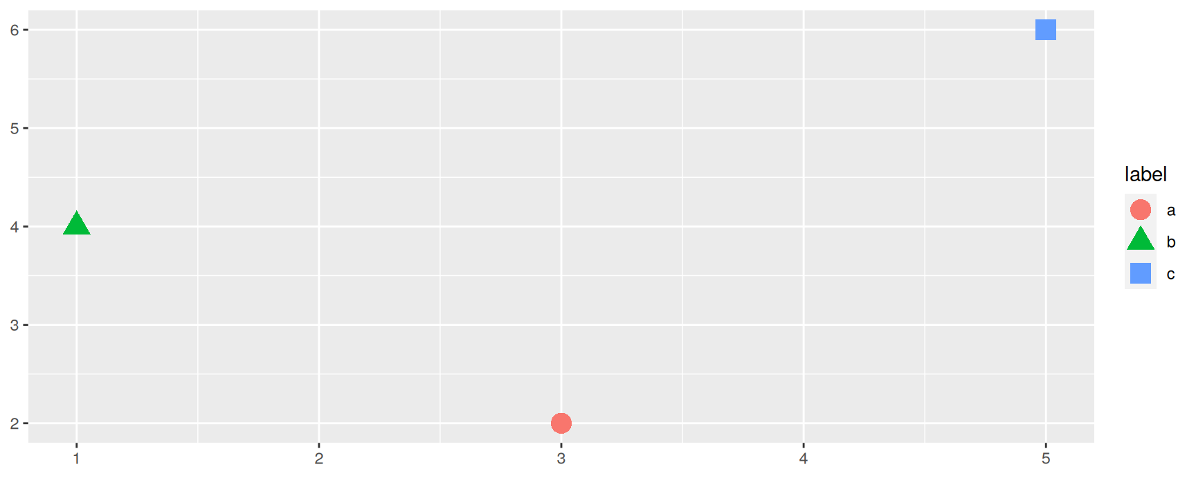
geom_point() draws one dot per row at the position you mapped. On its own it is a scatterplot.
base_plot +geom_point(size =4)
Points also understand shape, which takes a categorical variable. Use it when the plot may be printed in black and white, or when colour is already spoken for.
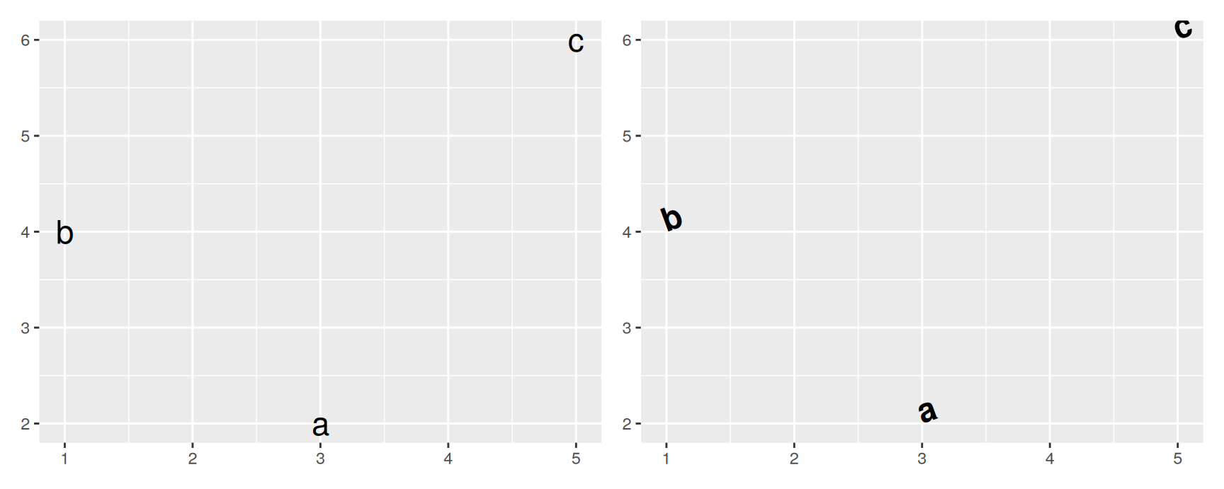
hjust and vjust move the text relative to the point, from 0 to 1. angle rotates it and family picks the typeface.
You will reach for these as soon as labels start colliding. Text is the one layer where ggplot2 cannot rescue you automatically, because it has no way of knowing which label matters most.
Bars
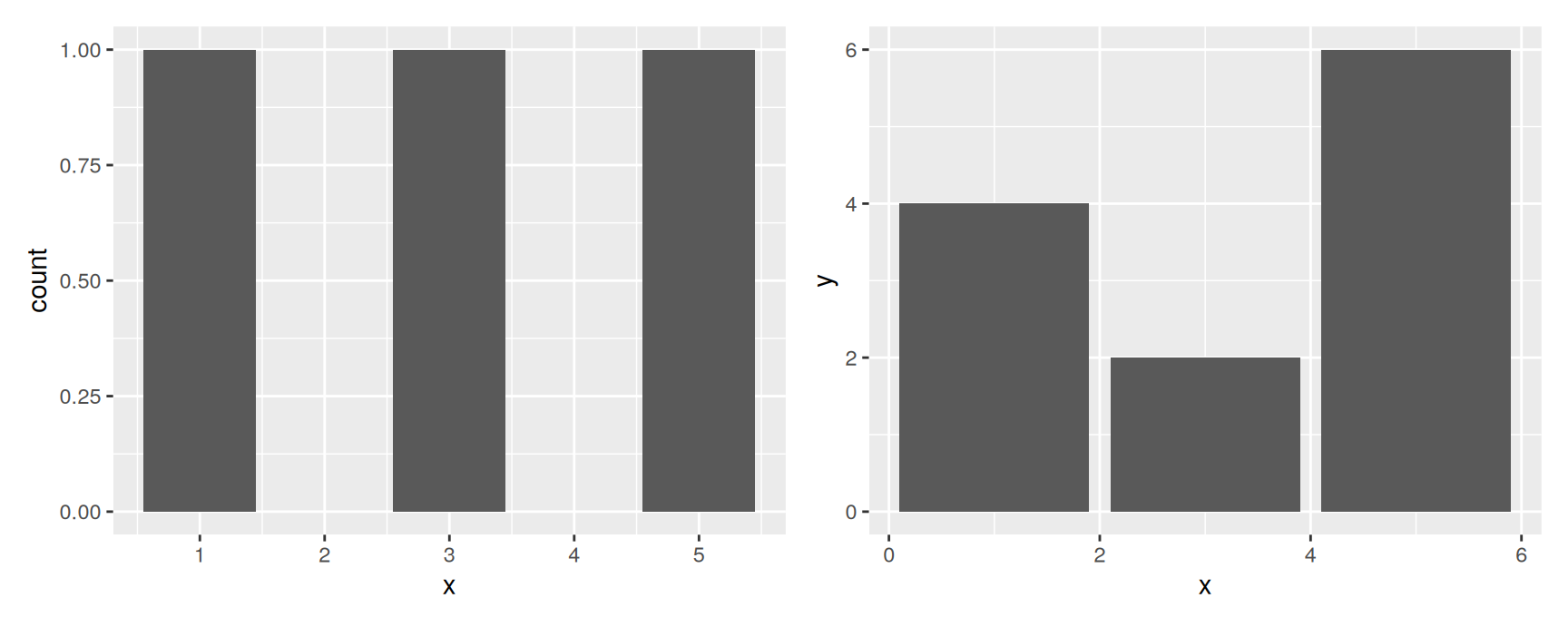
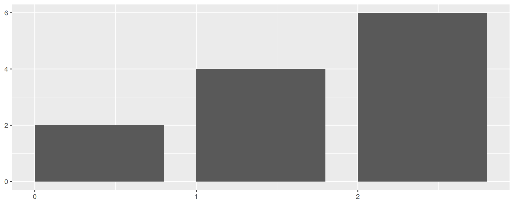
geom_bar() counts rows. It is a one dimensional geom, so it takes x alone and works out the height itself. Chapter 5 explains where that height comes from.
The left plot answers “how many rows sit at each x”. The right plot answers “what number did you give me for each x”. These are different questions, and mixing them up is the most common bar chart mistake.
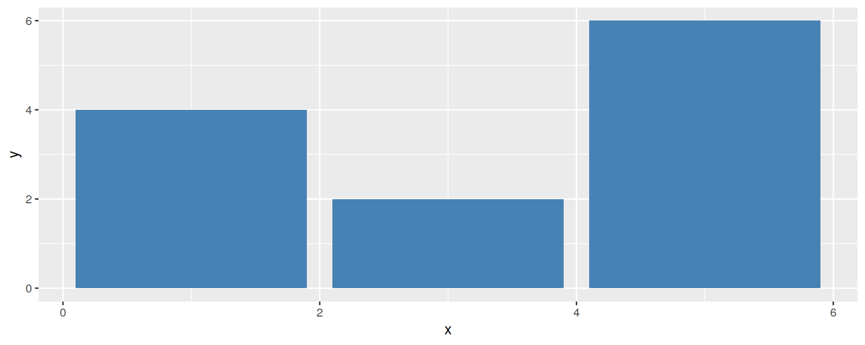
stat = "identity" is how you say “the height is already in the data, leave it alone”. geom_col() is the same thing with a shorter name.
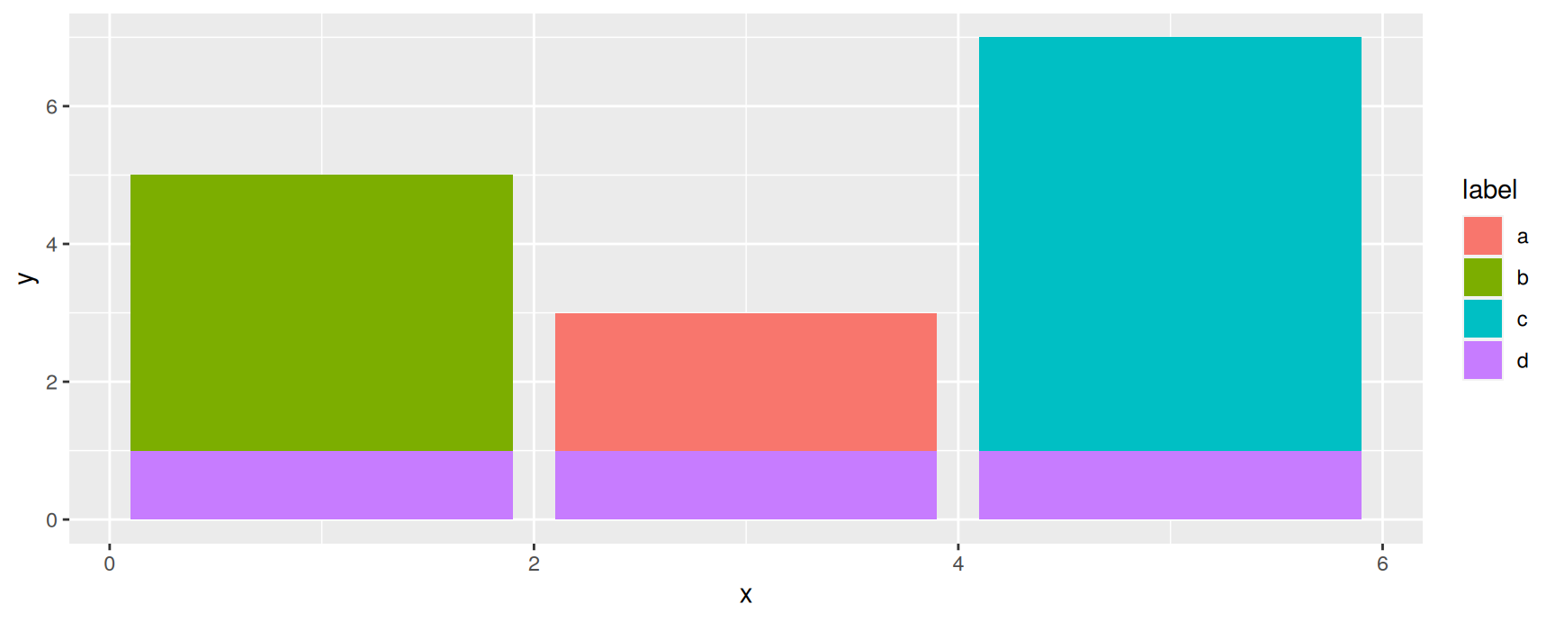
Bars that land on the same x are stacked on top of one another. That is worth remembering, because a stack of bars is a total, and a total is only meaningful if adding the pieces makes sense.
stacked <-rbind(df, data.frame(x =c(3, 1, 5), y =1, label ="d"))ggplot(stacked, aes(x, y, fill = label)) +geom_col()
Rectangles: tiles
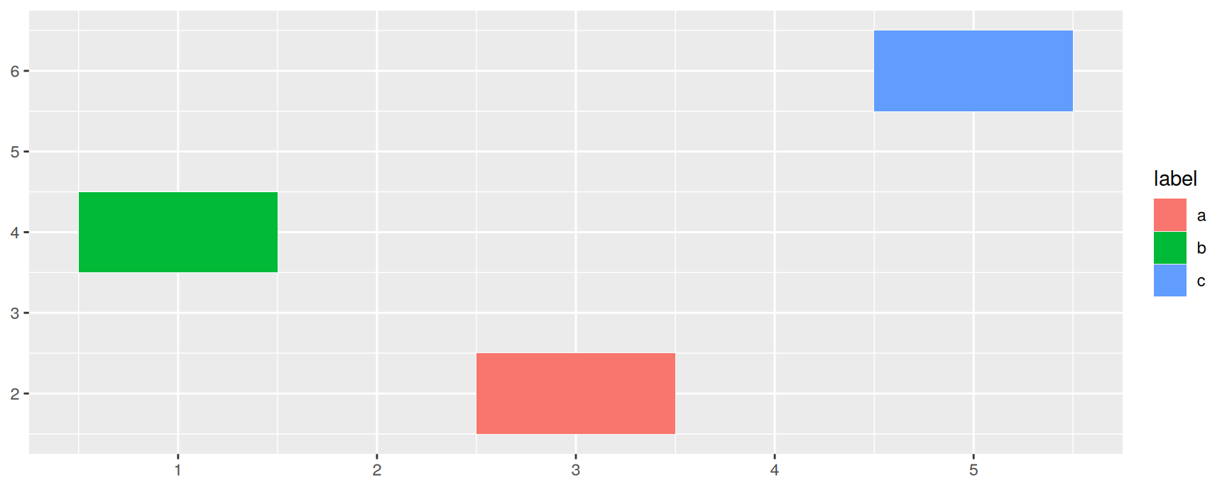
Three geoms draw rectangles. They differ only in how you describe the rectangle.
geom_tile() takes the centre of the rectangle plus its width and height. Use it when your data is already one row per cell.
geom_rect() takes the four edges, xmin, xmax, ymin and ymax. Use it when the rectangle is a region rather than a cell, such as a date range you want to shade.
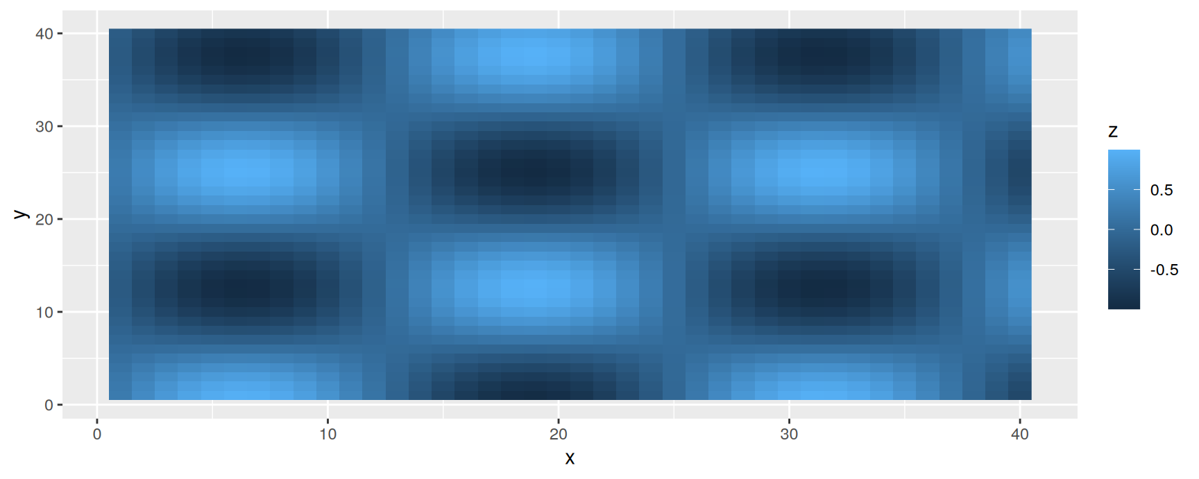
geom_raster() is geom_tile() for the case where every rectangle is the same size and sits on a regular grid. It draws the same picture much faster, which matters once you have thousands of cells.
grid <-expand.grid(x =1:40, y =1:40)grid$z <-sin(grid$x /4) *cos(grid$y /4)ggplot(grid, aes(x, y, fill = z)) +geom_raster()
A heatmap is the named plot here. Two categorical variables go on the axes, a count or a mean goes into fill, and the reader scans for dark cells.
The choice between the three is practical, not aesthetic. Regular grid, use geom_raster(). Varying cell sizes, use geom_tile(). Arbitrary regions, use geom_rect().
Lines
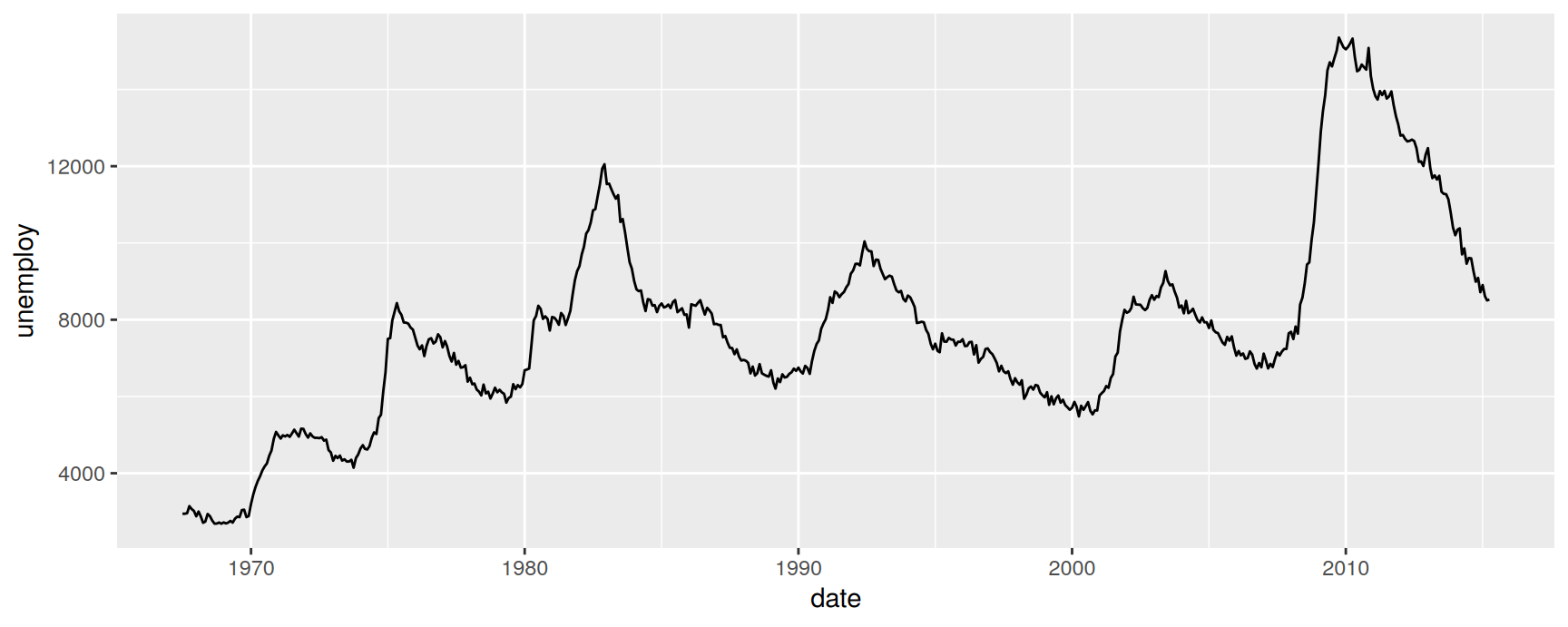
geom_line() connects the points from left to right. The result is a line chart, and it is the standard way to show a quantity moving through time.
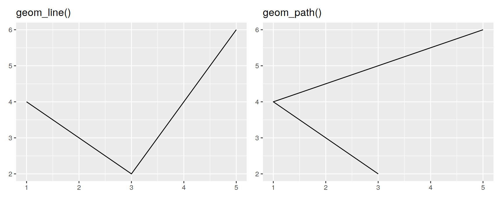
geom_line() sorted the rows for you. geom_path() did not.
Most of the time you want geom_line(), because time runs forwards and the sorting is free. You want geom_path() when the order in the data is itself the story, for example a trajectory that doubles back, or two variables tracked year by year.
Which observations get joined is controlled by the group aesthetic. Chapter 4 works through the rules.
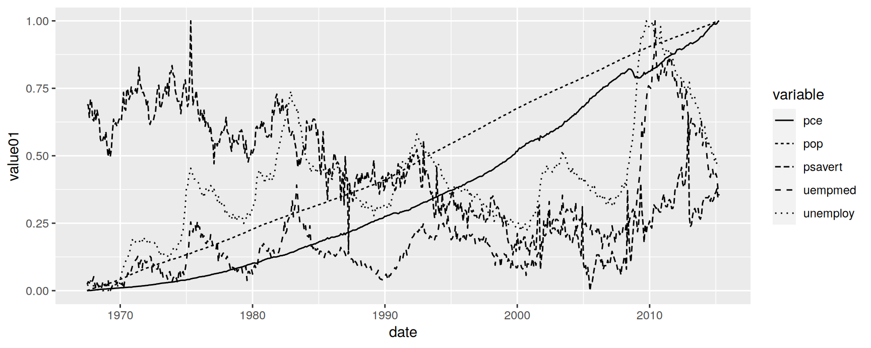
Lines also understand linetype, which maps a categorical variable onto solid, dashed and dotted. It is the only channel that survives photocopying.
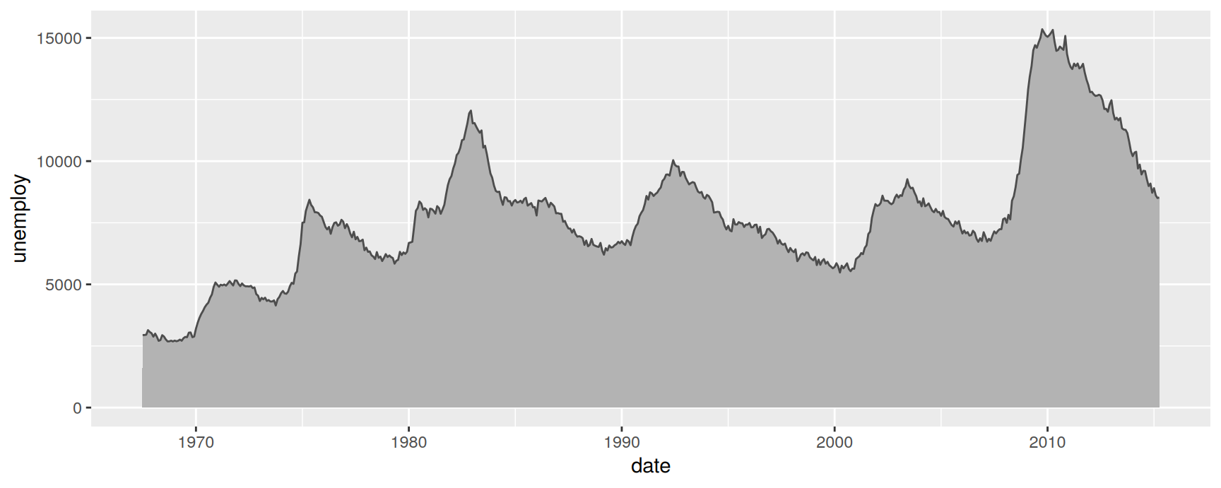
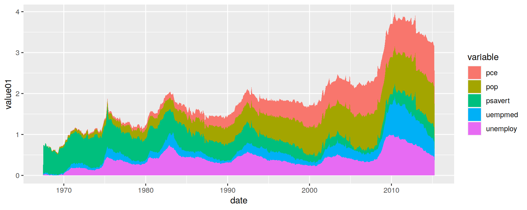
geom_area() is a line plot filled down to the y axis. The fill does not add information. It adds weight, which is why area plots suit a single quantity that you want to look substantial.
With more than one group the areas stack, exactly as bars do.
ggplot(economics_long, aes(date, value01, fill = variable)) +geom_area()
Read the top edge carefully. It is the sum of all five series, and only the bottom band starts from zero. Everything above it is measured off a moving floor.
Polygons
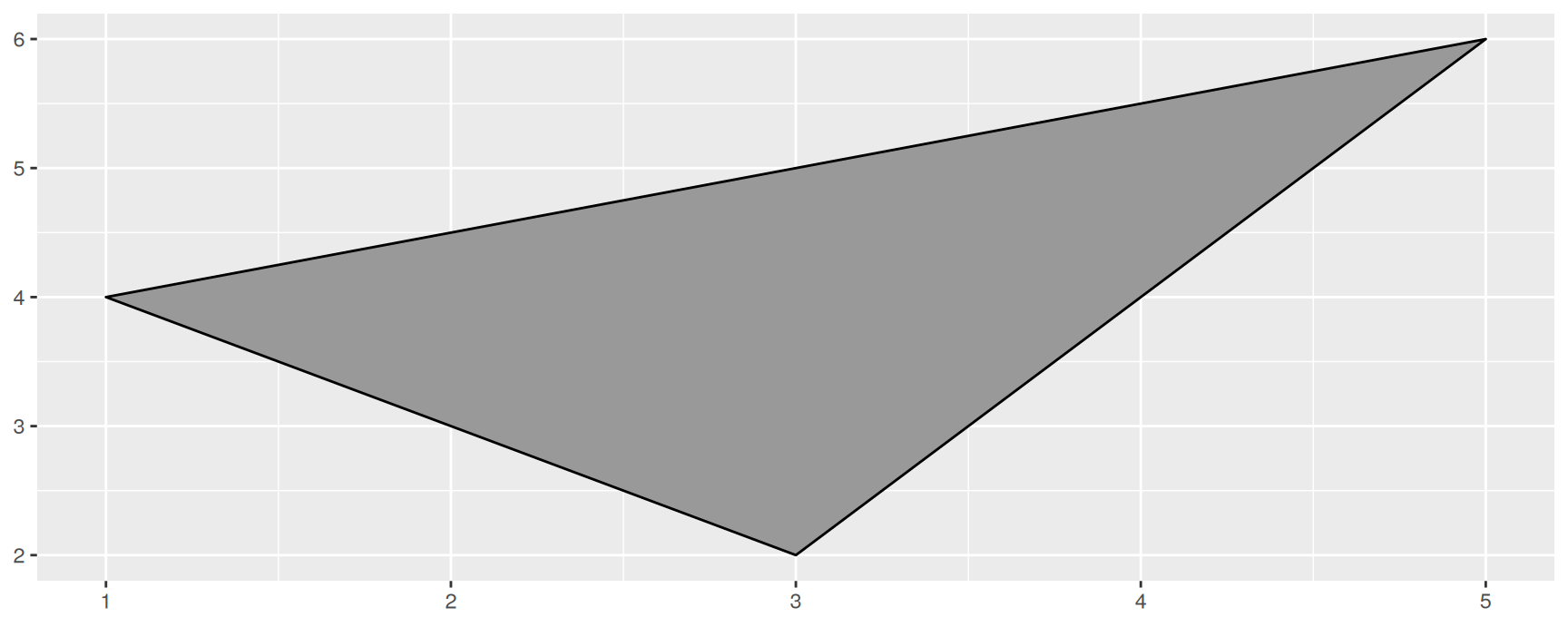
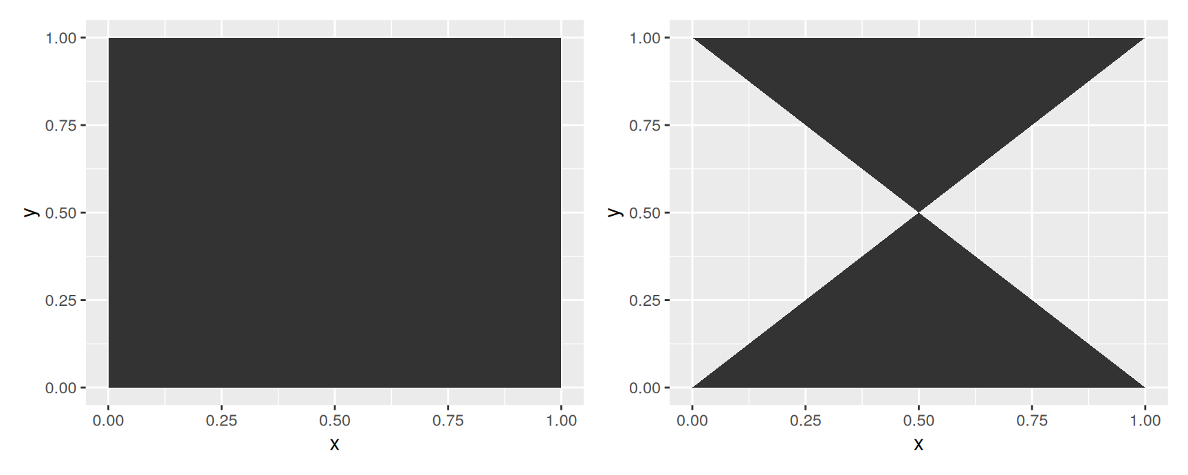
geom_polygon() draws a filled path and closes it by joining the last point back to the first. Each corner needs its own row.
This is why polygon data is usually kept as a long table of corners with a group column, then merged with whatever you are shading it by. Map data is the big case, and Chapter 6 deals with it properly.
Choosing a geom
You want to show
Geom
How two quantities relate
geom_point()
A quantity over time
geom_line()
A trajectory through two variables
geom_path()
A total, filled to the axis
geom_area()
A number per category, already computed
geom_col()
How many rows per category
geom_bar()
A value per cell of a grid
geom_tile() or geom_raster()
A region of the plot
geom_rect()
A shape or a map outline
geom_polygon()
The values themselves
geom_text()
Exercises
Plot psavert against date from economics, once with geom_line() and once with geom_point(). Which version makes the change after 2005 easier to see, and what does the other version show that it hides?
Shuffle the rows with economics[sample(nrow(economics)), ] and draw unemploy against date using geom_line() and then geom_path(). Only one picture changes. Explain in a sentence why.
Count the cars in each class of mpg two ways. First with geom_bar() and no y. Then compute the counts yourself with table() and draw them with geom_col(). Confirm the two plots agree, and say which one you would rather hand to someone else.
Cross-tabulate class and drv in mpg and draw the counts as a heatmap with geom_tile(). Some combinations never occur. Does your plot distinguish “no such car” from “zero cars”, and should it?
Draw the stacked area plot of economics_long from these slides. Pick one date and read off the height of the top edge. What quantity is that number, and would you put it in a report?
Draw unemploy against date from economics and shade the years 2008 to 2010 with a single geom_rect() layer in grey. Get the shading to sit behind the line. Which layer has to be added first, and why?
Add geom_text(aes(label = class)) to a scatterplot of displ against hwy in mpg. The result is unreadable. Name two changes that would make it useful, and try one of them.
Recap
The geom decides what one row of data becomes. Everything else in the call stays the same.
geom_bar() counts rows for you. geom_col() and stat = "identity" draw the numbers you supplied. Know which one you are asking for.
geom_line() sorts by x, geom_path() follows row order, and geom_polygon() follows row order and then closes the shape.
Rectangles come in three flavours. Centres for geom_tile(), corners for geom_rect(), regular grids for geom_raster().
Bars and areas stack when they overlap, so the top edge is a total. Check that the total is worth reading before you draw it.
colour is ink, fill is interior, linewidth is thickness. size now belongs to points and text.
Acknowledgement
Source. These slides follow the structure and the teaching sequence of ggplot2: Elegant Graphics for Data Analysis (3e) by Hadley Wickham, Danielle Navarro and Thomas Lin Pedersen. The explanations, examples and exercises here have been rewritten for this course; any errors in them are mine and not the book’s.
Copyright. All rights in the original work are reserved by its authors and publishers. Students are encouraged to read the book itself, which is freely available online.
Non-commercial use only. These materials are for teaching and must not be used for commercial gain.
Attribution. Any reuse or redistribution must credit both the original book and this course.