An individual geom draws one graphical object for every row of the data. geom_point() is the clearest case. Two hundred rows give you two hundred points, and you can point at any one of them and name the observation behind it.
A collective geom draws one graphical object for many rows. Sometimes that is because the layer summarises the data first, as a boxplot does. Sometimes it is built into the shape itself, as with a polygon, which needs a whole sequence of rows before it is anything at all.
Lines and paths sit between the two. A line is drawn as a chain of straight segments, and each segment is decided by exactly two rows.
The group aesthetic
Once a geom can cover several rows, something has to decide which rows belong together. That something is the group aesthetic.
group is an aesthetic like colour or x, with one difference. It is never drawn. It has no scale and produces no legend. Its only job is to partition the rows before the layer runs.
The mental model is short. Split the data by group, run the layer once on each piece, draw the results on the same panel.
You almost never set group by hand, because ggplot2 supplies a default. The default group is the interaction of every discrete variable mapped in the plot.
That default is right more often than you would expect, and it fails in two predictable ways.
Nothing discrete is mapped, so every row lands in one group.
Something discrete is mapped, but it is not the variable that defines the unit you care about.
Both failures are fixed the same way. Map group to the variable that names the unit.
One consequence is worth stating early, because it surprises people.
group controls the statistical transformation as well as the geometry. Every layer runs its stat once per group. A geom_smooth() in a plot with 26 groups fits 26 models. A geom_bar() in a plot with 26 groups counts 26 times.
So a grouping mistake is not only a drawing mistake. It can silently change the numbers the plot reports.
The Oxboys data
Most examples in this chapter use Oxboys, which ships with the nlme package. It records the height of 26 boys, each measured on nine occasions.
Subject names the boy and Occasion names the measurement round, both stored as ordered factors. age is age in years, centred so that zero is the middle of the study. There are 234 rows, nine for each boy.
Multiple groups, one aesthetic
One line per subject
The commonest reason to group is to keep units apart without labelling them. You want to see 26 growth curves as 26 curves, not to look up which is which.
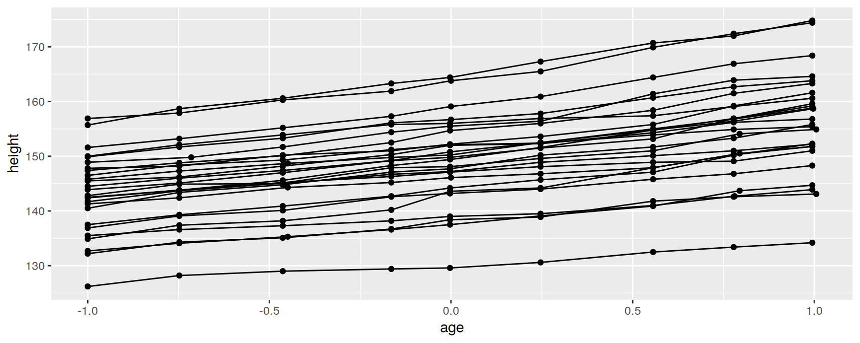
Mapping group to Subject tells geom_line() where one line ends and the next begins.
ggplot(Oxboys, aes(age, height, group = Subject)) +geom_point() +geom_line()
Plots like this are called spaghetti plots, and they answer a question a summary cannot.
The lines are close to straight and close to parallel. Growth over this period is steady, and the boys grow at broadly similar rates. What separates them is where they started. The spread between the highest and the lowest line is far larger than the change in that spread over four years, so almost all of the variation in height is variation between boys rather than variation in how fast they grow.
What the default does here
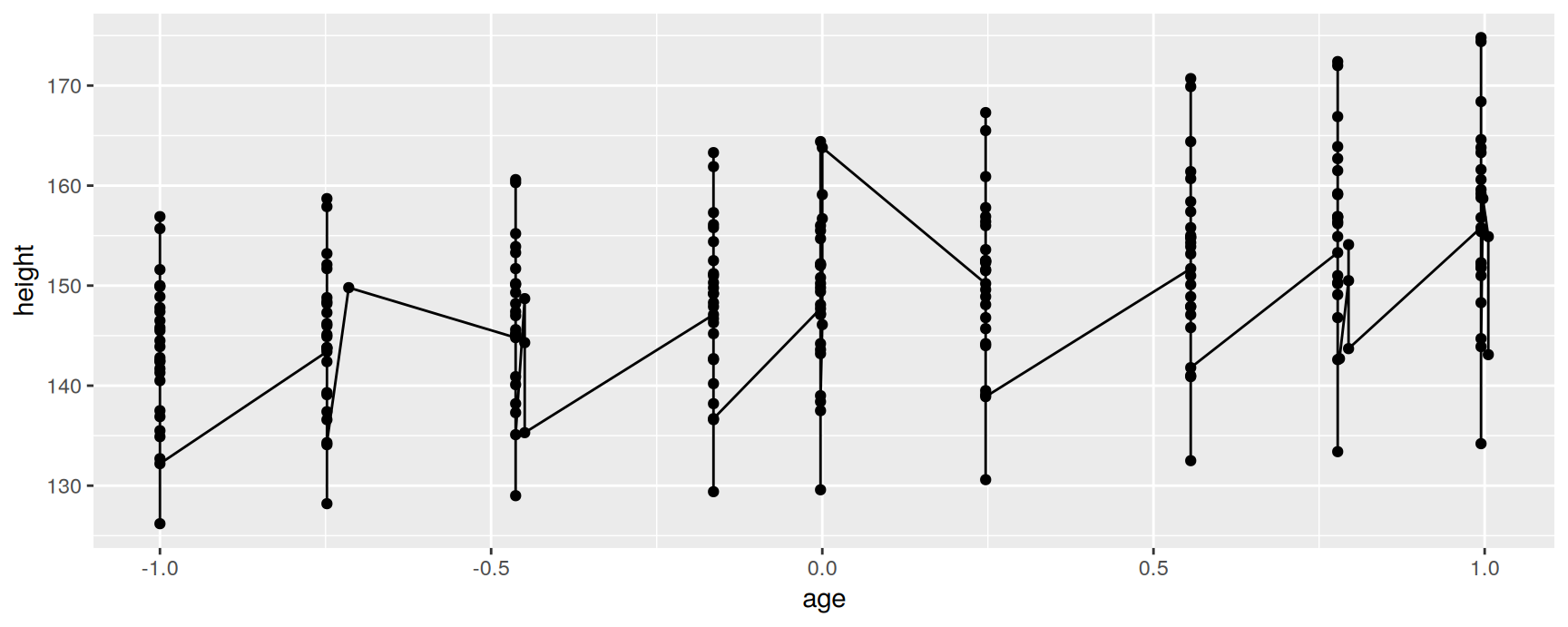
Drop the group mapping and the plot becomes nonsense.
The sawtooth is not a feature of the data. It is the default grouping doing exactly what it was told.
age and height are both continuous, so no discrete variable is mapped, so there is one group containing all 234 rows. geom_line() sorts them by age and joins them into a single path. Every time the path reaches the end of one boy’s measurements it jumps down to the next boy’s earliest one, and that jump is the downstroke of the tooth.
Note that nothing went wrong. The layer drew the group it was given.
Grouping on more than one variable
Sometimes the unit is a combination of columns rather than a single column. interaction() builds the composite key.
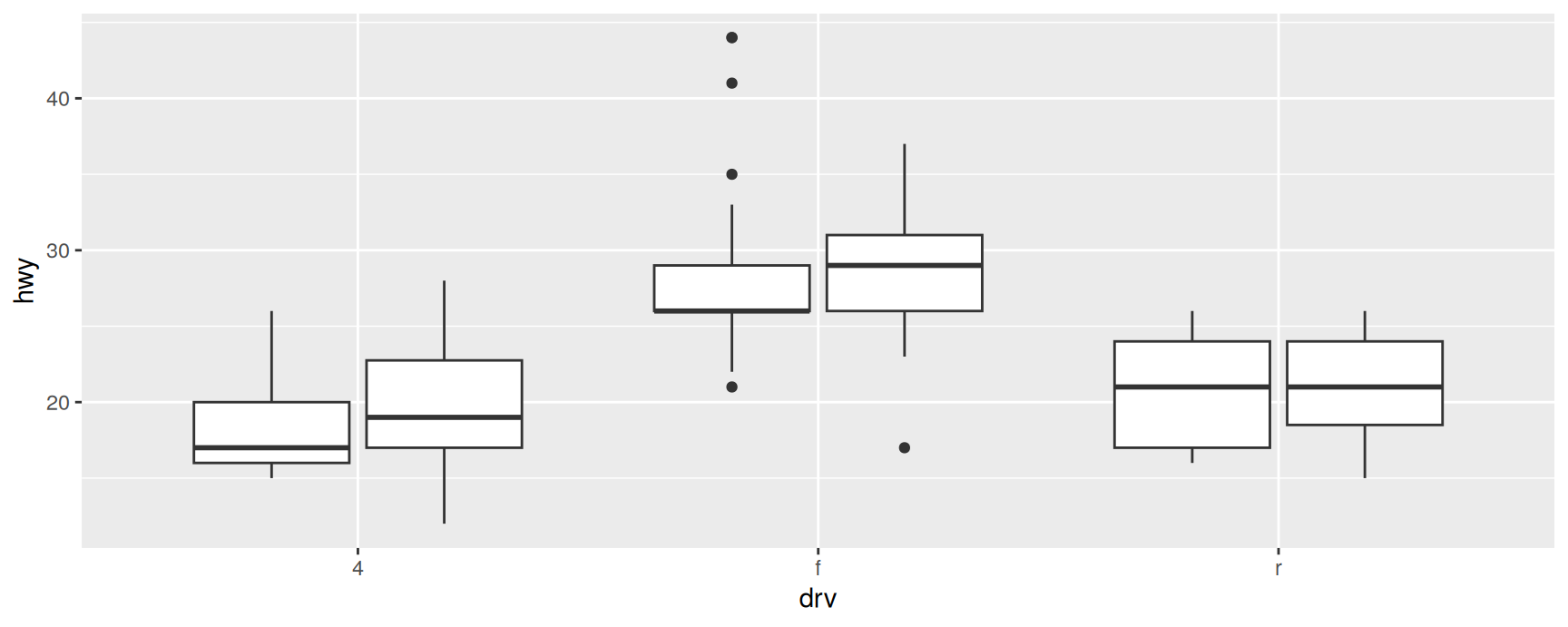
ggplot(mpg, aes(drv, hwy, group =interaction(drv, year))) +geom_boxplot()
Here the unit is a drivetrain in a given model year, so each drivetrain gets two boxes instead of one.
The mapping is needed because year is stored as a number. ggplot2 only puts discrete variables into the default group, so without interaction() the two years would be pooled into a single box per drivetrain and the comparison would disappear.
interaction(drv, year) and interaction(year, drv) give the same partition. The order only changes the labels of the levels, which nobody sees, because group is not drawn.
Different groups on different layers
When a global group is too much
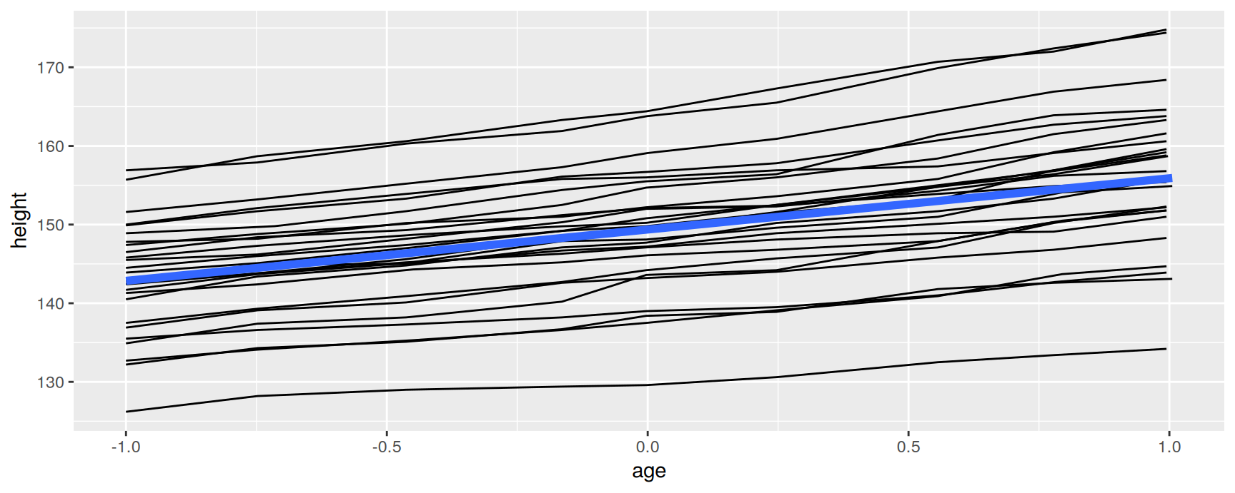
Layers often want different levels of aggregation. Here we want one line per boy and one trend line for the cohort.
Setting group in ggplot() cannot do that, because a mapping in ggplot() is inherited by every layer.
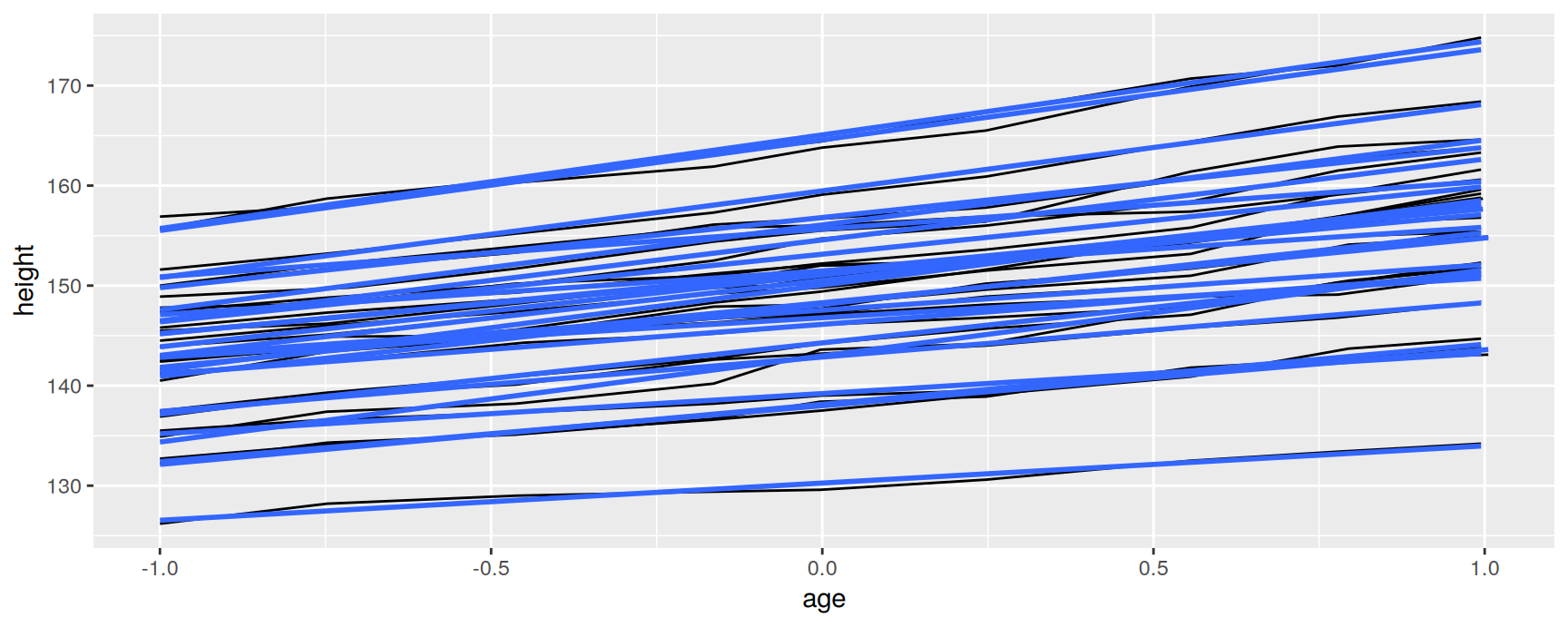
ggplot(Oxboys, aes(age, height, group = Subject)) +geom_line() +geom_smooth(method ="lm", se =FALSE)
There are 26 fitted lines in that plot, one per boy, drawn on top of 26 raw lines.
This is the stat consequence from the first section made visible. geom_smooth() inherited group = Subject, so lm() ran 26 times on nine points each. The result is not wrong, it just answers a question about individual boys when we asked one about the cohort.
Grouping one layer only
Move the mapping out of ggplot() and into the layer that needs it.
geom_line() now has a grouping and geom_smooth() does not. Since no discrete variable is mapped in the plot, the smooth layer falls back to one group and fits a single model to all 234 rows.
The rule to remember is the general one about aesthetics, not a special rule about grouping. Mappings in ggplot() are global and reach every layer. Mappings inside a geom are local and stop there. group obeys it like everything else.
The thick line is the average growth curve of the cohort. Read it against the thin lines to see how little of the spread it accounts for.
Overriding the default grouping
When the default is what you want
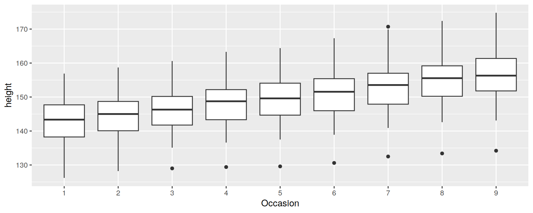
Occasion is a factor, so it becomes the default group, and geom_boxplot() produces one box per measurement round.
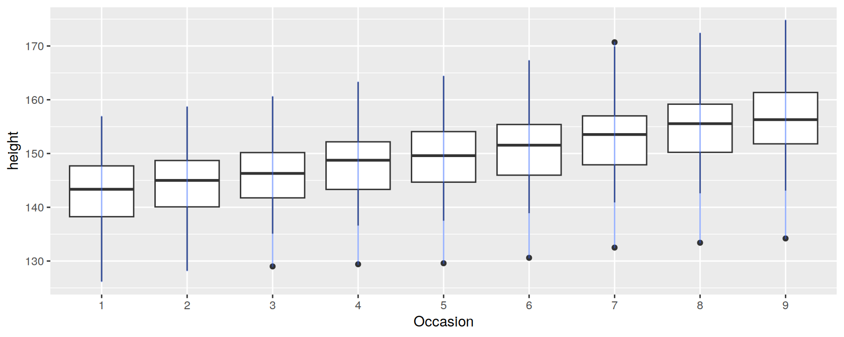
The lines are vertical, which tells you what they connect.
geom_line() inherited the same default group as the boxplots, so it drew one line per occasion. Each line joins the 26 boys measured at that occasion, all of whom share an x value. The layer did the only thing it could with the grouping it had.
A discrete axis is where this problem lives. The variable on x is discrete, so it becomes the default group, so any layer that wants to connect points across the axis has to say so.
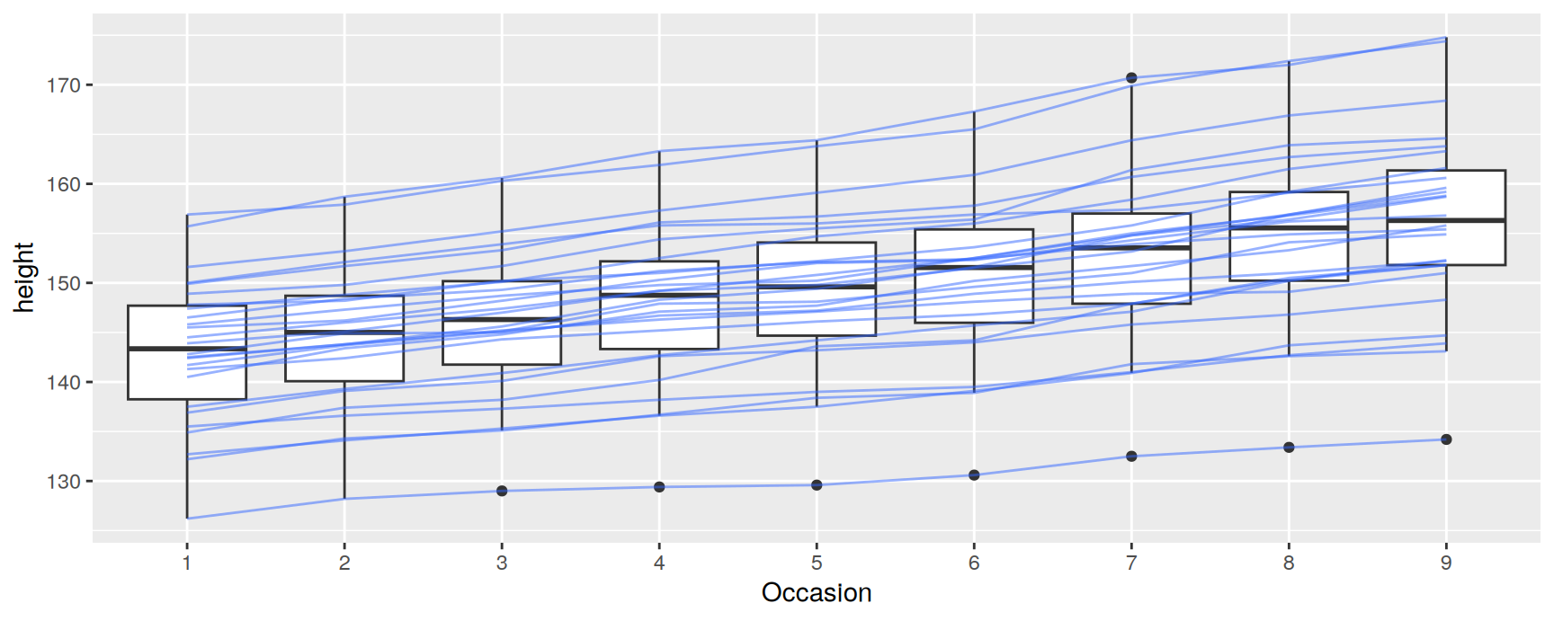
Two layers, two different groupings, one plot. The boxplots keep the default and summarise each occasion. The lines override it and follow each boy.
This combination is the basis of interaction plots, profile plots and parallel coordinate plots. In all of them a discrete axis carries the groups and a line layer crosses them.
The reading is also better than either layer alone. The boxes show the cohort rising steadily. The lines cross, but rarely by much, so a boy near the bottom at occasion one is usually still near the bottom at occasion nine. That is the same conclusion the first spaghetti plot reached, now with the cohort summary drawn beside it.
Matching aesthetics to graphic objects
One object, several values
A collective geom raises a question an individual geom never does. If the rows in a group carry different values of colour, what colour is the object?
ggplot2 gives two different answers, and which one applies depends on whether the object can be cut into pieces that each belong to one row.
Lines take the value of the first point
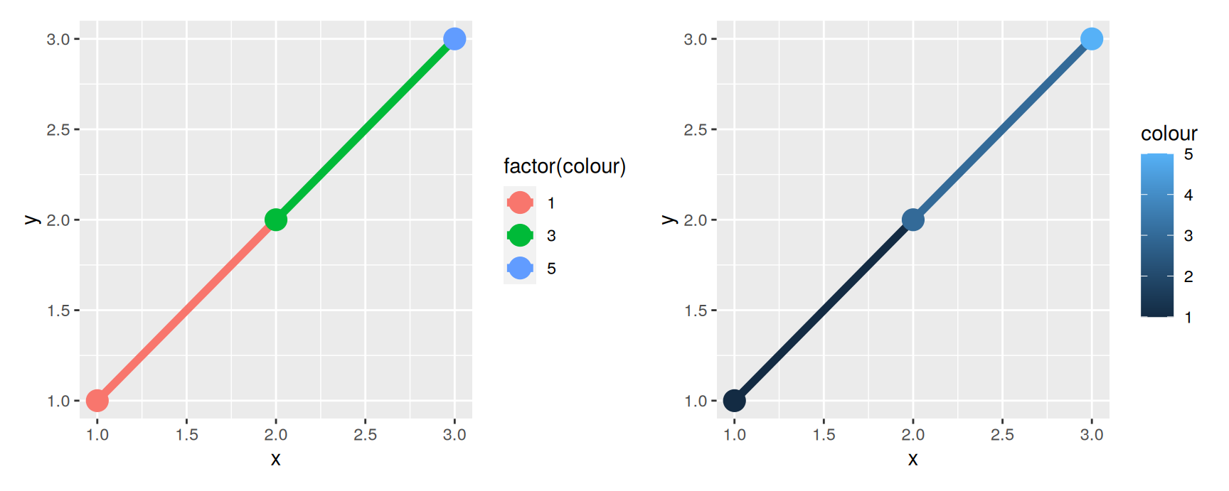
A line can be cut up, because each segment comes from two rows. The rule is that a segment takes the aesthetic of the first of its two points.
segments <-data.frame(x =1:3, y =1:3, colour =c(1, 3, 5))
Three rows and three colour values give two segments, so one value has to go unused.
In the left panel the first segment is the colour of the first point and the second segment is the colour of the second point. The third point’s colour is drawn as a point and never reaches a segment.
The right panel maps the same numbers to a continuous scale and behaves identically. This is the part people expect to be different. ggplot2 never blends an aesthetic along a path, even when the variable is continuous. You get two flat segments, not a gradient.
The aes(group = 1) in the left panel is doing real work. Exercise 3 asks why.
Making the gradient yourself
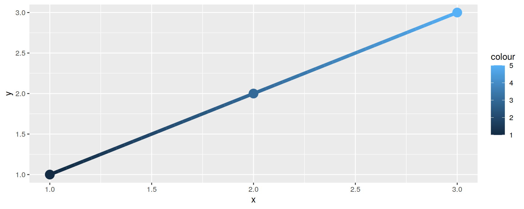
If you want a gradient you have to supply the rows that make one. Interpolate the position and the aesthetic on the same grid.
Fifty rows give 49 segments. Each is still a single flat colour, but consecutive colours are now close enough that the eye reads the result as continuous.
The same trick does not rescue linetype. A dash pattern has to be constant along a whole line, because R draws lines that way and there is no mechanism underneath for a pattern that changes as it goes.
If you need the dash pattern to change, you need separate lines.
Polygons cannot be cut up
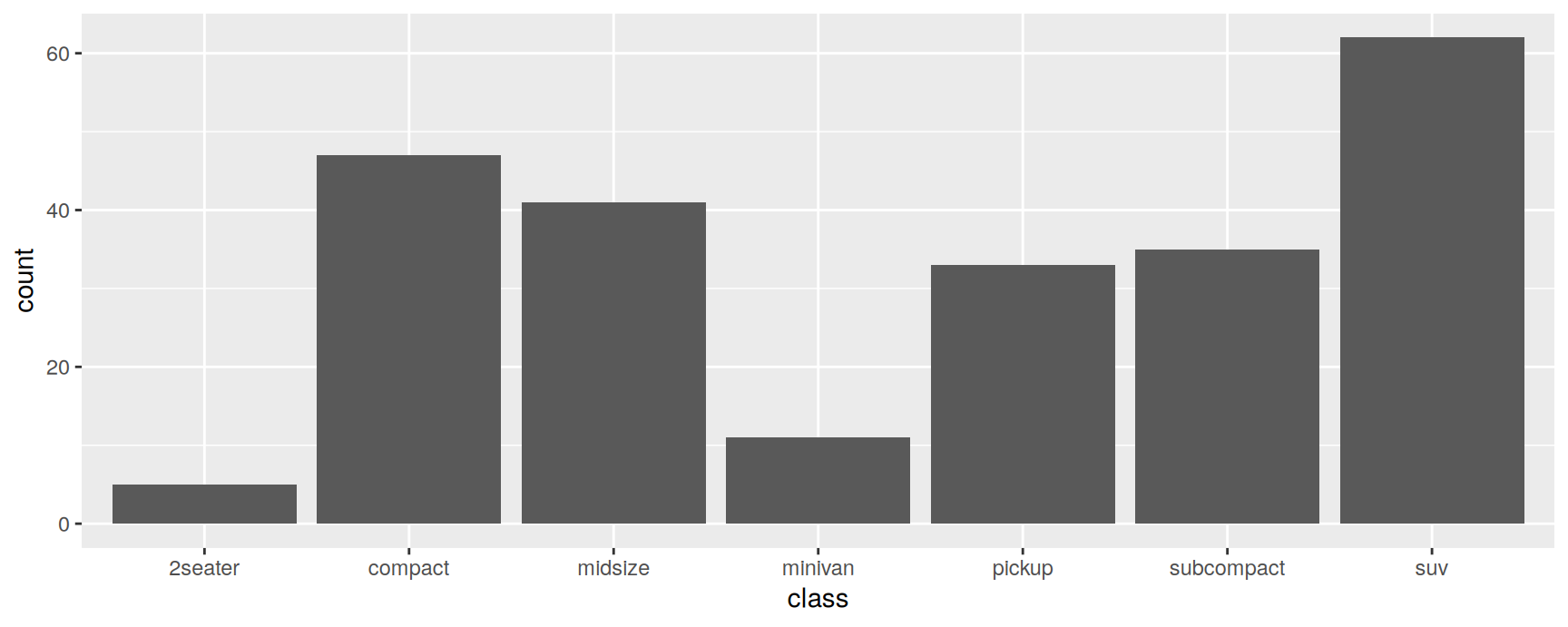
A polygon has no first row to prefer. It is one closed shape over many vertices, and there is no sensible way to fill it with four colours at once.
So ggplot2 uses a different rule for objects like this. The rows’ aesthetic is used only if every row in the group agrees on it. If the rows disagree, the default value is used instead and the mapping is quietly ignored.
Grey bars where you expected colour are almost always this rule firing.
Discrete fill splits the geom
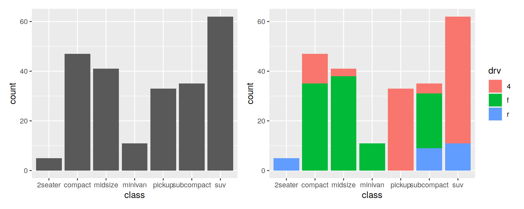
Before that rule can bite, ggplot2 tries something else. A discrete variable mapped to fill or colour is added to the default group, which splits the collective geom into smaller ones.
drv is discrete, so the group key becomes class crossed with drv and each bar breaks into up to three pieces. Every row is still counted once, so stacking the pieces rebuilds the original bar exactly.
That is why this works for bars and areas. The pieces are disjoint and their heights add up, so splitting the geom costs nothing.
Continuous fill does not
ggplot(mpg, aes(class, fill = hwy)) +geom_bar()
Warning: The following aesthetics were dropped during statistical transformation: fill
ℹ This can happen when ggplot fails to infer the correct grouping structure in
the data.
ℹ Did you forget to specify a `group` aesthetic or to convert a numerical
variable into a factor?
The bars are grey, the legend is gone, and a warning explains why.
hwy is continuous, so it is not added to the group. Each bar therefore covers many rows with many different hwy values, the rows disagree, and the polygon rule sends ggplot2 back to the default fill. The fill scale has nothing left to label, so it is dropped too.
Recent versions of ggplot2 warn about exactly this and name the likely cause. Older versions drew the grey bars in silence, so this is a warning worth reading rather than suppressing.
Force the split
Add the grouping the continuous variable did not get.
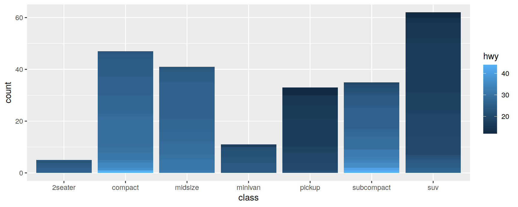
ggplot(mpg, aes(class, fill = hwy, group = hwy)) +geom_bar()
Each distinct value of hwy is now its own group, so each bar is a stack of thin pieces and every piece has rows that agree on fill.
Read each bar as a distribution. Pickups and SUVs are dark from top to bottom, so those classes are uniformly poor on the highway. Subcompacts run from pale at the bottom to dark at the top, so that class covers a wide range and an average would hide it.
Pieces are stacked in order of the grouping variable, largest at the bottom. If you need a different order, make the grouping variable a factor with the levels arranged the way you want them.
Exercises
Exercises
ggplot(mpg, aes(cyl, cty)) + geom_boxplot() draws a single box. Get one box per cylinder count without converting cyl to a factor. Say which aesthetic you set, and explain in one sentence why mapping cyl to x was not enough on its own.
Draw boxplots of cty by drv with the 1999 and the 2008 cars shown as separate boxes inside each drivetrain. year is stored as a number, so you will need interaction(). Then say in one sentence what changed between the two years.
Take the two panel colour example and delete aes(group = 1) from the left panel. Describe what you see and explain it. Now put aes(group = 2) in its place. Does the picture change? What does the value of group actually do?
For each plot below, write down how many rectangles you expect before running it, then check by adding colour = "white" to the layer. Explain any prediction you got wrong.
ggplot(mpg, aes(drv)) +geom_bar()ggplot(mpg, aes(drv, fill = cty)) +geom_bar()ggplot(mpg, aes(drv, fill = cty, group = cty)) +geom_bar()ggplot(mpg, aes(drv, fill = cty, group = model)) +geom_bar()
Install the babynames package and run the code below. The line has the sawtooth problem from earlier in this chapter. Find the column responsible, fix the plot in two different ways, and say what the fixed version shows that the broken one hid.
library(babynames)quinn <- dplyr::filter(babynames, name =="Quinn")ggplot(quinn, aes(year, prop)) +geom_line()
ggplot(mpg, aes(class, fill = hwy)) + geom_bar() gives grey bars and a warning. Put the warning into your own words, then build two different plots that do answer “how does highway economy vary within each class”. Say which of the two you would put in a report and why.
Recap
An individual geom draws one object per row. A collective geom draws one object for many rows, and group decides which rows go together.
The default group is the interaction of every discrete variable in the plot. With nothing discrete mapped, every row is in one group.
group changes the statistics as well as the picture. Each stat runs once per group, so a grouping mistake can change the numbers.
Mappings in ggplot() reach every layer. Put group inside a single geom when only that layer needs it.
A segment takes the aesthetic of its first point, and nothing is blended along a path. Build the intermediate rows yourself if you want a gradient.
A polygon uses the rows’ aesthetic only when all the rows agree. Discrete fill splits the geom first, continuous fill does not, which is where grey bars come from.
Acknowledgement
Source. These slides follow the structure and the teaching sequence of ggplot2: Elegant Graphics for Data Analysis (3e) by Hadley Wickham, Danielle Navarro and Thomas Lin Pedersen. The explanations, examples and exercises here have been rewritten for this course; any errors in them are mine and not the book’s.
Copyright. All rights in the original work are reserved by its authors and publishers. Students are encouraged to read the book itself, which is freely available online.
Non-commercial use only. These materials are for teaching and must not be used for commercial gain.
Attribution. Any reuse or redistribution must credit both the original book and this course.