Up to now almost every plot drew one mark for one row. This chapter deals with the other case, where the picture has to summarise the data before it can draw them.
Three problems run through it. How do you show that an estimate is uncertain. How do you plot rows that each stand for many people. And what do you do when the data set is large enough that individual points stop being visible.
The answers are mostly small additions to things you already know. A histogram with a weight, a scatterplot turned into a grid of counts, a bar chart whose height is a mean instead of a count.
By the end of the chapter you should be able to:
draw an interval around an estimate, and pick the geom that fits your x axis;
weight a plot by population or by area, and say how the weighting changed the question;
compare many distributions at once with histograms, densities, boxplots and violins;
recognise overplotting and deal with it by transparency, by binning or by summarising;
replace a count with any summary function you like, using stat_summary_bin();
show a surface as contours, as coloured tiles or as bubbles.
Revealing uncertainty
Show the interval, not just the number
An estimate without an interval invites the reader to believe it exactly. If you know something about the uncertainty, put it in the picture.
ggplot2 will not compute the interval for you. Standard errors depend on the model and the assumptions you are willing to make, so you calculate them first and hand over a data frame that already contains the bounds.
Every geom in this section reads the same two aesthetics, ymin and ymax. They describe the spread of y at each x. If you want horizontal intervals instead, flip the coordinates (Chapter 15).
Which geom you want depends on two questions.
x axis
What you show
Geoms
Discrete
Range only
geom_errorbar(), geom_linerange()
Discrete
Range and centre
geom_crossbar(), geom_pointrange()
Continuous
Range only
geom_ribbon()
Continuous
Range and centre
geom_smooth(stat = "identity")
The split matters because a ribbon across three unrelated categories implies a continuity that is not there, and error bars along a time axis are unreadable once there are more than a dozen of them.
A worked example
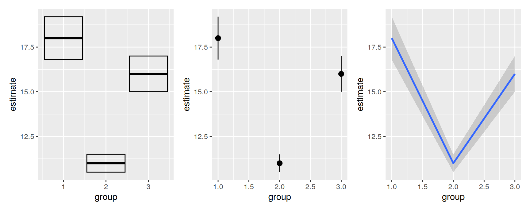
Three groups, each with an estimate and a standard error:
geom_crossbar() draws a box with a line at the estimate. geom_pointrange() draws a dot with a whisker through it. geom_smooth(stat = "identity") draws a line with a shaded band, and stat = "identity" is what tells it to use your numbers rather than fit anything.
The third one is the odd member of the family. It is the same geom that geom_smooth() uses for a fitted curve, which is why a model’s fitted values and your own hand-computed interval come out looking the same.
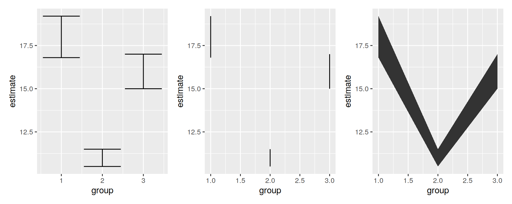
These three drop the centre. geom_errorbar() adds the familiar caps, geom_linerange() leaves them off, and geom_ribbon() fills the area between the two bounds.
The caps on an error bar carry no information. They are decoration, and their width is another thing you have to choose. When the plot is crowded, geom_linerange() says the same thing with less ink.
A range-only geom on its own is rarely enough. Add geom_point() on top when the reader also needs the estimate.
Weighted data
When a row is not an observation
Aggregated data arrive one row per group, and the groups are not the same size. A row for a county of eight thousand people should not count as much as a row for a county of five million.
midwest ships with ggplot2 and shows the problem clearly. It holds one row per county for five Midwestern states, from the 2000 US Census. Most of its columns are percentages, alongside total population and land area.
What should the weight be?
Nothing. Every county counts once. The plot describes counties.
Population. Counties count in proportion to the people in them. The plot describes people.
Area. Counties count in proportion to their size. The plot describes land.
These are three different questions, not three renderings of one question. Decide which one you are asking before you decide how to draw it, because the answers genuinely disagree.
Weights you can see
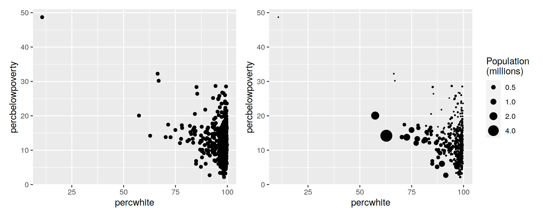
For points and lines, map the weighting variable to size. The reader can then see which rows carry the most data.
The left panel makes the scatter look like a cloud of equals. The right panel shows that the large counties sit in a narrow band, and that most of the spread at low percwhite comes from places with very few people in them.
scale_size_area() is the right scale here. It makes the area of the circle proportional to the value and pins zero to a point of zero size. The default size scale maps to radius, which exaggerates large values.
Weights the statistic uses
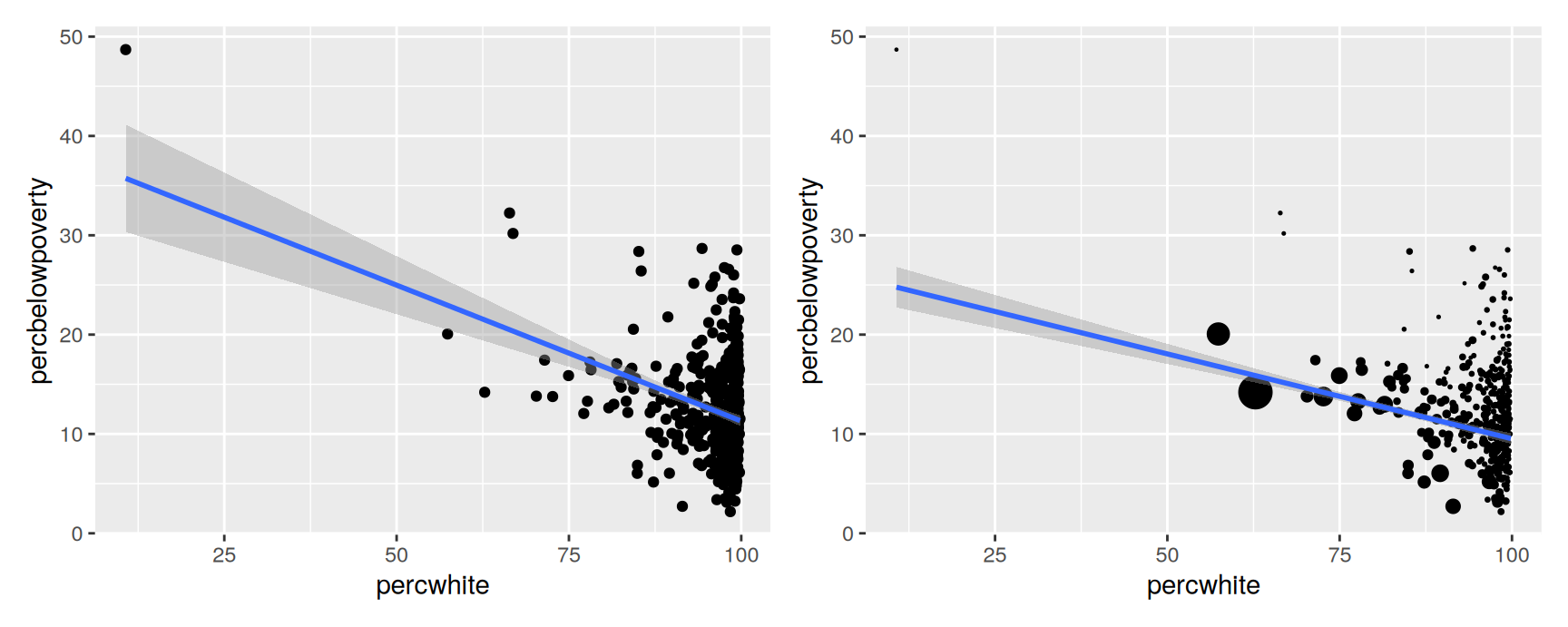
Any geom that computes something needs the weights inside the computation, not on the surface. That is the weight aesthetic. It draws nothing and produces no legend, but smoothers, histograms, densities, boxplots and quantile regressions all respect it.
The two lines answer different questions. The left is the average relationship across counties. The right is the average relationship across people, and it is noticeably flatter, because the populous counties do not follow the county-level trend.
Neither is wrong. But a report that says “poverty falls as the white share rises” has to say whose experience it is describing.
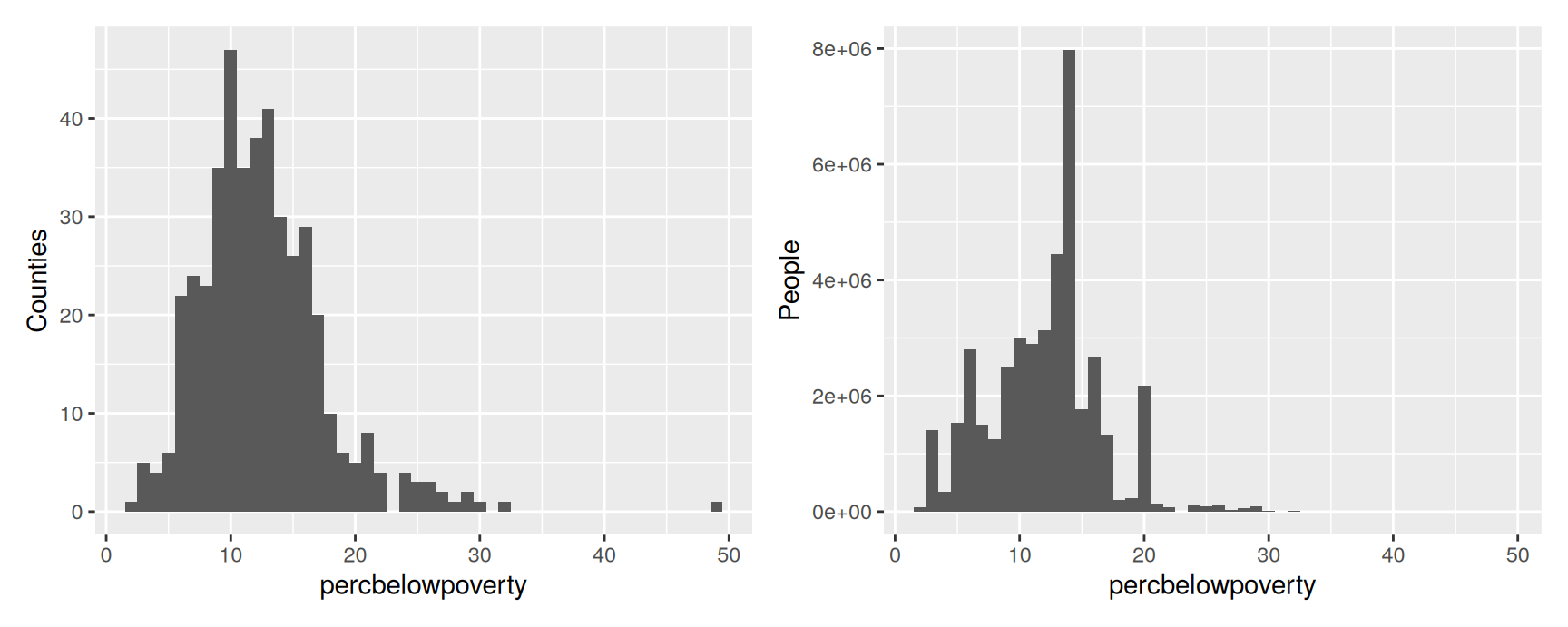
On the left, each bar counts counties. On the right, each bar counts residents, and the distribution tightens up around the lower poverty rates.
That difference is the whole point of the section. The unweighted histogram answers “what is a typical county like”, the weighted one answers “what is a typical person’s county like”, and the two shapes are not the same.
Diamonds data
The diamonds data set
The rest of the chapter needs data large enough to break a scatterplot. diamonds ships with ggplot2 and holds around 54,000 stones.
diamonds
# A tibble: 53,940 × 10
   carat cut       color clarity depth table price     x     y     z
   <dbl> <ord>     <ord> <ord>   <dbl> <dbl> <int> <dbl> <dbl> <dbl>
 1  0.23 Ideal     E     SI2      61.5    55   326  3.95  3.98  2.43
 2  0.21 Premium   E     SI1      59.8    61   326  3.89  3.84  2.31
 3  0.23 Good      E     VS1      56.9    65   327  4.05  4.07  2.31
 4  0.29 Premium   I     VS2      62.4    58   334  4.2   4.23  2.63
 5  0.31 Good      J     SI2      63.3    58   335  4.34  4.35  2.75
 6  0.24 Very Good J     VVS2     62.8    57   336  3.94  3.96  2.48
 7  0.24 Very Good I     VVS1     62.3    57   336  3.95  3.98  2.47
 8  0.26 Very Good H     SI1      61.9    55   337  4.07  4.11  2.53
 9  0.22 Fair      E     VS2      65.1    61   337  3.87  3.78  2.49
10  0.23 Very Good H     VS1      59.4    61   338  4     4.05  2.39
# ℹ 53,930 more rows
The variables
Variable
Meaning
carat
Weight of the stone
cut
Cut quality: Fair, Good, Very Good, Premium, Ideal
color
Colour grade, D (best) to J (worst)
clarity
Inclusions, I1 (worst) to IF (best)
price
Price in US dollars
x, y, z
Length, width and depth in millimetres
depth
Depth as a percentage of width: z / mean(x, y) * 100
table
Width of the top facet, relative to the widest point
The first four are the trade’s “four Cs”. The data have not been cleaned, which is useful here. Several of the patterns in the following sections are recording artefacts rather than facts about diamonds, and telling the two apart is part of the exercise.
Displaying distributions
Choosing a display
Three questions decide which geom you want. Is the distribution one dimensional or two. Is the variable continuous or discrete. And do you want the distribution on its own, or conditional on another variable.
The histogram is the starting point for one continuous variable, and binwidth is the only argument that really matters.
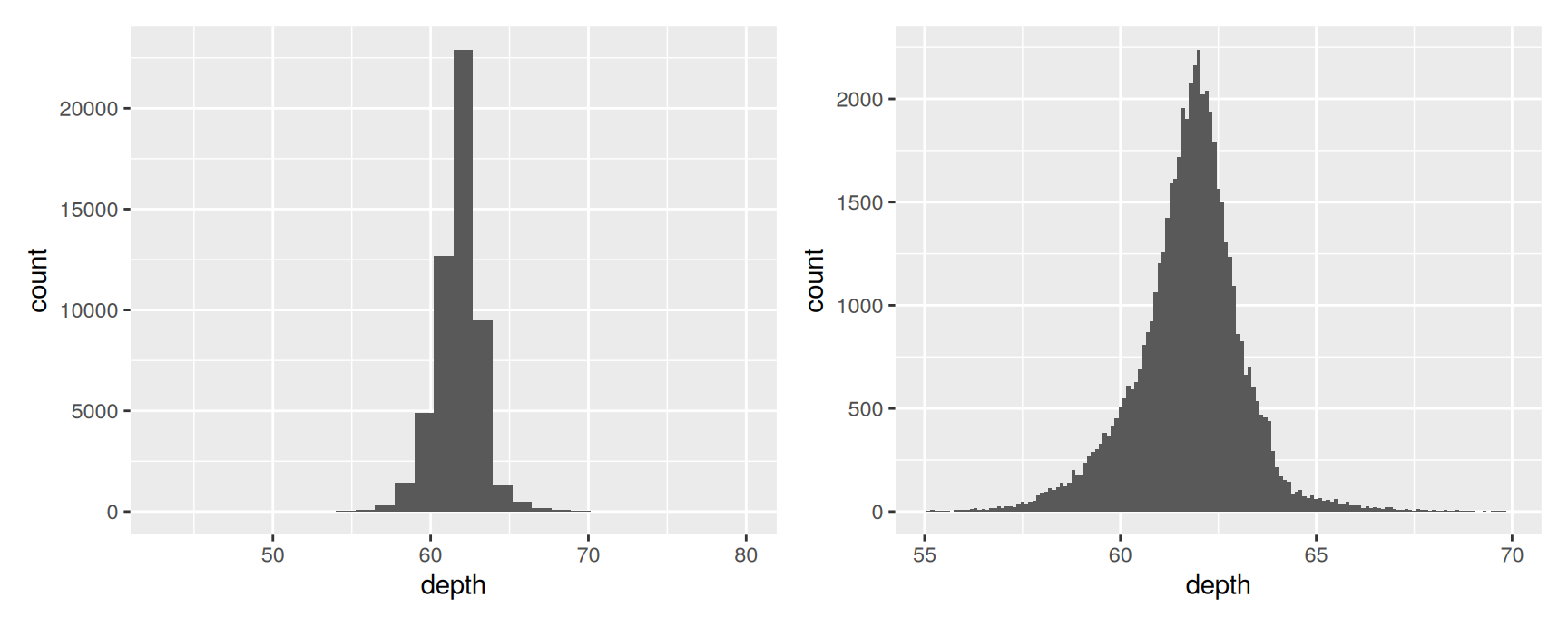
The default is 30 bins, and ggplot2 warns you about it because 30 is a placeholder rather than a recommendation. At that width depth is a single lump.
Narrowing the bins to 0.1 and cutting the axis to the region where the data actually live shows a sharp, almost symmetric peak just above 61. Try several widths every time. You are looking for the one that shows structure without showing noise, and you will not find it by accident.
When you publish a histogram, say what the bin width was. Without it the reader cannot judge anything they are looking at.
Comparing groups
Three ways to put a categorical variable into a distribution plot.
Faceting is the third, and Chapter 2 already used it. It is the easiest to read and the hardest to compare across.
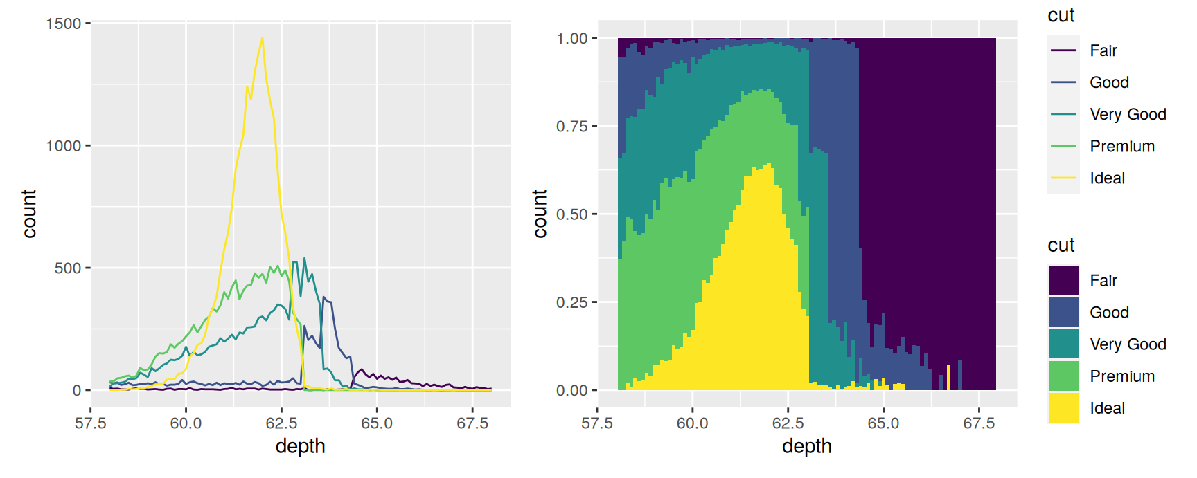
The frequency polygon on the left keeps the counts, so a group with few diamonds stays visibly small. The filled histogram on the right throws the counts away and shows composition instead: at each depth, what fraction of the stones had each cut. Fair diamonds turn out to occupy the tails of the depth distribution almost exclusively.
Counts or density?
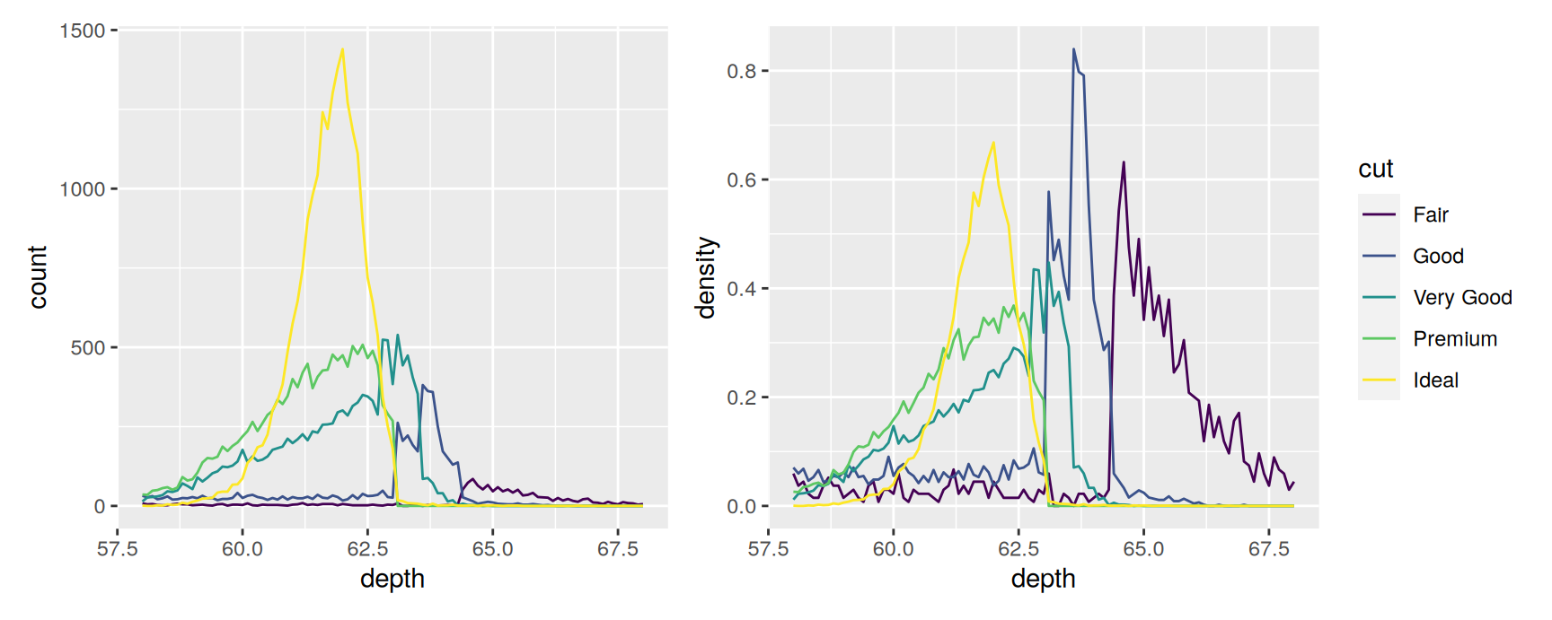
geom_histogram() and geom_freqpoly() share one statistic, stat_bin(). It computes a count per bin and also a density, the count divided by the total and by the bin width. Reach for density when the groups are very different sizes.
after_stat() says “use a variable the statistic computed, not one from the data”. density does not exist in diamonds. It only exists after the binning has happened.
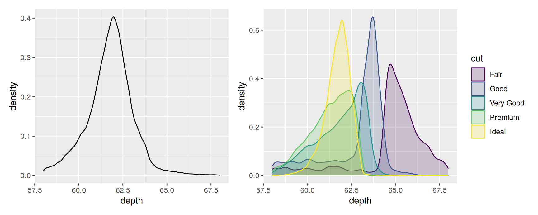
The left panel says Ideal diamonds are the most common. The right panel says that, once you correct for how many there are of each, the five cuts have nearly the same depth distribution apart from Fair. Both are true, and they answer different questions.
Kernel density estimates
geom_density() takes a different route. It drops a small normal curve on every observation and adds them up, which gives a smooth estimate with no bins at all.
The smoothness is a choice, made through adjust. Values above 1 smooth more, values below 1 smooth less, and the underlying bandwidth rule assumes the variable is continuous, unbounded and not too lumpy.
Two cautions. A density curve will happily put probability where no observation can exist, which matters for anything bounded at zero. And every curve is scaled to area one, so the plot on the right has thrown away all information about how many diamonds are in each group.
Many groups at once
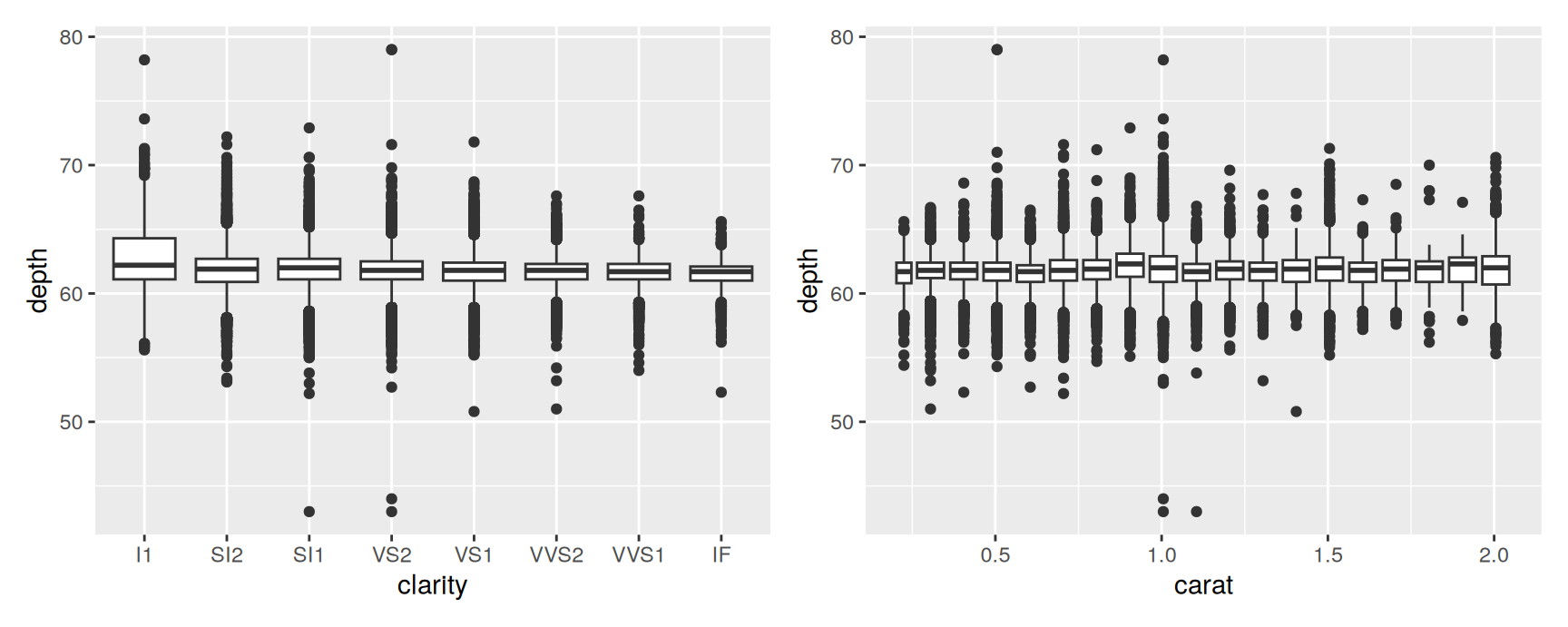
When you need to compare more distributions than you can stack, trade detail for space. geom_boxplot() reduces each group to a median, a box holding the middle half, whiskers reaching 1.5 times the box width, and the points beyond that.
The left panel is the usual case, one box per level of a categorical variable.
The right panel is the useful trick. carat is continuous, so there are no groups to box. cut_width() manufactures them by slicing the x axis into intervals of 0.1, and mapping the result to group gives one box per slice. You now have a conditional distribution across a continuous predictor, which a smoother would have reduced to a single line.
Violins
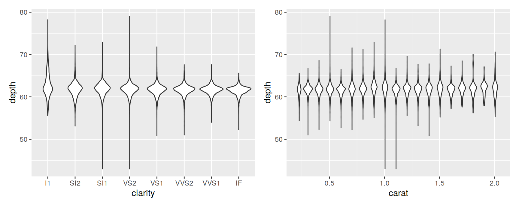
A violin is a density estimate, mirrored, drawn in the space a boxplot would occupy. It keeps the shape of the distribution, which is exactly what the boxplot throws away.
The choice between them is a choice about failure modes. A boxplot reports a tidy five-number summary for a bimodal distribution and never mentions the second mode. A violin shows the second mode, but its smoothness is something you chose rather than measured.
For small samples there is a third option, geom_dotplot(), which stacks one dot per observation. It hides nothing, and it stops working somewhere in the low hundreds of points.
Exercises
Draw the distribution of carat with bin widths of 0.5, 0.1 and 0.01. At the narrowest width the data become spiky at particular values. Which values, and what does that tell you about how diamonds are cut and sold?
Draw a histogram of price with a bin width of 100 and restrict the x axis to below \(5{,}000\). Describe the gap you find and suggest an explanation.
Compare price across levels of color using boxplots, then using violins. The relationship runs the opposite way to what the grading scale would suggest. State the pattern in one sentence, then look at carat by color and explain it.
Use cut_width() to draw boxplots of price against carat in slices of 0.25. What happens to the spread as the stones get heavier, and why does that make a single straight-line summary misleading?
Draw geom_density() of table with adjust set to 0.2, 1 and 5. Which features survive all three settings? Those are the ones worth reporting.
Overlay a frequency polygon and a density estimate of carat in the same panel. One of them has to be rescaled before the two can share an axis. Say which, do it, and explain what after_stat() is doing in your answer.
Dealing with overplotting
When points stop being visible
A scatterplot works because you can see individual points. With enough data you cannot. Points land on top of each other, the interior of the cloud saturates, and all you can read is its outline.
This is overplotting. It is worth naming because the plot does not look broken. It looks like a solid black blob, and a solid black blob is perfectly capable of hiding a second cluster inside it.
The fixes come in three kinds. Change how a point is drawn. Count points instead of drawing them. Or draw a summary on top of them.
Changing the glyph
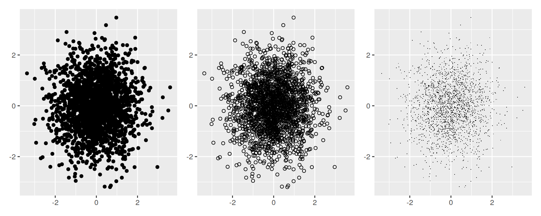
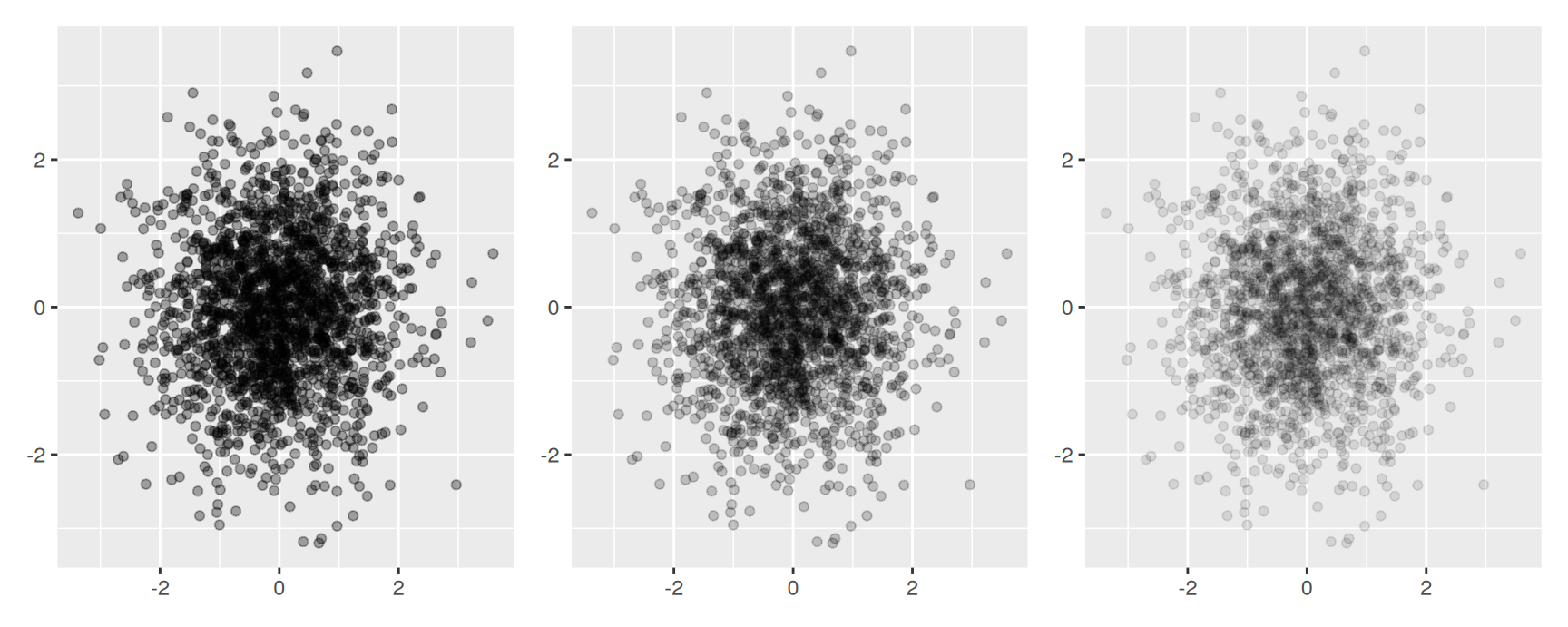
Two thousand points from a standard bivariate normal are enough to show the problem.
A solid circle covers everything under it. A hollow one (shape = 1) lets you see through the middle. A pixel (shape = ".") takes up almost no room at all.
Both tricks buy you maybe a factor of a few. They are the right answer for a few thousand points and useless for a hundred thousand.
Alpha blending
alpha makes each point partly transparent, so that stacked points come out darker than lonely ones. Writing it as a fraction is the useful habit: alpha = 1/n means the colour reaches full strength where n points overlap.
So alpha turns the plot into a rough density estimate that you read by darkness. Pick the denominator to match the crowding you expect.
There is a floor. Below roughly 1/500 the value rounds to zero and the points vanish entirely. Alpha also works best with hollow glyphs, because two transparent outlines still overlap less than two transparent discs.
Jittering
Sometimes the overlap is exact rather than dense, because the values were rounded before you got them. geom_jitter() adds a small random displacement to each point so that ties separate.
The default displacement is 40% of the resolution of the data, and width and height change it. Use it when the recorded values are coarser than the quantity they measure. Do not use it when the positions are exact, because you are then inventing data to make the picture look better.
Counting instead of drawing
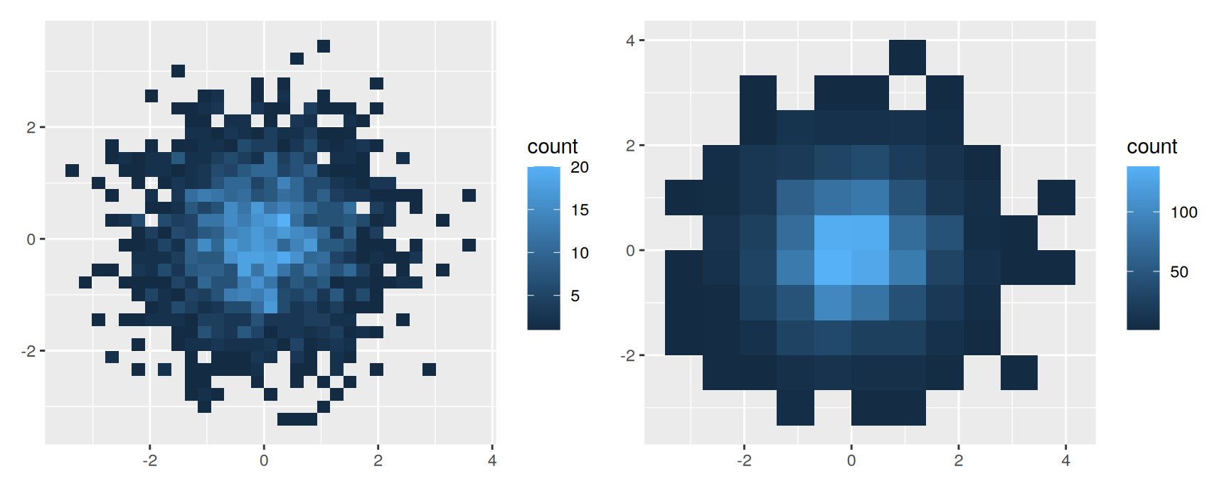
The honest fix for a large data set is to stop drawing points. Divide the plane into bins, count what falls in each, and map the count to fill. This is a two dimensional histogram.
bins sets how many bins per axis, binwidth sets their size in data units. The same trade-off as a histogram applies, one axis at a time.
Nothing is hidden now. The colour scale reports exactly how many observations sit in each cell, and the number is readable whether the data set has two thousand rows or two million.
Hexagons
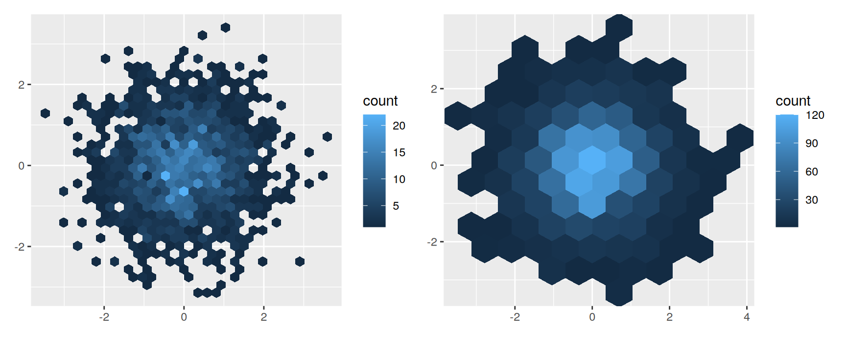
Square bins have a quirk. A square’s corners are further from its centre than its edges are, so a point’s bin depends on direction as well as distance, and the eye picks up faint horizontal and vertical banding. Hexagons are closer to round and do not do this.
geom_hex() needs the hexbin package installed. It takes the same bins and binwidth arguments.
Smoothing and summarising
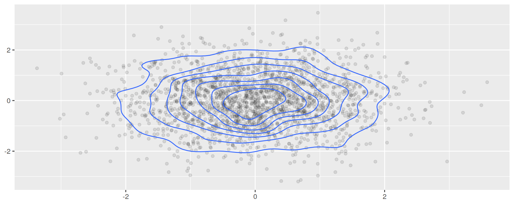
Binning is one way to estimate a two dimensional density. Smoothing is the other. geom_density_2d() fits a smooth surface and draws its contour lines, which costs more computation and gives a cleaner picture when the underlying density really is smooth.
norm +geom_point(alpha =1/10) +geom_density_2d()
The last strategy is to give up on showing every point and show the conclusion instead. A geom_smooth() layer over a saturated scatterplot tells the reader where the middle of the cloud is, which is usually the thing they were trying to see. The summary geoms in the next section do the same job with more control.
Statistical summaries
Beyond counting
geom_histogram() is geom_bar() plus stat_bin(). geom_bin2d() is geom_raster() plus stat_bin2d(). In both cases the statistic bins the data and returns a count.
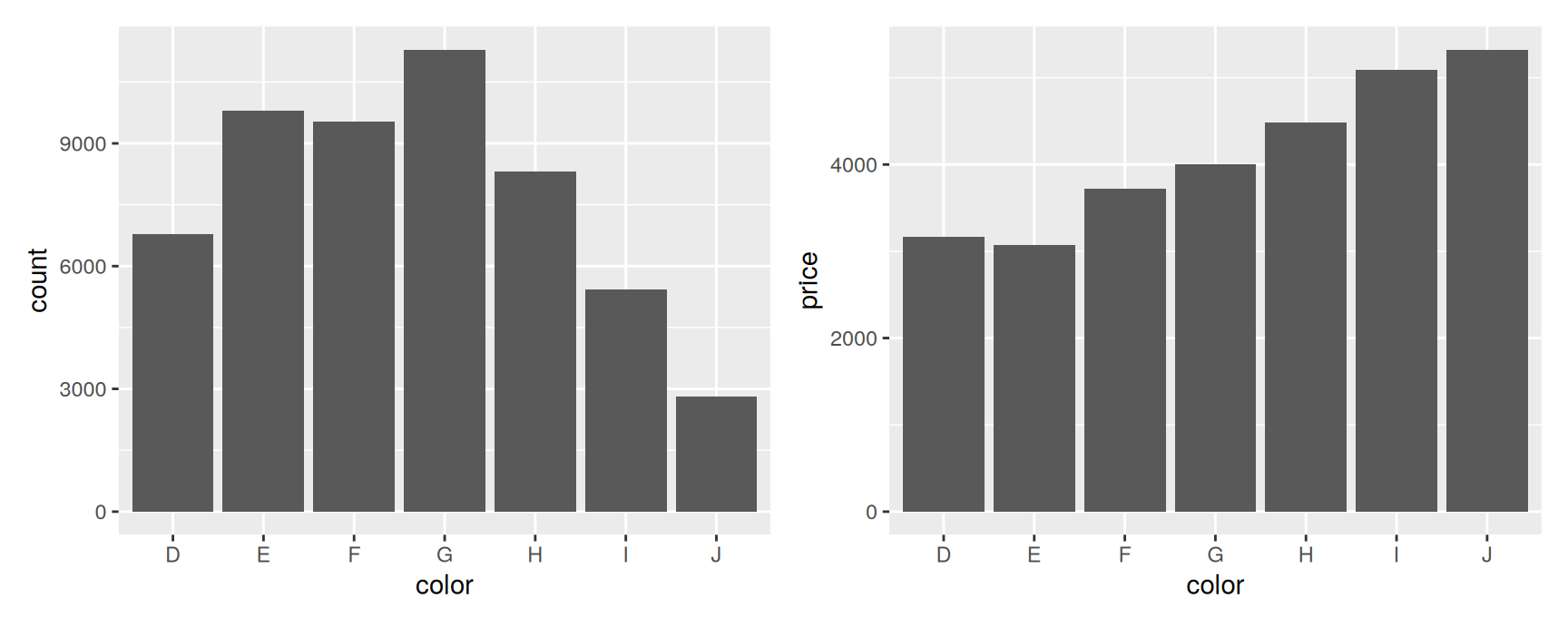
Counts are not the only thing worth binning towards. stat_summary_bin() and stat_summary_2d() do the same binning and then apply any summary function you name.
Bar height now means average price rather than number of stones. fun takes any function that turns a vector into one number, so median, sd or something you wrote yourself all work.
The result is worth a second look. Colour D is the best grade and J the worst, yet average price rises steadily from D to J. Grade is not the only thing that varies across these groups, and the exercises ask you to find what else does.
Adding spread
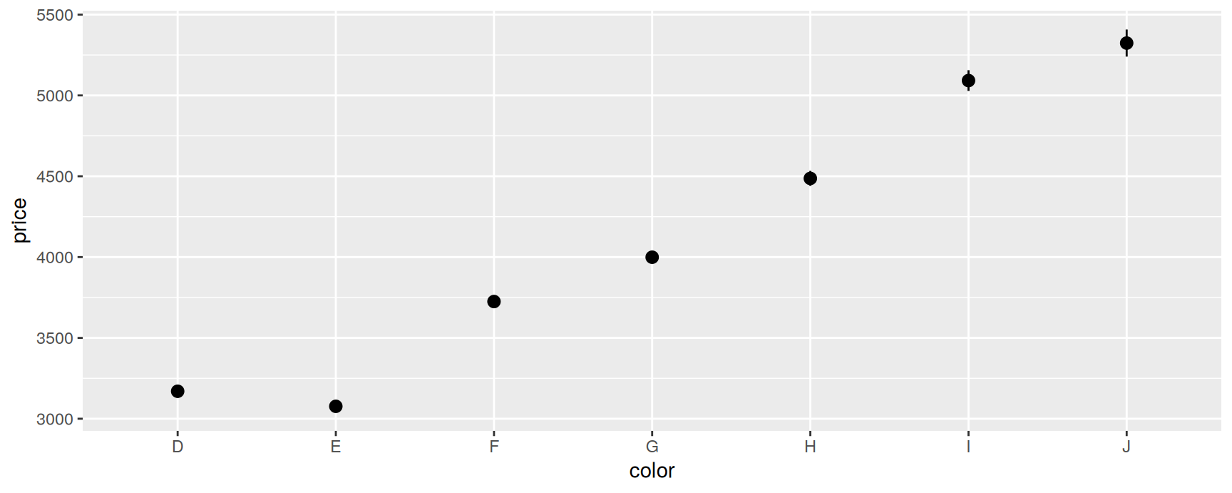
stat_summary_bin() can return ymin and ymax as well as y, which brings this section back to the first one. Give it a function that reports an interval and a geom that can draw one.
mean_se() returns the mean and one standard error either side. With 54,000 diamonds the intervals are tiny, which is itself informative: the differences between colour grades are real, and they are still not evidence about grade.
Two dimensional summaries
The same idea one dimension up. Bin on two axes, then summarise a third variable inside each cell.
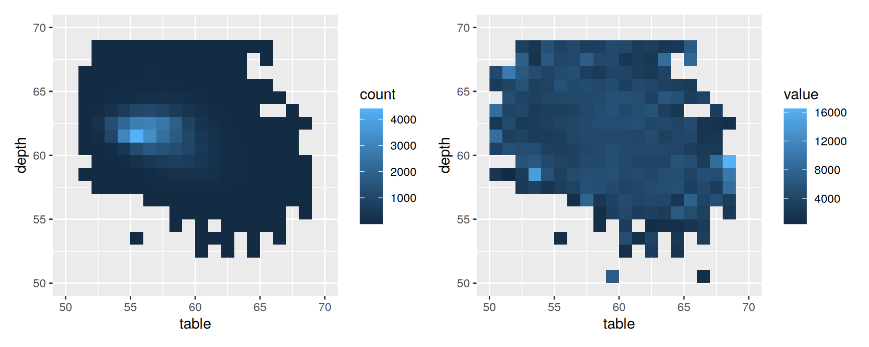
cells <-ggplot(diamonds, aes(table, depth)) +geom_bin2d(binwidth =1) +xlim(50, 70) +ylim(50, 70)mean_price <-ggplot(diamonds, aes(table, depth, z = price)) +geom_raster(binwidth =1, stat ="summary_2d", fun = mean) +xlim(50, 70) +ylim(50, 70)cells + mean_price
The left panel shows where the diamonds are. The right panel shows what they cost, and the two are almost unrelated: the expensive cells sit out at the edges of the cloud where there are hardly any stones at all.
That is the standard hazard of a summary plot. A cell holding three diamonds is coloured just as boldly as a cell holding three thousand. Always draw the count version beside the summary version, or the reader will read noise as signal.
How far this goes
bins and binwidth control the grid, exactly as in a histogram.
These two statistics are deliberately limited. They bin on the plotting variables and apply one function. Anything more, such as summarising by a variable that is not on an axis, or fitting a model per group, is easier to do before you start plotting. Compute the summary table first, then plot it with geom_col() or geom_point().
Surfaces
Three dimensions on flat paper
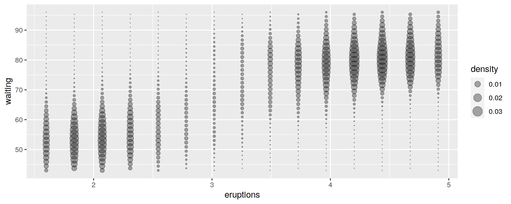
A surface is a value z defined over a grid of x and y. ggplot2 draws no true three dimensional graphics, so z has to become something else: the colour of a line, the fill of a tile, or the size of a point.
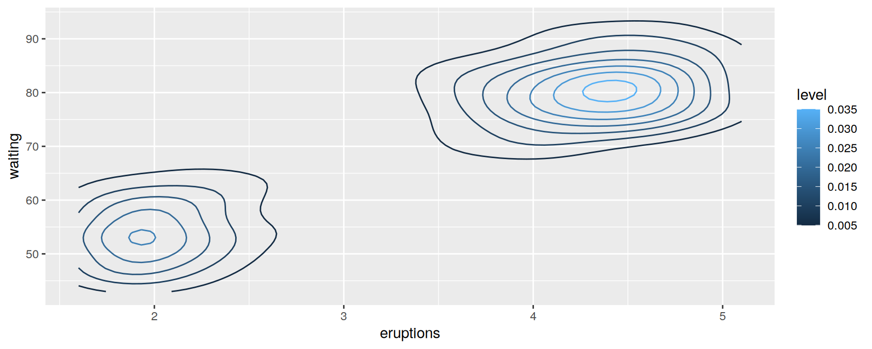
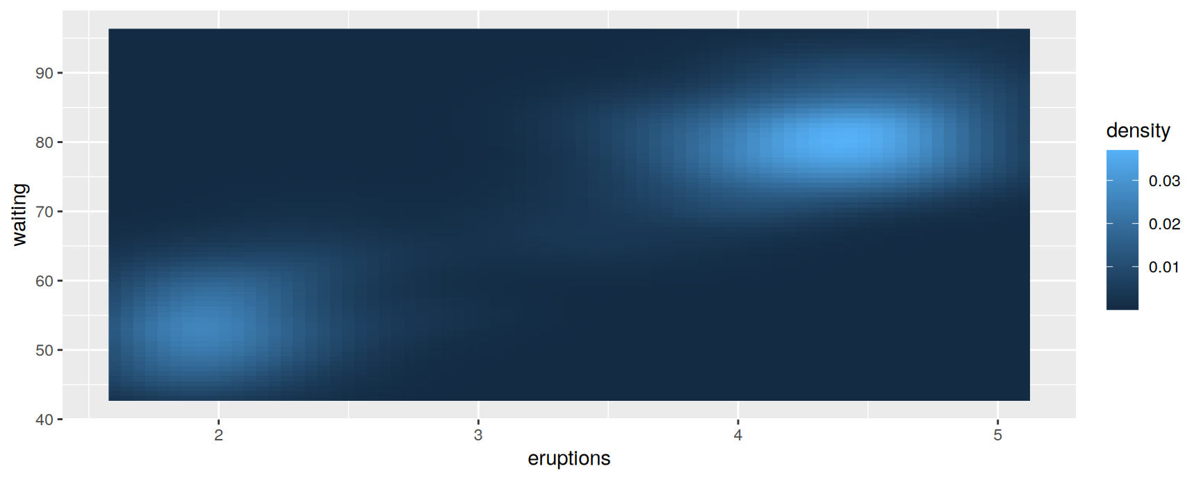
faithfuld ships with ggplot2 and is a ready-made surface. It holds a two dimensional density estimate for the Old Faithful eruption data, on a regular grid of eruption length and waiting time.
Contours
geom_contour() joins points of equal z, the way a topographic map draws height.
level is computed by the statistic, so it needs after_stat(). Mapping it to colour means the lines themselves carry the magnitude, and the reader does not have to count rings to work out which peak is higher.
Contours are good at showing gradients and at letting you trace one particular value across the plot. They are poor at conveying absolute height.
Tiles
geom_raster() colours a rectangle per grid point. It is the fastest of these geoms and assumes a regular grid with equally sized cells.
Use an ordered colour scale, sequential or diverging. A rainbow palette destroys the ordering, and the reader has to consult the legend for every cell.
Bubbles
For a sparse grid, keep the points and let their area carry z. Here every tenth row of faithfuld is used.
scale_size_area() again, for the same reason as in the weighting section. Area is what the eye reads, and zero should look like nothing.
For a rotatable three dimensional surface you need a different tool. The rgl package (https://dmurdoch.github.io/rgl/) does that job.
Exercises
Take the diamonds scatterplot of carat against price and fix its overplotting three ways: with alpha, with geom_hex() and with geom_bin2d(). Which one would you put in a report, and what does it show that the plain scatterplot does not?
Redraw the carat against price hexbin plot for stones under 2.5 carats. Vertical stripes appear at particular weights. Explain them, and say whether they are a fact about diamonds or a fact about the data.
Use stat_summary_bin() to plot mean price against carat in bins of 0.1, with fun.data = mean_se and geom = "pointrange". Where do the intervals get wide, and why?
Draw a two dimensional summary of mean carat over the x and y measurements, then draw the matching count plot beside it. Name one cell you would not trust and say how the count plot told you so.
Build a weighted version of exercise 3: weight each diamond by its carat when computing the mean price per bin. Does the curve change, and what question is the weighted version answering?
Contour faithfuld and raster it in the same figure with patchwork. Give one question that the contour version answers better and one that the raster version answers better.
Recap
If you know the uncertainty, draw it. ymin and ymax feed every interval geom, and you compute the bounds yourself.
Discrete x takes error bars, line ranges, crossbars or point ranges. Continuous x takes ribbons or geom_smooth(stat = "identity").
size shows a weight; weight feeds it into the statistic. Weighting turns a plot about counties into a plot about people.
Bin width, bandwidth and smoothing span are your decisions, and each of them can invent a pattern. Change them and keep only what survives.
Overplotting is fixed by transparency, by binning into squares or hexagons, or by summarising. Pick by how large the data set is.
stat_summary_bin() and stat_summary_2d() swap a count for any summary you like. Always show the counts beside the summary.
Acknowledgement
Source. These slides follow the structure and the teaching sequence of ggplot2: Elegant Graphics for Data Analysis (3e) by Hadley Wickham, Danielle Navarro and Thomas Lin Pedersen. The explanations, examples and exercises here have been rewritten for this course; any errors in them are mine and not the book’s.
Copyright. All rights in the original work are reserved by its authors and publishers. Students are encouraged to read the book itself, which is freely available online.
Non-commercial use only. These materials are for teaching and must not be used for commercial gain.
Attribution. Any reuse or redistribution must credit both the original book and this course.