A map is almost never one data set. It is the geography, plus whatever you want to say about the geography, drawn on top of each other.
The two halves come from different places. Boundaries come from a mapping package or a file someone sent you. Your numbers come from a survey, an election, a sensor. Nothing links them until you put them in the same plot, and making them line up is most of the work.
This chapter deals with both halves.
What we cover:
geom_polygon(), the cheapest way to get a map on the screen.
geom_sf() and the simple features standard, which is how spatial data actually arrives.
Map projections, and why the same country can come out two different shapes.
The sf data structure itself, so that you can take a region apart.
Raster maps, for satellite images and anything else stored as pixels.
You will need the maps, sf, ozmaps, rmapshaper and stars packages. Install them before you work through the slides.
Polygon maps
A boundary is a list of corners
The simplest map is a polygon. Hand ggplot2 the corners of a region in order and geom_polygon() joins them up.
The maps package carries boundary data for much of the world, and map_data() returns it as an ordinary data frame. It is neither current nor precise, but it is already on your machine, which makes it a good place to start.
mi_counties <-map_data("county", "michigan") |>select(lon = long, lat, group, id = subregion)head(mi_counties)
group numbers one unbroken ring of corners. A county made of several separate pieces gets several group numbers.
The difference between id and group is the one that catches people out. Group by id and every island in a county gets joined to the mainland by a stray line.
From corners to counties
Drawing the rows as points is a sanity check. Drawing them as polygons is the map.
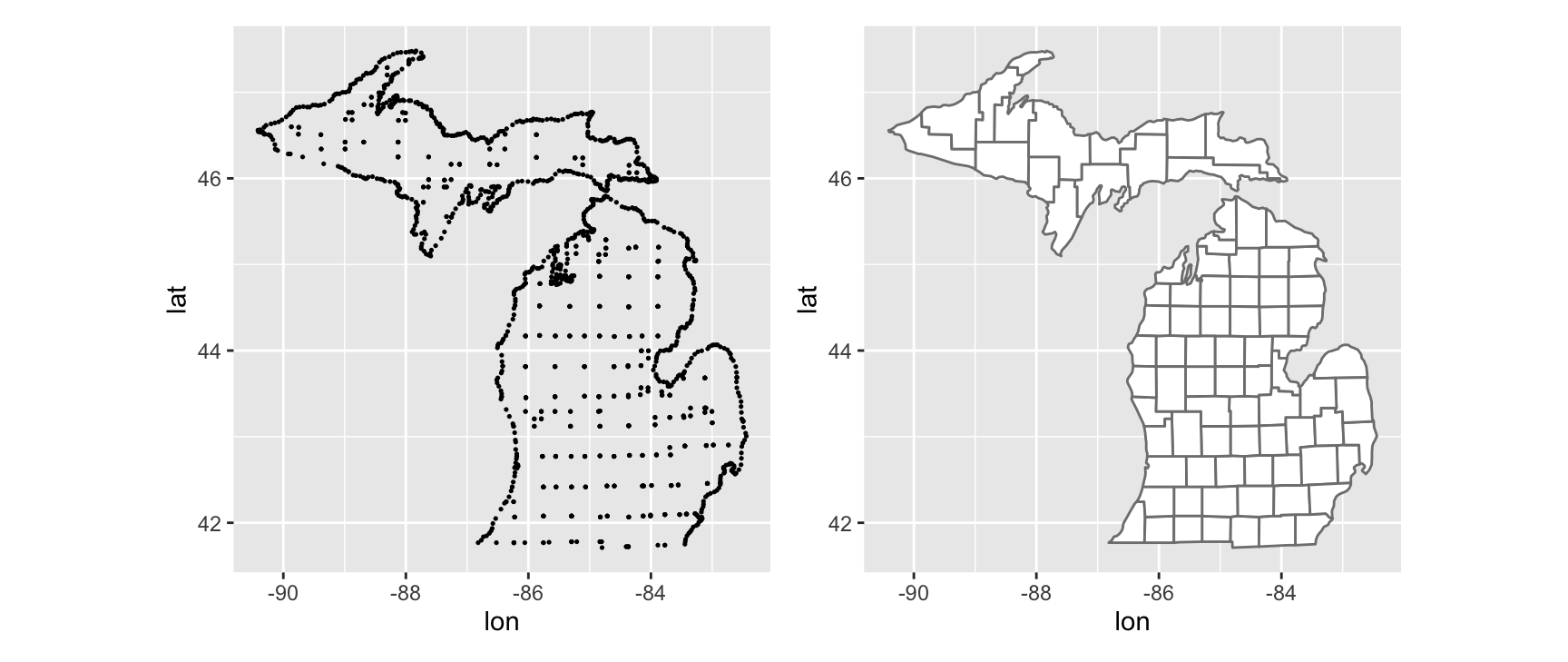
vertices <-ggplot(mi_counties, aes(lon, lat)) +geom_point(size =0.25) +coord_quickmap()counties <-ggplot(mi_counties, aes(lon, lat, group = group)) +geom_polygon(fill ="white", colour ="grey50") +coord_quickmap()vertices + counties
The left panel is a scatterplot of every corner in the data. It already looks like Michigan, which tells you the data loaded correctly and that the columns mean what you think they mean.
The right panel adds two things. group = group tells geom_polygon() which corners belong to the same ring, and the fill and colour settings turn each ring into a county with a visible border.
Why coord_quickmap() is there
Both plots end with coord_quickmap(). Without it, one degree of longitude and one degree of latitude get the same number of pixels, and the map comes out stretched sideways.
That is wrong everywhere except the equator. A degree of longitude shrinks as you move towards the poles, so a map of Michigan drawn on square degrees is noticeably too wide. coord_quickmap() applies a quick correction based on the latitude of the data.
Quick is the operative word. It is a linear approximation, fine for one state and not fine for a continent. The rest of the chapter uses a proper projection instead.
Exercises
Draw the counties of Florida. Count the distinct values of group and of id. Are the two counts the same, and what does the difference tell you about the state’s coastline?
Redraw the Michigan map without coord_quickmap(). Describe how the shape changes, then say which version you would hand in and why.
Delete group = group from the polygon call and draw it again. Explain the shape you get in terms of what geom_polygon() does with a list of corners.
map_data("state") returns the lower 48 states. Draw it, map fill to region and switch the legend off. The colours carry no information here. Describe the kind of variable that would make the same plot worth drawing.
Detroit sits at roughly 42.33 N, 83.05 W and Marquette at 46.55 N, 87.40 W. Put both on the county map with geom_point(). Check that they land where you expect, and say what you had to be careful about with the sign of the longitude.
Simple features maps
Why polygons are not enough
The polygon approach works, but no one distributes serious spatial data as a data frame of corners. The standard is simple features, published by the Open Geospatial Consortium, and the sf package is the R implementation of it.
ggplot2 talks to sf through two functions.
geom_sf() draws whatever geometry it is given, be it points, lines or polygons.
coord_sf() fixes the coordinate reference system for the whole plot.
The examples use ozmaps, which packages Australian state, local government and electoral boundaries as sf objects.
Simple feature collection with 9 features and 1 field
Geometry type: MULTIPOLYGON
Dimension:     XY
Bounding box:  xmin: 105.5507 ymin: -43.63203 xmax: 167.9969 ymax: -9.229287
Geodetic CRS:  GDA94
# A tibble: 9 × 2
  NAME                                                                  geometry
* <chr>                                                       <MULTIPOLYGON [°]>
1 New South Wales              (((150.7016 -35.12286, 150.6611 -35.11782, 150.6…
2 Victoria                     (((146.6196 -38.70196, 146.6721 -38.70259, 146.6…
3 Queensland                   (((148.8473 -20.3457, 148.8722 -20.37575, 148.85…
4 South Australia              (((137.3481 -34.48242, 137.3749 -34.46885, 137.3…
5 Western Australia            (((126.3868 -14.01168, 126.3625 -13.98264, 126.3…
6 Tasmania                     (((147.8397 -40.29844, 147.8902 -40.30258, 147.8…
7 Northern Territory           (((136.3669 -13.84237, 136.3339 -13.83922, 136.3…
8 Australian Capital Territory (((149.2317 -35.222, 149.2346 -35.24047, 149.271…
9 Other Territories            (((167.9333 -29.05421, 167.9188 -29.0344, 167.93…
Look at what changed. One row is now one geographic unit, not one corner. Australia has six states and a few territories, so the object has nine rows and you can read that off the printout immediately.
The work is done by the geometry column. Each cell holds a MULTIPOLYGON, a complete description of every ring that makes up that state, islands included.
The lines above the table are metadata that travels with the object. Geometry type, bounding box and coordinate reference system are stored in the data, so you never have to remember them separately.
Drawing it
geom_sf() finds the geometry column on its own. There is nothing to map.
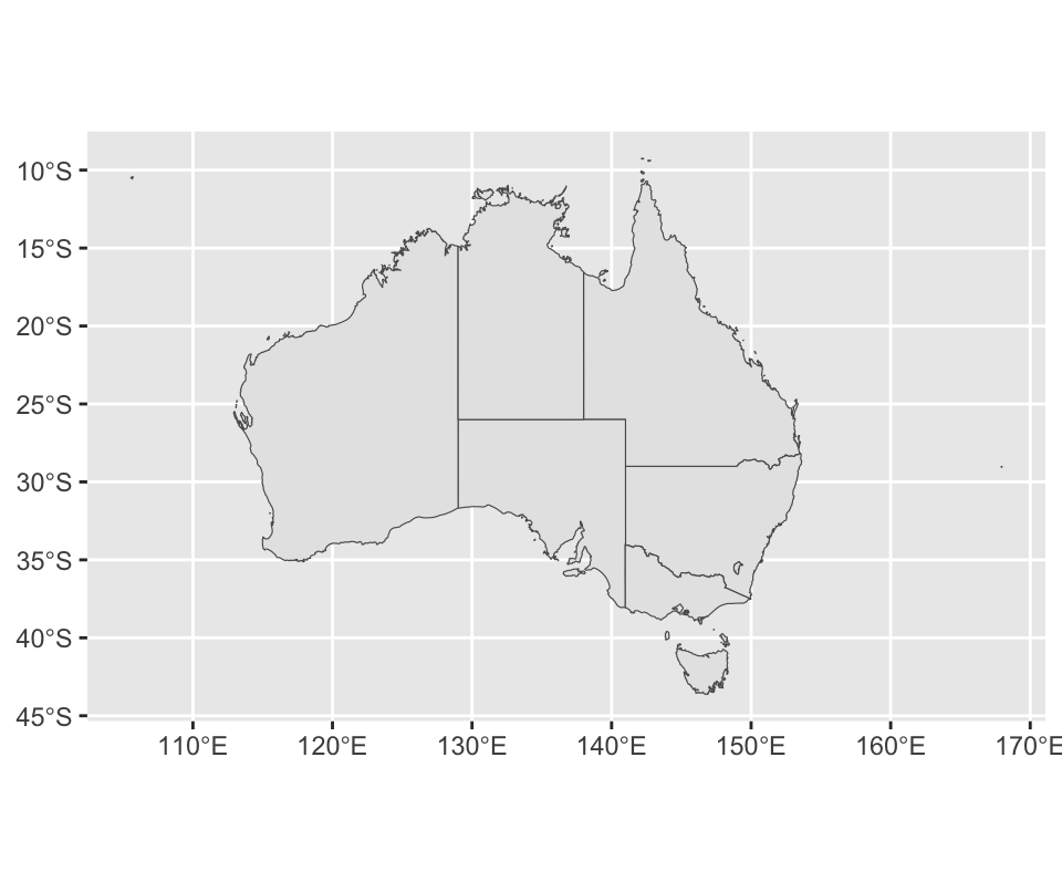
ggplot(oz_states) +geom_sf() +coord_sf()
How the geometry is found
geom_sf() uses an internal geometry aesthetic that no other geom has. It gets filled in one of three ways.
You do nothing and the data has a column called geometry. That is the case above.
The data is an sf object and the geometry column is called something else. geom_sf() detects it anyway.
You write aes(geometry = my_column) yourself. You need this when a data frame carries more than one geometry column.
coord_sf() handles the projection, which is the subject of the next section.
Layered maps
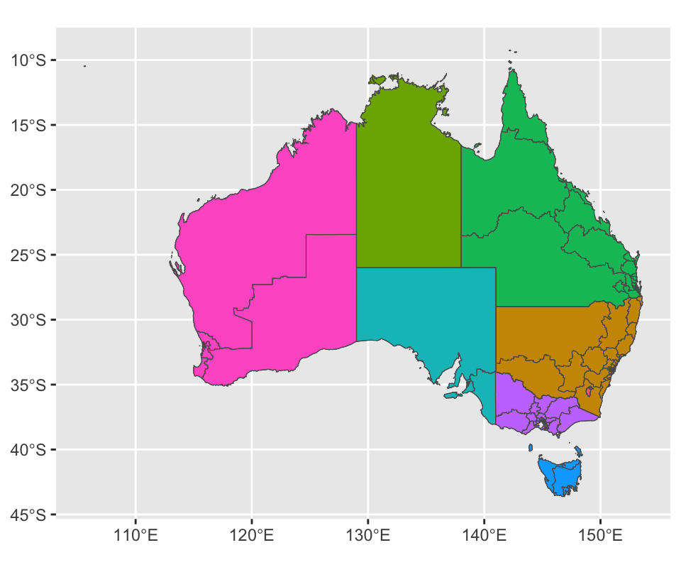
Two geom_sf() layers stack like any other layers. We will fill the states with colour and draw electoral boundaries over the top.
Two things have to happen first.
Drop “Other Territories” from the state data. It covers islands far offshore and stretches the map to nothing.
Thin the electoral boundaries with ms_simplify(). The original resolution is far higher than a slide needs, and the plot renders much faster without it.
ggplot() is called with no data at all. When layers come from different tables, each layer names its own data =, and there is nothing sensible to put in the default slot.
fill = NAME maps a variable to colour. Here NAME is just a label, so the colours say nothing. Swap in a column holding unemployment or turnout and the same three lines produce a choropleth map.
Labelled maps
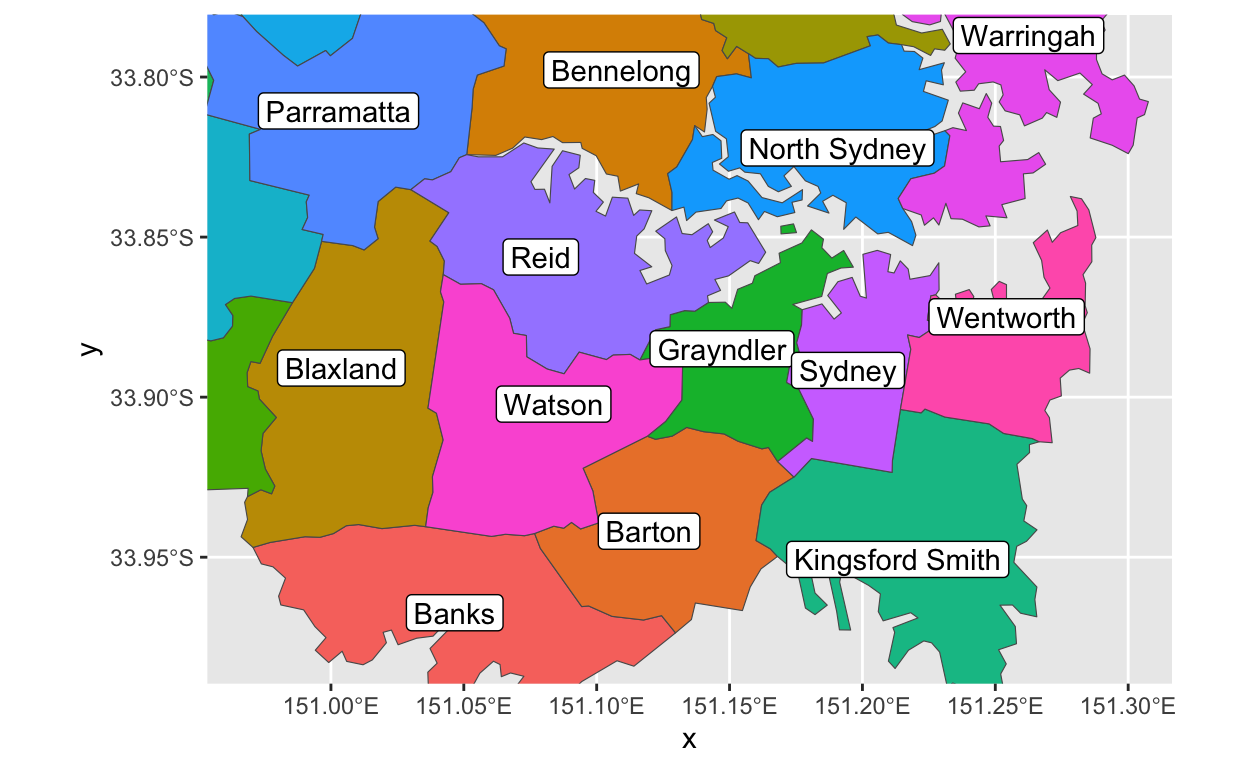
Australians know their states. Almost nobody knows the twenty odd federal electorates inside Sydney, so that map needs labels.
Two geoms do it. geom_sf_label() puts the text in a small box, which survives a busy background. geom_sf_text() writes bare text. Both call st_point_on_surface() to pick an anchor that is guaranteed to fall inside the region.
That code prints a warning about st_point_on_surface() and longitude–latitude data. It is telling you something real.
Most of the geometric routines in sf assume the points lie on a flat plane. Longitude and latitude do not. Over a city the error is far smaller than a label, so you can ignore it. Over a continent, or anywhere near a pole, it is not, and you should project the data to a planar system before you compute anything.
The general rule: sf warns when it takes a shortcut. Decide whether the shortcut matters at your scale rather than switching the warning off.
Adding other geoms
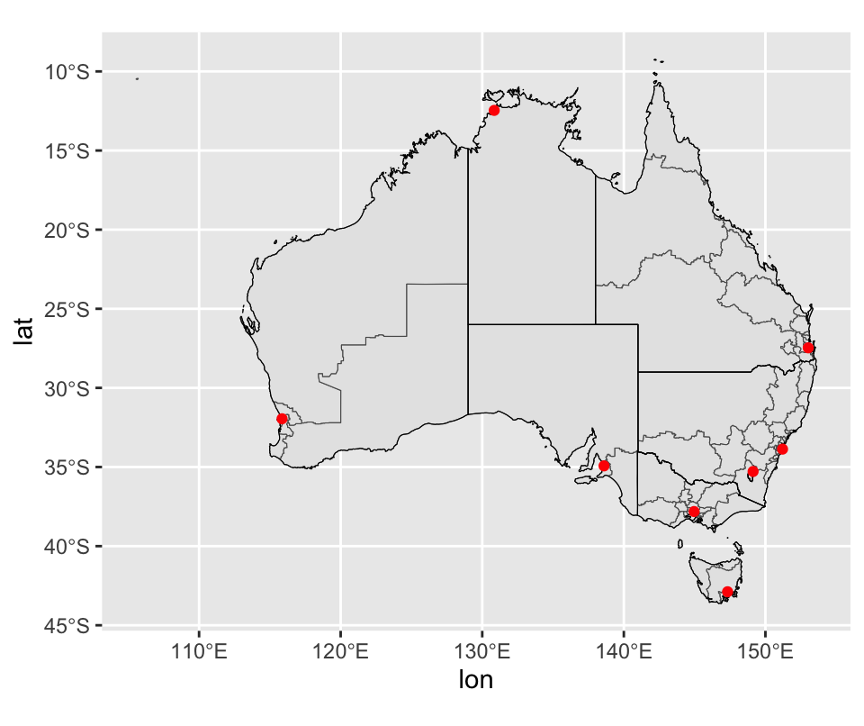
geom_sf() is an ordinary layer. Any other geom can sit beside it, as long as the coordinates agree.
Australian capital cities are a plain table of numbers, not an sf object, so geom_point() is enough.
The points only mark locations here, but geom_point() keeps all of its aesthetics. If oz_capitals also held the number of electorates in each city, mapping that column to size would turn the red dots into a proportional symbol map.
That is the second half of the mapping problem solved. One layer supplies the geography, another supplies the thing you actually wanted to show.
Exercises
ozmap_country holds a single outline of Australia. Draw it next to ozmap_states with patchwork. Report the number of rows in each object and explain what a row means in an sf table.
Draw abs_ced raw and then simplified with ms_simplify(), timing both with system.time(). State what simplification cost you visually and whether the time saved was worth it.
Add a column to oz_states holding each state’s area from st_area(), then map it to fill. Describe how the legend differs from the fill = NAME version and say why.
Repeat the Sydney map for Melbourne or Brisbane. You will have to find the electorate names and the right xlim and ylim. Which labels collide, and what would you change to fix it?
Swap geom_sf_label() for geom_sf_text() on the Sydney map. Which one reads better over coloured polygons, and what did you give up by switching?
Draw the state map with geom_sf(fill = NA) and no coord_sf() call at all. Does anything change? Explain what coord_sf() was doing when you did include it.
Map projections
Why longitude and latitude are not enough
So far we have treated longitude and latitude as ordinary x and y. At the scale of one city that is harmless. At the scale of a continent it is wrong, for two separate reasons.
The first is the shape of the planet. The second is the shape of the page.
Problem one: the datum
The Earth is not flat and it is not a sphere. It is a lumpy ellipsoid, and turning a coordinate pair into a place on the ground means assuming a lot of things. How ellipsoidal? Where is the centre? Where is sea level? Where does longitude start? How do the plates move?
That bundle of assumptions is the geodetic datum. Two you will meet often:
NAD83, tuned for North America.
WGS84, the global system your phone’s GPS uses.
The same pair of numbers can land metres apart under different datums. For a map of a country that does not matter. For anything you intend to navigate by, it does.
Problem two: the projection
The Earth’s surface curves. A screen does not. You cannot flatten one onto the other without tearing or stretching something, and the map projection is your choice of what to sacrifice.
Projections are usually sorted by what they preserve.
Equal-area projections keep areas honest. Shapes get distorted.
Conformal projections keep local shapes and angles honest. Areas get distorted, badly so near the poles. Mercator is the famous example, and it is why Greenland looks the size of Africa.
No projection does both. Pick the one that suits the claim your map is making.
Coordinate reference systems
Put the datum, the projection and the projection’s parameters together and you have a coordinate reference system, a CRS. It is the full recipe for turning coordinates into a picture.
An sf object carries its CRS with it. st_crs() reads it back.
st_crs(oz_votes)$input
[1] "EPSG:4283"
st_crs(oz_votes)$epsg
[1] 4283
Printing st_crs(oz_votes) in full gives you a long block of well-known text. WKT is unambiguous and machine readable, and it is what sf uses internally.
For everyday work the EPSG code is easier. It is an integer from a public registry at https://epsg.org, and one number stands in for the whole WKT block. The Australian electoral data defaults to EPSG 4283, which is the GDA94 datum.
st_crs(oz_votes) ==st_crs(4283)
[1] TRUE
Changing the projection
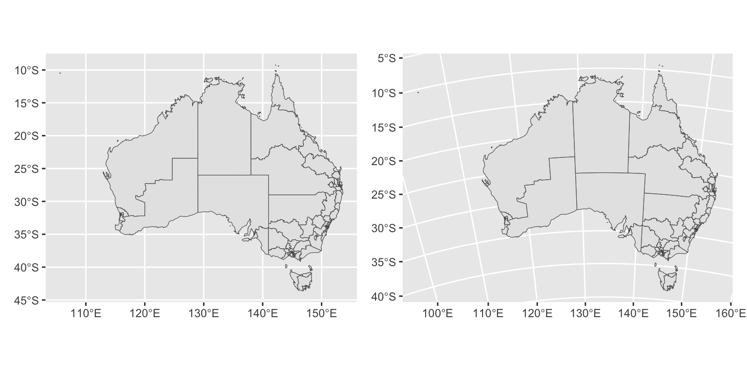
coord_sf() sets the CRS for every layer at once, so the layers cannot disagree. Left alone it takes the CRS of the first sf layer, which is usually the right answer.
EPSG 3112 is the Geoscience Australia Lambert projection, built to keep areas close to correct across the continent.
Compare the two outlines. The country leans, the top edge curves, and the coastline in the south changes shape. Nothing about the data changed. Only the assumption about how to flatten it did, and that alone is enough to change what a reader takes away.
Draw oz_votes under EPSG 4283, 3112 and 3857. Put the three side by side and describe in one sentence how Tasmania moves and changes shape.
Compare st_crs(oz_states) with st_crs(4326). Are they equal? Name one thing that differs between them.
Give coord_sf() a CRS built for somewhere else, say EPSG 2154, which is French. Draw the result and explain what went wrong in terms of the projection parameters.
Transform oz_states with st_transform(oz_states, 3112) and draw it with a plain coord_sf(). Compare against leaving the data alone and setting crs inside coord_sf(). Are the pictures the same, and which approach would you rather maintain?
Build a plot with oz_states in one layer and st_transform(oz_votes, 3112) in another, then draw it. What does coord_sf() do about the disagreement, and how would you have found out if it had silently done the wrong thing?
Working with sf data
Regions are complicated
The reason simple features won is that one row can describe a genuinely awkward region. A MULTIPOLYGON holds any number of separate rings, and rings can have holes.
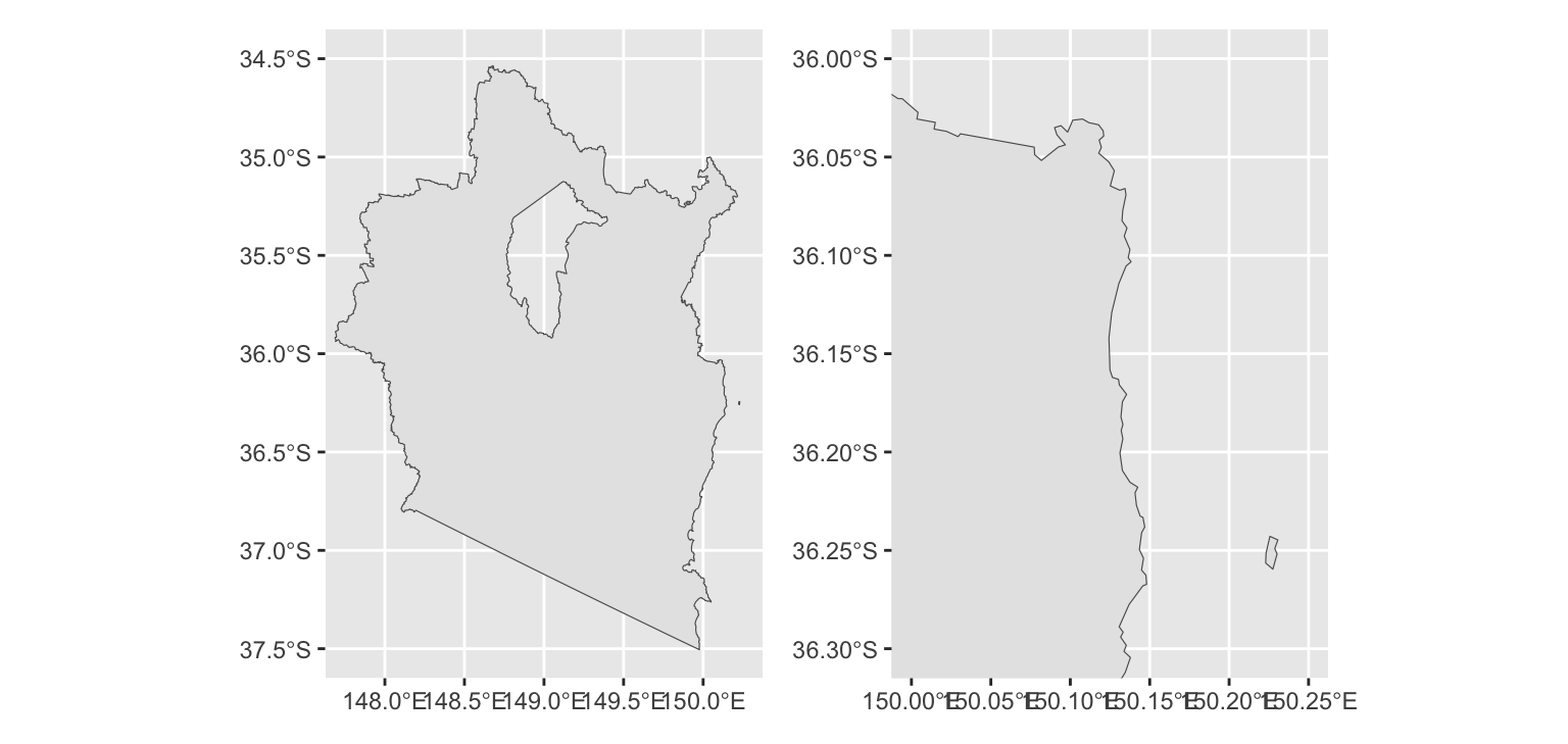
Eden-Monaro, a federal electorate in New South Wales, is a good example. It is a large mainland area with a hole punched in it, because the Australian Capital Territory sits entirely inside it and electoral boundaries do not cross state lines. It also owns a small island offshore.
st_cast() converts between geometry types. Cast a MULTIPOLYGON down to POLYGON and you get one row per ring, which is how you get at the pieces separately.
st_cast(edenmonaro, "POLYGON")
Geometry set for 2 features
Geometry type: POLYGON
Dimension:     XY
Bounding box:  xmin: 147.6874 ymin: -37.50503 xmax: 150.2307 ymax: -34.53558
Geodetic CRS:  GDA94
A worked example
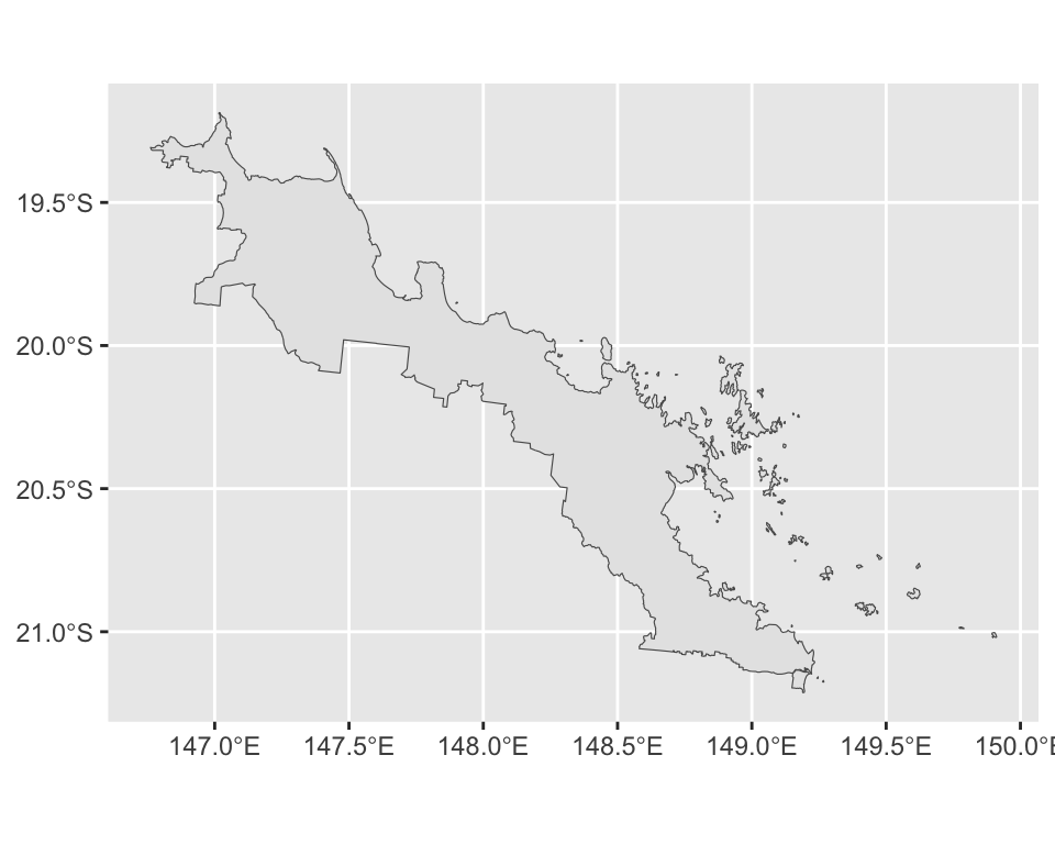
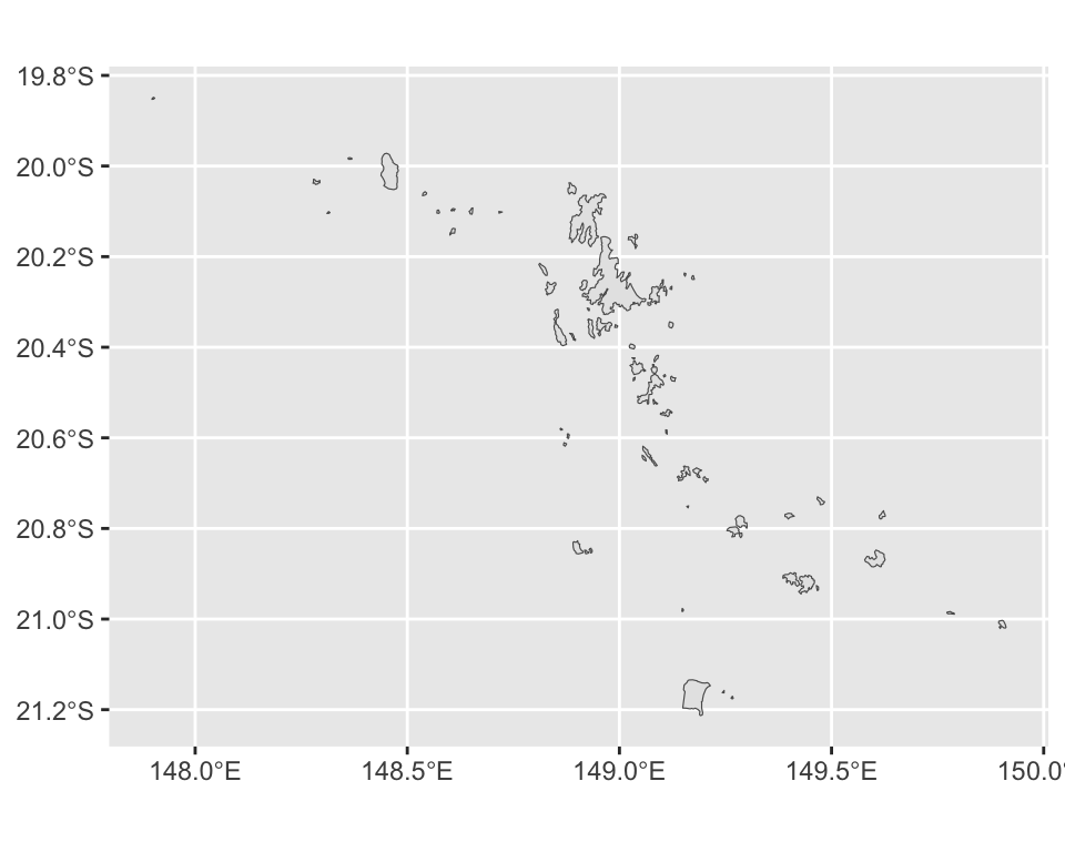
Dawson, in Queensland, is a strip of coast plus 69 islands. Drawn whole, the islands are specks.
Cast, measure, subset. That sequence solves a whole family of problems: separating mainland from islands, finding the largest contiguous piece of a scattered region, dropping slivers left behind by a bad merge.
Note that mainland is computed rather than typed in. It happens to be polygon 69 today. Hard-coding that number breaks the first time the boundaries are redrawn.
Exercises
Pull the geometry of an electorate of your choosing and report its st_geometry_type(), st_dimension() and st_bbox(). Say in words roughly how big the region is.
Cast that electorate to "POLYGON" and count the pieces. Do the same for a neighbouring electorate and explain what the difference in counts says about the two coastlines.
Use st_area() on the Dawson polygons to work out what share of the electorate’s total area sits on the mainland. Report the number and say whether it surprised you.
Sort the Dawson islands by area and draw only the ten largest. Does the map still read as the same place? What have you hidden?
Cast a single POLYGON to "POINT". How many rows come back, and what does that number correspond to in the original data?
st_bbox() returns four numbers. Use them to set xlim and ylim in coord_sf() so that a plot of Tasmania fills the panel exactly. Explain why you might want to pad the box slightly.
Raster maps
Pixels instead of polygons
Not all spatial data is made of lines and areas. Raster data is a grid of cells, each holding a number. Satellite images, elevation models, land cover and gridded climate data all arrive this way.
A plain bitmap has no idea where on Earth it belongs. Formats such as GeoTIFF fix that by storing the CRS and the extent alongside the pixels, so the image can be placed on the ground.
R reads these through GDAL. sf::gdal_read() exposes it directly, but you will almost never call that yourself.
Reading a raster
The stars package handles raster arrays. The file below is a visible-light image from the Himawari-8 weather satellite, taken over Australia.
RasterIO passes options straight to GDAL. Here it downsamples the image to 600 by 600 pixels while reading, which keeps the memory cost small.
stars object with 3 dimensions and 1 attribute
attribute(s), summary of first 1e+05 cells:
                           Min. 1st Qu. Median     Mean 3rd Qu. Max.
IDE00422.202001072100.tif     0       0      0 18.12981       0  255
dimension(s):
     from  to   offset  delta                  refsys point x/y
x       1 600 -5500000  18333 Geostationary_Satellite FALSE [x]
y       1 600  5500000 -18333 Geostationary_Satellite FALSE [y]
band    1   3       NA     NA                      NA    NA
What a stars object is
An n-dimensional labelled array. This one has three dimensions.
Dimension
Meaning
x
Columns, east to west, tied to a CRS
y
Rows, north to south, tied to a CRS
band
Colour channel: 1 red, 2 green, 3 blue
The image is greyscale, so all three bands hold the same numbers. Other data sets put sensors in the band dimension, or add a time dimension for a series of images. The refsys entry in the printout is the CRS, stored with the data as usual.
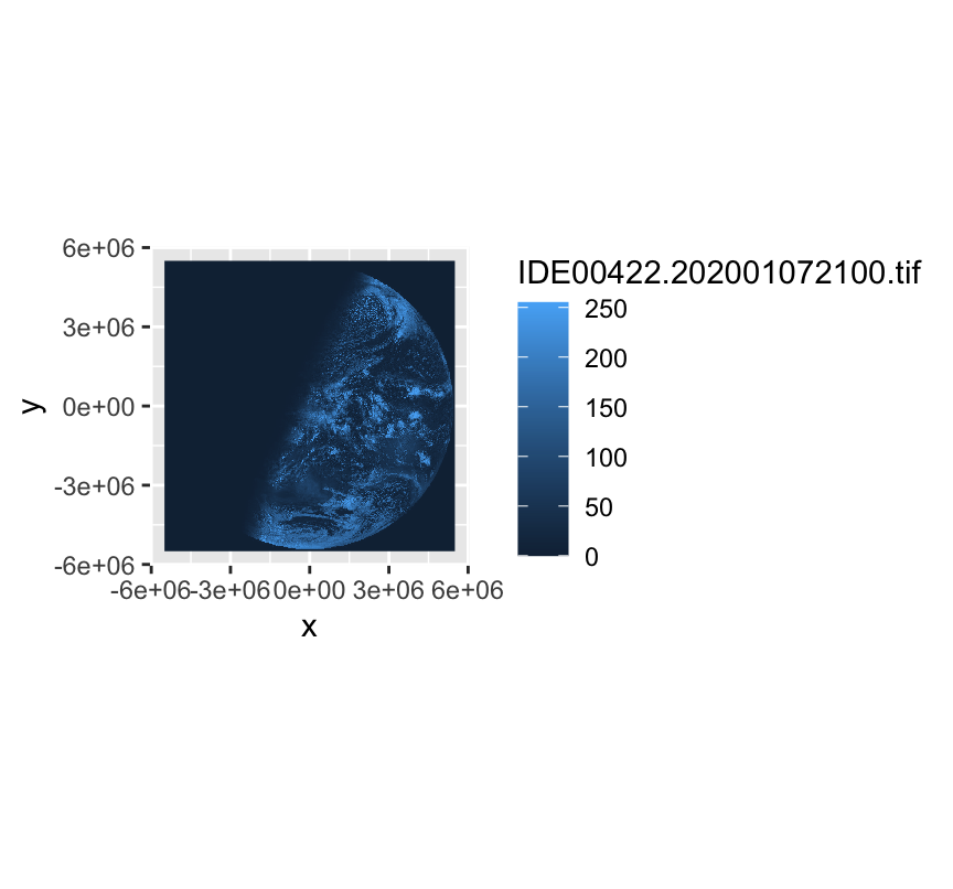
The image is blue, and the satellite did not take a blue picture. Values from 0 to 255 went through ggplot2’s default continuous scale, which is a blue gradient.
The plot also shows one band only. To see what the file holds, separate the bands and force a sensible palette.
Three identical panels, which confirms the greyscale claim. For a multispectral image the panels would differ, and comparing them is how you decide which band answers your question.
The lesson generalises. A default colour scale is a decision ggplot2 made for you, and on image data it is almost always the wrong one.
Making the image readable
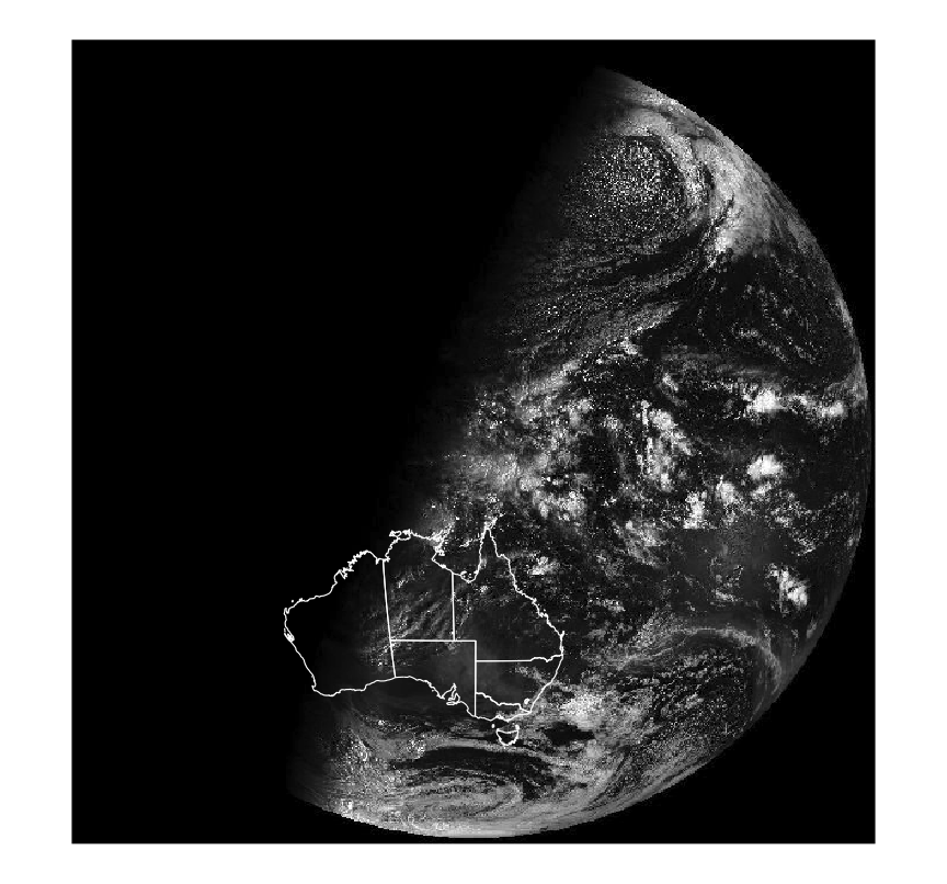
An unlabelled satellite image is hard to interpret. Drawing the state boundaries over it helps, but the two data sets use different coordinate reference systems, so they will not line up until one is converted.
st_transform() does the conversion. Take the CRS off the raster and push the vector data into it.
The white outlines sit exactly on the coastlines in the image. That is the check: if the transform had been skipped, or done in the wrong direction, the mismatch would be obvious.
Note theme_void(). Axis ticks in the satellite’s own coordinate system are metres from a point in space, which tells the reader nothing, so we remove them.
Overlaying point data
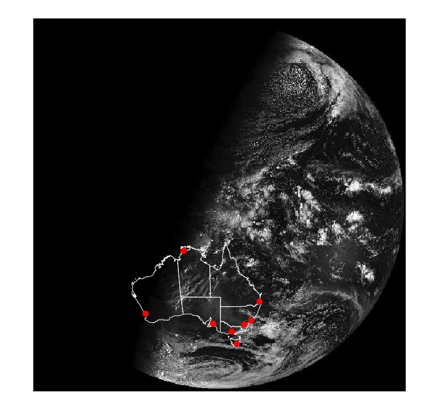
The capital cities are still a plain table of longitudes and latitudes, with no CRS attached. They need the same treatment, in two steps.
st_as_sf() turns the columns into geometry and declares their CRS. EPSG 4326 is plain longitude and latitude on the WGS84 datum, which is what those numbers are.
st_transform() moves them into the raster’s system.
The first step is the one people forget. Without it sf has coordinates but no idea what they mean.
Now the picture says something. Sydney, Melbourne, Brisbane and Canberra sit in daylight. Perth is still in the dark. The image was taken at about sunrise in Darwin.
That reading was impossible from the raw raster. It became possible only once two other data sets were projected onto it correctly.
Adding the names is one more layer, geom_sf_text(data = cities, aes(label = city)), though the labels need nudging apart. Chapter 8 covers annotation properly.
Exercises
Read sat_vis again at nBufXSize = 100 and at nBufXSize = 1200. Draw both and time the reads. What resolution is enough for a slide, and what would you use for a printed figure?
Draw the raster with the default fill scale and with the black-to-white gradient. Which of the two is a picture of the data, and which is a picture of a ggplot2 default?
Check that the three bands really are identical, and say what facet_wrap(vars(band)) would have shown if they were not.
Overlay the state boundaries without calling st_transform() first. Describe the failure, and state exactly which piece of metadata the two data sets disagreed on.
Add the city names with geom_sf_text(). Which labels run off the edge of the image, and what would you change to keep them on it?
Replace theme_void() with the default theme. Read the axis labels and explain, in one sentence, what units they are in and why they are useless to a reader.
Data sources
Where maps come from
You will rarely draw a map of a country the tutorials chose for you. These packages cover most of what you will need.
tigris (https://github.com/walkerke/tigris) downloads the US Census TIGER shapefiles: states, counties, ZIP codes, census tracts and a great deal more.
The rest of the world
rnaturalearth (https://CRAN.R-project.org/package=rnaturalearth) wraps the Natural Earth data set. Country borders plus the top-level division inside each country, such as states, regions or counties.
If someone hands you a shapefile, read it straight in.
my_map <- sf::read_sf("path/to/my_shapefile.shp")
What comes back is an sf object, so everything in this chapter applies to it unchanged.
Recap
A map is two data sets. Draw the geography, then draw your numbers on top of it.
geom_polygon() is fine for a quick look. Anything real arrives as simple features and belongs in geom_sf().
One row of an sf table is one region, however many rings and holes that takes.
The CRS is not a formality. Layers with different coordinate reference systems will not line up until you transform one of them.
st_cast(), st_area() and st_bbox() let you take a region apart and measure the pieces.
Raster data is pixels with a CRS attached. geom_stars() draws it, and you should always replace the default fill scale.
Acknowledgement
Source. These slides follow the structure and the teaching sequence of ggplot2: Elegant Graphics for Data Analysis (3e) by Hadley Wickham, Danielle Navarro and Thomas Lin Pedersen. The explanations, examples and exercises here have been rewritten for this course; any errors in them are mine and not the book’s.
Copyright. All rights in the original work are reserved by its authors and publishers. Students are encouraged to read the book itself, which is freely available online.
Non-commercial use only. These materials are for teaching and must not be used for commercial gain.
Attribution. Any reuse or redistribution must credit both the original book and this course.