Network data is the second specialised corner of this course. Maps, in Chapter 6, needed one extra idea, the projection. Networks need two: a data structure that is not a table, and a family of pictures that no other chapter uses.
ggplot2 on its own cannot draw a network. The package that fills the gap is ggraph (https://ggraph.data-imaginist.com), and these slides use it throughout.
Other packages cover some of the same ground.
geomnet, ggnetwork and GGally draw general networks.
ggtree and ggdendro specialise in trees and dendrograms.
What Chapter 7 covers
What network data is, and how tidygraph stores and manipulates it.
How ggraph draws it: layouts, node geoms, edge geoms, facets.
Where to read further.
The examples assume tidygraph, ggraph and dplyr are installed and loaded.
What is network data?
Nodes and edges
A network, also called a graph, holds exactly two kinds of thing.
Nodes, or vertices, are the entities. People, genes, web pages, colours.
Edges, or links, are the relations between pairs of nodes.
Both can carry data of their own. A node might have an age and a job title. An edge might have a weight and a date.
Edges are either directed or undirected. Friendship is usually treated as symmetric, so its edges are undirected. “Is the child of” is not symmetric, so its edges point from one node to the other.
Why one data frame is not enough
ggplot2 assumes a single rectangular table. A network will not fit into one. The nodes and the edges have different row counts and different attributes, and the edge table only means anything by pointing at rows of the node table.
So you need two tables that know about each other. tidygraph supplies exactly that, and ggraph is built on top of it.
A dplyr interface for graphs
tidygraph keeps both tables inside one object and lets you use the dplyr verbs you already know on either of them. activate() chooses which table the following verbs apply to. Only one is active at a time.
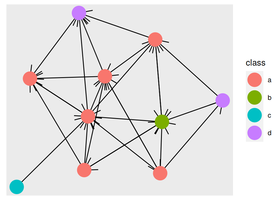
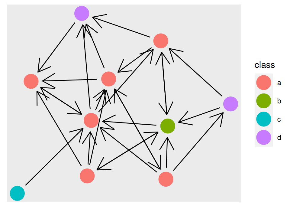
play_gnp() draws a random graph under the Erdős–Rényi model: ten nodes, and every possible directed edge present with probability 0.2. Older material calls the same function play_erdos_renyi(), which still works but has been deprecated since tidygraph 1.3.0.
graph
# A tbl_graph: 10 nodes and 26 edges
#
# A directed simple graph with 1 component
#
# Edge Data: 26 × 2 (active)
   from    to
  <int> <int>
1     3     1
2     6     1
3     9     1
4     3     2
# ℹ 22 more rows
#
# Node Data: 10 × 1
  class
  <chr>
1 a
2 a
3 a
# ℹ 7 more rows
Reaching across the two tables
The arrange() above sorts the edges by an attribute of the node each edge starts from. It can do that because of .N().
.N() returns the node table. Use it while the edges are active.
.E() returns the edge table. Use it while the nodes are active.
.G() returns the whole graph.
from and to hold the row numbers of the two endpoints, so .N()$class[from] is the class of each edge’s source node.
Conversion
Network data arrives in whatever format the package that produced it prefers. as_tbl_graph() converts most of them into a tbl_graph.
An edge list is the most common starting point. highschool, which ships with ggraph, records which boys nominated which other boys as friends, in 1957 and again in 1958.
# A tbl_graph: 70 nodes and 506 edges
#
# An undirected multigraph with 1 component
#
# Node Data: 70 × 0 (active)
#
# Edge Data: 506 × 3
   from    to  year
  <int> <int> <dbl>
1     1    13  1957
2     1    14  1957
3     1    20  1957
# ℹ 503 more rows
The third column survived the conversion. year describes the nomination rather than either boy, so tidygraph attached it to the edge table. Anything extra in the input is kept the same way.
Read the description line as well. There are 506 edges over 70 nodes, and the object is a multigraph, because the same pair of boys can be joined twice, once per year.
A clustering is a graph too
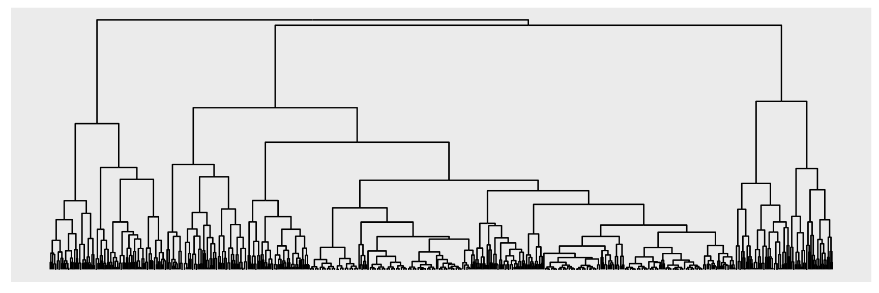
hclust() returns a tree, and a tree is a graph. as_tbl_graph() knows how to read one.
# A tbl_graph: 1313 nodes and 1312 edges
#
# A rooted tree
#
# Node Data: 1,313 × 4 (active)
  height leaf  label members
   <dbl> <lgl> <chr>   <int>
1     0  TRUE  "101"       1
2     0  TRUE  "427"       1
3   778. FALSE ""          2
4     0  TRUE  "571"       1
# ℹ 1,309 more rows
#
# Edge Data: 1,312 × 2
   from    to
  <int> <int>
1     3     1
2     3     2
3     8     6
# ℹ 1,309 more rows
The node table gained four columns that were never in the distance matrix. height is the merge height, leaf marks the original observations, label carries their names and members counts the leaves below each node.
Nothing asked for those columns. The conversion pulled them out of the hclust object, which is what makes the result immediately drawable.
Algorithms
tidygraph ships a large library of graph algorithms, grouped by the question they answer.
Centrality asks which nodes matter. Degree, betweenness, PageRank, eigenvector.
Ranking orders the nodes so that well connected ones end up near each other.
Grouping splits the nodes into communities using the density of the edges.
They are all written to be called inside mutate(). They take no graph argument, work out the context for themselves, and return one value per row of the active table.
# A tbl_graph: 10 nodes and 26 edges
#
# A directed simple graph with 1 component
#
# Node Data: 10 × 2 (active)
  class centrality
  <chr>      <dbl>
1 a          0.249
2 a          0.217
3 d          0.128
4 a          0.114
# ℹ 6 more rows
#
# Edge Data: 26 × 2
   from    to
  <int> <int>
1     1     2
2     4     2
3     8     2
# ℹ 23 more rows
The algorithm only runs when the verb around it runs. That is why the same call also works inside aes(). You can colour nodes by betweenness without ever adding a betweenness column, and the next section does exactly that.
Build a graph with play_gnp(n = 40, p = 0.08) after setting a seed. Add both centrality_degree() and centrality_betweenness() to the node table. Is the top node the same under both measures? Say in one sentence what each one rewards.
Activate the edges of hs_graph and count the nominations made in each year. Then keep only the 1958 edges and report how many boys end up with no edges at all.
With the edges of graph active, add a logical column same_class that is TRUE when both endpoints share a class. You will need .N() twice. What fraction of edges stay inside a class, and is that what a random graph should give?
Count the leaves and the internal nodes of luv_graph. Check the counts against the rule that a binary merge tree on \(k\) leaves has \(k - 1\) internal nodes.
Convert highschool again with directed = TRUE and compare the printed description with the one from hs_graph. Which line changed, and what does the change say about how the two nominations of a pair were treated?
Run group_louvain() and group_infomap() on hs_graph and cross-tabulate the two partitions with table(). Do they agree? Write one sentence about what a disagreement between two community detection algorithms would tell you.
Visualising networks
Position without meaning
ggraph sits on top of tidygraph and ggplot2 and gives networks a full grammar of graphics. One habit has to be dropped first.
In a scatterplot, x and y are variables you chose. In a network plot they are almost never variables at all. A layout algorithm reads the topology of the graph and returns a coordinate for every node.
So position carries structure, not measurement. Two nodes drawn close together are close in the network. Asking what the x axis means is the wrong question.
Starting a plot
A network plot starts with ggraph() rather than ggplot().
ggraph(graph, layout ="stress", ...)
The first argument is the graph, or anything as_tbl_graph() can convert.
layout is the name of a built-in layout, or a function that takes a tbl_graph and returns a data frame with x, y and one row per node.
Everything else is passed to the layout. Those arguments are evaluated inside the graph, so you can name a column.
Leave layout out and ggraph picks one for you. Treat that as a starting point.
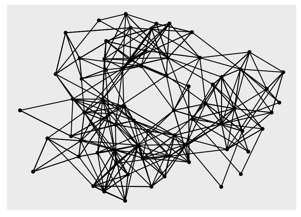
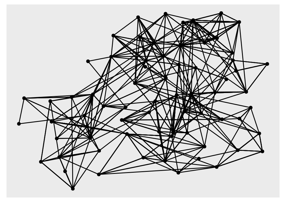
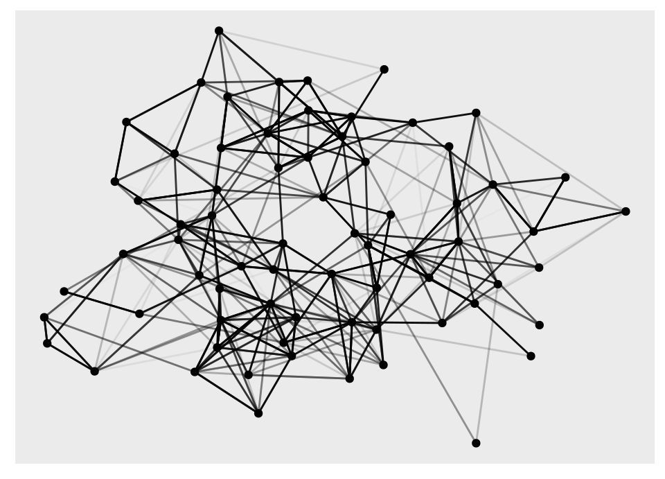
A layout invents coordinates. Different algorithms invent different ones, and the same network can look tightly clustered under one and evenly spread under another.
Any structure that shows up in only one layout is a property of the algorithm, not of the data. Run several before you believe a picture. This is the single most common way a network graphic misleads its reader, and it is easy to do by accident.
Circularity
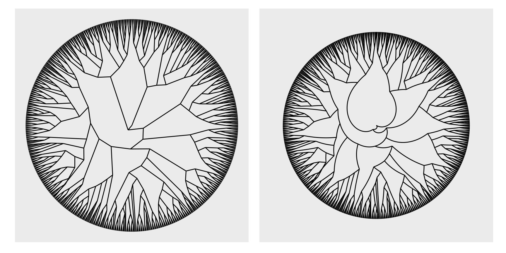
Several layouts have a circular version. Switch it on inside the layout with circular = TRUE, not with coord_polar().
The difference matters. circular = TRUE moves the nodes onto a ring and leaves the edges alone. coord_polar() bends the edges as well, which is almost never what you want.
ring <-ggraph(luv_graph, layout ="dendrogram", circular =TRUE) +geom_edge_link() +coord_fixed()bent <-ggraph(luv_graph, layout ="dendrogram") +geom_edge_link() +coord_polar() +scale_y_reverse()ring + bent
Drawing nodes
Node geoms all start with geom_node_, and geom_node_point() is the one you will use most. It looks like geom_point() but differs in three ways, and those three differences apply to every node and edge geom in the package.
x and y come from the layout. You never map them.
A filter aesthetic switches individual nodes off. They stay in the graph, so the edges are unaffected.
Any tidygraph algorithm can be called inside aes(), and it is evaluated on the graph being drawn.
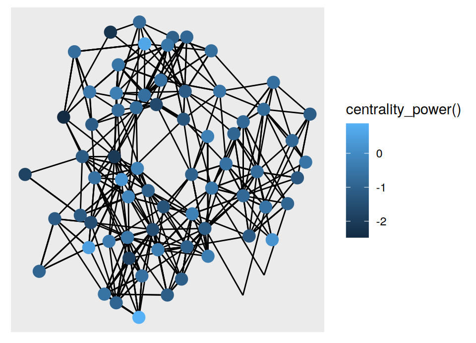
Boys with two or fewer nominations are hidden, and the rest are coloured by power centrality. Neither quantity exists in hs_graph. Both were computed while the plot was being drawn.
That is why iterating is cheap here. Swapping in a different centrality measure is a one word edit, and the graph object never changes.
Node geoms tied to a layout
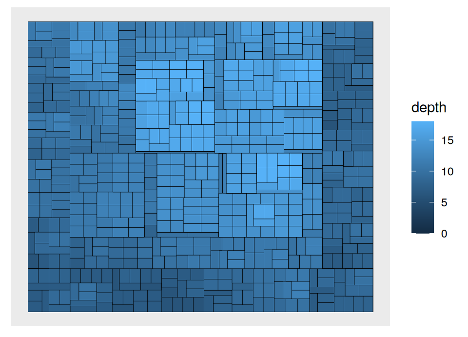
Some node geoms only make sense with a particular layout. A treemap is made of nested rectangles, so it needs geom_node_tile().
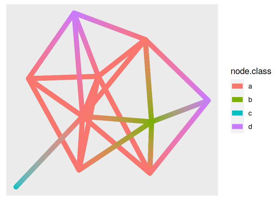
In the standard and 0 variants, node1. and node2. give you the source and the target separately.
In the 2 variant, node. refers to whichever end is currently being interpolated.
This works for every edge geom, not only geom_edge_link().
Parallel edges
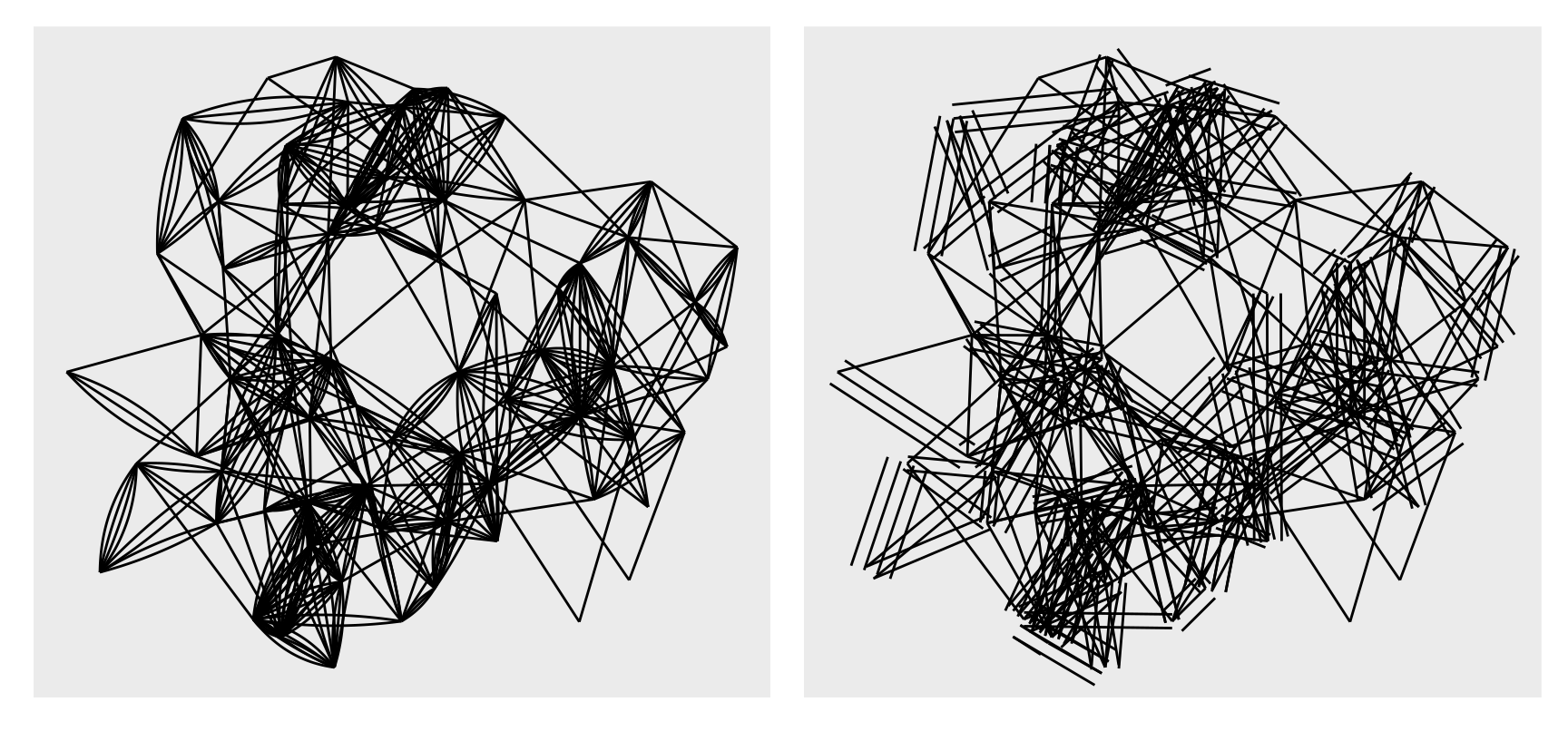
hs_graph has 506 edges over 70 nodes because a pair of boys can be joined twice. Straight lines put one edge exactly on top of the other, so the multiplicity vanishes from the picture.
geom_edge_fan() bows parallel edges apart into a fan.
geom_edge_parallel() offsets them into parallel straight lines.
circle(5, "mm") is a region of fixed physical size, so the clipping does not change when the plot is resized. Match the radius to the node size by hand.
square(), rectangle() and ellipsis() are there for nodes that are not round.
An edge is not always a line
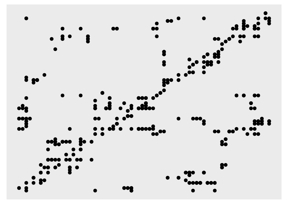
Points joined by lines is one convention, not the definition of a network plot. In a matrix plot the nodes sit along both axes, and each edge becomes a mark where its two endpoints cross.
The ordering of the rows and columns is the whole point of the plot. node_rank_traveller() puts similar nodes next to each other, which pushes dense groups into blocks along the diagonal.
A matrix plot also stays readable at sizes where a node and link diagram has already turned into a hairball.
Faceting
Splitting a plot into panels is as useful for a network as it is for a table. Plain facet_wrap() cannot do it. It would move nodes into panels and drag their edges along, even though the faceting variable is not in the edge table.
ggraph supplies three replacements.
facet_edges() splits the edge table. Every node is repeated in every panel.
facet_nodes() splits the node table. An edge whose two ends fall in different panels is dropped.
facet_graph() is the two way version. row_type and col_type say which table drives each direction.
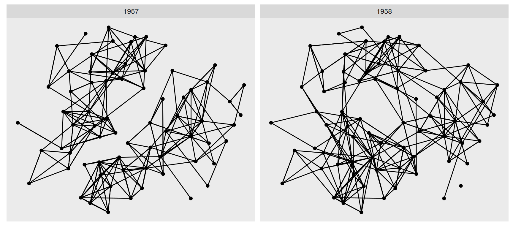
The node positions are identical in the two panels, so the comparison is a fair one. In 1957 the boys fall into two groups that barely nominate each other. A year later the two groups have merged into one.
That is a claim about the data rather than about the drawing, because the only thing that differs between the panels is which edges were kept.
Splitting the nodes
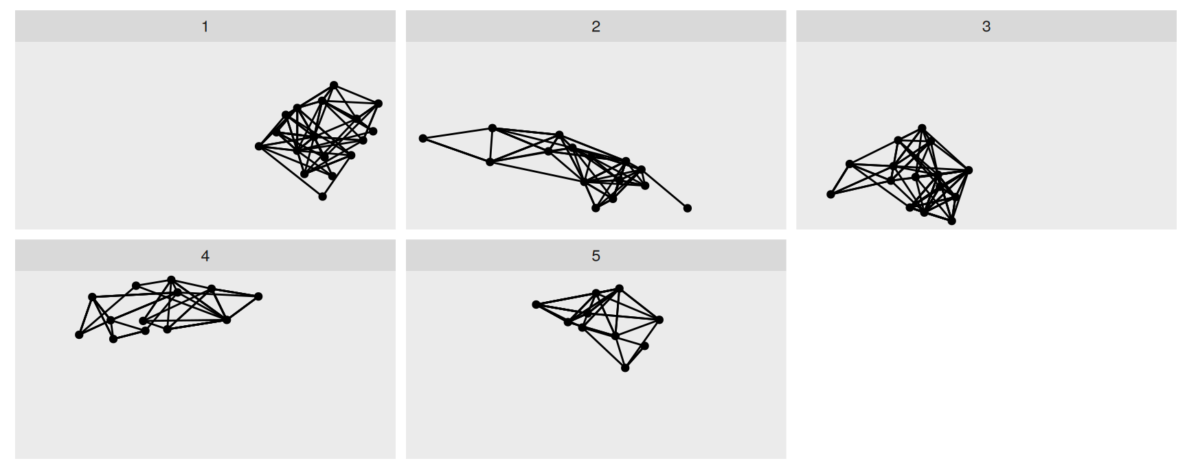
Facet specifications accept algorithms too, so a community detection can be checked without storing its output anywhere.
Each panel holds one detected community and only the edges that stay inside it. Edges running between communities are gone, and that absence is the test.
A partition worth reporting leaves few edges unaccounted for. If the panels look sparse, the algorithm has cut through the middle of something real.
Exercises
Draw hs_graph with the "kk", "fr" and "circle" layouts. Which features survive all three? Name one feature that appears in only one of them, and say why you should distrust it.
Redraw the filtered node plot using centrality_betweenness() for colour and centrality_degree() > 5 for the filter. Describe how the set of visible boys changes and what that says about the network.
Filter the edges of hs_graph to 1958 only, then draw the result with geom_edge_fan(). Compare it with the same geom on the full graph. Where did the fanning go, and what does that tell you about the source of the multiplicity?
Repeat the arrow example with circle(2, "mm") and then with circle(10, "mm"). What happens when the clipping region is wider than the gap between two nodes?
Draw luv_graph as a dendrogram with height = height and again without it. What is on the y axis in each case, and which version would you show a reader?
Facet hs_graph with facet_graph(group_louvain() ~ year, row_type = "node", col_type = "edge"). Say in two sentences what a single panel contains and what an empty panel means.
luv_graph carries a label column on its nodes and hs_graph carries nothing at all. Add geom_node_text(aes(label = label)) to a dendrogram of luv_graph, then say why the same line cannot work on hs_graph as it stands.
Want more?
Where to read next
These slides cover a working subset. ggraph has more layouts, more node and edge geoms, scales and legends built specifically for edges, and a family of connection geoms that never came up here.
Study the two packages together. Every drawing decision in ggraph comes back to how the graph is stored and queried in tidygraph.
Recap
Network data needs two tables. tidygraph keeps them in one object, and activate() says which one the dplyr verbs are talking to.
.N(), .E() and .G() let one table read the other. That is how an edge gets at the attributes of its endpoints.
Graph algorithms are called inside mutate() and inside aes(). Nothing has to be computed in advance.
Position in a network plot comes from a layout, not from the data. Try several before you trust any structure you see.
Node geoms start with geom_node_, edge geoms with geom_edge_, and every edge geom has a plain, a 0 and a 2 version.
Facet with facet_nodes(), facet_edges() or facet_graph(). Plain facet_wrap() does not know the two tables belong together.
Acknowledgement
Source. These slides follow the structure and the teaching sequence of ggplot2: Elegant Graphics for Data Analysis (3e) by Hadley Wickham, Danielle Navarro and Thomas Lin Pedersen. The explanations, examples and exercises here have been rewritten for this course; any errors in them are mine and not the book’s.
Copyright. All rights in the original work are reserved by its authors and publishers. Students are encouraged to read the book itself, which is freely available online.
Non-commercial use only. These materials are for teaching and must not be used for commercial gain.
Attribution. Any reuse or redistribution must credit both the original book and this course.