A plot on its own almost never explains itself. The reader needs to know what the axes mean, which group is which, and which few points are the ones you want them to look at.
Annotations carry that information. They are data about the plot rather than data from the study, but ggplot2 draws them with the same machinery it uses for everything else.
That is the useful idea in this chapter. There is no separate annotation system to learn. You add another layer, give it its own data, and the geoms you already know do the work.
What the chapter covers
Titles for the plot and for the axes, with labs().
Text on the panel itself, with geom_text() and geom_label().
Boxes, lines, arrows and one-off marks, with the annotation geoms and annotate().
Labelling groups in place instead of in a legend.
Annotations that repeat across every facet.
Each part is small. The judgement is in knowing when an annotation earns its ink and when it is clutter.
Plot and axis titles
labs()
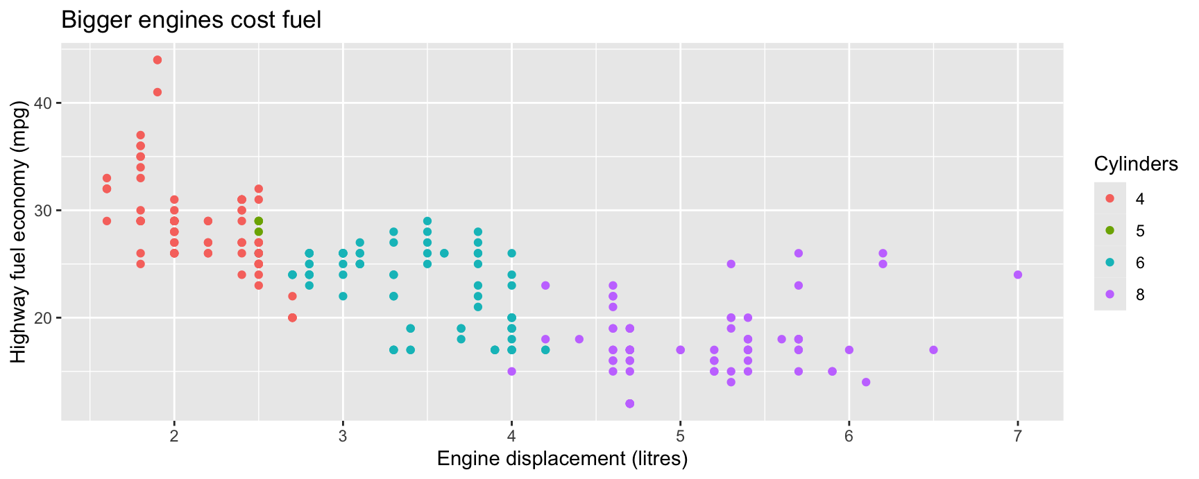
labs() sets every piece of text that sits outside the panel. You name the thing you want to change and give it a string.
The names are either aesthetics (x, y, colour, fill, size) or the plot-level slots title, subtitle and caption. An aesthetic name sets the axis label or the legend title for that aesthetic.
Three things changed at once. Both axis labels now read as English rather than as column names, and the legend lost the factor(cyl) heading that told the reader nothing.
Get into the habit of writing labs() last, once the plot is finished. Column names are for you while you work. They are not for the person reading the finished figure.
title sits above the plot, subtitle below the title, and caption in the bottom right. Use the caption for the data source, which is the fact readers most often want and most often cannot find.
Mathematics in a label
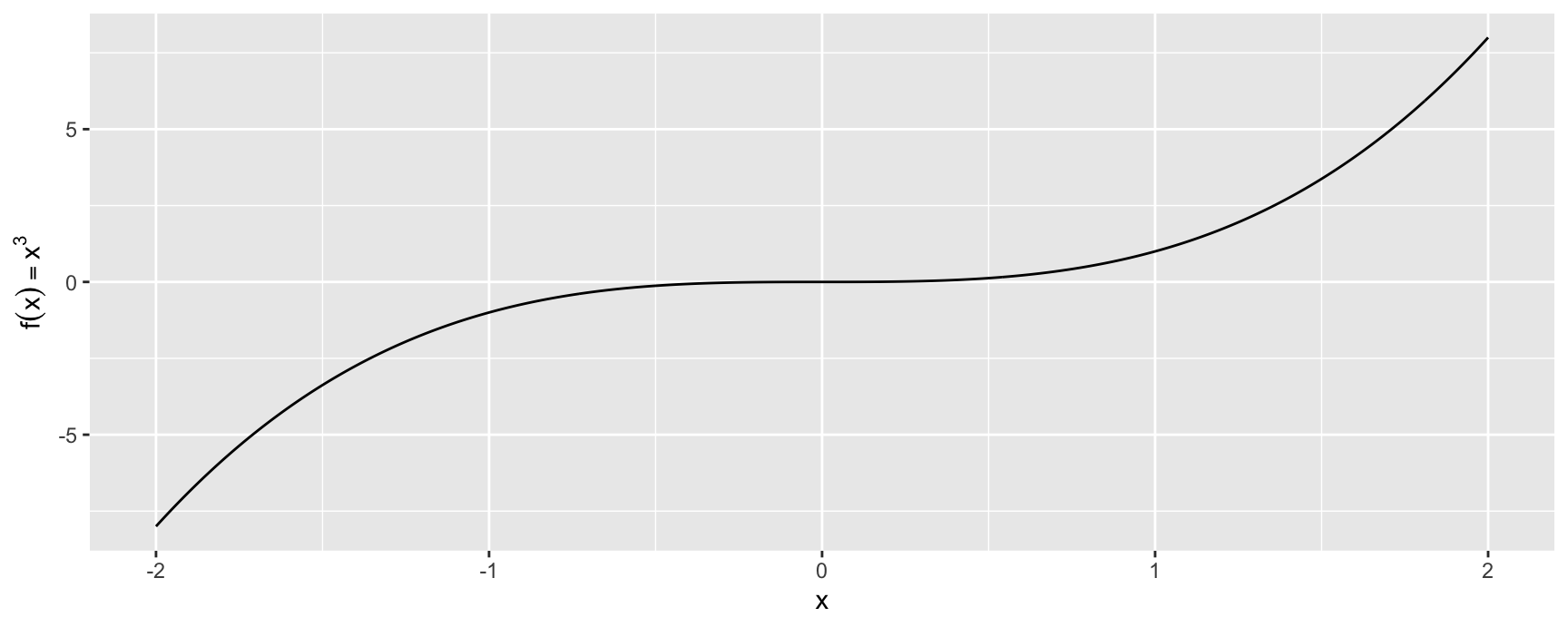
Labels are ordinary strings, and \n starts a new line inside one. When you need a symbol or a formula, pass an expression wrapped in quote() instead of a string.
R renders it with plotmath, the same notation used by base graphics. ?plotmath lists the operators and symbol names.
cubic <-data.frame(x =seq(-2, 2, by =0.01))ggplot(cubic, aes(x, x ^3)) +geom_path() +labs(y =quote(f(x) == x^3))
Note == rather than =. Plotmath reads the expression as R code before it draws it, so the label has to be something R can parse. A single = is an assignment and will fail.
Plotmath covers subscripts, superscripts, Greek letters, fractions and integrals. That is enough for most axis labels in a statistics course.
Markdown with ggtext
Plotmath cannot put one word of a label in bold. The ggtext package can. It lets you write a small amount of Markdown in a label and have it rendered.
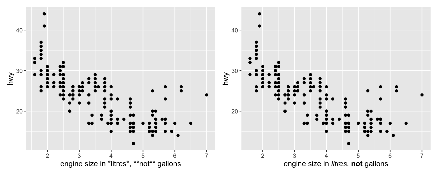
Markdown is off by default. You switch it on for one theme element at a time by setting that element to ggtext::element_markdown().
On the left the asterisks are printed as asterisks, because a default axis title is plain text. On the right the same string is parsed, and the emphasis comes out as italic and bold.
The same trick works on legend titles, facet strips and axis text. It is the straightforward way to colour one category name in a title so that it matches the colour of its line in the plot.
Removing a label
There are two ways to make an axis label go away, and they are not the same.
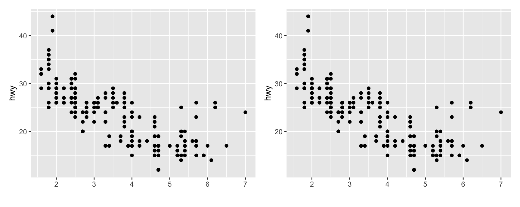
labs(x = "") replaces the label with an empty string. The label is gone but the row it occupied is still reserved, so the panel does not move.
labs(x = NULL) deletes the label entirely. The space goes back to the panel.
The difference is a few millimetres, which sounds trivial until you are fitting four panels onto one slide.
Use NULL when the label is genuinely redundant, for example a date axis in a time series. Use "" when you are lining several plots up and want their panels to start at the same height.
Chapter 14 comes back to this. labs() is a convenience wrapper, and every label it sets is really the name argument of a scale.
Exercises
Take the displ against hwy scatterplot and give it a title, a subtitle and a caption naming the data source. Which of the three does a reader notice first, and where would you put the sample size?
Map drv to colour and then set both the legend title and the axis labels with a single labs() call. Confirm that the legend title changed by removing the colour argument and rerunning.
Plot hwy against cty and label the y axis with a plotmath expression for “miles per gallon” using a subscript. Say what happens if you forget quote().
Draw the same plot twice, once with labs(y = "") and once with labs(y = NULL), and combine them with +. Describe in one sentence what moved.
Use ggtext::element_markdown() to put the word “highway” in bold in the y axis title. Then try the same string without the theme change and explain what you see.
Text labels
Text on the panel
geom_text() draws a string at an (x, y) position. It needs a label aesthetic on top of the usual two.
Labelling every point is almost always a mistake. Labelling five points is often the most useful thing you can do to a scatterplot, because it turns anonymous dots into named cases the reader can reason about.
geom_text() takes more aesthetics than any other geom in ggplot2. The next few slides work through the ones that matter.
family
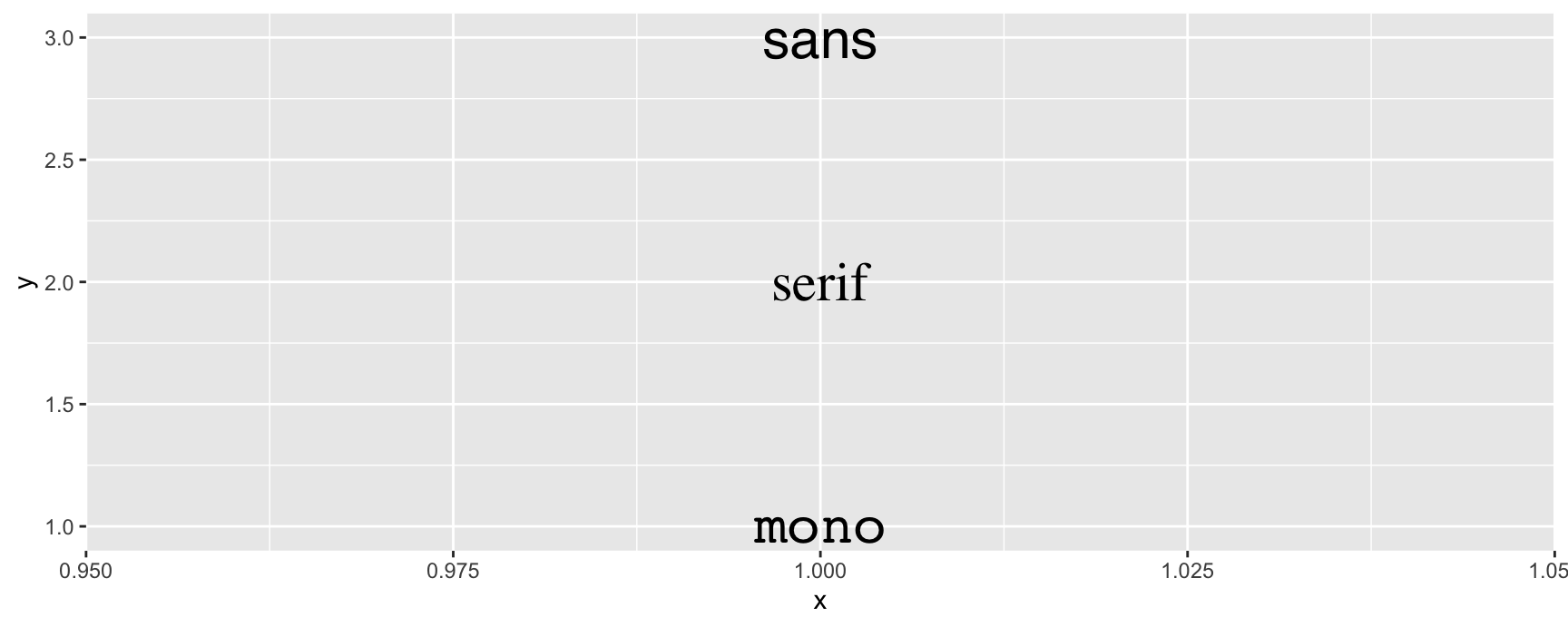
family chooses the typeface. Only three values are safe everywhere, because they are names R maps to whatever the device has available.
fonts <-data.frame(x =1, y =3:1, family =c("sans", "serif", "mono"))ggplot(fonts, aes(x, y)) +geom_text(aes(label = family, family = family), size =8)
Anything else is a gamble. A font that renders on your screen may be missing when the same code writes a PDF, and the result is silently substituted or blank.
Two packages fix this. showtext turns text into polygons, so the glyphs are drawn the same way on every device. extrafont registers the fonts already installed on your machine so that every device can find them.
Both work. showtext is the easier one to start with, and it is what these slides use for their Chinese version.
fontface
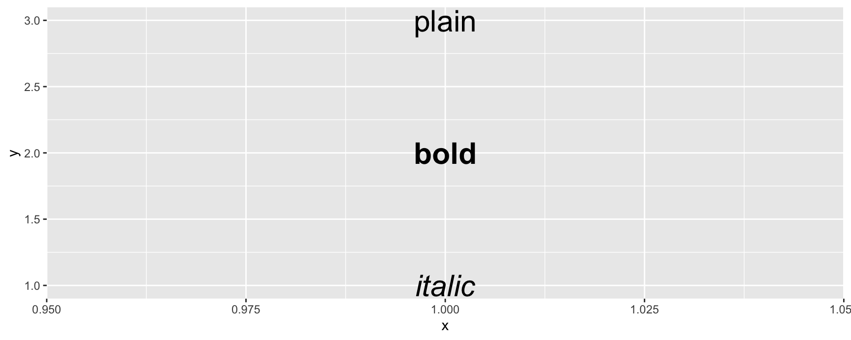
fontface takes "plain", "bold" or "italic". There is no half weight and no underline, because those are not properties the graphics devices agree on.
faces <-data.frame(x =1, y =3:1, face =c("plain", "bold", "italic"))ggplot(faces, aes(x, y)) +geom_text(aes(label = face, fontface = face), size =8)
hjust and vjust
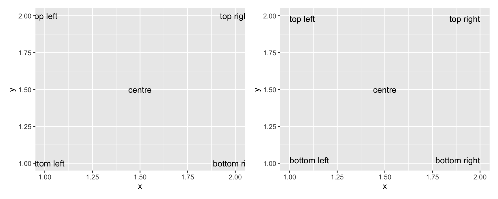
These control where the label sits relative to its anchor point. hjust accepts "left", "centre", "right", and vjust accepts "bottom", "middle", "top". Both also take a number from 0 to 1.
Two extra values are worth memorising. "inward" pushes every label towards the middle of the panel and "outward" pushes it away, and which direction that means is decided separately for each label.
On the left the corner labels run off the panel, because each one is centred on a point that sits at the edge of the data. On the right they have all been turned to face the centre and they fit.
This is the reason "inward" exists. You rarely know in advance which of your labels will land near an edge, and "inward" handles all of them with one argument.
size and angle
size is in millimetres, not points. Every other size in ggplot2 is a physical length, and text was made to match.
To convert a point size, multiply by 25.4 / 72.27. A 12 point font is about 4.2 millimetres.
angle rotates the label anticlockwise from horizontal, in degrees. It is mostly used at 90 degrees to squeeze long category names onto a crowded axis, and it is worth remembering that rotated text is genuinely slower to read.
Nudging a label off its point
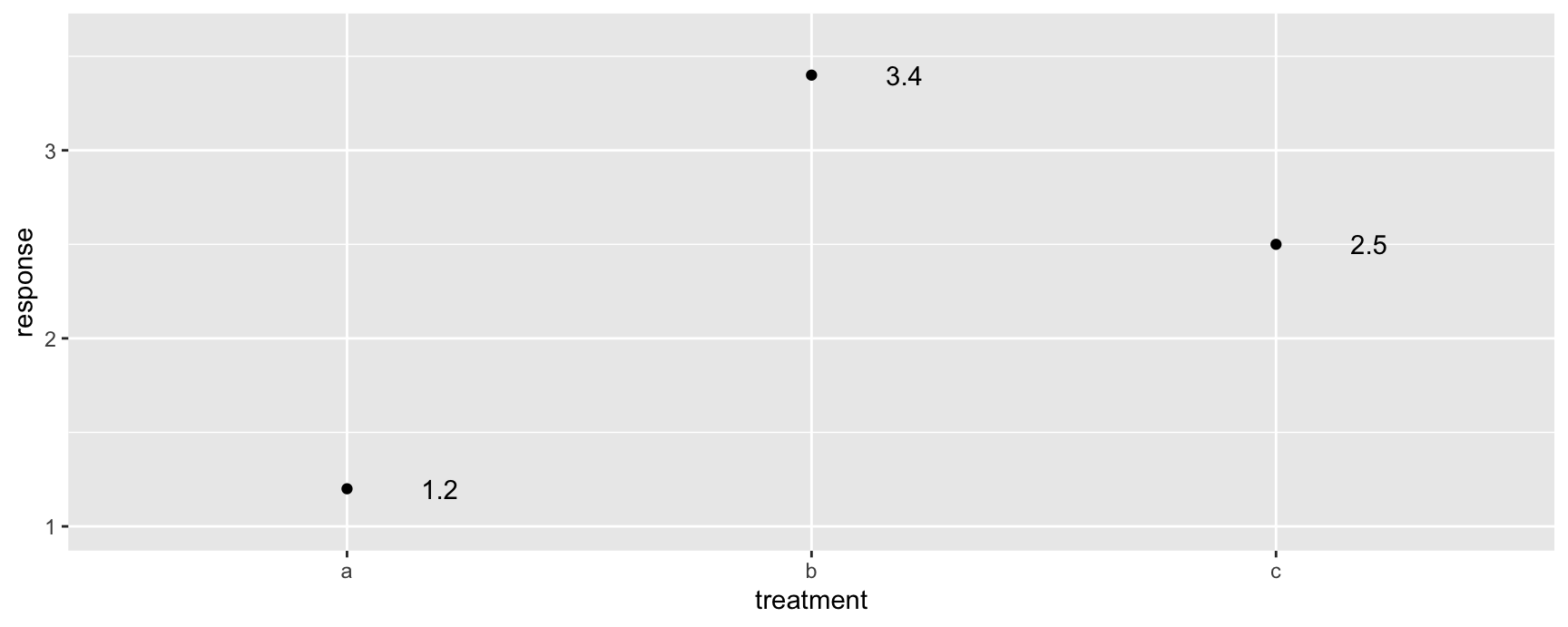
When you label a data point, the text lands on top of the point. nudge_x and nudge_y shift the text by a fixed amount without touching the position the aesthetics gave it.
Nudging moves the label only. The point stays where the data put it, which is what you want, because the label is an annotation and the point is the measurement.
Note the ylim() call. Without it the top label would sit half outside the panel. That is not a coincidence, and the next few slides explain why.
check_overlap
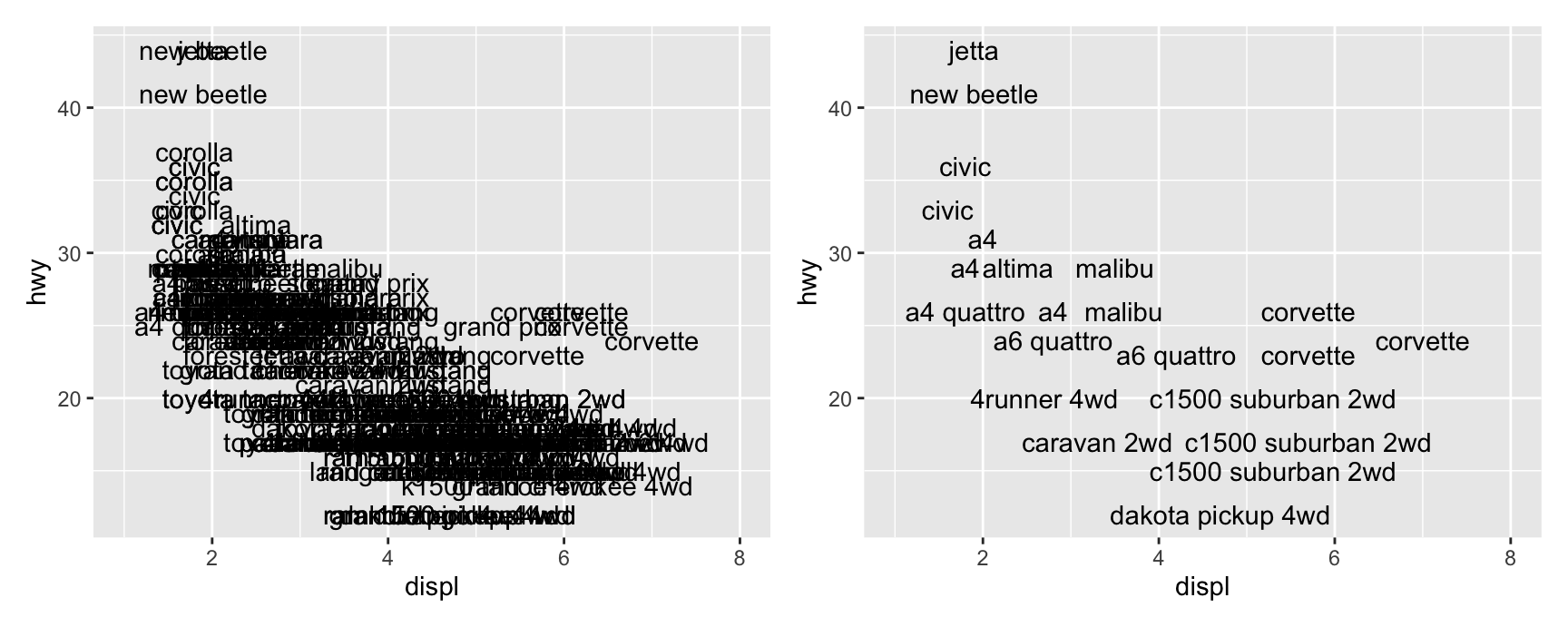
Setting check_overlap = TRUE throws away any label that would collide with a label already drawn. Nothing is moved and nothing is shrunk. The clashing label is simply not drawn.
Labels are drawn in row order, so the earlier a row sits in the data frame, the better its chance of surviving. That gives you a lever. Sort the data so that the cases you care about come first and check_overlap will keep exactly those.
What it will not do is find a better arrangement. If two important points sit close together, one of them loses its label no matter how you sort.
geom_label()
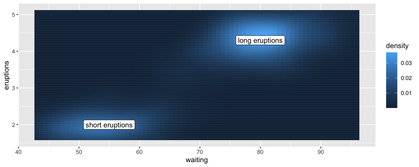
geom_label() is geom_text() with a rounded box behind it. The box is opaque, so the text stays readable over a busy background.
Over a filled surface like this one, plain text would be dark grey on dark blue in some places and dark grey on pale blue in others. The box removes the problem.
The cost is ink. A label box is much heavier than a string, so use it when the background is genuinely fighting the text and use geom_text() otherwise.
Notice that both layers here have their own data. geom_tile() uses faithfuld from the ggplot() call and geom_label() uses the two-row peaks frame. Mixing data sets across layers is normal in annotation work.
Two problems text will give you
Text does not push the panel out. A label has a fixed physical size in millimetres, and the panel has a size in data units. ggplot2 cannot solve for both at once, so it ignores the text when it works out the limits. Long labels near an edge get cut off, and you fix that by widening the range yourself with xlim() or ylim().
Overlapping labels stay overlapping.check_overlap deletes collisions rather than resolving them. When you need to keep every label, you need a package that moves them.
ggrepel
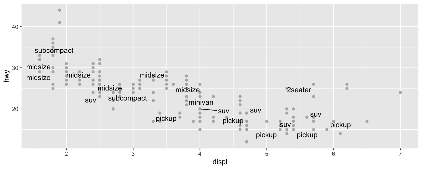
ggrepel provides geom_text_repel() and geom_label_repel(). They run a small physical simulation that pushes labels apart and away from the points, then draws a short line segment from each label back to what it belongs to.
All twenty labels survive, which check_overlap could not have managed, and the connecting segments keep the mapping unambiguous.
Two warnings. The layout is random, so set a seed if you want the figure to come back the same way tomorrow. And repelling twenty labels works well while repelling two hundred does not, because there is nowhere left to push them.
For labels that must sit inside a bar or a tile, ggfittext shrinks or wraps the text until it fits the shape. That is a different problem from repelling, and it needs a different package.
Exercises
Label the five cars in mpg with the highest cty using geom_text(), leaving the rest as plain points. Say in one sentence what those five have in common.
Redraw the plot from question 1 with ggrepel::geom_text_repel(). Which version would you put in a report, and what did the segments cost you?
Build a data frame of the mean hwy for each class and label each mean with geom_label(). Then switch to geom_text() with nudge_y. Which is easier to read here, and why?
Take the check_overlap plot from these slides and sort mpg by hwy in descending order first. Which labels appear now that did not before, and explain the mechanism in one sentence.
Put a geom_text() label at the largest displ value in mpg with a long string such as the full model name. Show that it is clipped, then fix it two different ways and say which fix you prefer.
Set size = 3 and then size = 3 * 25.4 / 72.27 on the same labels. Explain what the second number is doing.
Building custom annotations
The annotation geoms
Text is only one kind of annotation. These geoms cover the rest, and they behave like any other layer.
geom_rect() shades a rectangular region, positioned with xmin, xmax, ymin and ymax.
geom_segment(), geom_line() and geom_path() draw straight connections. All three take an arrow argument, built with arrow(), for an arrowhead.
geom_curve() draws an arc between two points, which is how you connect a label to something without running the line through your data.
geom_vline(), geom_hline() and geom_abline() draw reference lines that span the whole panel.
-Inf and Inf
An annotation often needs to reach the edge of the panel, and you do not know where the edge is until the data are drawn.
Give the position as -Inf for the bottom or left limit and Inf for the top or right. The layer then stretches to whatever the panel turns out to be.
This is what makes background shading practical. A geom_rect() with ymin = -Inf, ymax = Inf fills its column of the plot no matter how the y scale ends up.
A worked example
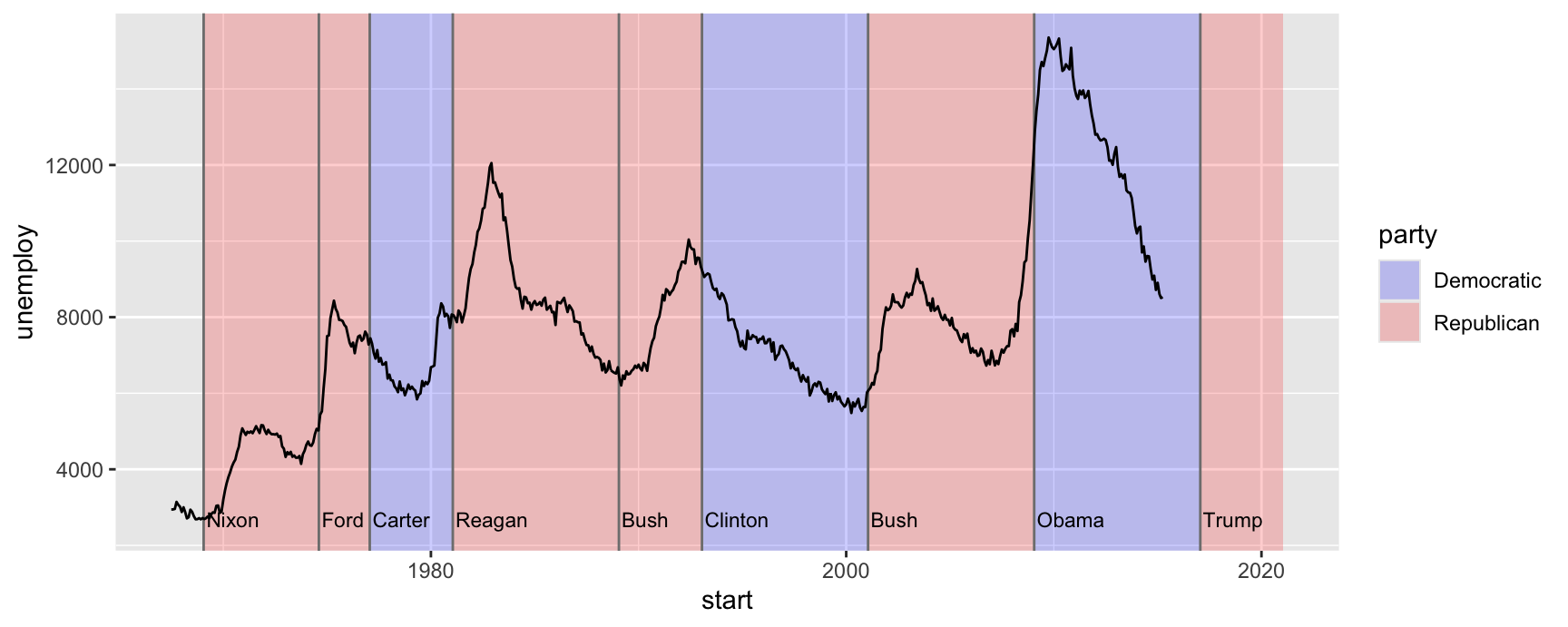
economics records US unemployment monthly since 1967. presidential records who was in office and from when. The question is whether unemployment tracks the party in power, and the only way to see it is to put both on one plot.
shading +geom_vline(aes(xintercept = start), data = terms, colour ="grey50") +geom_text(aes(x = start, y =2500, label = name), data = terms,size =3, hjust =0, vjust =0, nudge_x =50 ) +geom_line(aes(date, unemploy))
Four layers, three of them annotation. Every annotation layer names data = terms, while geom_line() inherits economics from the ggplot() call. That is the normal pattern once a plot carries context as well as data.
Order matters. The shading and the rules go on first so the unemployment line is drawn over the top of them, not under. Swap the layers and the line disappears into the background.
The plot does not settle the political argument, and it was not going to. What it does is make the argument discussable, because now you can point at a term and a slope at the same time.
annotate()
Annotating one thing with a geom means building a one-row data frame first. That is tedious, and it puts a data.frame() call in the middle of a plot specification.
annotate() builds that frame for you. You name the geom as a string and pass the aesthetics as ordinary arguments, using plain values rather than variables.
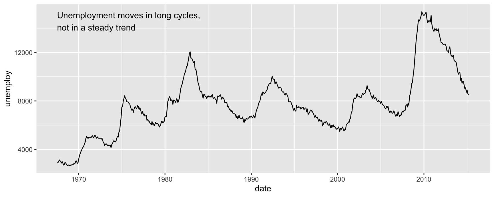
ggplot(economics, aes(date, unemploy)) +geom_line() +annotate("text", x =min(economics$date), y =max(economics$unemploy),label ="Unemployment moves in long cycles,\nnot in a steady trend",hjust =0, vjust =1, size =4 )
The \n in the middle of the string starts a second line. For a longer caption, strwrap() will break a sentence into pieces of a given width and paste() with collapse = "\n" will join them back up, which saves you counting characters.
hjust = 0 and vjust = 1 anchor the block by its top left corner. Combined with the minimum date and the maximum count, that puts the text in the top left of the panel and lets it grow downwards.
An annotate() layer has no variables in it, so it draws once. A geom_text() layer drawing the same constant string would draw it once per row of the data, which is slow and looks bold from the overprinting.
Highlighting a subgroup
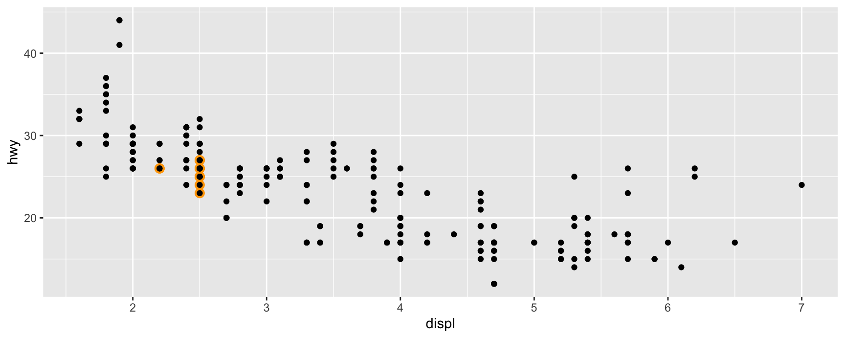
A common job is to make one group stand out without giving up the rest of the data. Draw the subgroup first as larger coloured points, then draw everything on top in the normal style.
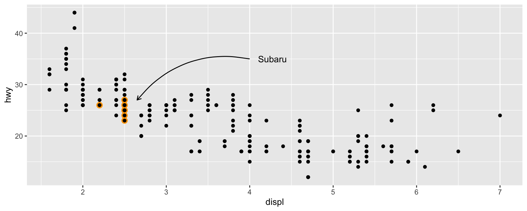
Every Subaru in the data is four wheel drive, and they sit noticeably above the other four wheel drive cars. That is the finding, and it is visible only because the rest of mpg is still on the plot as a comparison.
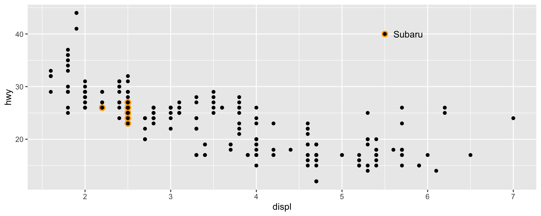
There is no legend, because nothing was mapped. The orange came from a constant inside a layer. If we want a key, we have to draw one.
subaru +annotate("point", x =5.5, y =40, colour ="orange", size =3) +annotate("point", x =5.5, y =40) +annotate("text", x =5.6, y =40, label ="Subaru", hjust ="left")
Three annotate() calls reproduce exactly what a point looks like in the highlight layer, then put a word next to it. The reader gets a key without a legend box eating into the panel.
This is a deliberate trade. A real legend is generated from the data and stays correct when the data change. A hand-built key is a set of coordinates you typed, and it will quietly become wrong the day the axis range moves.
Curved connectors
When the label cannot sit next to the thing it names, connect the two. geom_curve() draws an arc, and curvature controls how much it bends and in which direction.
subaru +annotate("curve", x =4, y =35, xend =2.65, yend =27,curvature =0.3, arrow =arrow(length =unit(2, "mm")) ) +annotate("text", x =4.1, y =35, label ="Subaru", hjust ="left")
A positive curvature bends the arc one way and a negative value bends it the other. Zero gives a straight line, which is geom_segment().
The arrowhead is built by arrow(), and length = unit(2, "mm") keeps it small. A large arrowhead on a small plot reads as a warning sign rather than as a pointer.
Both endpoints are in data units. That is convenient while you are working and fragile afterwards, because changing the axis limits moves your arrow but not your data.
Exercises
Shade the region of the mpg scatterplot where hwy exceeds 35 using one geom_rect() with xmin = -Inf and xmax = Inf. Which cars are inside it?
Add a horizontal line at the mean hwy and a vertical line at the mean displ to the same plot. Which of the four quadrants is empty, and what does that tell you about engines?
Rewrite question 2 using annotate() instead of geom_hline() and geom_vline(). Explain why the reference-line geoms are still the better choice here.
Using economics, mark the single month with the highest unemploy with a point, a curved arrow and a label giving the date. Put the label where it does not cross the series.
Take the presidential plot and move geom_line() to be the first layer instead of the last. Describe what happens and state the rule you have just demonstrated.
Annotate the diamonds plot of carat against price with a text box giving the number of diamonds and the median price. Say why annotate() is a better fit than geom_text() for this.
Direct labelling
Labels instead of a legend
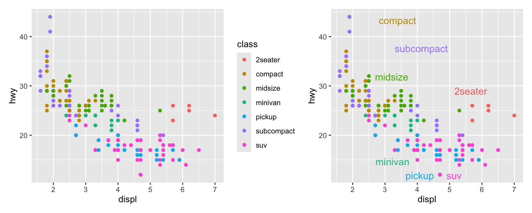
A legend asks the reader to do a lookup. They see a colour on the panel, move their eye to the legend, find the matching swatch, read the name, and move back.
Direct labelling removes that trip. The group name is written on or beside the group itself, so the colour never has to be decoded.
It is not free. Labels take space inside the panel, and they only work when the groups are separated enough to be labelled without collisions. Three packages automate the placement.
directlabels
directlabels::geom_dl() places a label per group at a position it computes. The method argument chooses the placement strategy.
"smart.grid" is the sensible default for a scatterplot. It looks for a gap inside each cloud of points and puts the name there.
Line plots want something different. "last.points" writes the name at the right-hand end of each line, which is how most published time series are labelled, and "angled.boxes" tilts the label to follow the slope.
Note show.legend = FALSE on the point layer. Without it you get the labels and the legend, which defeats the purpose.
ggforce
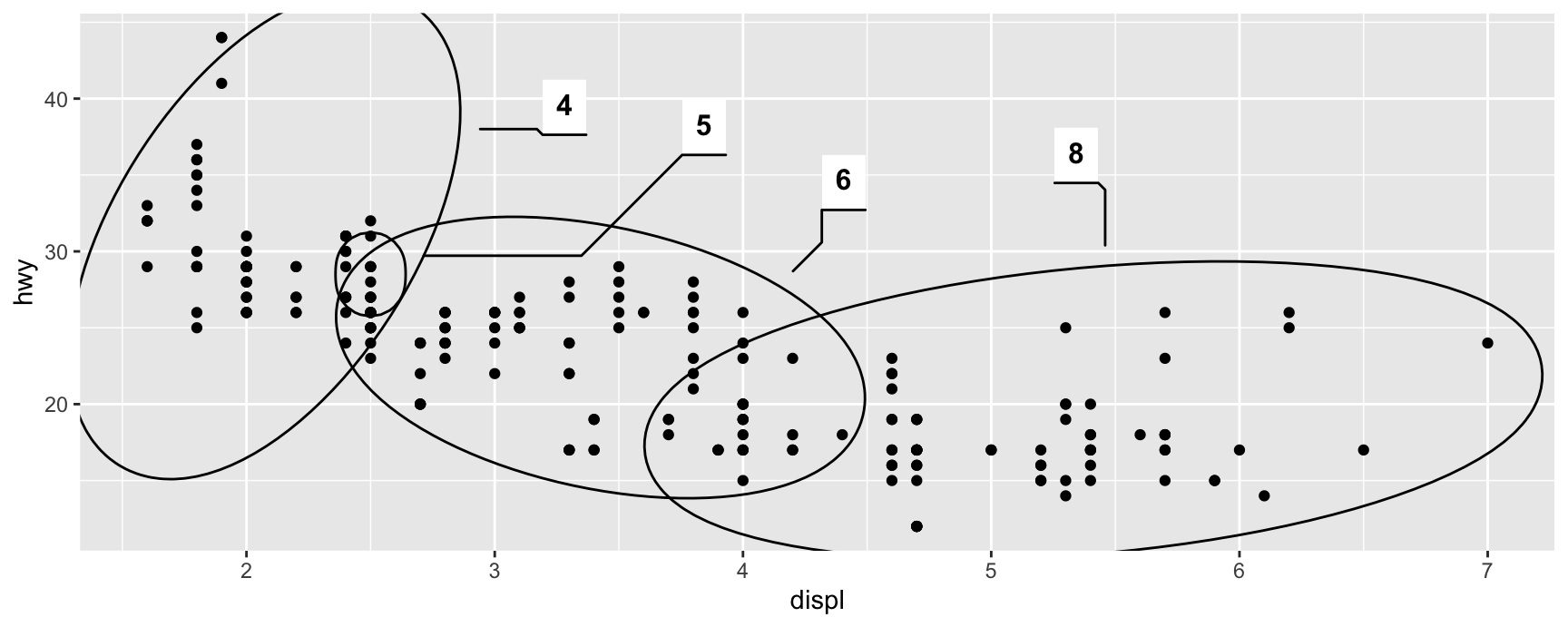
ggforce::geom_mark_ellipse() draws an ellipse around each group and hangs a label off it. It says “these points belong together” more strongly than a colour does.
The ellipses overlap, which is honest. Four and six cylinder cars really do share a region of this plot, and a legend would have hidden that behind two tidy colours.
ggforce also offers rectangular, circular and hull marks, plus a description aesthetic for a second line of text under the label. Use marks when the groups are compact and few. With ten overlapping groups the ellipses become the clutter.
gghighlight
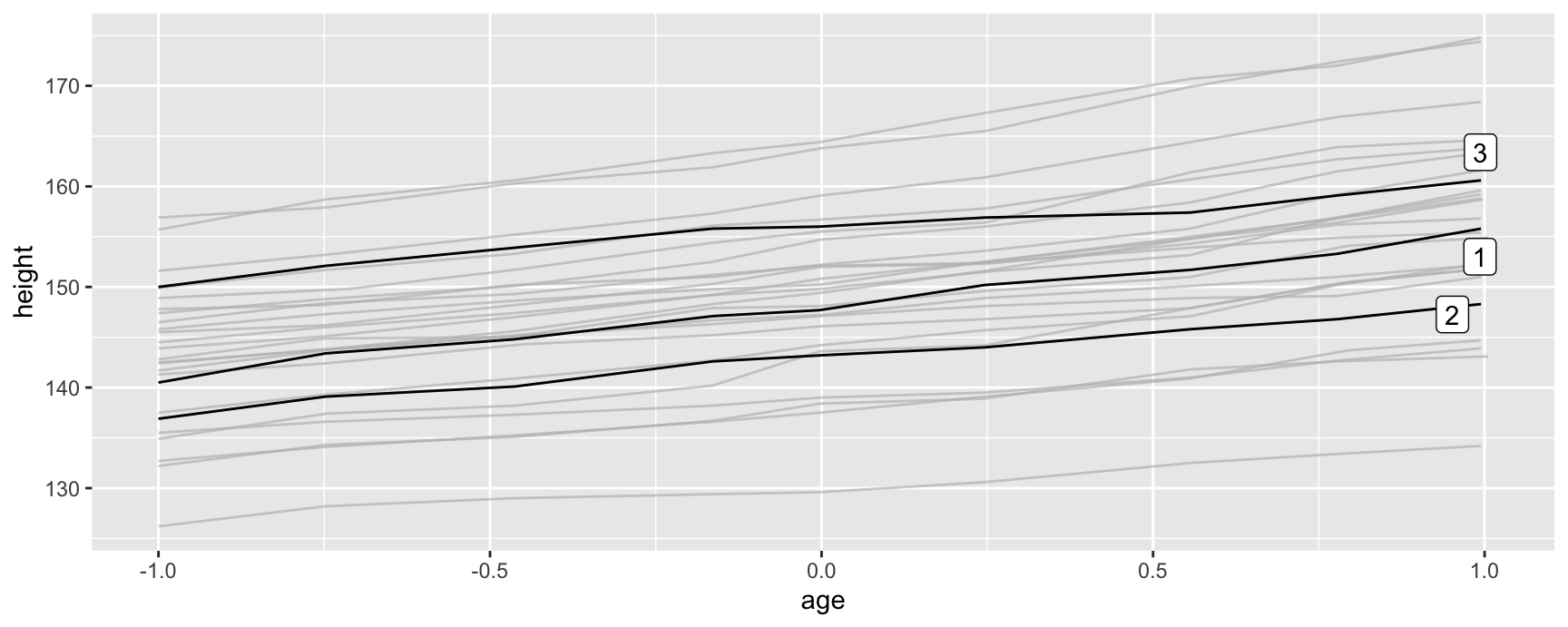
gghighlight::gghighlight() takes a condition, keeps the matching observations in full colour, and redraws everything else in grey behind them.
Three boys are followed and the other twenty-three stay on the plot as context. You can see at once that the highlighted trajectories are roughly parallel, and that one of them sits well below the rest of the cohort at every age.
Filtering the data to three subjects would have produced three lines with no sense of scale. Keeping the grey is what turns the plot into a comparison.
gghighlight() also labels the highlighted groups for you, which is why it belongs in this section and not in a chapter about subsetting.
Exercises
Label the drv groups directly on a displ against hwy scatterplot using geom_dl(), then try method = "smart.grid" and one other method. Which reads better with only three groups?
Draw hwy over displ for each manufacturer as separate lines and use gghighlight() to pick out the two manufacturers with the highest mean hwy. State what the grey lines are doing for the reader.
Put ellipses around the drv groups with geom_mark_ellipse(). Do the ellipses overlap, and what does that say about drivetrain and fuel economy?
Take the Oxboys plot and highlight the three tallest boys at the final measurement instead of subjects 1 to 3. Were they also the tallest at the start?
Argue in three sentences for the legend version of the class plot over the directly labelled version. Then argue the other way. Which situation decides it?
Annotation across facets
The problem facets create
Faceting gives each group its own panel and shared axes. Comparison within a panel gets easier and comparison between panels gets harder, because the eye has to carry a shape across a gap.
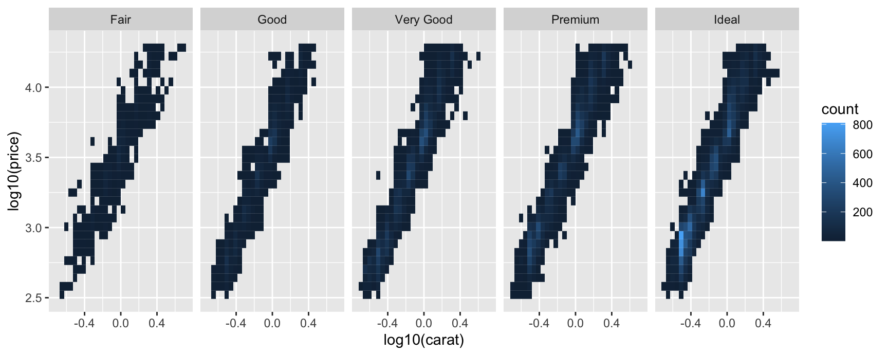
Five panels, all of them showing the same strong relationship between size and price. Whether the fair-cut diamonds sit above or below the ideal ones at the same size is not something you can read off this figure.
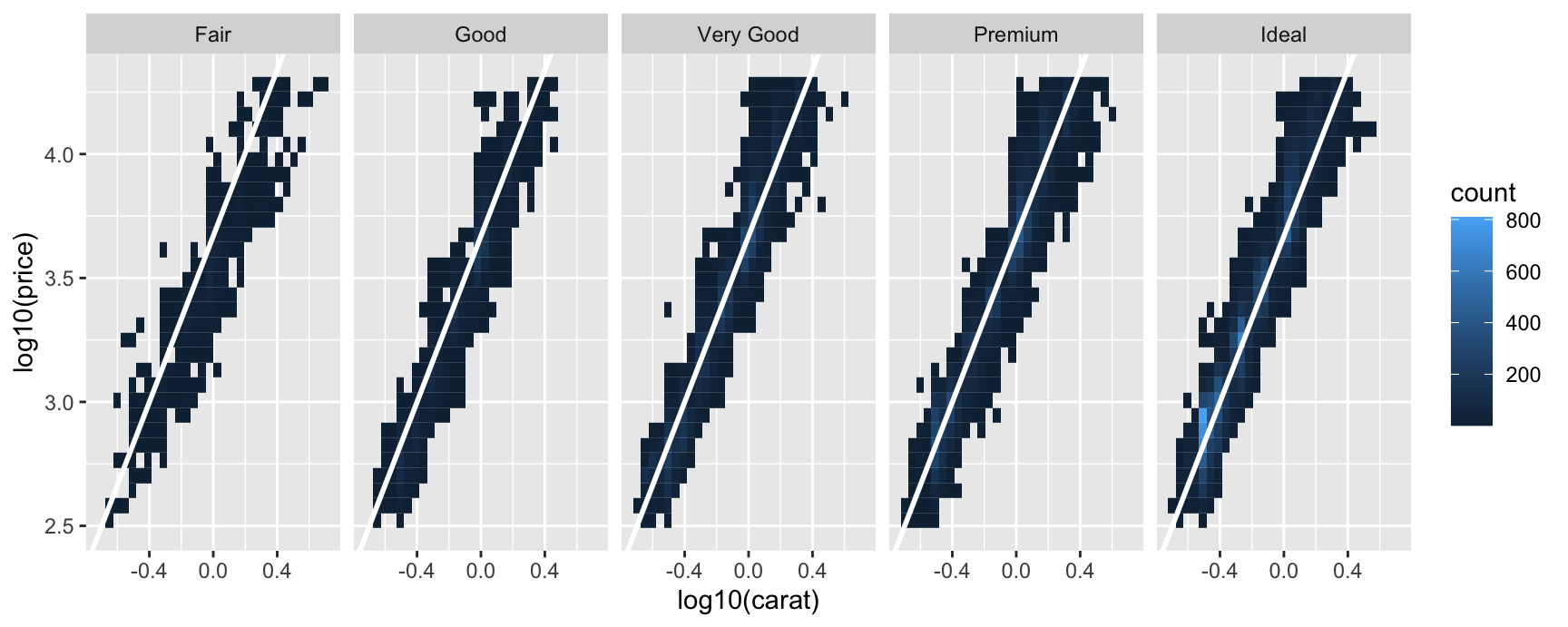
The fix is to give every panel the same reference. An annotation layer with no faceting variable in its data is drawn identically in every panel, which is exactly what we need.
A shared reference line
Fit one model to all the diamonds, then draw that single line in each facet.
Now the panels are comparable. Each one shows its cloud against the same fixed line, so a panel sitting above the line is one where diamonds of that cut fetch more than the overall relationship predicts.
The line is white on purpose. On a filled surface a dark line reads as data and a white line reads as a grid, and we want the reader to treat it as scaffolding.
The general rule is worth stating plainly. A layer whose data contain the faceting variable is split across panels. A layer whose data do not contain it is repeated in every panel.
Greying out with facets
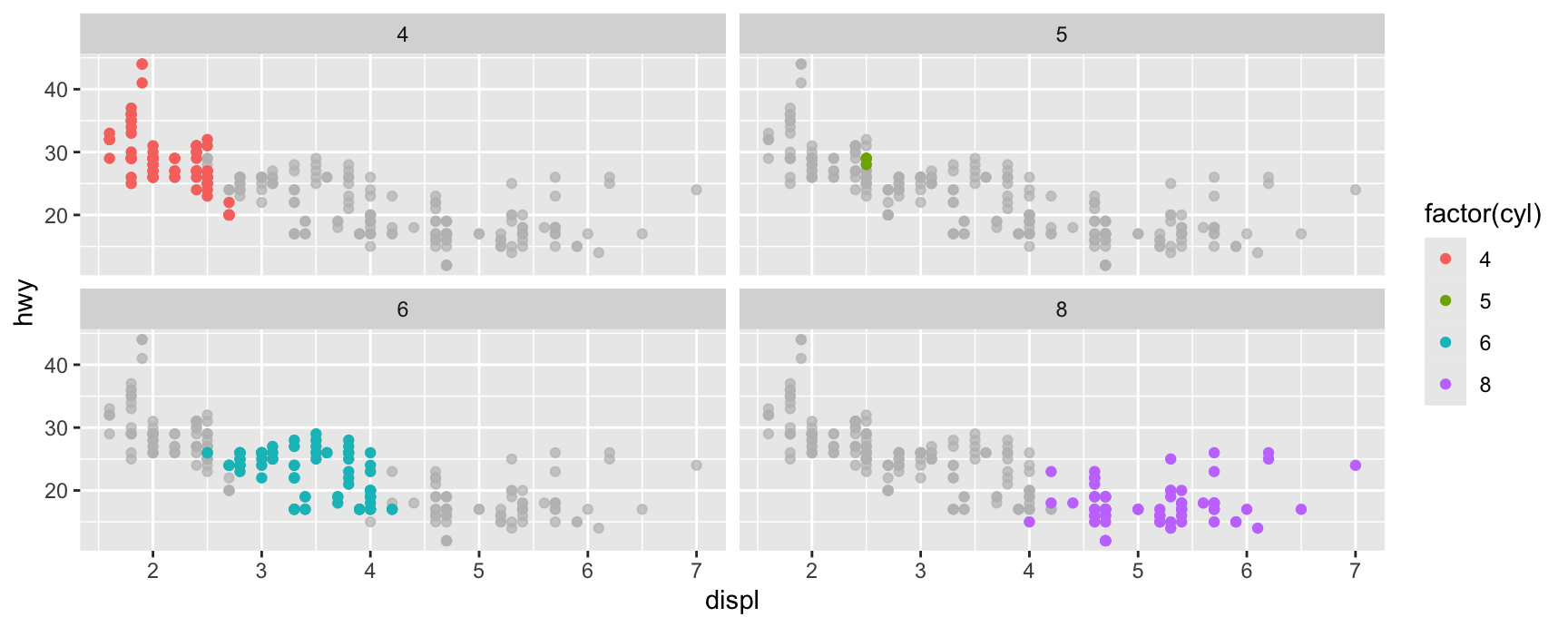
gghighlight() with no condition combines with faceting to do something neat. Each panel highlights its own group and shows the whole data set in grey underneath.
Every panel now carries its own context. The four cylinder cars are recognisably the small-engine, high-economy corner of the whole cloud, and the eight cylinder cars are the opposite corner, and you can see both claims without leaving a panel.
Compare this with the plain faceted version, where each panel shows a cluster of points floating in empty space with no indication of where in the data it sits.
This is the pattern to reach for whenever a facet contains too little data to interpret on its own.
Exercises
Facet the mpg scatterplot by drv and add a single geom_smooth() fitted to all the data as a reference. Which drivetrain sits furthest from the shared curve?
Add a geom_hline() at the overall mean hwy to a plot faceted by class. How many classes sit entirely on one side of it?
Facet the same plot by class and put a geom_text() label giving the panel’s own mean hwy in each panel. You will need a summary data frame. Explain why the label differs per panel here but the line in question 2 did not.
Redraw question 2 with the mean computed per class instead of overall. Which version answers “is this class above average” and which answers “is this car above average for its class”?
Use gghighlight() with facet_wrap(vars(class)) on mpg. Name one class where the grey background changes your reading of the panel.
Recap
labs() sets every label outside the panel. Write it last, and never ship a figure whose axes still say the column names.
geom_text() puts a string at a position. hjust, vjust, nudge_x and nudge_y decide where exactly, and text never widens the panel for you.
check_overlap deletes clashing labels and ggrepel moves them. Pick the one that matches how much you care about the labels you would lose.
Annotation layers are ordinary layers with their own data. Order them so the data are drawn over the context, not under it.
annotate() is the shortcut for a single mark. It takes values rather than variables and draws once.
Direct labelling trades panel space for a shorter path from a mark to its name. Annotations without a faceting variable repeat in every panel, which is what makes cross-panel comparison possible.
Acknowledgement
Source. These slides follow the structure and the teaching sequence of ggplot2: Elegant Graphics for Data Analysis (3e) by Hadley Wickham, Danielle Navarro and Thomas Lin Pedersen. The explanations, examples and exercises here have been rewritten for this course; any errors in them are mine and not the book’s.
Copyright. All rights in the original work are reserved by its authors and publishers. Students are encouraged to read the book itself, which is freely available online.
Non-commercial use only. These materials are for teaching and must not be used for commercial gain.
Attribution. Any reuse or redistribution must credit both the original book and this course.