Everything so far has been about one plot. The grammar describes a single set of data, a single set of mappings and a set of layers drawn on top of each other.
Faceting looks like an exception, but it is not. Every facet panel comes from the same data, the same layers and the same scales. Faceting splits one plot up. It does not put two different plots together.
Real analyses need the second thing. A distribution beside the model that was fitted to it, a map beside the time series it summarises, a small detail view dropped on top of an overview. None of these can be expressed as one ggplot() call.
You could export each plot and arrange them in a drawing program. Do not. The moment the data change you have to redo the arrangement by hand, and the figure stops being reproducible.
The patchwork package does the job in R instead. It takes finished ggplot objects and composes them, and it keeps working when you rerun the script.
Other packages solve parts of the same problem. cowplot, gridExtra and ggpubr all arrange plots. These slides use patchwork because its interface is the one that feels most like ggplot2 itself.
What this chapter covers
Side by side. Combining plots with +, | and /, and taking control of the result with plot_layout().
Modifying an assembly. Reaching into a single panel, and broadcasting a change to all of them.
Annotation. Titles and captions that belong to the whole figure, and automatic panel tags.
Insets. Putting one plot on top of another with inset_element().
The package is loaded once, in the setup chunk, alongside ggplot2.
Four plots to work with
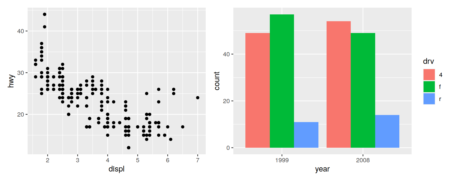
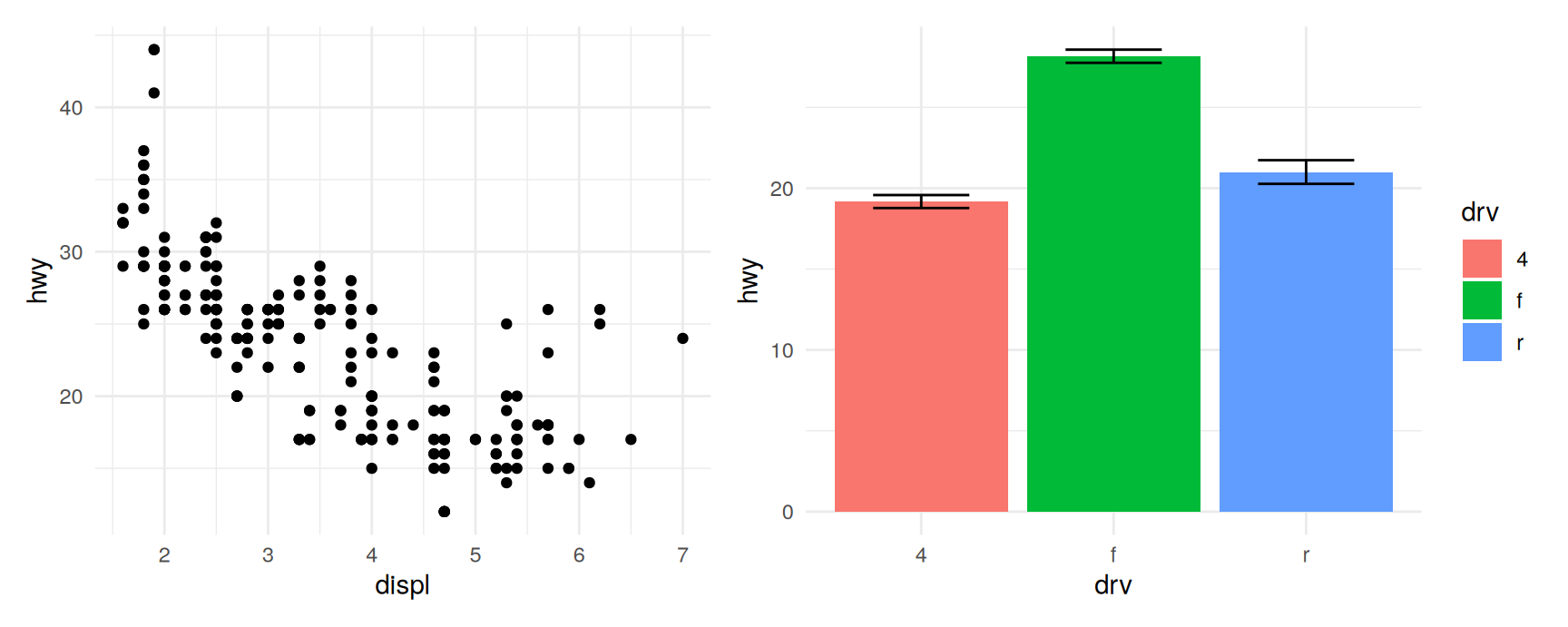
Every example below reuses the same four plots of mpg, so that the code on each slide is about the arrangement and nothing else.
densities carries a drv legend and is faceted, so it has strip labels down its right edge.
Building them once and reusing them is also the habit worth copying. A ggplot object is an ordinary value, and an assembly is built out of values.
Laying out plots side by side
Two plots, one operator
patchwork gives + a second meaning. Add a plot to a plot and you get an assembly rather than an error.
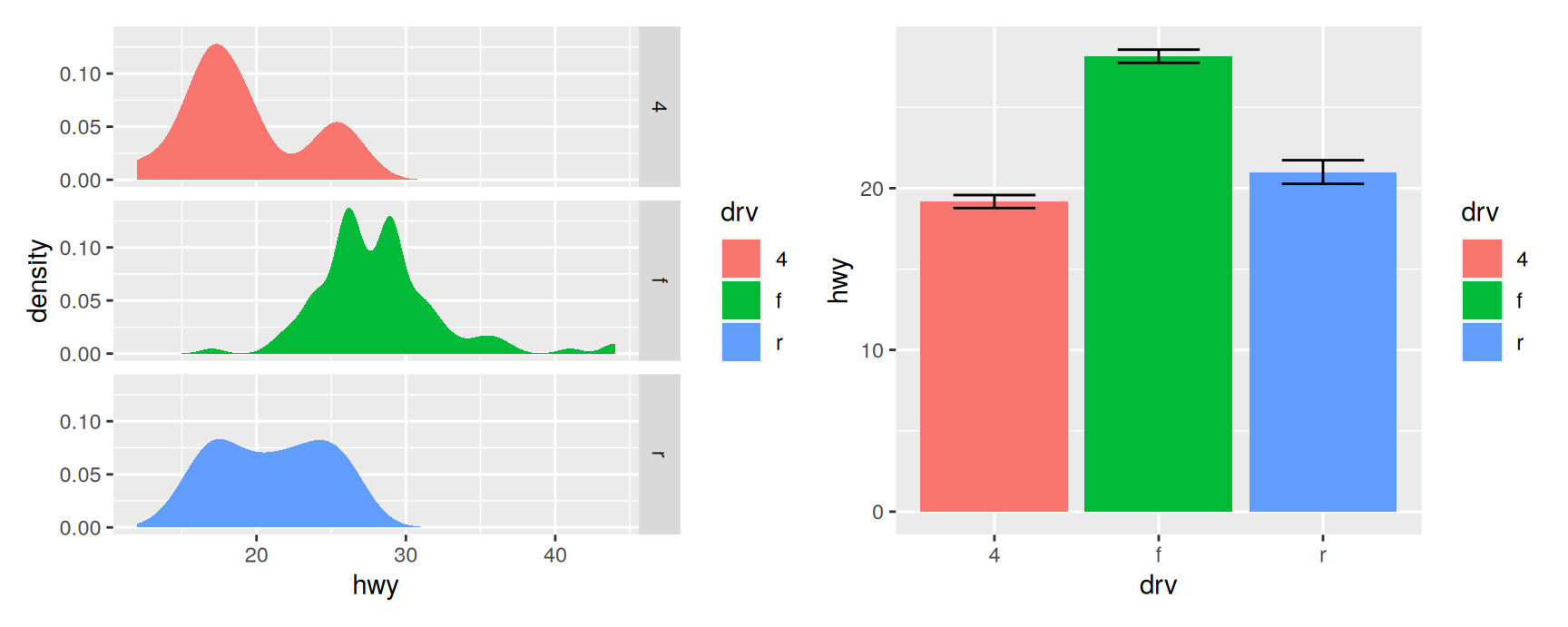
economy + counts
Nothing about either plot changed. Each one still has its own axes, its own scales and its own legend. What changed is that the two are now one object, which prints as one figure and can be saved with a single ggsave().
That is the whole idea. Build each plot so that it is correct on its own, then compose.
More than two
Keep adding. With no further instructions, patchwork chooses the grid for you, using the same rule that facet_wrap() uses to decide rows and columns.
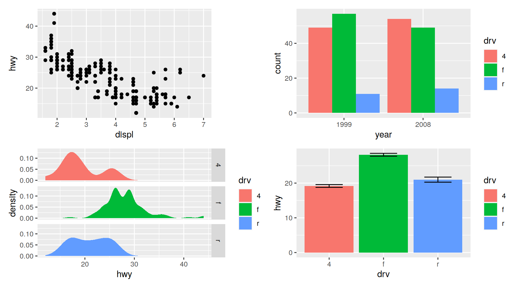
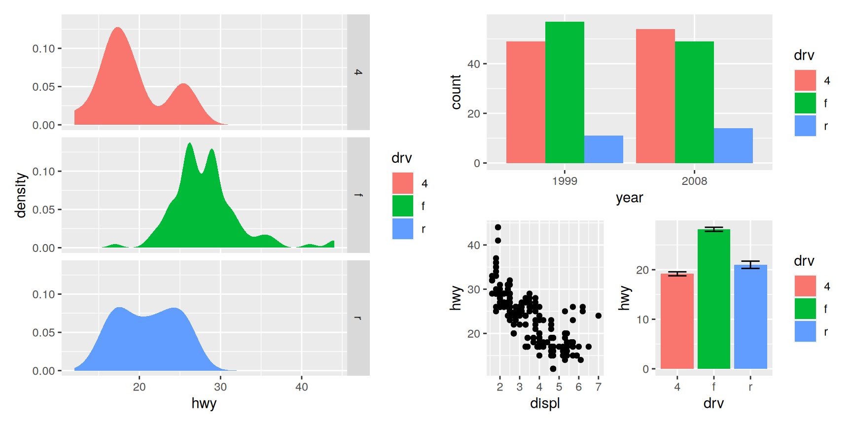
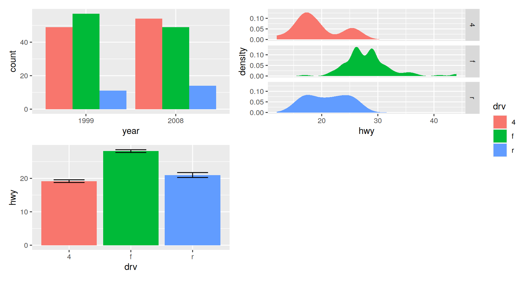
economy + counts + densities + means
Three plots would have come out in a single row of three. Four come out as two by two. The rule is to stay as close to square as possible.
Look at the edges rather than at the plots. The two left panels start at exactly the same horizontal position even though densities has wider tick labels than economy. The two top panels have the same height even though only one of them has a legend.
Alignment is the point
Getting that right by hand is tedious and it breaks every time the data change. patchwork recomputes it on every draw.
Panels in the same column share left and right edges.
Panels in the same row share top and bottom edges.
Axis titles line up with each other, not with whatever the tick labels happened to need.
Faceted plots and legends are absorbed into the grid without special handling.
Alignment is most of what you are buying. The operators are just how you ask for it.
Setting rows and columns
The automatic grid is a guess. plot_layout() replaces it. Add it to the assembly and set ncol or nrow.
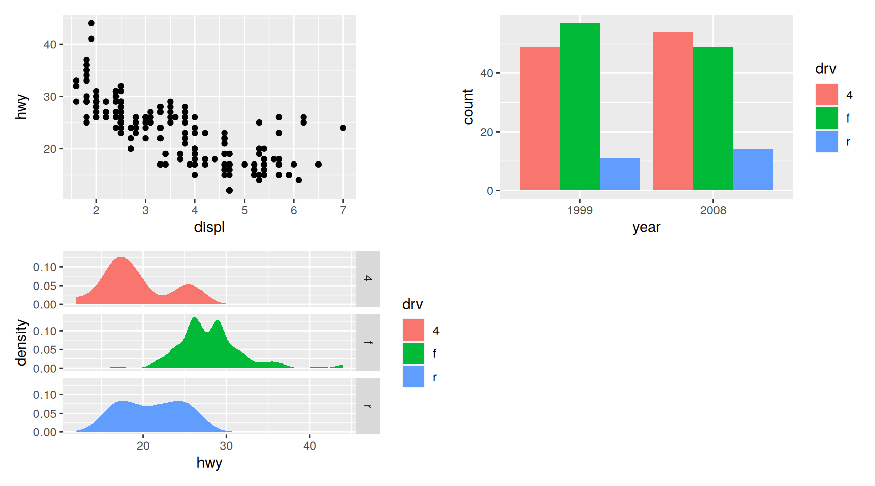
Three plots in two columns leaves the last cell empty, and patchwork gives the three panels the space anyway rather than stretching one of them to fill the hole.
plot_layout() is added with +, like any other ggplot component. It attaches to the assembly, not to the plot immediately before it.
Forcing a row or a column
Two extra operators cover the common cases. | puts everything in one row and / stacks everything in one column.
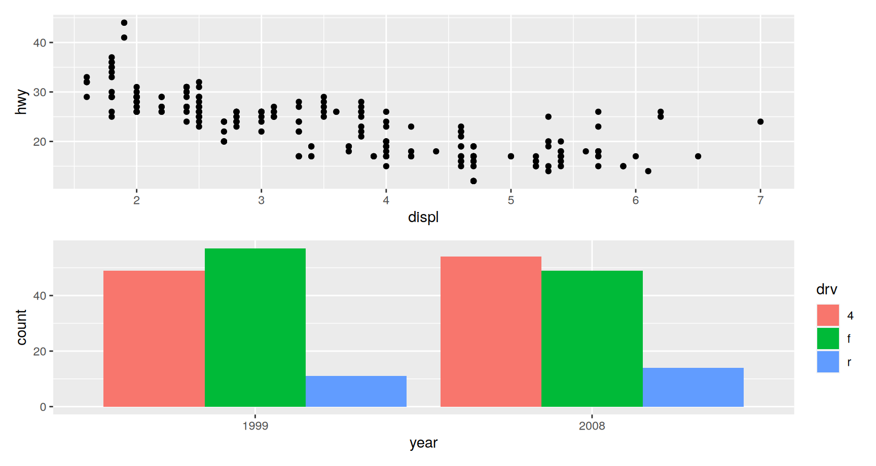
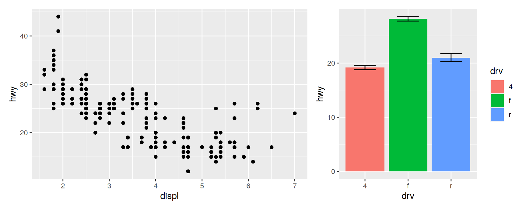
economy / counts
densities | means
| and / do no more than plot_layout(nrow = 1) and plot_layout(ncol = 1). Use them anyway. A reader can see the shape of the figure in the shape of the expression, which is not true of a layout buried in an argument.
Note that / binds more tightly than |, exactly as division binds more tightly than the vertical bar would suggest. When you are unsure, add brackets.
Relative sizes
Panels share the space equally unless you say otherwise. widths and heights take a vector of relative sizes.
economy + means +plot_layout(widths =c(2, 1))
The numbers are ratios, not units. c(2, 1) says the first column gets twice the width of the second, whatever the figure size turns out to be.
This is the fix for a figure in which one panel is genuinely the point and the other is supporting evidence. Give the argument the space and the reader will follow.
Nesting the operators
| and / combine. Put brackets around a sub-assembly and it behaves as a single plot in the level above.
densities | (counts / (economy | means))
Read it from the outside in. The top level is two things side by side. The right hand thing is two things stacked. The lower of those is again two things side by side.
This handles most non-uniform layouts. It does not handle a panel that spans two rows of a three row grid, which is what the next slide is for.
Freeform layouts
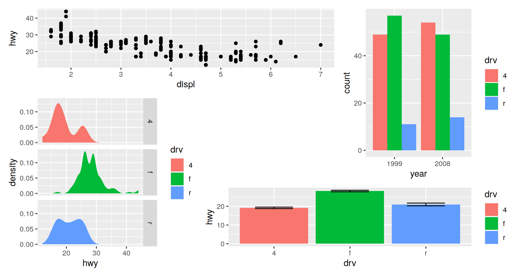
plot_layout() also takes a design argument. Write the grid out as a block of text, one line per row, one character per cell.
Each distinct letter is one plot. # marks a cell that stays empty. A letter repeated over several cells makes that plot span them.
The letters are assigned in the order the plots were added, so A is the first plot in the expression, B the second, and so on.
So economy takes the top two cells of the first row, counts runs down the right column of the first two rows, densities runs down the left column of the last two, and means takes the bottom right pair.
The block of text is a picture of the figure. That is the reason to prefer it over counting rows and columns in your head.
Collecting legends
Three of the four plots map drv to fill, so three of them draw the same legend. Three copies of one legend is wasted space and it invites the reader to look for a difference that is not there.
guides = "collect" pulls the guides out of the panels and places them once.
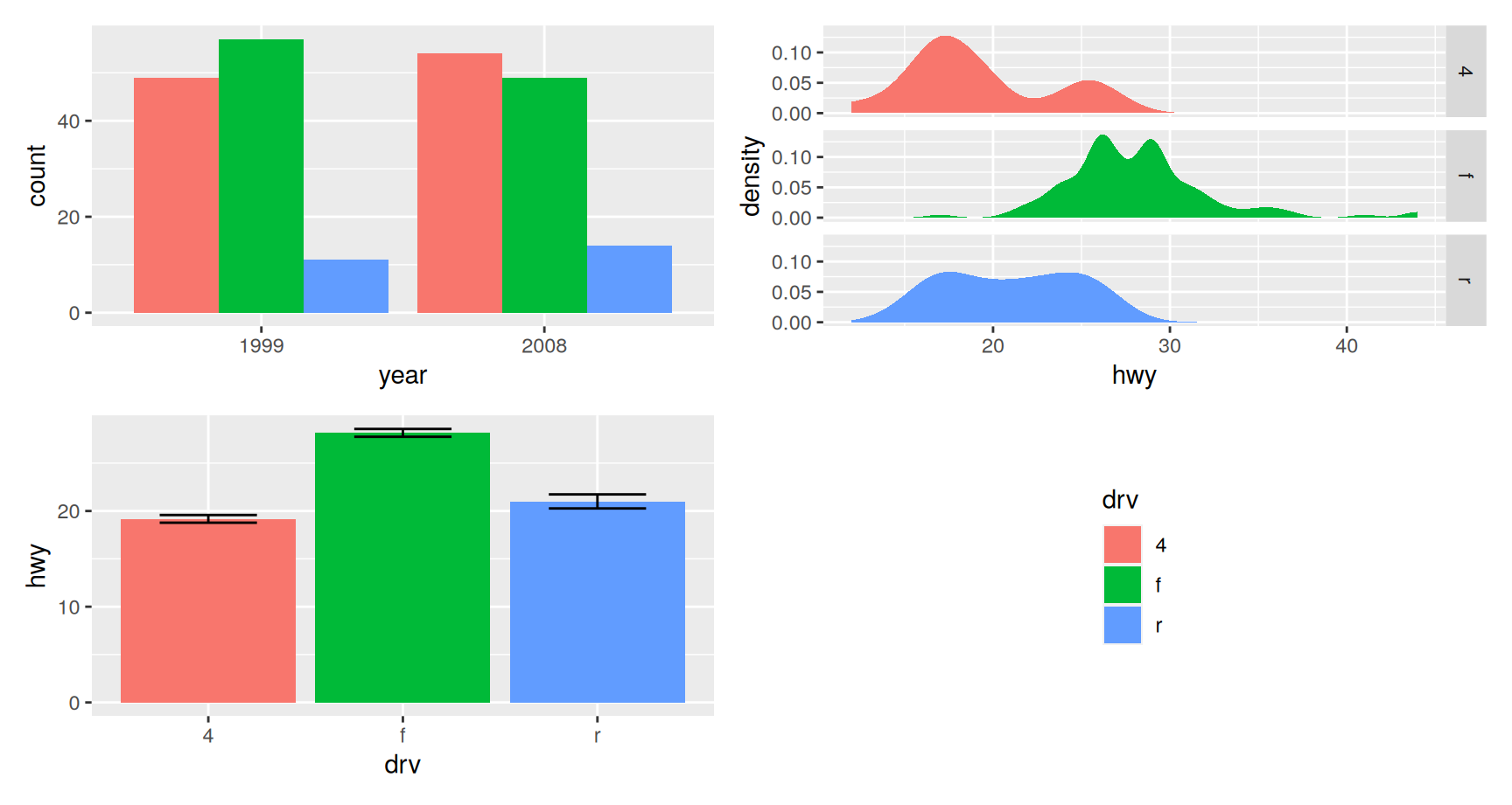
counts + densities + means +plot_layout(ncol =2, guides ="collect")
Two things are worth knowing about how the collection works.
patchwork compares the guides as they are drawn, not the scales behind them. Two legends that look identical are merged into one even if they came from different scales in different plots. Two that differ in any visible way are both kept.
The collected guide is placed according to the global theme of the assembly. Add & theme(legend.position = "bottom") and it moves, without touching where the panels sit.
Giving the guides a home
When the layout leaves a hole, the legend can go in it instead of outside the figure. guide_area() claims a cell for that purpose.
counts + densities + means +guide_area() +plot_layout(ncol =2, guides ="collect")
guide_area() occupies a position in the layout like a plot does, so it can be placed with design as well. Without guides = "collect" it does nothing, because there is nothing to put in it.
This is usually the best use of the empty cell in a two by two grid built from three plots. The figure gets wider panels and the legend stops competing with them.
Collecting axes
Duplicate axes are the other kind of repetition. When panels share a scale, the labels only need to appear once.
economy + means +plot_layout(axis_titles ="collect")
Both panels show hwy on the vertical axis, so one title is enough. axes = "collect" goes further and drops the duplicated tick labels too, which is only honest when the scales really are identical.
Exercises
Build economy | counts and economy + counts. Print both. Explain in one sentence why they look the same here, and give a case where they would not.
Assemble all four plots with plot_layout(nrow = 2, byrow = FALSE). Say where each plot ended up and what byrow controls.
Draw economy + densities twice, once with widths = c(1, 2) and once with widths = c(3, 1). Which version makes the density panels readable, and what did you give up to get it?
Write a design string that puts means across the whole bottom row and economy, counts and densities side by side above it. Check your answer by rendering it.
Take the three plots that carry a drv legend and combine them with guides = "collect". Then change one of them to use colour instead of fill and combine again. Does the collection still produce a single legend, and why?
Replace the empty cell of a two by two layout with guide_area(), then remove guides = "collect". Describe what happens and say what that tells you about the order in which the two arguments take effect.
Reaching into one panel
An assembly keeps its plots as plots until it is drawn. Double brackets index them in the order they were added.
The line reads as a normal R replacement. Take element two, add something to it, put it back. The plot in position two is now a different plot, and the assembly is otherwise untouched.
Use this when one panel genuinely needs different treatment. A different theme for a map, a different legend position for the one panel that has a legend, a caption on the panel it belongs to.
Changing every panel at once
Doing that panel by panel gets long. The & operator adds the same thing to every plot in the assembly.
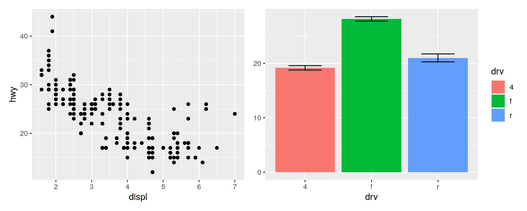
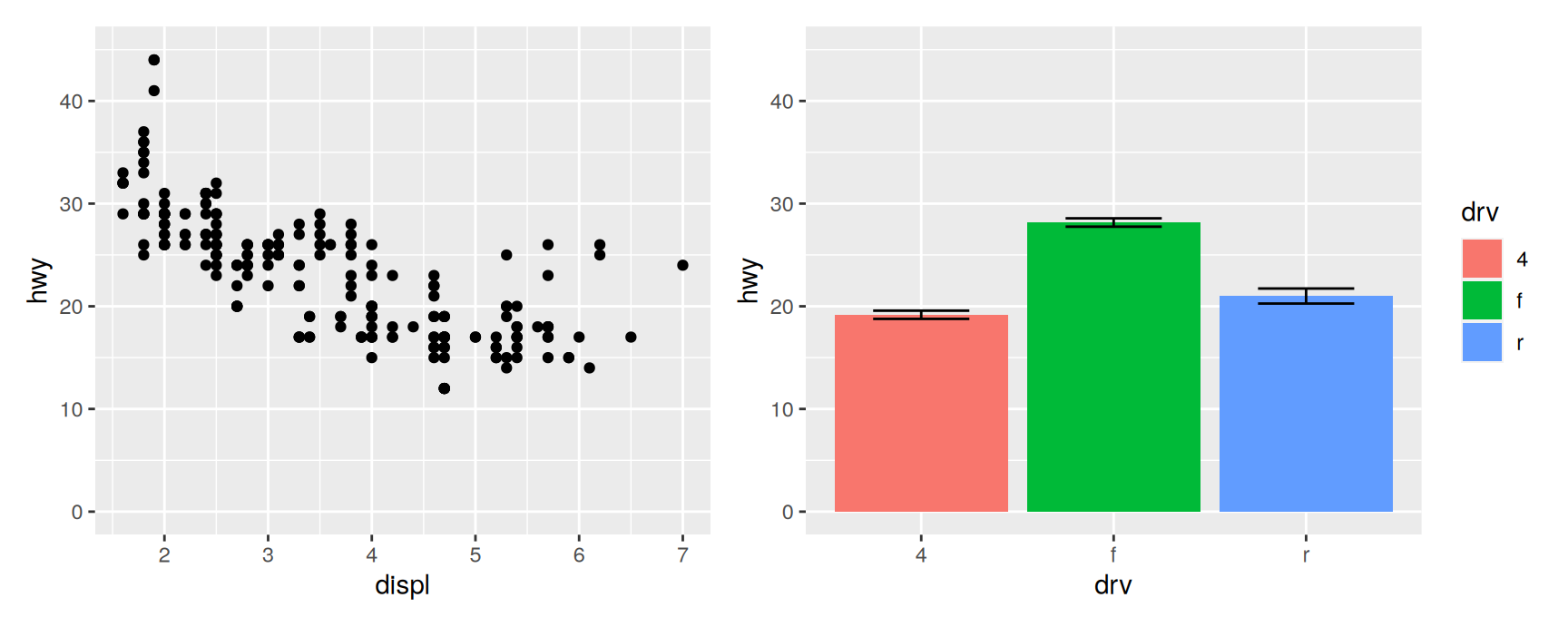
economy + means &theme_minimal()
The difference between + and & is worth memorising, because the mistake is easy to make and the result is a figure that is nearly right.
+ adds to the last plot in the assembly. Only that panel changes.
& adds to every plot, and to the assembly’s own theme.
Try economy + means + theme_minimal() and compare. The scatterplot keeps its grey background and the bar chart does not, which is almost never what anyone wanted.
Making scales comparable
The most useful thing to broadcast is a scale. Panels that share a variable should share its range, otherwise two bars of the same height mean two different numbers.
economy + means &scale_y_continuous(limits =c(0, 45))
Both axes now run from 0 to 45, and the panels can be compared directly.
One warning carries over from Chapter 2. limits drops observations outside the range rather than zooming, so anything a layer computes is computed on what is left. If a panel contains a smoother or a summary, use coord_cartesian() and broadcast that instead.
Titles for the whole figure
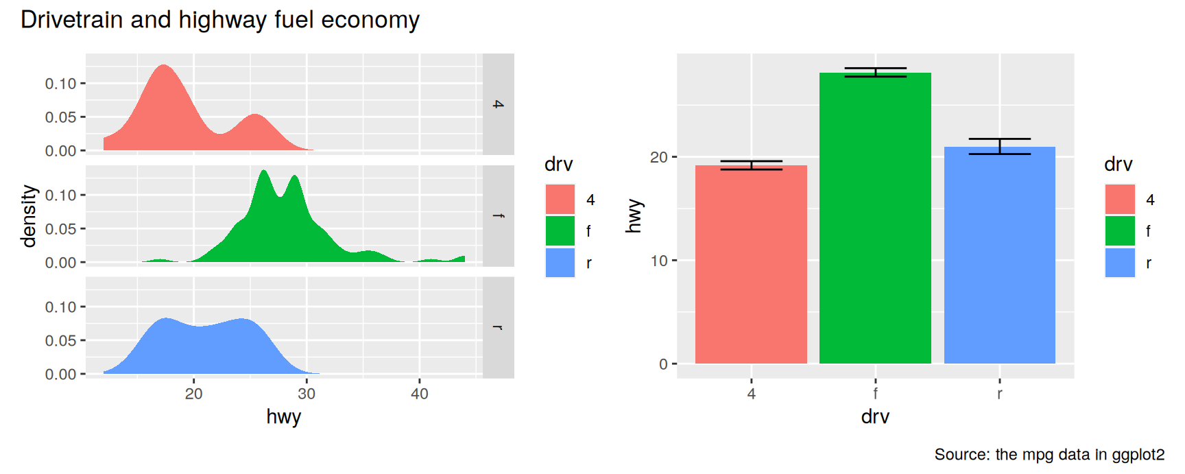
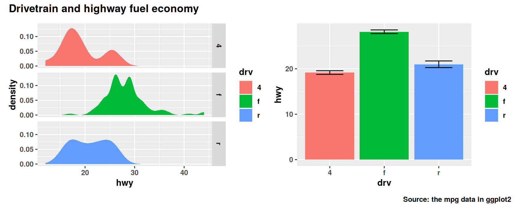
Once plots are assembled they are read as one figure, so the title belongs to the assembly rather than to any panel. plot_annotation() attaches it.
annotated <- densities + means +plot_annotation(title ="Drivetrain and highway fuel economy",caption ="Source: the mpg data in ggplot2")annotated
plot_annotation() takes title, subtitle and caption, and they behave like their labs() counterparts one level up. The title sits above everything, the caption below everything, and neither is tied to a panel.
A panel that still needs its own title keeps it. The two levels coexist, which is exactly how a published figure is usually labelled.
Styling the annotation
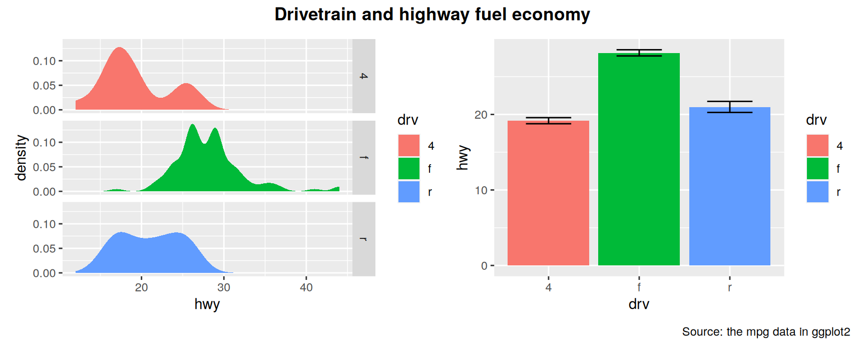
The theme argument of plot_annotation() controls the assembly’s own text and nothing else.
The title is bold because the assembly’s theme changed. The axis labels are bold because every panel’s theme changed too.
Tagging the panels
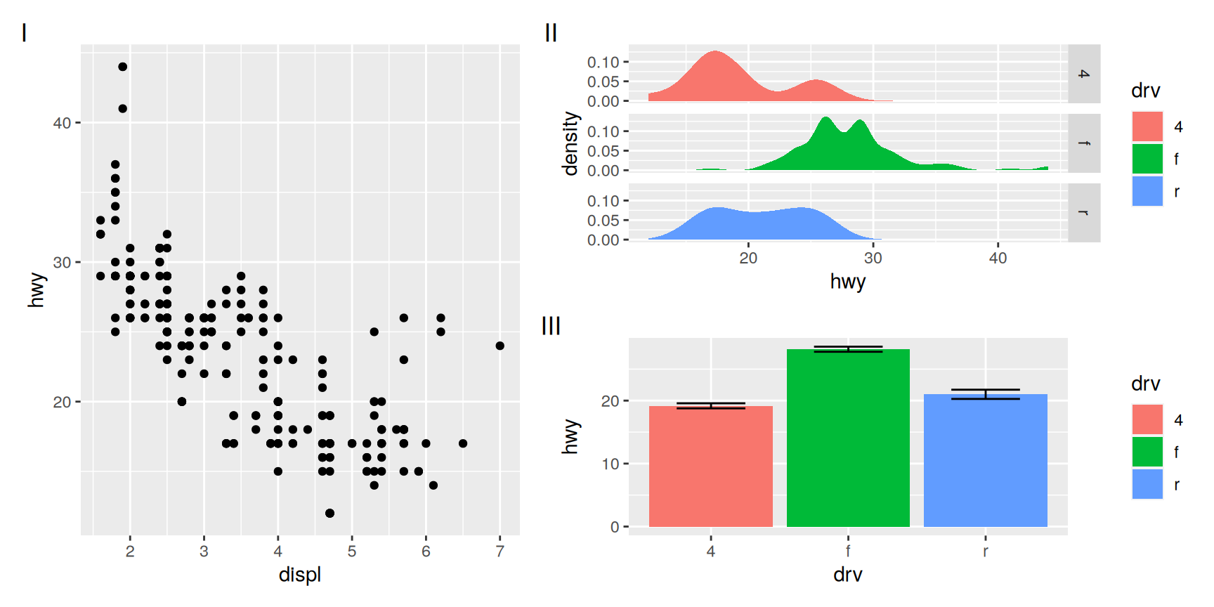
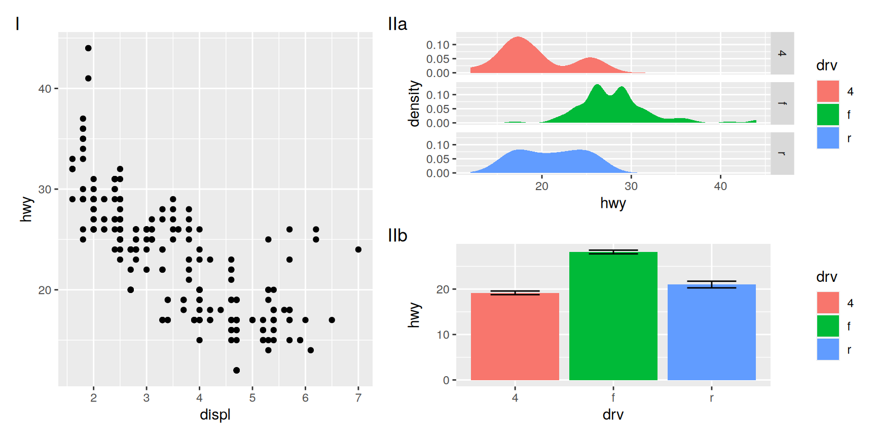
Published multi-panel figures label their panels, so that the caption can refer to one of them. tag_levels does the labelling for you, in the order the plots were added.
The outer level counts in Roman numerals and the inner level in letters, so the two stacked panels become IIa and IIb.
That is the notation a journal caption expects when a figure has a group of related sub-panels. Getting it from two arguments rather than from careful typing is a good trade.
Exercises
Build economy + counts + densities, then give only the middle panel a horizontal legend using double bracket indexing. Say why & would be the wrong tool here.
Apply theme_minimal() to the same assembly twice, once with + and once with &. Describe the difference in one sentence, then state a rule for choosing between them.
Combine economy and means and broadcast coord_cartesian(ylim = c(10, 45)). Then do it again with scale_y_continuous(limits = c(10, 45)). Which panel changes its message, and why?
Give an assembly a title with plot_annotation() and a second title with labs() on one of its panels. Render it and describe how a reader is meant to tell the two apart.
Tag a four panel assembly with "1", then with "A", then with tag_levels = "a" and tag_prefix = "(" and tag_suffix = ")". Which version would you use in a report, and what made you choose it?
Reorder the plots inside a tagged assembly without touching the plot_annotation() call. Confirm that the tags follow the new order, and say what that implies about when tags are computed.
Arranging plots on top of each other
Insets
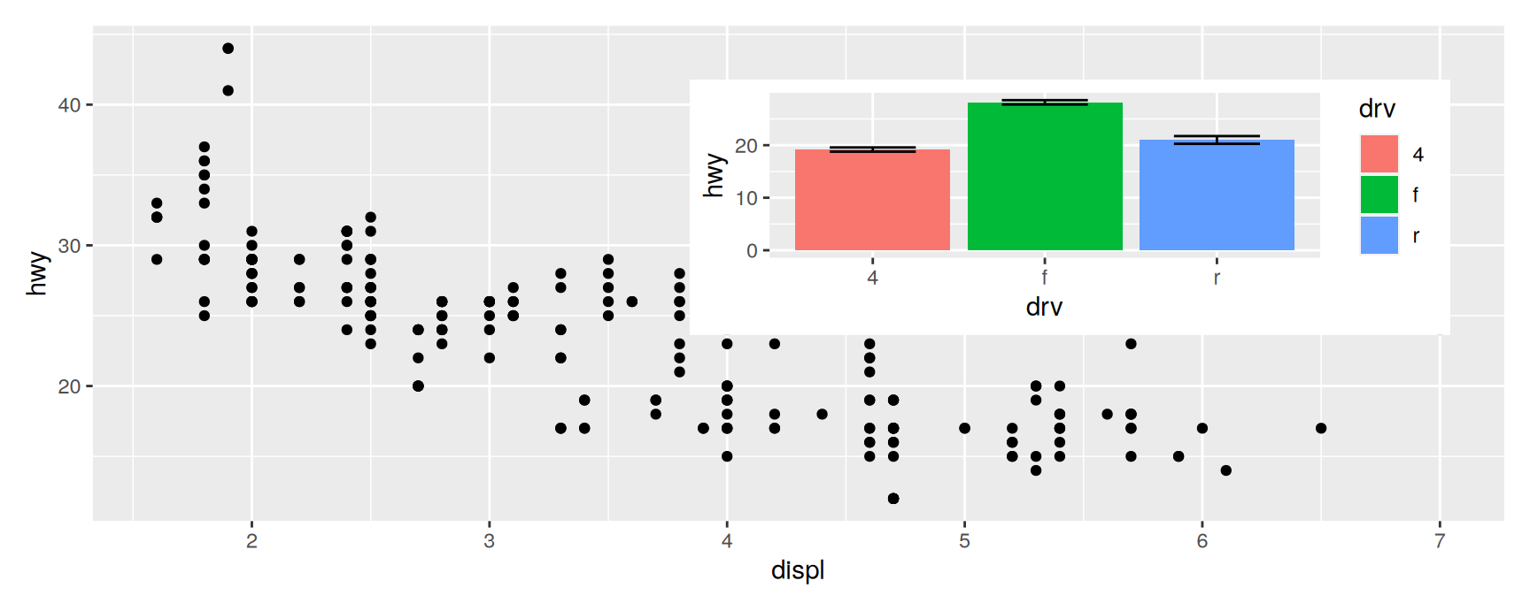
A side by side layout gives every plot its own territory. An inset does the opposite. It puts a small plot on top of a larger one, inside the larger one’s area.
Insets earn their place when the small plot is context rather than a separate result. An overview map beside a detail, a full range axis beside a zoomed one, a sample size beside the estimates computed from it.
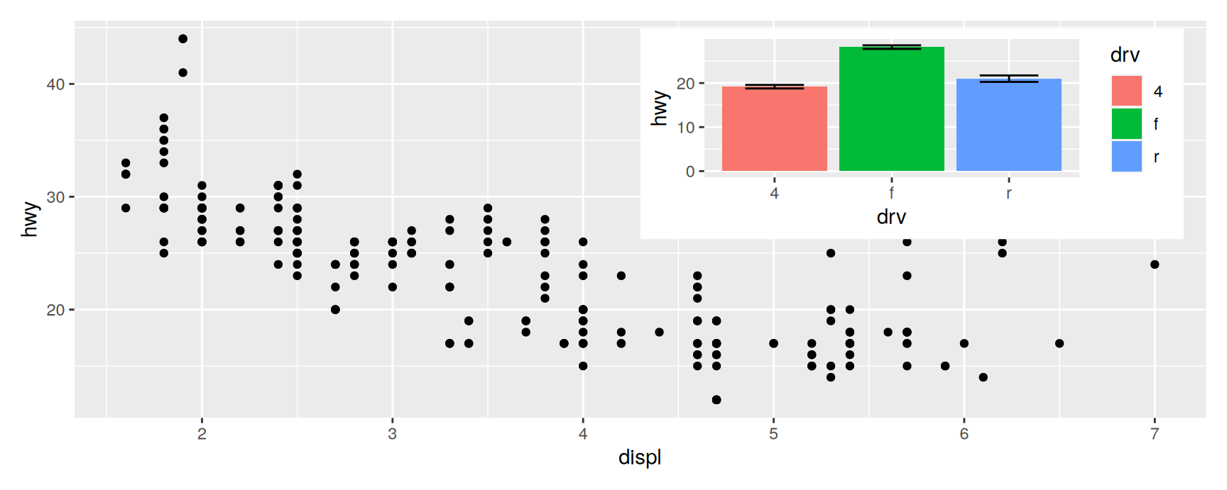
inset_element() marks a plot as an inset on the plot immediately before it, and its four position arguments say where the inset goes.
economy +inset_element(means, left =0.5, bottom =0.45, right =0.98, top =0.98)
What the numbers mean
By default the four numbers are fractions of the background plot’s panel, the grey rectangle inside the axes. Zero is the left or bottom edge, one is the right or top edge.
Set align_to = "full" to measure against the whole plot instead, axis labels and titles included. Use it when the inset should sit in the figure’s corner rather than in the data’s corner.
Any grid::unit() works in place of a fraction, which is how you place an inset a fixed distance from an edge whatever the figure size.
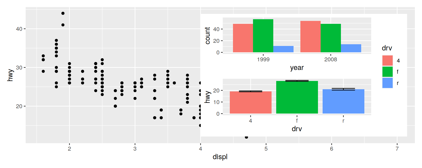
The inset does not have to be a single plot. Anything wrap_elements() can take works, including a patchwork assembly.
stacked <- counts / means +plot_layout(guides ="collect")economy +inset_element(stacked, left =0.45, bottom =0.05, right =0.98, top =0.95)
Two arrangements are nested here. The inset is a two panel column with its own collected legend, and that whole thing sits on top of the scatterplot.
Be careful with this. Nesting is easy to do and easy to overdo, and an inset that needs its own legend is often a plot that deserves its own panel.
Insets stay live
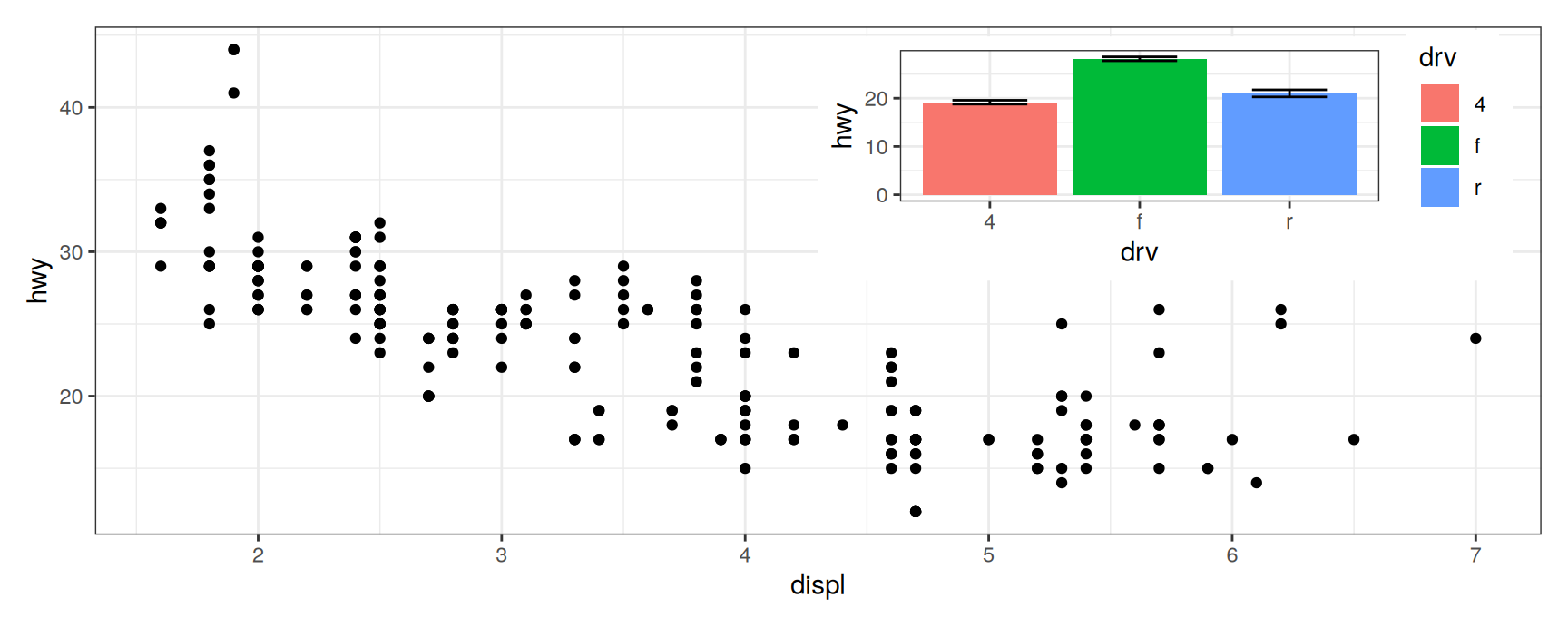
An inset is a subplot like any other until the figure is drawn, so & reaches it.
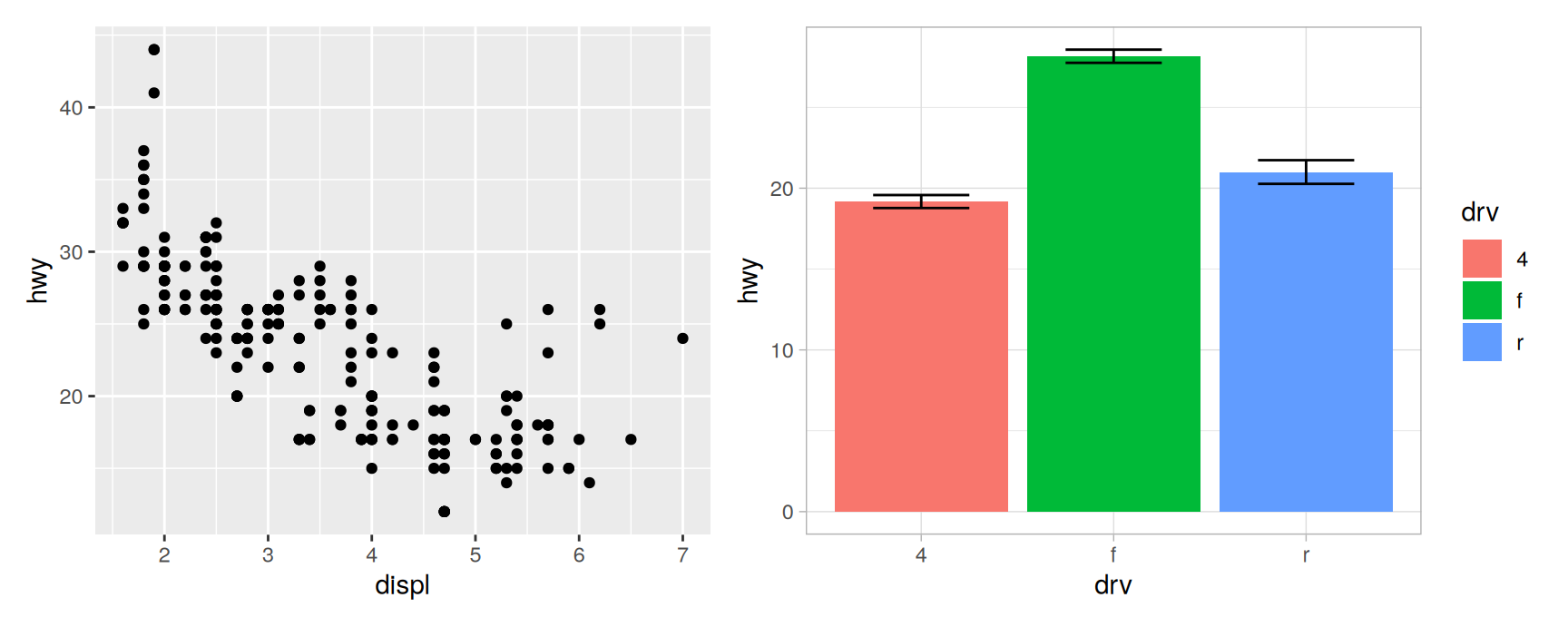
with_inset <- economy +inset_element(means, left =0.5, bottom =0.5, right =0.98, top =0.98)with_inset &theme_bw()
Background and inset change together, which is what keeps the two looking like one figure.
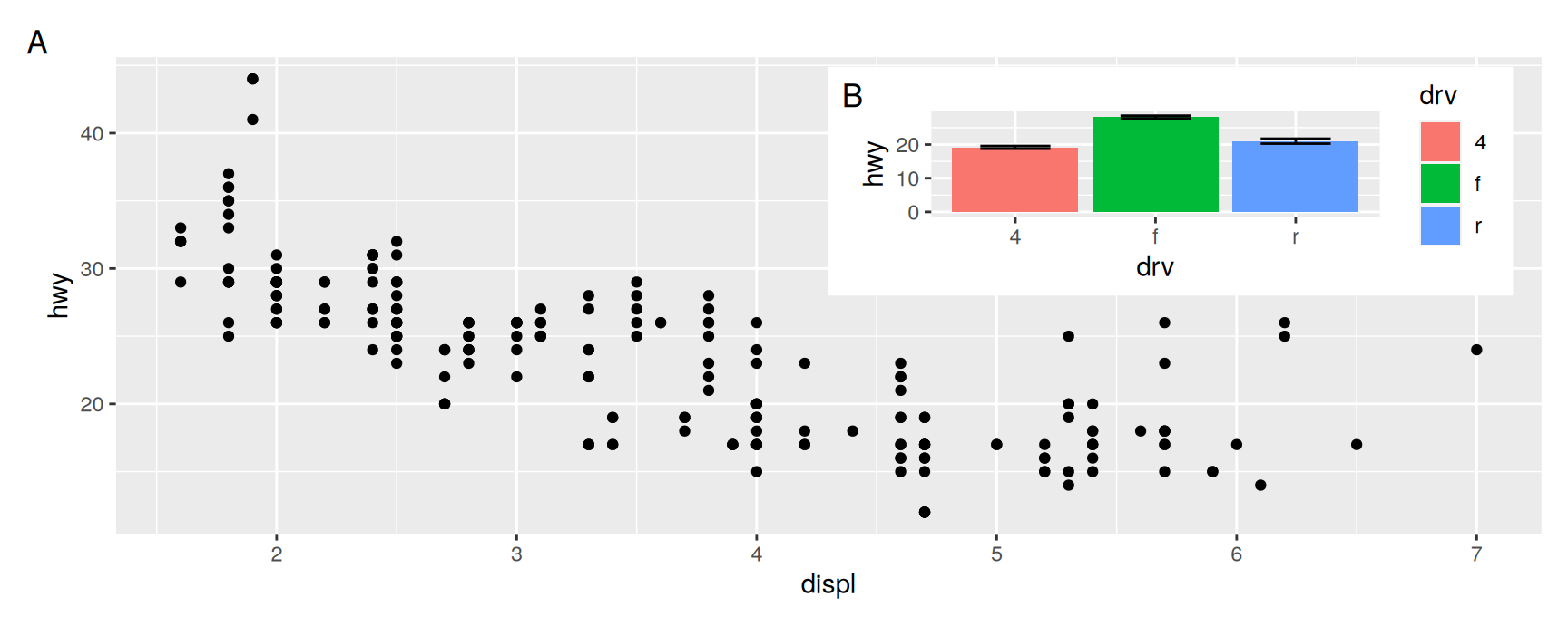
Tagging reaches insets too.
with_inset +plot_annotation(tag_levels ="A")
Both the background plot and the inset get a tag, so a caption can talk about B without describing where on the page it sits. Pass ignore_tag = TRUE to inset_element() when the inset is decoration and should not be counted.
Exercises
Inset densities into economy at left = 0.5, bottom = 0.5, right = 1, top = 1, once with the default align_to and once with align_to = "full". Measure the difference and explain where it comes from.
Place an inset 5 mm from the top right corner of economy using unit(). Render the figure at two different fig.width values and say what stayed fixed.
Give an inset a white background with theme(plot.background = element_rect(fill = "white")). Why does an inset usually need this and a side by side panel not?
Build economy + inset_element(means, ...) and then broadcast scale_y_continuous(limits = c(0, 45)) with &. Is the result still readable, and what does that tell you about broadcasting scales onto insets?
Take any inset figure and tag it with tag_levels = "A", then add ignore_tag = TRUE to the inset_element() call. Describe both results and name a figure where you would want the second.
Argue the case against one of the inset figures on these slides. Redraw it as a side by side assembly and say which version you would publish.
Wrapping up
The toolkit
What you write
What it does
a + b
Combine, layout chosen automatically
a \| b, a / b
Force one row, force one column
plot_layout()
ncol, nrow, widths, heights, design, guides, axes
guide_area()
Reserve a cell for the collected legend
x[[i]] <- ...
Replace one panel
&
Add to every panel and to the assembly
plot_annotation()
Title, caption and automatic tags
inset_element()
Overlay one plot on another
What is left
patchwork is not limited to ggplot objects. wrap_elements() accepts base R graphics and grid grobs, which is how a legend, a table or a drawing gets into the same aligned grid as the plots.
Complex designs can also be built with area() instead of the text block, which matters when the layout is generated by code rather than typed out.
Faceting splits one plot. patchwork joins several. They solve different problems.
+ guesses a layout, | and / state one, plot_layout() controls it in detail, and design draws it as a picture.
Alignment across panels is the hard part, and it is the part you get for free.
+ changes the last panel, & changes all of them. Nearly every surprising result comes from confusing the two.
Collect legends and axis titles so the figure spends its space on data.
plot_annotation() labels the figure as a whole, and inset_element() puts one plot inside another.
Acknowledgement
Source. These slides follow the structure and the teaching sequence of ggplot2: Elegant Graphics for Data Analysis (3e) by Hadley Wickham, Danielle Navarro and Thomas Lin Pedersen. The explanations, examples and exercises here have been rewritten for this course; any errors in them are mine and not the book’s.
Copyright. All rights in the original work are reserved by its authors and publishers. Students are encouraged to read the book itself, which is freely available online.
Non-commercial use only. These materials are for teaching and must not be used for commercial gain.
Attribution. Any reuse or redistribution must credit both the original book and this course.