Programming for Applications
Chapter 13: Graphics
2026-08-03
plot: the Generic Entry Point
Our example data: 2008 cancer cases (American Cancer Society) and 2006 toxic releases by state (EPA), packaged as toxins.and.cancer:
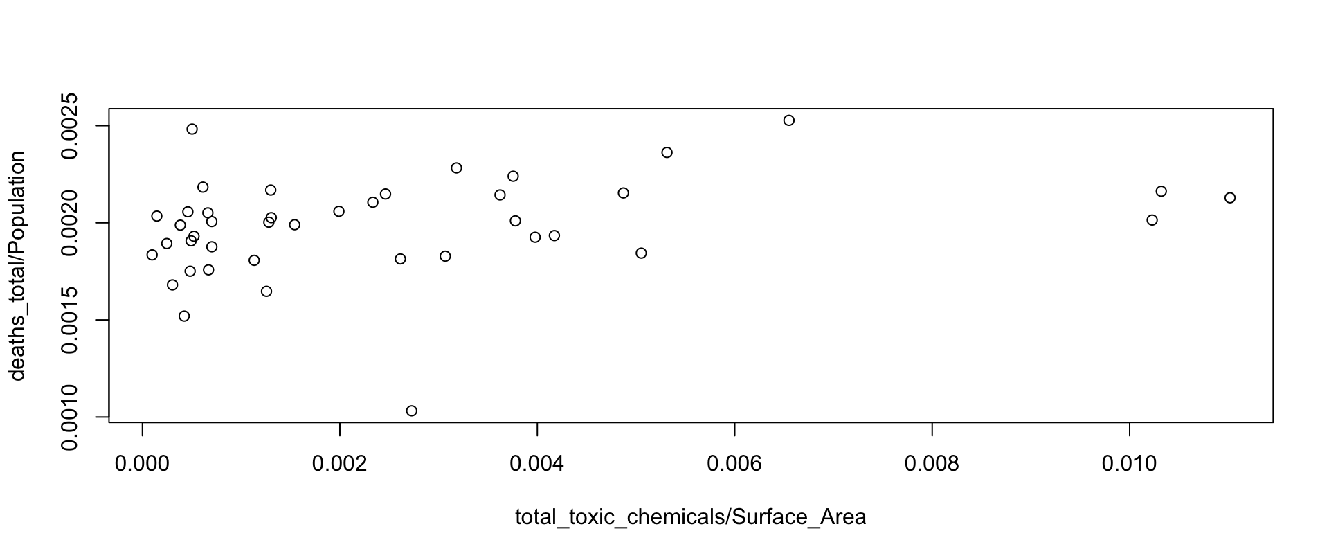
plot is generic — vectors, tables, time series all plot. For two vectors, plot.default runs. Cancer death rate vs. toxin release rate:
Interactive Identification, and Labels
A stronger correlation appears between airborne toxins and lung cancer:
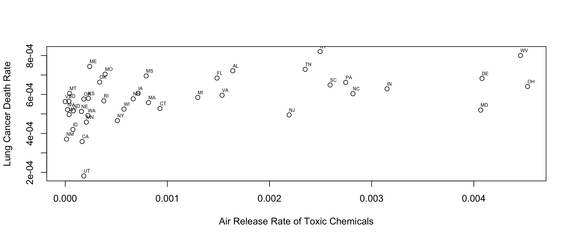
- Interactively:
locator(1)prints the coordinates of a clicked point;identify(x, y, labels)labels points as you click them. - For all labels at once,
textdoes it (here resized withcex, repositioned withadj). The relationship is statistically significant (Chapter 18) — though that alone argues no causal story.
matplot, smoothScatter, pairs
Three relatives for special situations:
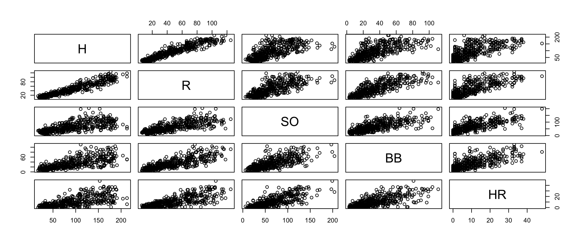
matplot(x, y, type=, lty=, lwd=, pch=, col=, cex=, ..., add=)plots all columns of one matrix against all columns of another; the usualpar-style arguments accept vectors, one entry per series.smoothScattershades regions by point density — the cure for overplotting with very many points (see Chapter 16).pairsdraws a scatter plot matrix for every pair of variables:
plot.ts and acf
plot has a time-series method (plot.type = "multiple"/"single", panel, nc, yax.flip, margin controls…). The turkey prices of Chapter 7:
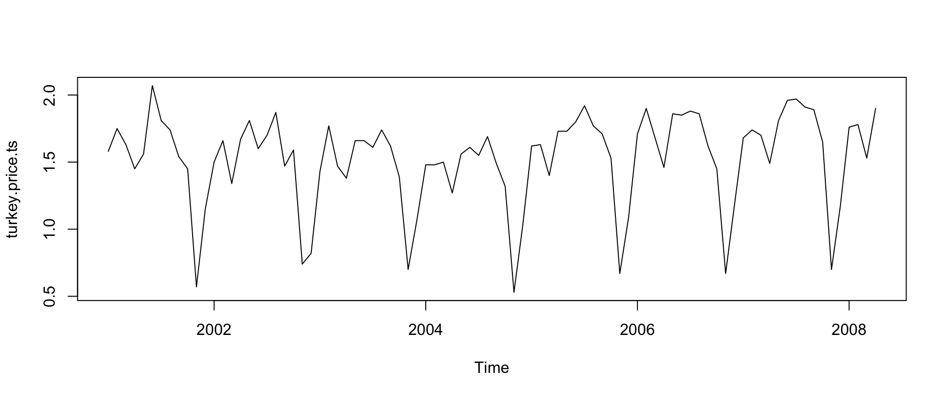
Strongly seasonal: November/December sales (Thanksgiving, Christmas), minor spring dips (Easter).
The Correlogram
The autocorrelation function shows how correlated points are with their past, by lag — acf computes it and plots by default:
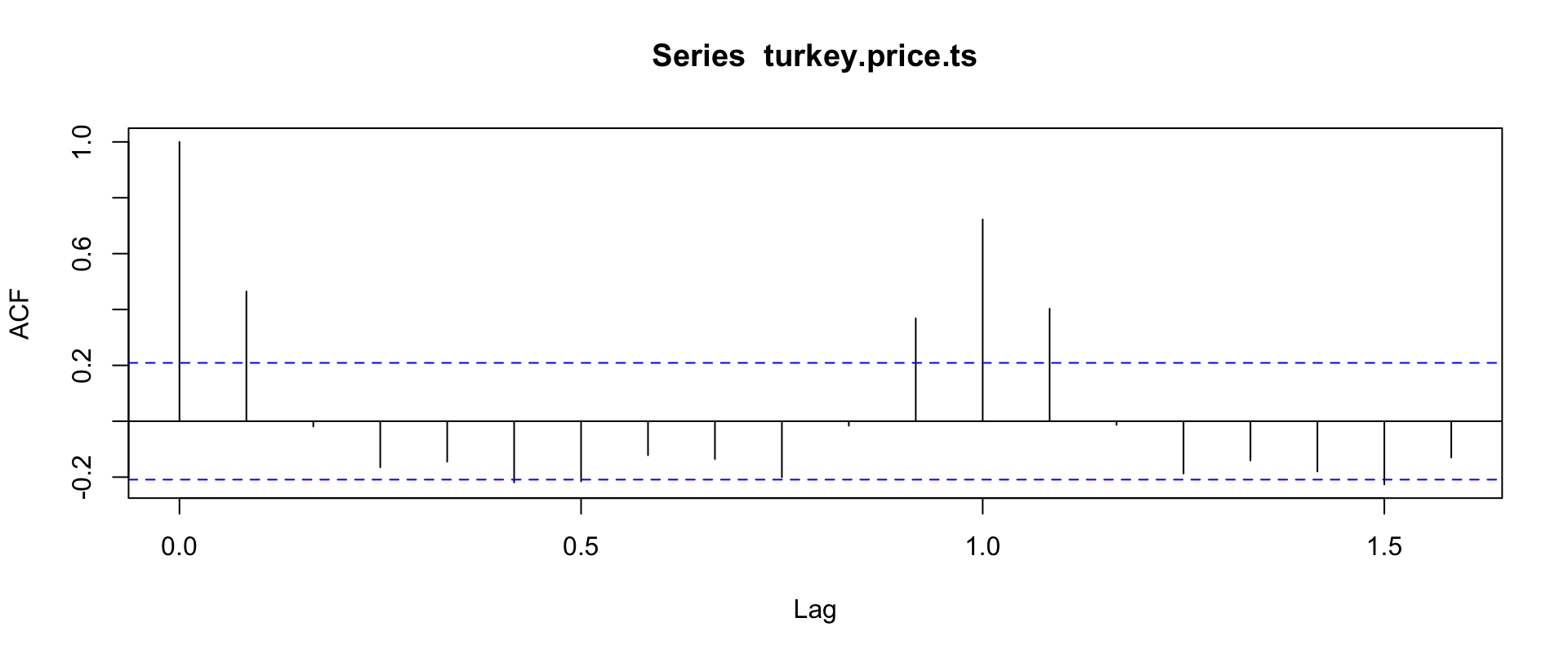
Correlated at 12-month cycles, inversely at 6-month cycles. (Time series analysis proper: Chapter 23.)
barplot Basics
US doctoral degrees, 2001–2006 (Statistical Abstract), entered directly:
doctorates <- data.frame(
  year=c(2001, 2002, 2003, 2004, 2005, 2006),
  engineering=c(5323, 5511, 5079, 5280, 5777, 6425),
  science=c(20643, 20017, 19529, 20001, 20498, 21564),
  education=c(6436, 6349, 6503, 6643, 6635, 6226),
  health=c(1591, 1541, 1654, 1633, 1720, 1785),
  humanities=c(5213, 5178, 5051, 5020, 5013, 4949),
  other=c(2159, 2141, 2209, 2180, 2480, 2436))
doctorates.m <- as.matrix(doctorates[2:7])   # barplot wants a matrix,
rownames(doctorates.m) <- doctorates[, 1]    # not a data frame
barplot(doctorates.m[1, ])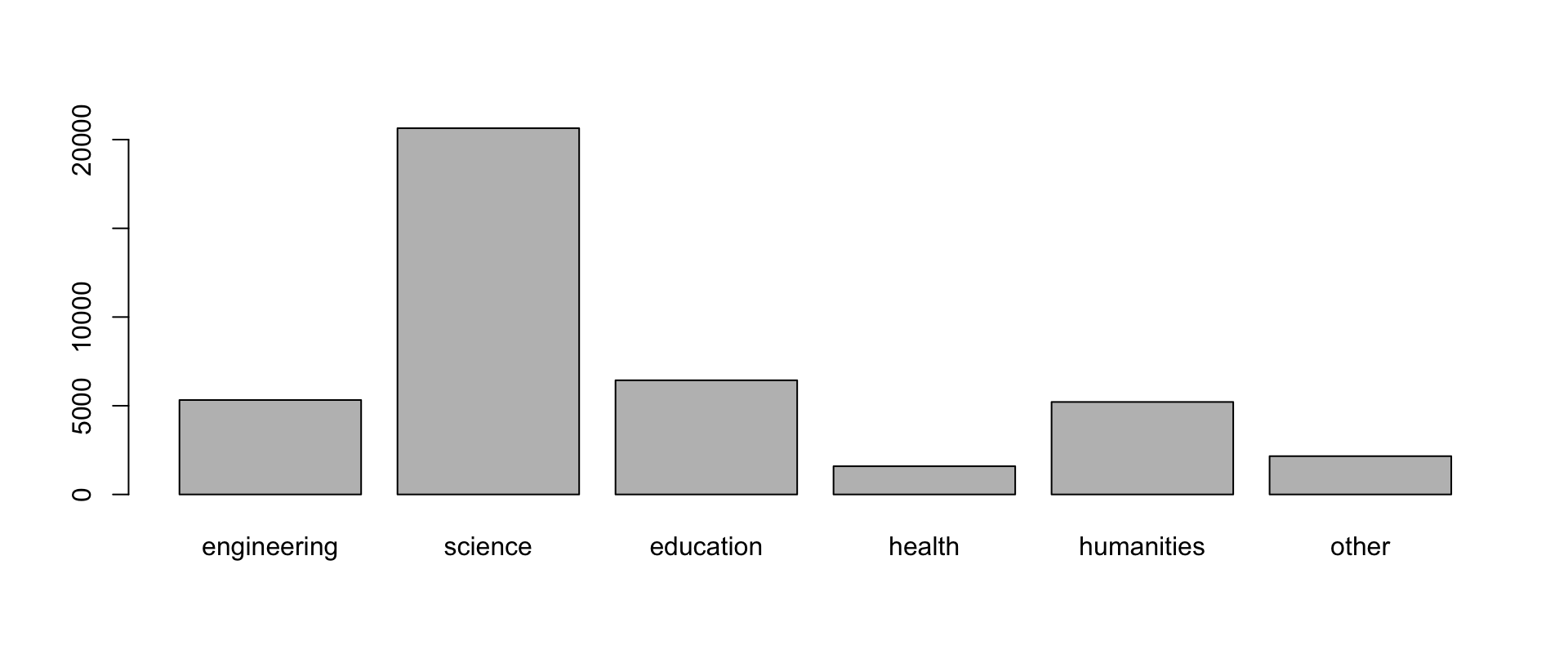
Default behavior: y-axis drawn, no x-axis line, bars named from column names.
Grouped and Stacked Bars
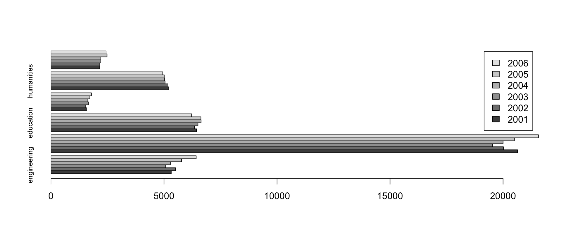
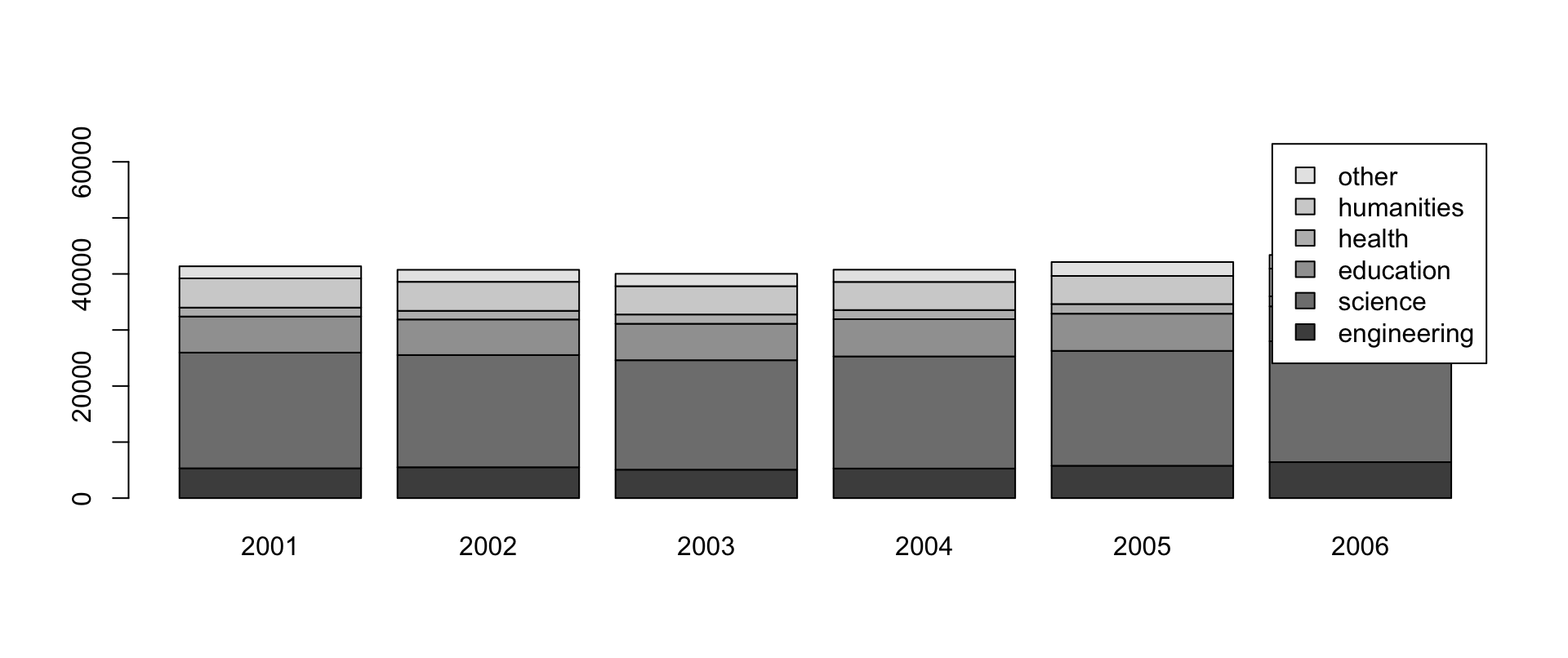
Side-by-side horizontal bars with a legend; then stacked columns (transpose so columns = years, widen ylim to fit the legend):
pie — Use Sparingly
What happened to US-caught fish in 2006 (millions of pounds):
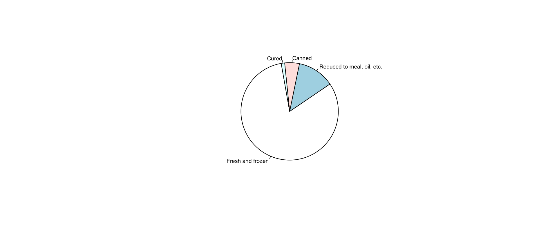
Arguments: x (nonnegative values), labels, edges (polygon smoothness), radius, clockwise + init.angle, density/angle shading, col (default: six pastels), border, lty, main.
Warning
The help file itself says it: “Pie charts are a very bad way of displaying information. The eye is good at judging linear measures and bad at judging relative areas. A bar chart or dot chart is a preferable way of displaying this type of data.”
Conditional Density: cdplot
How does a categorical outcome vary along a numeric axis? cdplot smooths with kernel density estimates (density underneath; arguments bw, n, from, to pass through; ylevels reorders; formula+data+subset supported). Batting hand by batting average:
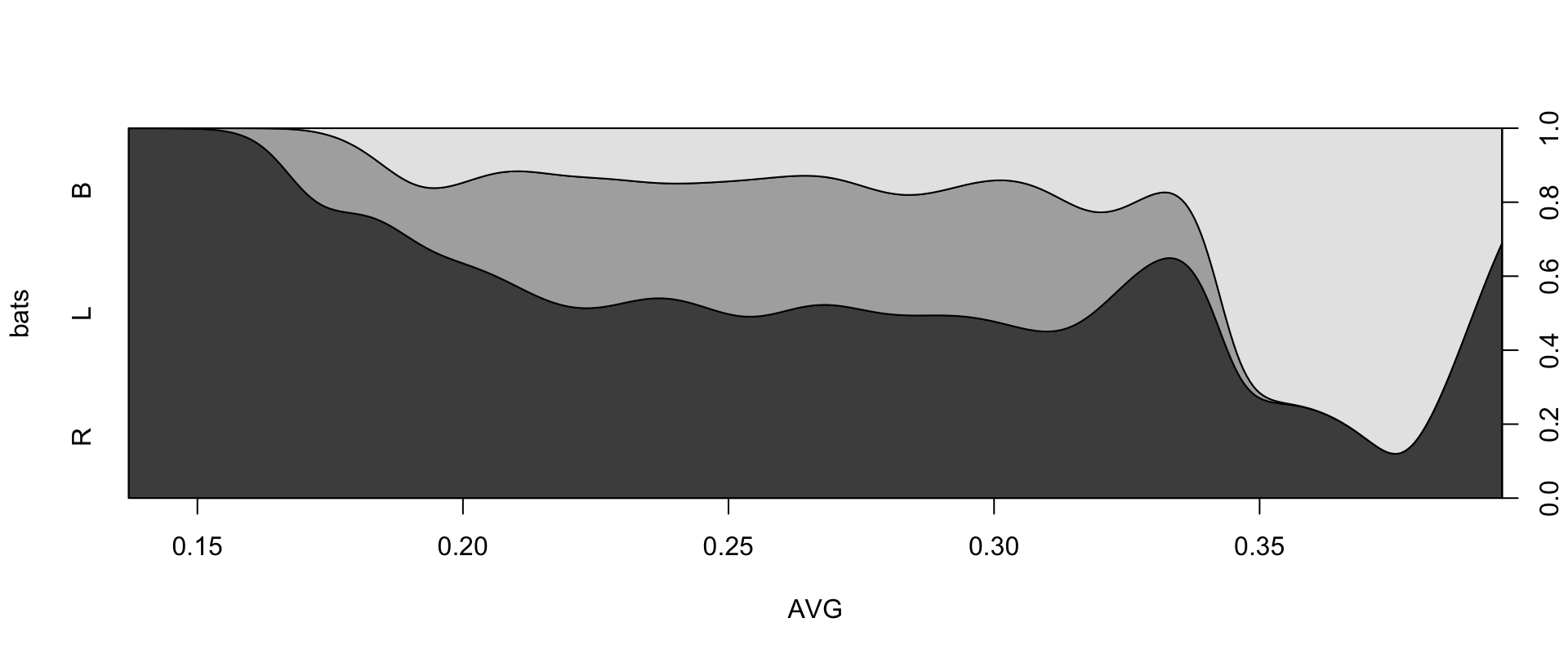
The proportion of switch hitters (B) rises with batting average.
Mosaic, Spine, and Association Plots
For two factors, three displays of the contingency structure:
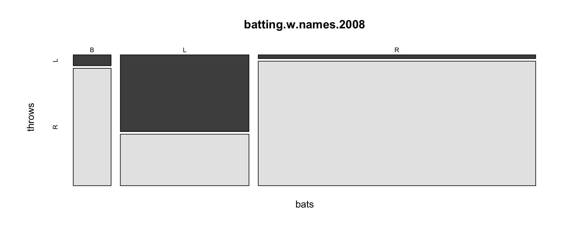
mosaicplotboxes are proportional to counts; further arguments:sort,off(spacing),dir(orientations),shade(extended plots coloring log-linear residuals),margin,type("pearson"/"deviance"/"FT"residuals).spineplot(bats~throws, data=...)— the close sibling.assocplot(table(bats, throws))— bars showing each cell’s deviation from independence (Cohen–Friendly).- See also
starsandfourfoldplot.
persp: Surfaces in Perspective
Key arguments: x/y (coordinates of rows/columns), z (the matrix), theta/phi (viewing azimuth/colatitude), r/d (viewpoint distance, perspective strength), expand (z exaggeration), col/border, ltheta/lphi (light source), shade, box/axes/nticks/ticktype.
Looking toward Half Dome — flip the columns (persp draws y bottom-up), take a square 253-column subset (mind the fencepost +1!), rotate and light:
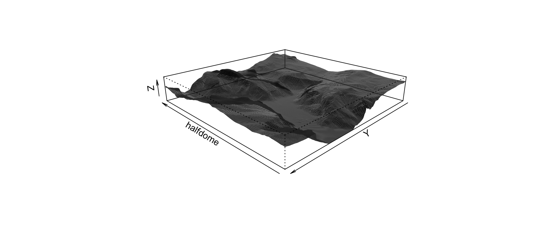
image and heatmap
image color-codes the matrix as a grid (arguments: zlim, col — typically heat.colors, topo.colors, terrain.colors, breaks, oldstyle, add):
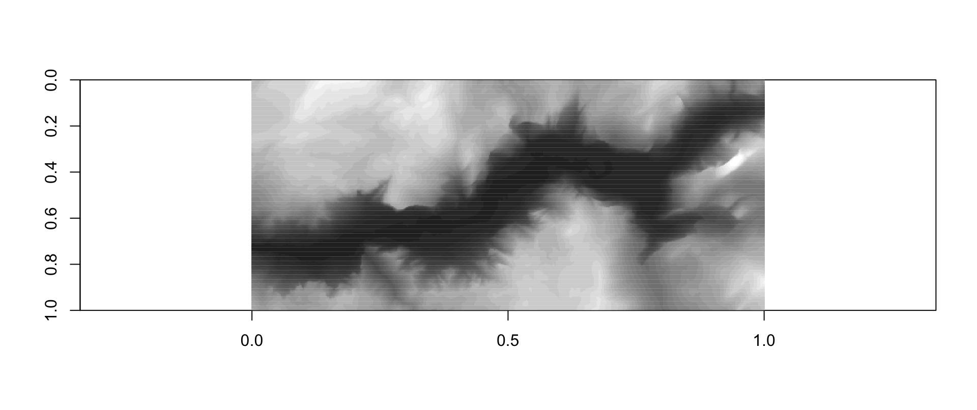
(Tweaks: aspect ratio matching the data, reversed y, a 33-step gray ramp (0:32)/32.) The biology-flavored relative heatmap adds optional dendrograms along the margins — Rowv/Colv, distfun/hclustfun, scale, margins, cexRow/cexCol and friends.
contour
contour joins equal values with lines — arguments nlevels/levels, labels/labcex/drawlabels/method (label placement: "simple", "edge", "flattest"), vfont, plus the usual col/lty/lwd/add:
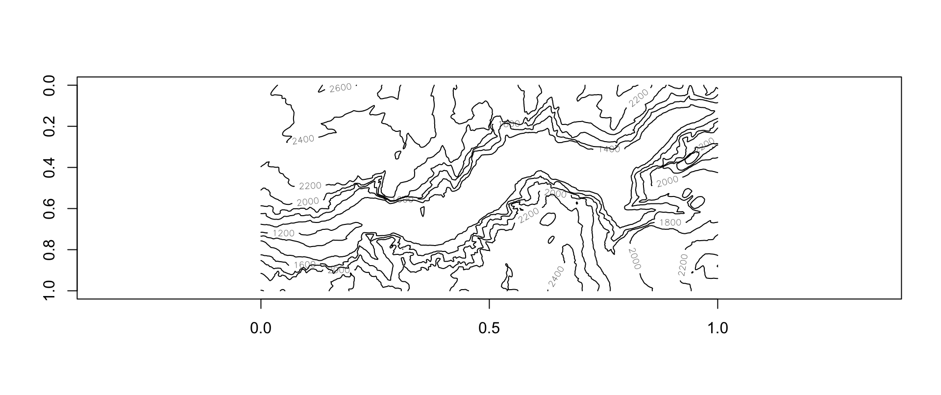
Contours are commonly added to an image plot (add=TRUE).
Histograms
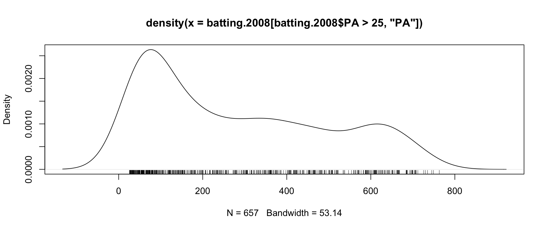
Plate appearances (PA = AB+BB+HBP+SF+SH) per batter, 2008:
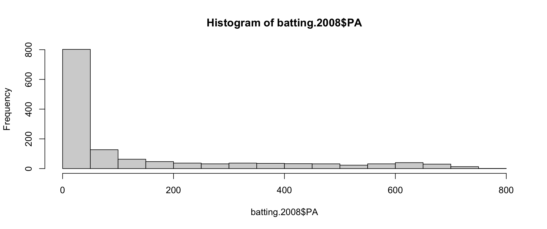
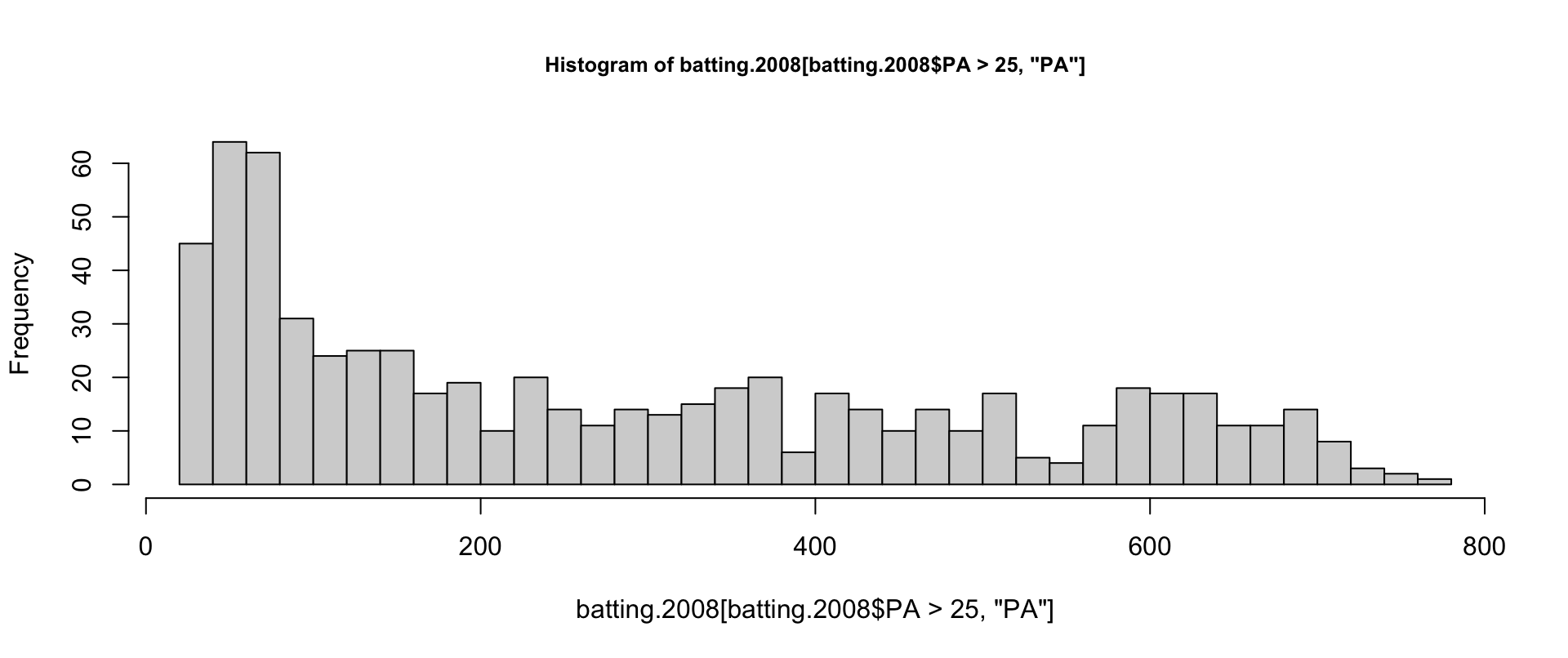
A horde of sub-50-PA players — worth excluding from rate statistics. Zoom in and refine the bins:
Density Plots and Rugs
Many statisticians prefer density plots — more robust, easier to read. Compute with density, draw with plot, garnish with a rug (a strip plot along the axis):
Quantile-Quantile Plots
A Q-Q plot charts sample quantiles against theoretical ones — points on the 45° diagonal mean the distributions match. qqnorm compares against the normal; qqplot compares two arbitrary distributions:
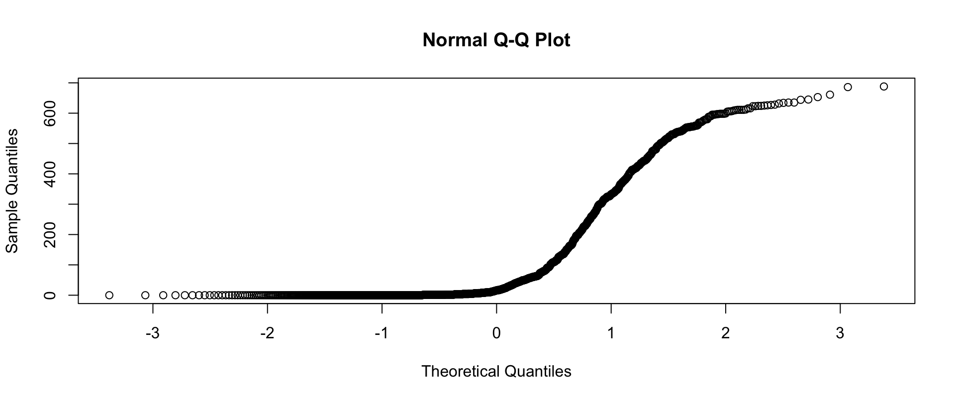
At-bats are decidedly not normal — the bowed shape says it instantly.
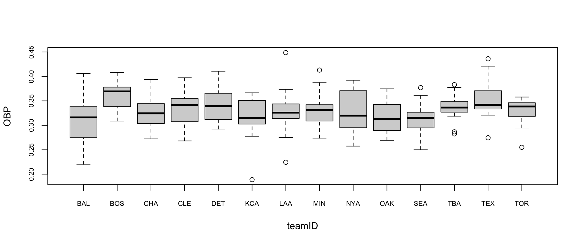
OBP by Team
On-base percentage by American League team, regulars only:
Layout: Margins and Multiple Plots
- Margins:
mai(inches) /mar(text lines, defaultc(5.1, 4.1, 4.1, 2.1)for bottom/left/top/right) /mex(line-size factor); title-label spacing viamgp; device size via read-onlydin; square plot region viapty="s". - Multiple figures:
mfcol=c(3,2)(fill by column) ormfrow(by row) split the device;mfgjumps to a chosen cell. Outer margins:omi/oma/omd. Per-figure geometry:pin,plt,fig. Clipping:xpd.
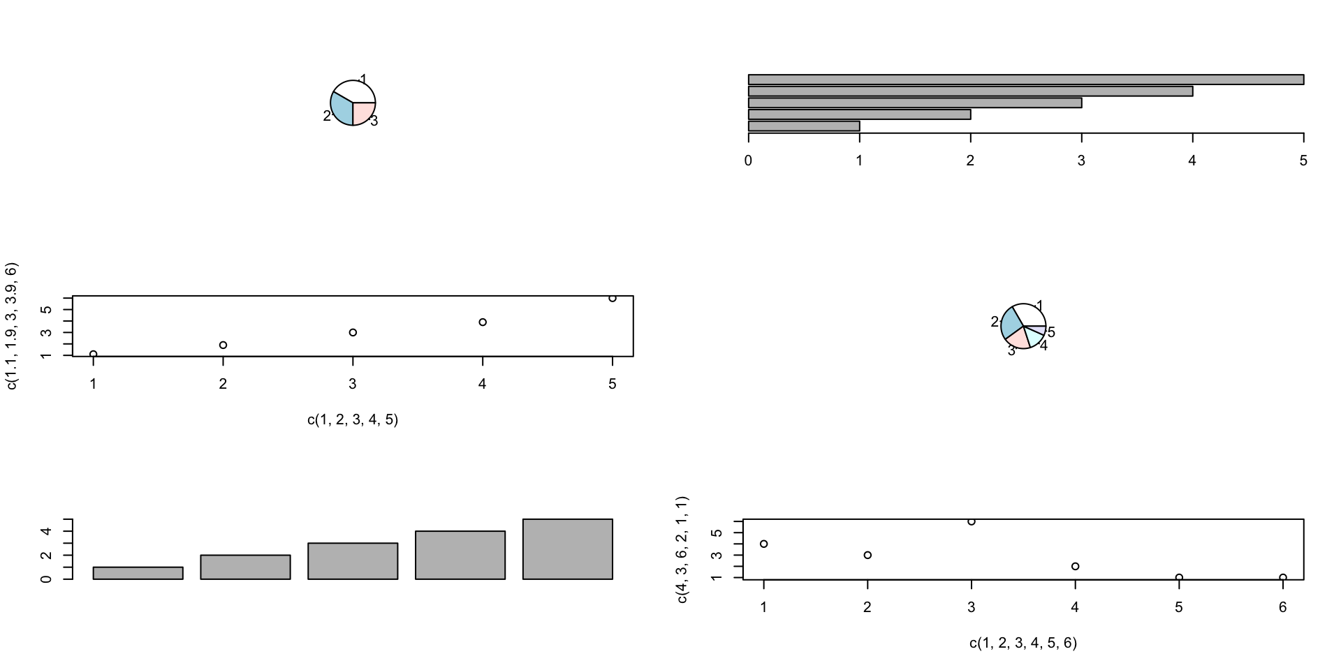
(Easier alternatives: layout, split.screen — or the grid/lattice packages.)
Straight Lines, Shapes, Segments
abline draws one line across the plot — by intercept+slope (a, b), horizontal (h), vertical (v), regression object (reg), or coef; untf un-transforms on log axes:
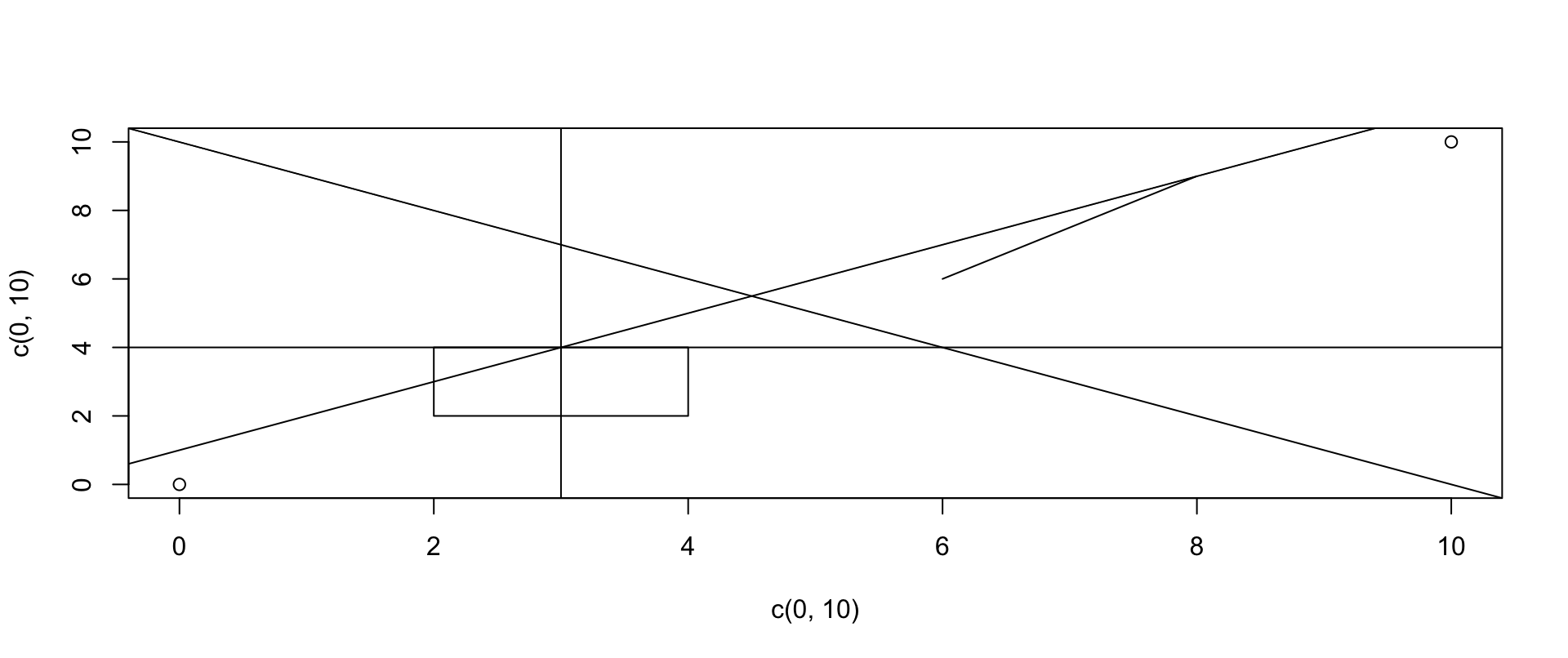
Vector arguments draw many lines at once (abline(h=1:10, v=1:10)) — though for a grid, use grid(nx, ny, col, lty, lwd). Shapes: polygon(x, y, density, angle, border, col, lty); rectangles via rect(xleft, ybottom, xright, ytop, ...); point-pair segments via segments(x0, y0, x1, y1, ...); arrows via arrows.