Programming for Applications
Chapter 15: ggplot2
2026-08-03
A Short Introduction
Hadley Wickham’s ggplot2 became one of R’s most popular packages — not just for pretty output, but because it speaks a language for describing plots: the grammar of graphics. You describe what you want to show, not how to draw it. The toy data (lattice’s, with renamed variables):
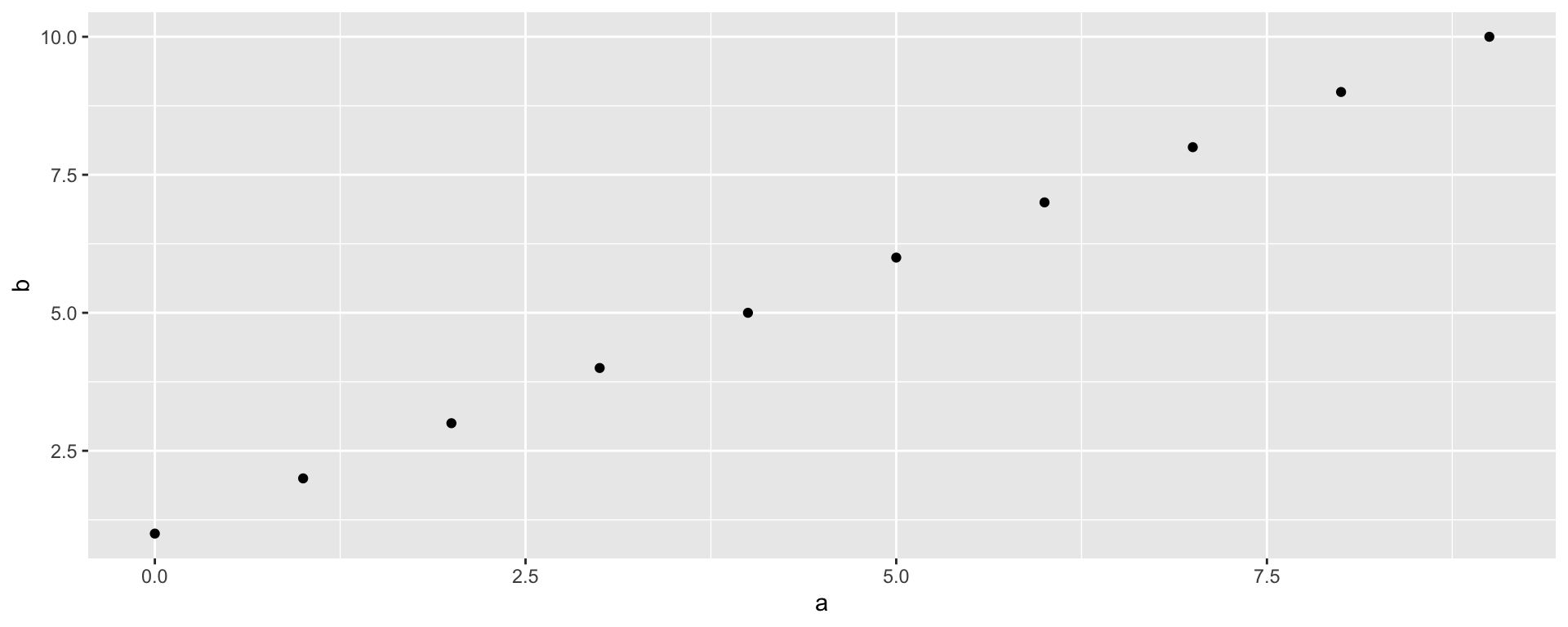
We specified an x, a y, and a data set — never the words “scatter plot.” (qplot = quick plot; deprecated in recent ggplot2 but still working — the full ggplot() style follows shortly.)
Facets
Panels (lattice’s conditioning) are facets, specified by formula:
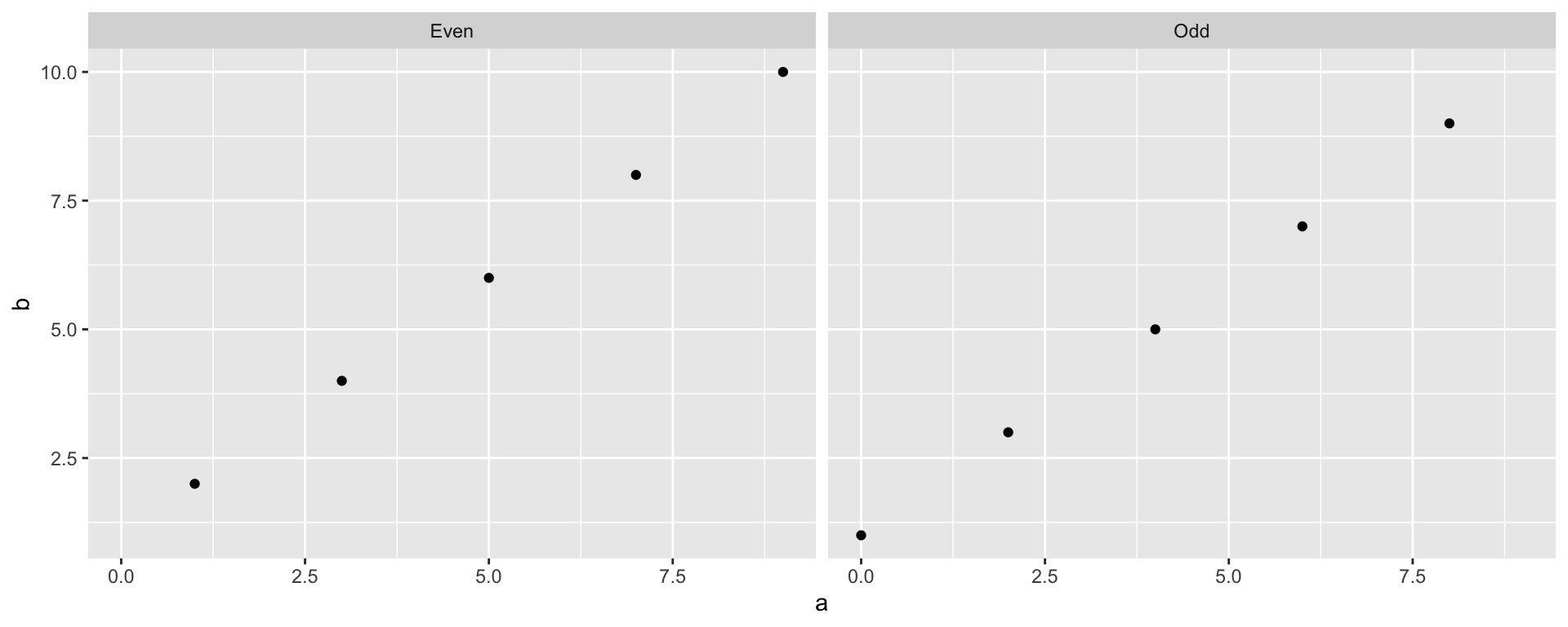
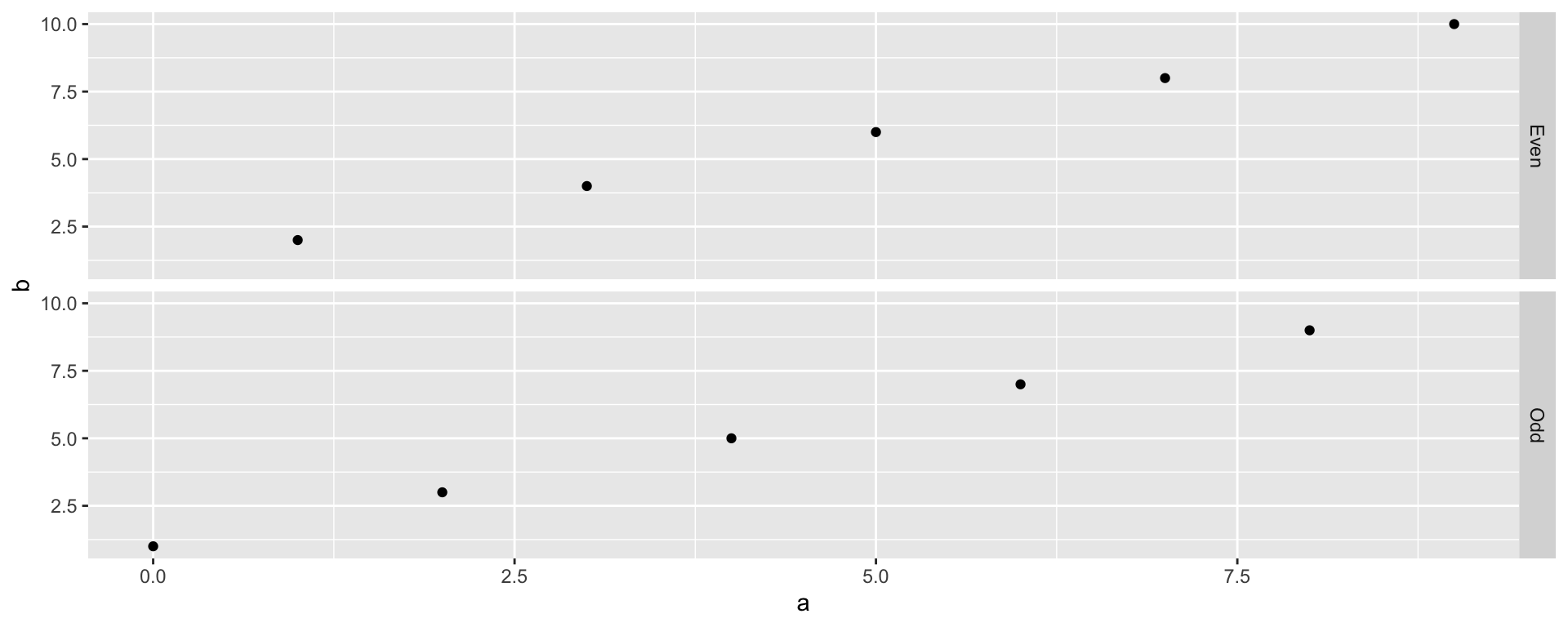
(Hadley’s preferred spelling of the first: qplot(x=a, y=b, data=d) + facet_wrap(~c).)
Colors Instead of Facets
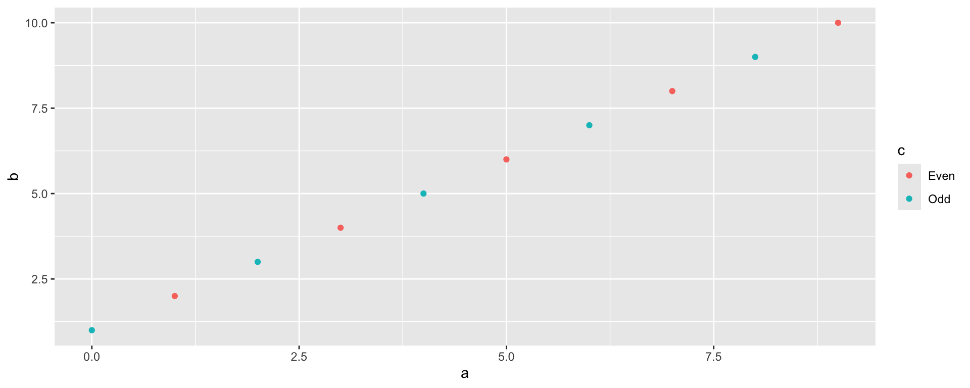
Group-by-color is just another mapping — same data, one panel:
One Variable: Histogram and Density
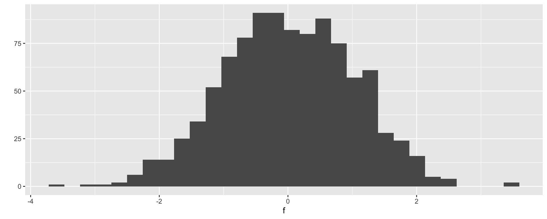
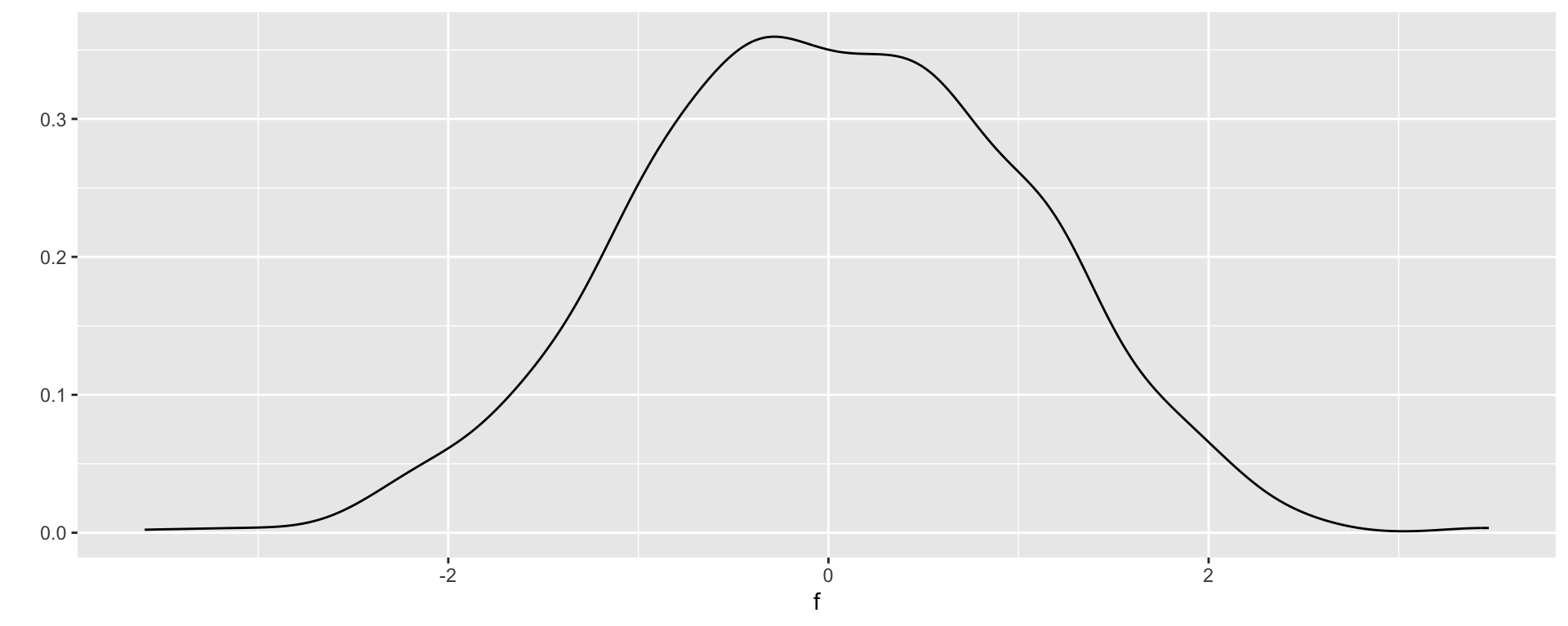
With only x supplied, qplot defaults to a histogram; ask for another geom by name:
Bar Charts: Facets…
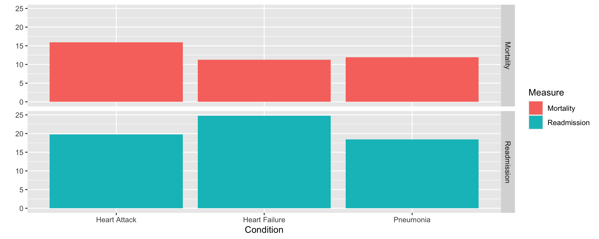
One categorical x, so a univariate plot with bar heights from weight=Rate; facet by Measure, fill by Measure:
…or Dodging
Drop the facets, set position="dodge" to place bars side by side. The book wrote qplot(..., position="dodge"), but modern ggplot2 has removed qplot’s position argument — position adjustments now belong to the layer, so we write it the full-grammar way:
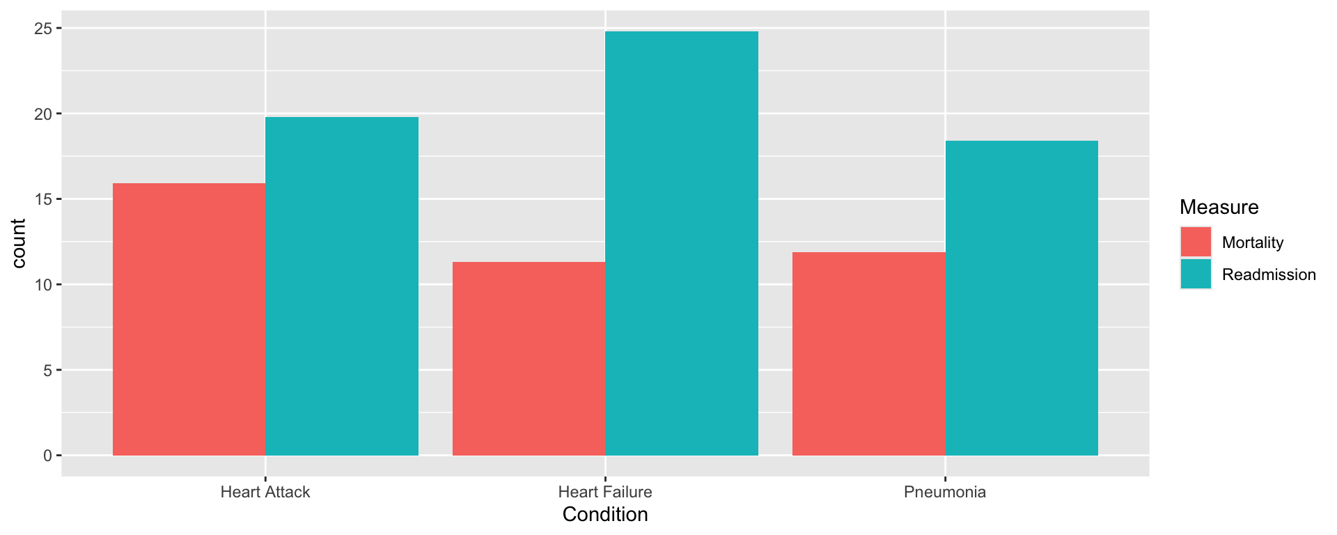
Both work — differently: faceting invites comparing conditions within each measure; dodging invites comparing measures within each condition. The display is an argument.
Payments vs. Volume
Question: do hospitals treating more cases charge Medicare more or less? Restrict to the three heart-failure diagnosis groups and plot payment vs. case count, colored by diagnosis:
temp <- tempfile(fileext = ".rda")
download.file("https://raw.githubusercontent.com/cran/nutshell/master/data/medicare.payments.rda",
              temp, mode = "wb")
load(temp)
heart.failure <- c("Heart failure and shock w/o CC/MCC",
                   "Heart failure and shock w MCC",
                   "Heart failure and shock w CC")
payment.plot <- qplot(x=Number.Of.Cases, y=Medicare.Average.Payment,
  data=subset(medicare.payments, Diagnosis.Related.Group %in% heart.failure),
  color=Diagnosis.Related.Group)
payment.plot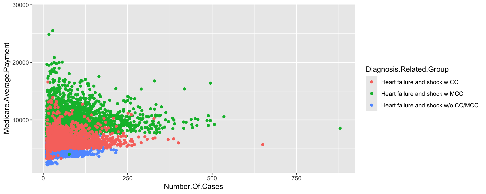
Unreadable — everything clumps left. (Small counts are censored by HIPAA.)
Fixing the Plot by Adding Layers
Recipe: log x-scale, semi-opaque points (alpha=I(1/10)), a smoothing line, trimmed y. The elegant route adds components with +:
payment.plot.alpha <- qplot(x=Number.Of.Cases, y=Medicare.Average.Payment,
  data=subset(medicare.payments, Diagnosis.Related.Group %in% heart.failure),
  color=Diagnosis.Related.Group, alpha=I(1/10), ylim=c(0, 20000))
payment.plot.scaled <- payment.plot.alpha + scale_x_log10() + geom_smooth()
payment.plot.scaled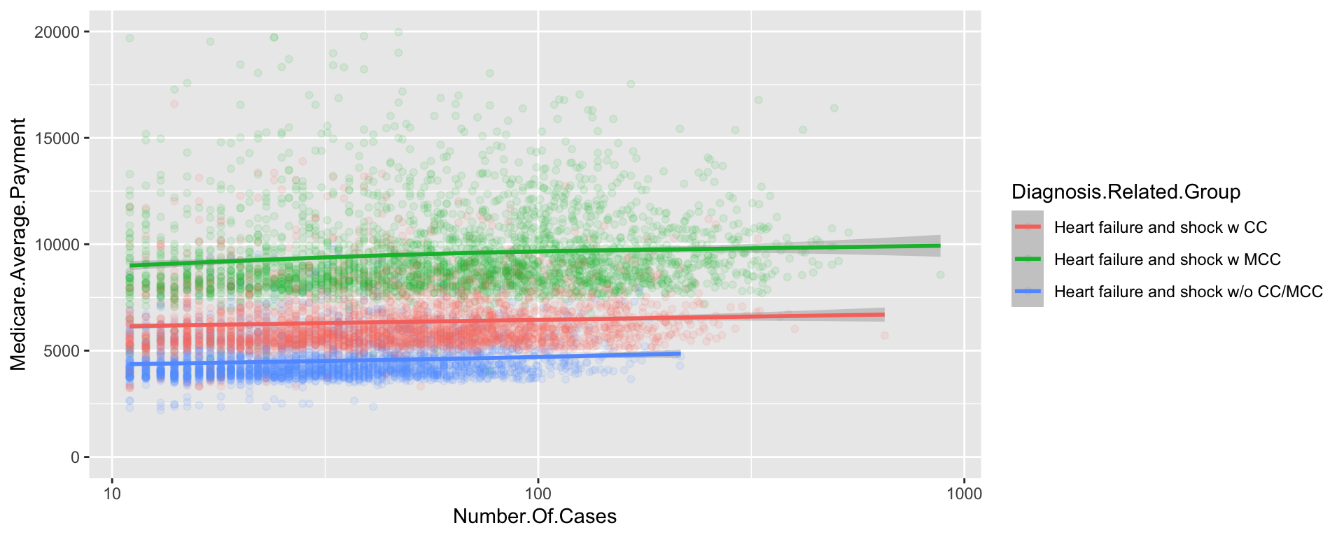
summary of this object now shows two geom/stat/position triples — one per layer — with the alpha aesthetic threaded through.
Reordering Factors for Dot Plots
Costs rise with volume — geography, perhaps? State-level data, with State levels reordered by payment (sorting the levels, not the rows) before a dot plot:
temp <- tempfile(fileext = ".rda")
download.file("https://raw.githubusercontent.com/cran/nutshell/master/data/medicare.payments.by.state.rda",
              temp, mode = "wb")
load(temp)
medicare.payments.by.state.hf <- subset(medicare.payments.by.state,
  Diagnosis.Related.Group %in% heart.failure)
medicare.payments.by.state.hf$State <- with(medicare.payments.by.state.hf,
  reorder(State, Medicare.Average.Payment.Maximum, mean))
qplot(x=Medicare.Average.Payment.Maximum, y=State,
      data=medicare.payments.by.state.hf,
      color=Diagnosis.Related.Group)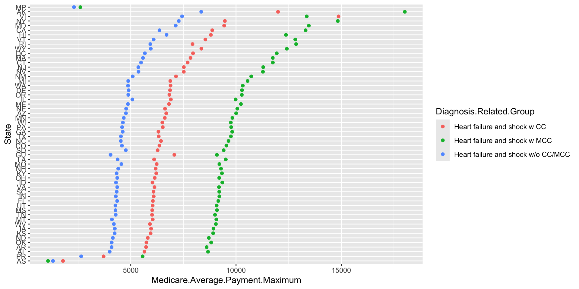
Top of the list: Northern Mariana Islands, Alaska, Virgin Islands — remote and expensive — then NY, MD, CA: high cost of living and big hospitals. Cheapest: Puerto Rico, American Samoa. Cost and volume are both correlated with geography.
A Choropleth Map
Are adjacent states similar? Merge payments with state polygons (maps package) and fill by payment — geom="polygon" plus a repositioned legend:
library(maps)
states <- map_data("state")
state.name.map <- data.frame(abb=state.abb, region=tolower(state.name),
                             stringsAsFactors=FALSE)
states <- merge(states, state.name.map, by="region")
toplot <- merge(states, medicare.payments.by.state,
                by.x="abb", by.y="State")
toplot <- toplot[order(toplot$order), ]
qplot(long, lat,
      data=subset(toplot,
        Diagnosis.Related.Group=="Heart failure and shock w/o CC/MCC"),
      group=group, fill=Medicare.Average.Payment.Maximum,
      geom="polygon") +
  theme(legend.position="bottom", legend.direction="vertical")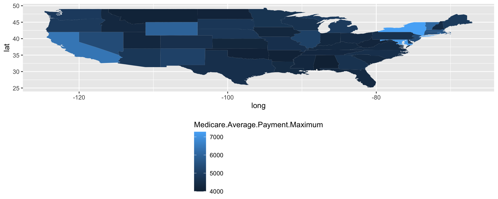
(The book wrote opts(...) — long since replaced by theme().)